The Python Graph Gallery
A collection of hundreds of charts made with Python, from beginner-friendly basics to stunning dataviz. Each example comes with its reproducible code and explanations. Most of them use matplotlib and seaborn.
The biggest list of python chart examples
Charts are classified by chart type. Each section starts with a foundational tutorial, then goes into the most common customizations.




























General Knowledge







Hunting the most beautiful Python charts
Explore our curated collection of the finest Python charts, handpicked for their superior design and accuracy. Go beyond the defaults with chart examples that are both visually stunning and instructive.
Accompanied by in-depth tutorials, this section will please seasoned professionals aspiring to elevate their craft. Featuring the finest charts on the web, we stay ahead of the curve, showcasing the latest tips, tricks, and advanced techniques in data visualization.
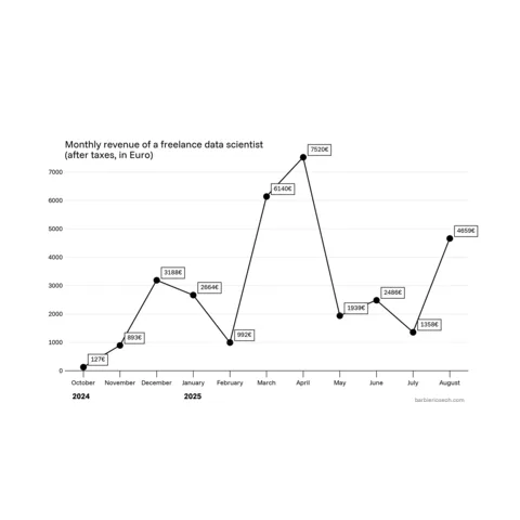
Salary evolution
Joseph Barbier
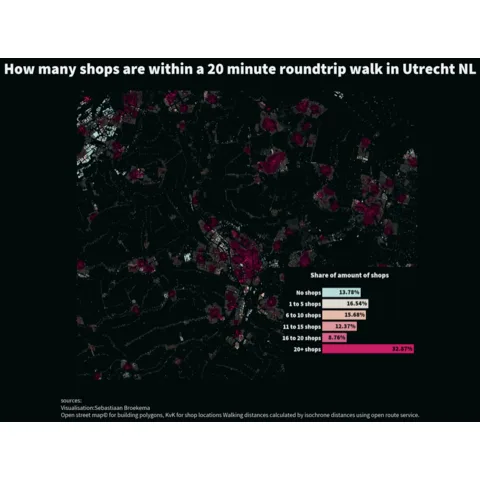
Beyond the choropleth: a polygon map
Sebastiaan Broekema
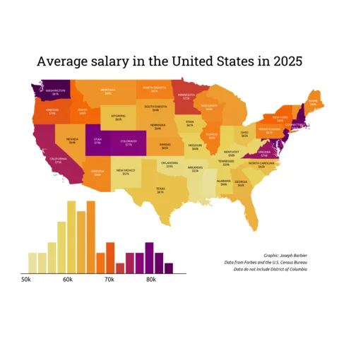
Salary in the USA
Joseph Barbier
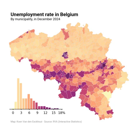
Unemployment rate in Belgium
Koen Van den Eeckhout
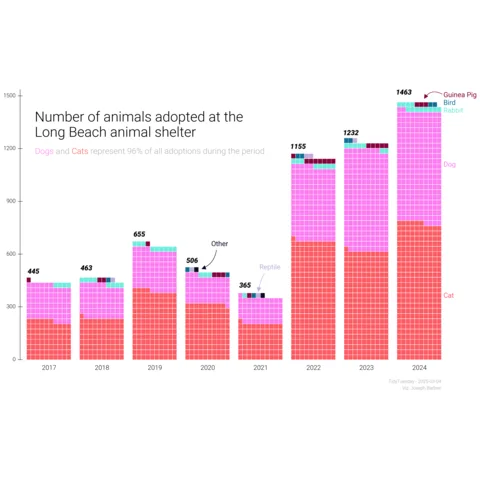
Animal adoption evolution
Joseph Barbier
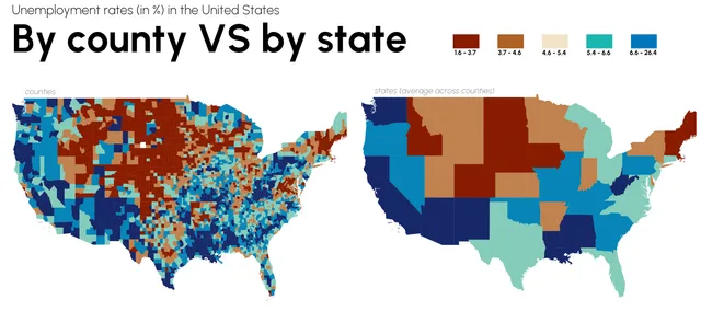
Unemployment rates in the US
Joseph Barbier
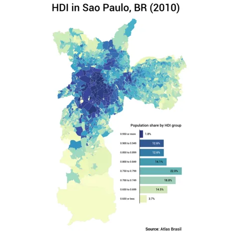
HDI distribution in Sao Paulo
Vinicius Oike Reginatto
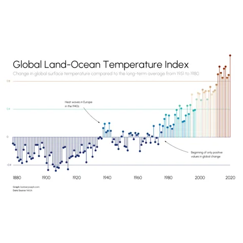
Evolution of temperature variation
Joseph Barbier
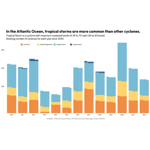
Share of cereals used as animal feeds
Muhammad Azhar
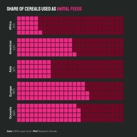
Share of cereals used as animal feeds
Benjamin Nowak
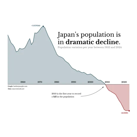
Japan's population evolution
Joseph Barbier
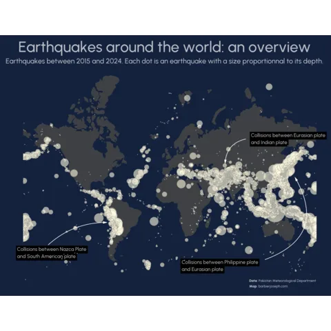
Earthquakes around the world
Joseph Barbier
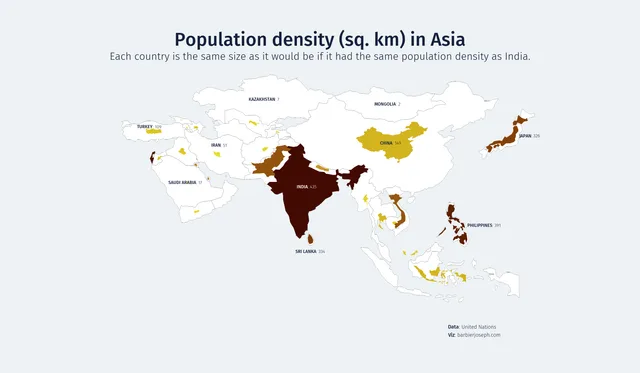
Density population in Asia
Joseph Barbier
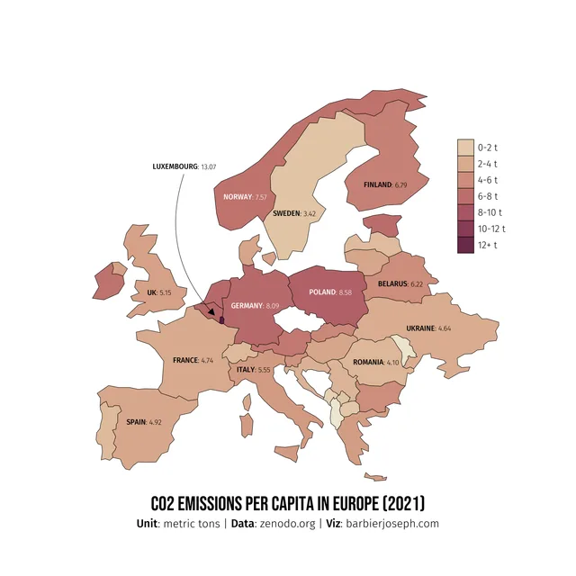
CO2 consumption in Europe
Joseph Barbier
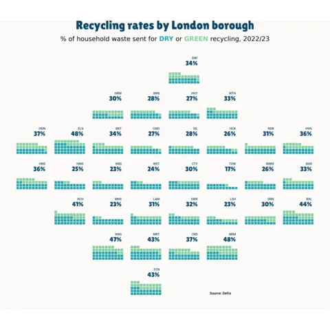
London recycling rates
Lisa Hornung
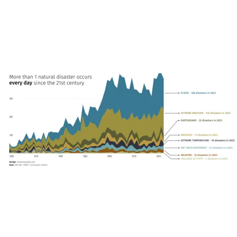
Evolution of natural disasters
Joseph Barbier
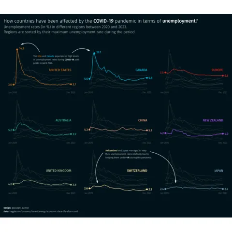
Unemployment rate during COVID-19
Joseph Barbier
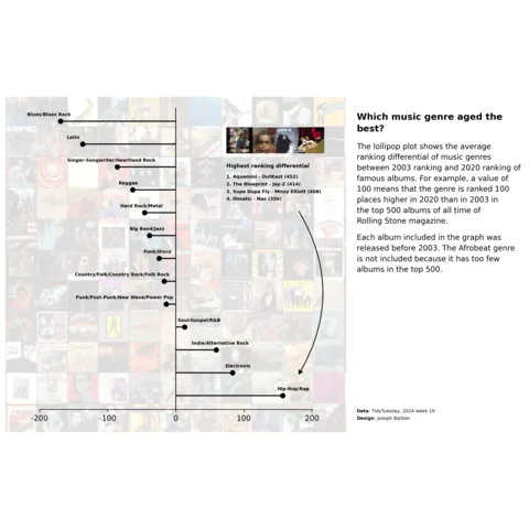
Lollipop about music genres
Joseph Barbier

Map with scatter plot on top
Joseph Barbier
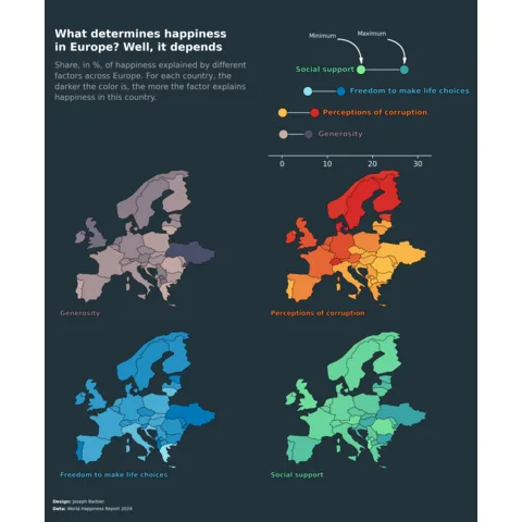
Multiple choropleth map
Joseph Barbier
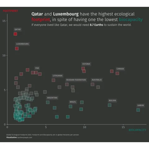
Scatter plot with specific highlights
Joseph Barbier
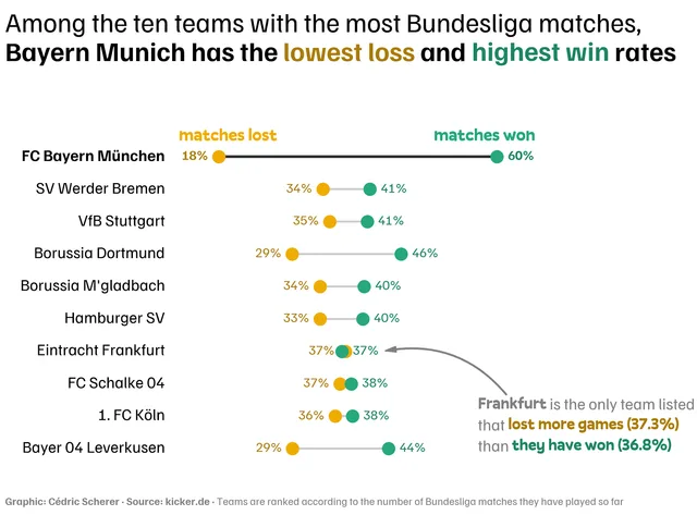
Dumbell chart
Cédric Scherer
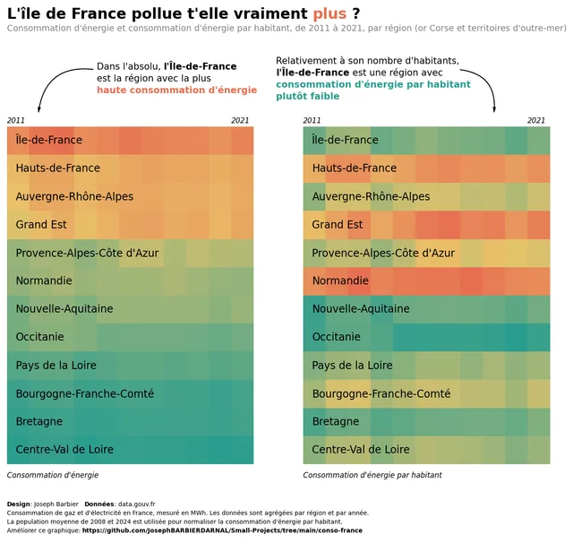
Double heatmap for comparison
Joseph Barbier
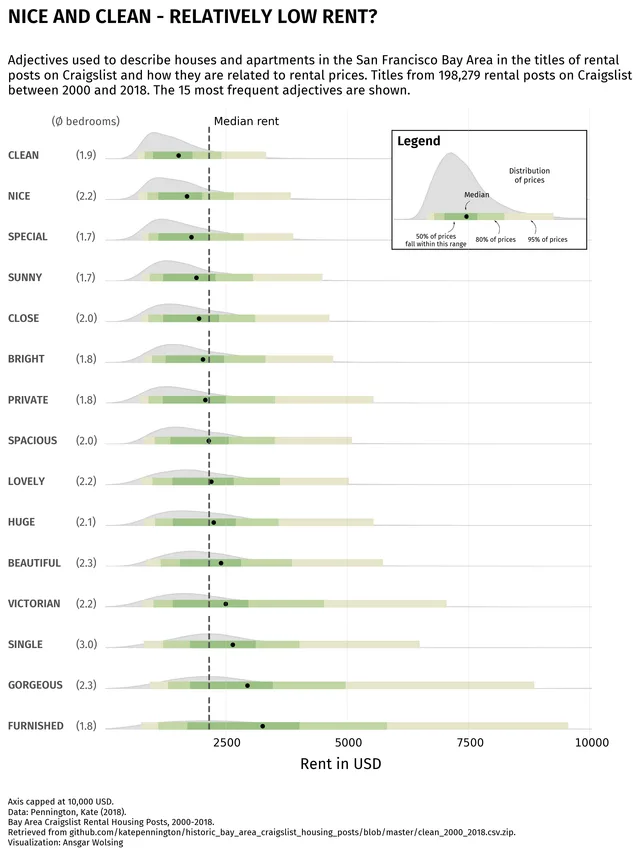
Ridgeline with quantiles display
Ansgar Wolsing
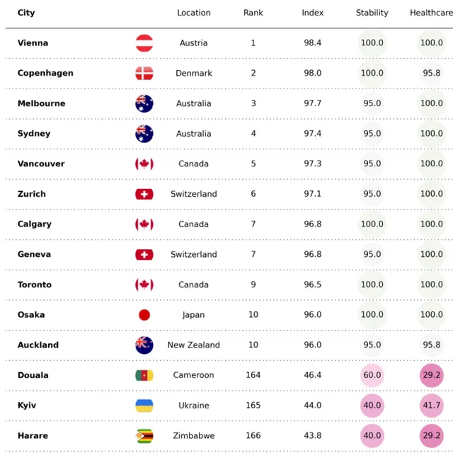
Polished table with bubbles
Fortune Uwha
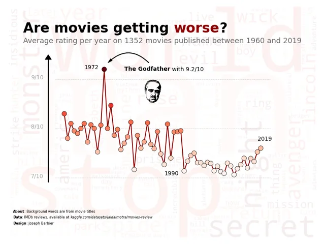
Line chart with word cloud
Joseph Barbier
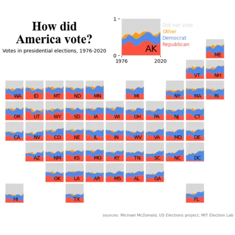
Mini stacked areas for US states
Erin
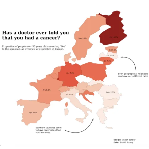
Choropleth map with gradient color
Joseph Barbier
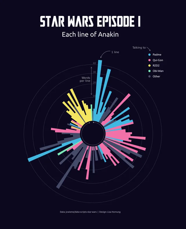
Ordered & Mirrored barplot
Lisa Hornung
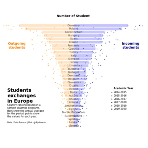
Ordered & Mirrored barplot
Benjamin Nowak
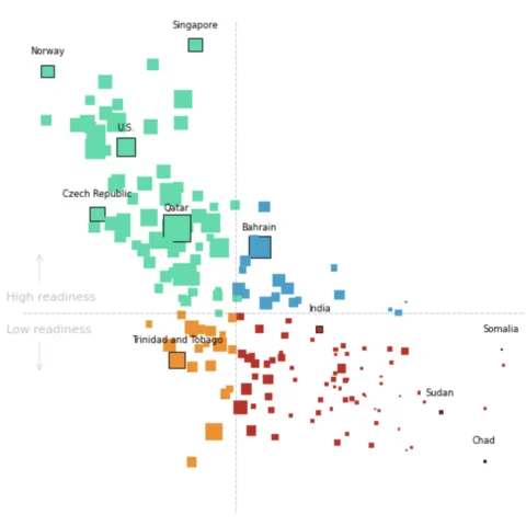
Scatterplot with grouping, highlighting and annotation
Data Wrapper
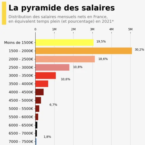
Histogram with clean color scale and annotation
INSEE
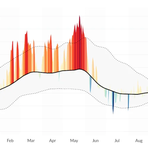
Area over flexible baseline chart
J. Kühn
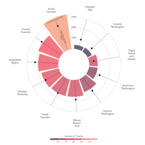
Circular Barplot
T. Stadler
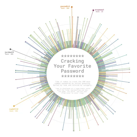
Circular Lollipop Plot
C. Scherer
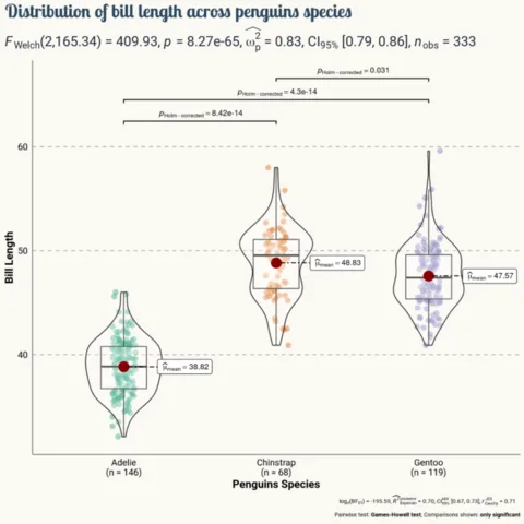
Violin and Boxplot combination
T. Wang
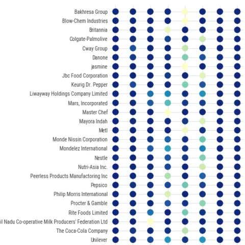
Circle Heatmap
M. Siple
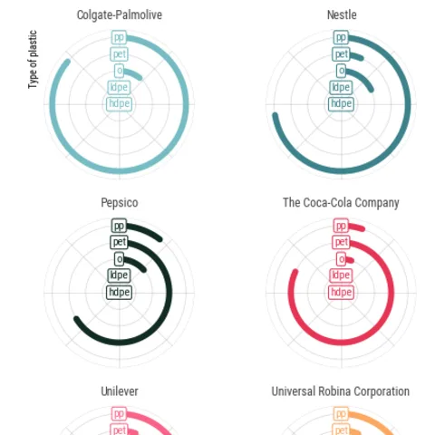
Circular barplot
M. Siple
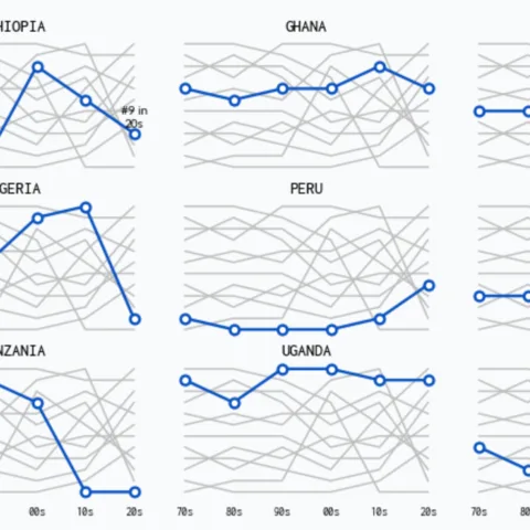
Line chart with faceting
A. Madjid
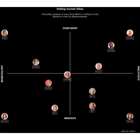
Scatterplot with images
Tanya Shapiro
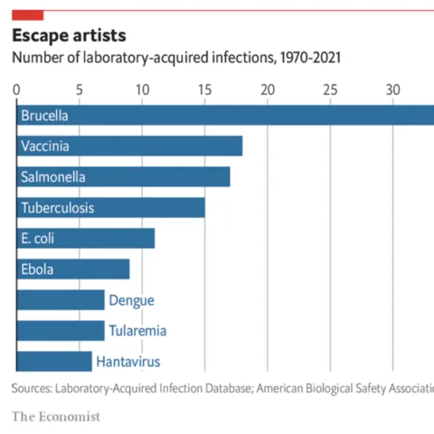
Horizontal Barplot
The Economist
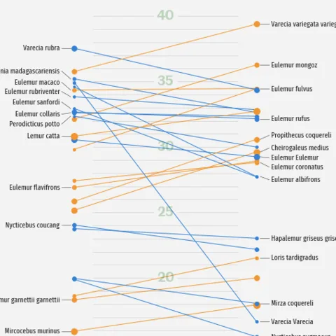
Parallel chart
G. Karamanis
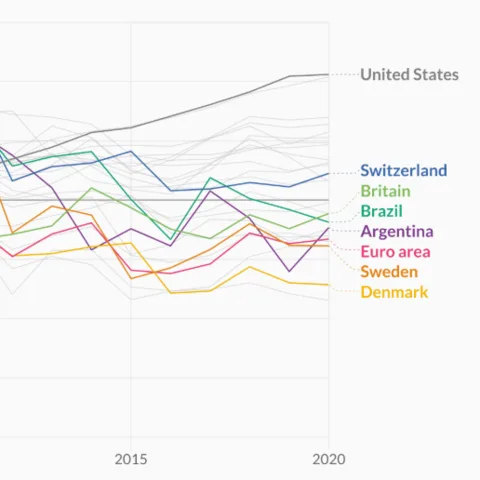
Inline labels
C. Scherer
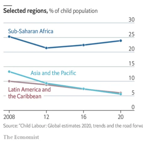
Line chart from the Economist
The Economist
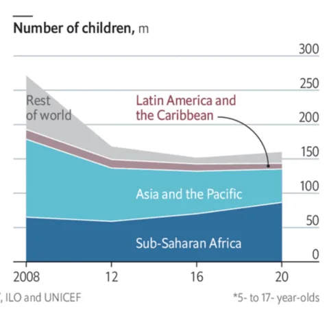
Area chart from the Economist
The Economist
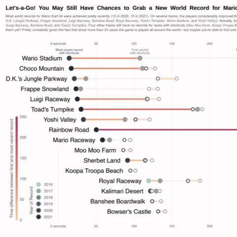
Lollipop chart
C. Scherer
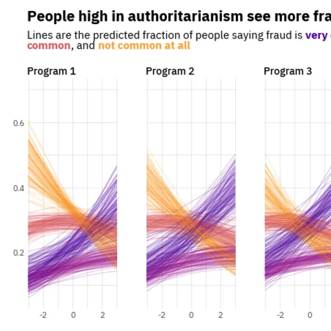
Line chart with small multiple
O. Medina
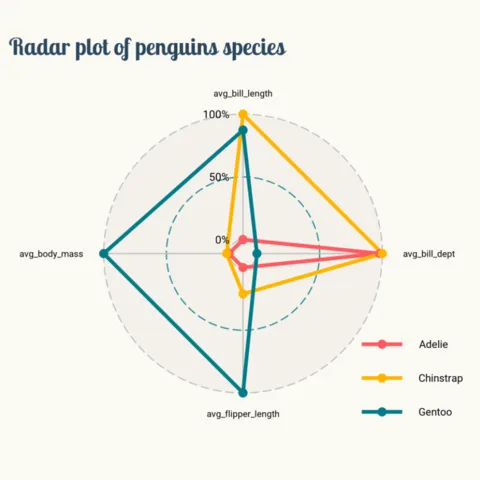
Radar chart with matplotlib
T. Wang
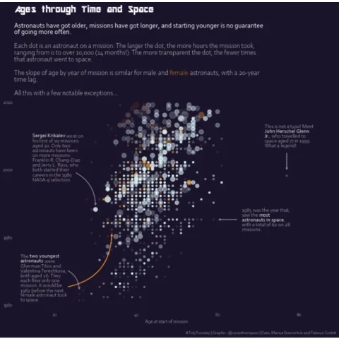
Astronaut Scatterplot
C. Thompson
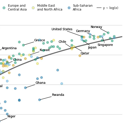
Scatterplot with regression fit
C. O. Wilke
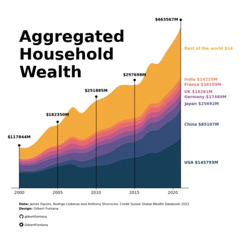
Stacked barchart
G. Fontana
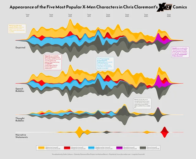
X-men Streamchart
C. Scherer
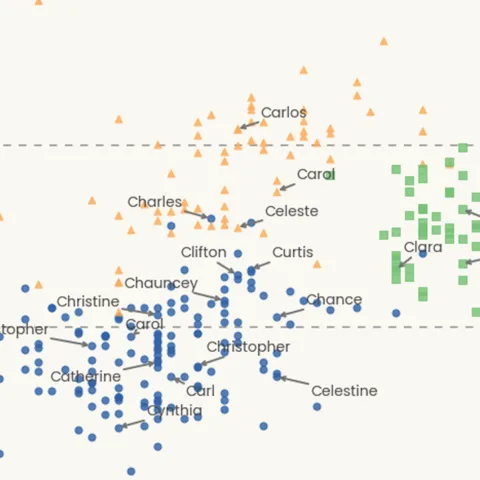
Scatterplot with text repel
T. Wang
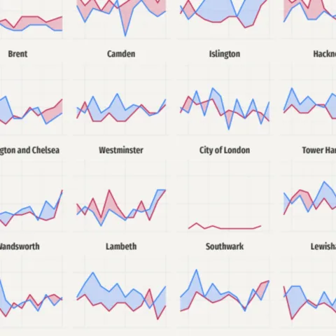
Timeseries and faceting
G. Karamanis
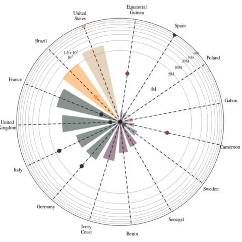
Polar bar chart
nyx-it-up
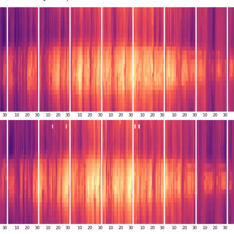
Hourly heatmap
J. MacKintosh
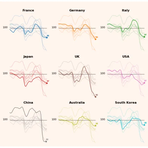
Line chart & small multiple
G. Fontana
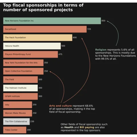
Barplot with annotations and arrows
J. Barbier
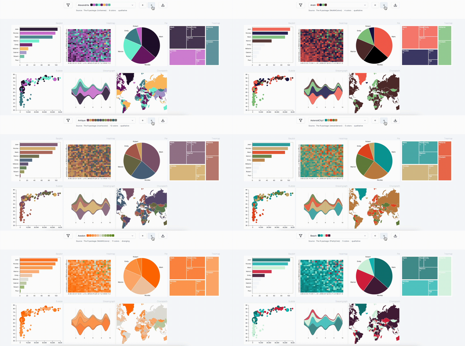
Palette color finder
Selecting optimal chart colors can be challenging and time-intensive. The pypalettes library simplifies this process by providing access to over 2,500 color palettes with a single line of code.
Additionally, the Python Graph Gallery features a dedicated page where you can browse all these palettes and preview their appearance on your charts.
Python Graphing with State-of-the-Art Libraries
The python graph gallery relies on the latest and most powerful charting libraries.
 Matplotlib
The foundation of Python visualization. Offers a wide array of customizable 2D plots and an extensive set of tools for creating intricate figures and charts.
Tutorial Seaborn
Built atop Matplotlib, Seaborn elevates data visualization by providing a higher-level interface and stunning default themes.
Tutorial Pandas
Beyond its powerful data manipulation capabilities, Pandas offers convenient plotting methods, enabling users to visualize data directly from DataFrame and Series objects.
Tutorial Plotly
Delivering interactive and browser-based visualizations, Plotly allows users to craft visually captivating charts, bridging the gap between static graphs and web-based interactivity.
Tutorial Plotnine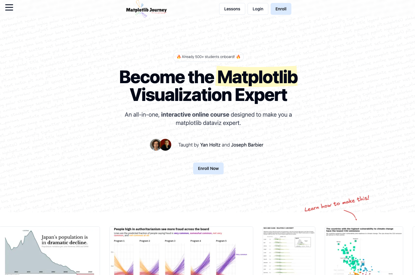
Matplotlib Journey is an interactive online course crafted to transform you into a Matplotlib dataviz expert. It provides a clear, big-picture understanding of how data visualization works in Python, empowering you to grasp any example from the gallery with ease.
Finally, Understand Matplotlib.💡 Out of dataviz inspiration?
I have spent years collecting the most beautiful data visualizations out there. Get the list of my top 300 dataviz projects, hand-picked, for free.
I respect your privacy. Unsubscribe anytime.