Donut Plot

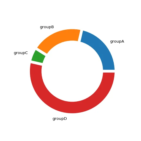
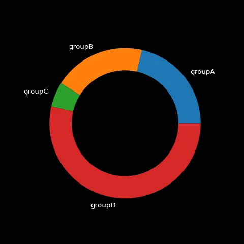
A Donut chart is essentially a Pie Chart with an area of the center cut out. You can build one hacking the plt.pie() function of the matplotlib library as shown in the examples below.
⏱ Quick start
matplotlib allows to build a pie chart easily thanks to its pie() function. Visit the dedicated section for more about that.
We can use the exact same principle and add a circle to the center thanks to the circle() function and get a donut chart.🔥
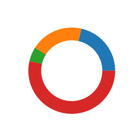
Most basic donut chart with Python and Matplotlib
# library
import matplotlib.pyplot as plt

# create data
size_of_groups=[12,11,3,30]

# Create a pieplot
plt.pie(size_of_groups)

# add a circle at the center to transform it in a donut chart
my_circle=plt.Circle( (0,0), 0.7, color='white')
p=plt.gcf()
p.gca().add_artist(my_circle)

plt.show()⚠️ Mind the donut!
As his friend the Pie chart, the Donut chart is often criticized. Humans are pretty bad at reading angles, making it hard to rank the groups accurately. Most of the time, it is better to display the information as a barchart, a treemap or a lollipop plot.
Have a look to the 3 pie charts below, can you spot the pattern hidden in it?
See it as a barplot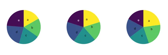
 Donut plot with
 Matplotlib
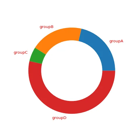
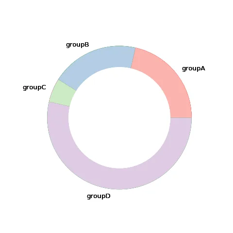
The example above is a good start but you probably need to go further. The blog posts linked below explain common tasks like adding and customizing labels, change section colors, add padding between each and more.
Related chart types






💡 Out of dataviz inspiration?
I have spent years collecting the most beautiful data visualizations out there. Get the list of my top 300 dataviz projects, hand-picked, for free.
I respect your privacy. Unsubscribe anytime.