Treemap

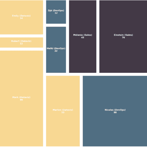
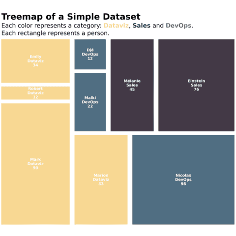
A treemap displays hierarchical data as a set of nested rectangles. Each group is represented by a rectangle, which area is proportional to its value. In Python, the squarify library allows to compute the rectangle positions and plot it.
⏱ Quick start
A treemap displays each element of a dataset as a rectangle. It allows to see what proportion each element has compared to the whole.
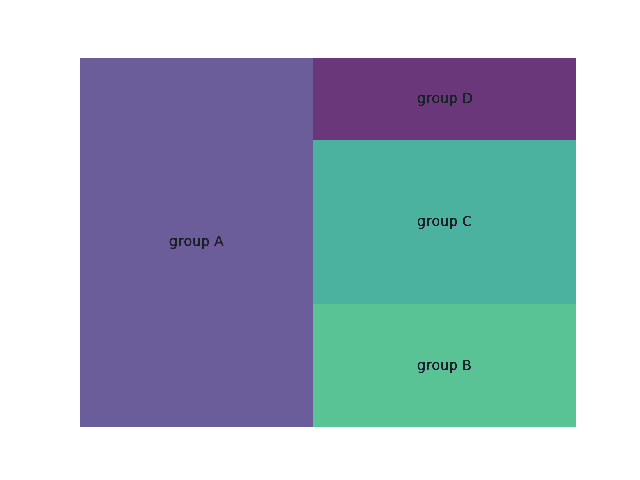
This is doable with python and Matplotlib thanks to the squarify library that can be used as follow:🔥
# libraries
import matplotlib.pyplot as plt
import squarify    # pip install squarify (algorithm for treemap)
import pandas as pd

# Create a data frame with fake data
df = pd.DataFrame({'nb_people':[8,3,4,2], 'group':["group A", "group B", "group C", "group D"] })

# plot it
squarify.plot(sizes=df['nb_people'], label=df['group'], alpha=.8 )
plt.axis('off')
plt.show()
 Treemap with
 Matplotlib and Squarify
Matplotlib is probably the most famous and flexible python library for data visualization. It is appropriate to build any kind of chart, including the lollipop plot thanks to its stem() function.
 Treemap with
 Plotly
Plotly is a very powerful library to create interactive graphics. It is known for its great interactivity and its ability to handle large datasets.
It comes with multiple functions to create treemaps, for both of its API: plotly.graph_objects and plotly.express. Try to hover and click on the following treemap to see how it reacts:
🚨 Grab the Data To Viz poster!
Do you know all the chart types? Do you know which one you should pick? I made a decision tree that answers those questions. You can download it for free!

