Waffle chart

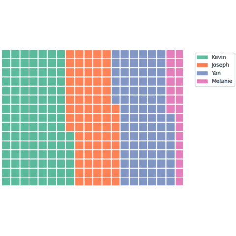
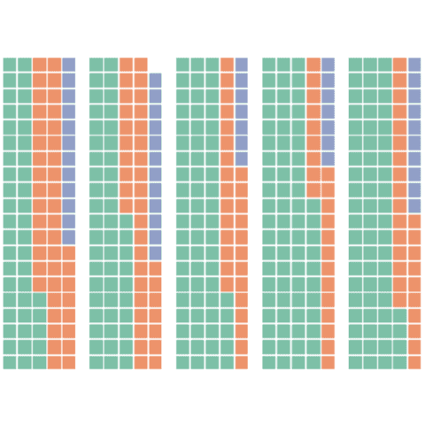
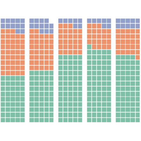
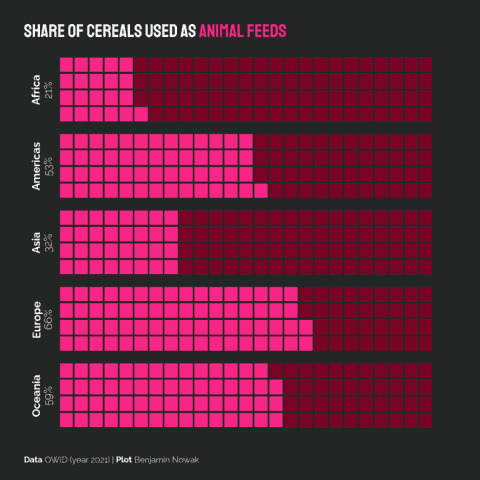
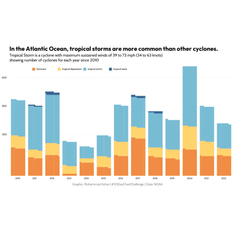
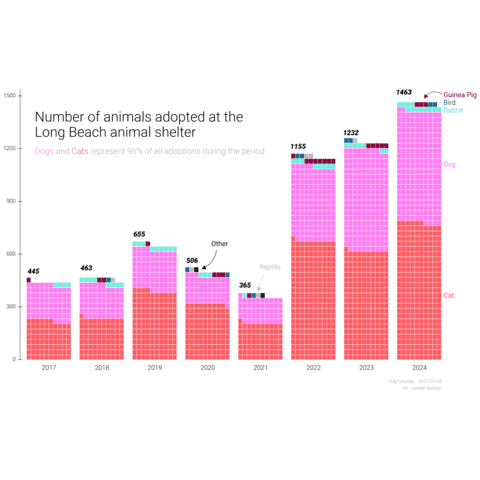
A Waffle Chart represents categorical data using a grid of equally sized squares or rectangles, each colored or shaded to depict different categories or segments.
Python enables the creation of waffle charts through the PyWafflelibrary. This page offers numerous examples of charts built using the PyWaffle library, ranging from basic implementations to more advanced customizations.
⏱ Quick start
The PyWaffle library allows to build a waffle chart easily thanks to its Waffle class.
The input data is a dictionary with names as keys and associated integer values.
The number of rows and columns can be set with the rows and columns arguments:
# useful libraries, including pyWaffle
import matplotlib.pyplot as plt
from pywaffle import Waffle

# create simple dummy data
data = {'Kevin': 10, 'Joseph': 7, 'Yan': 8}

# Basic waffle
plt.figure(
  FigureClass=Waffle,
  rows=5,
  columns=20,
  values=data,
  legend={'loc': 'upper left', 'bbox_to_anchor': (1.05, 1)},
)
plt.show()
Waffle chart with PyWaffle
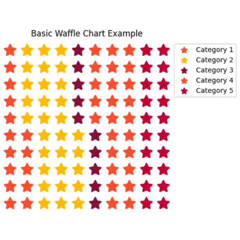
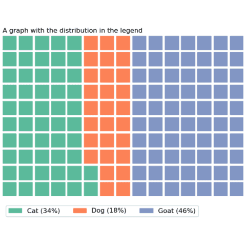
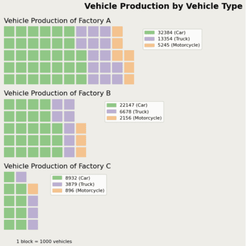
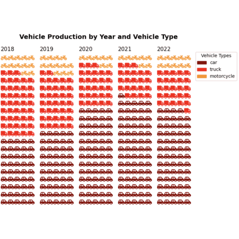
The examples below should guide you through the Waffle class usage. It starts with a very basic example and then provides hints on how to apply usual customization like using icons or showing percentages in the legend.
Best examples
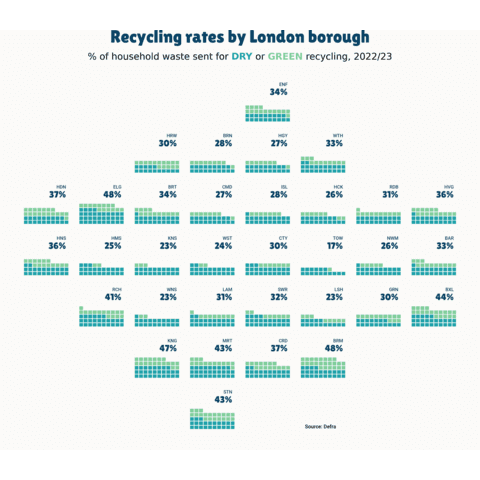
The web is full of astonishing charts made by awesome bloggers, (often using R). The Python graph gallery tries to display (or translate from R) some of the best creations and explain how their source code works. If you want to display your work here, please drop me a word or even better, submit a Pull Request!
🚨 Grab the Data To Viz poster!
Do you know all the chart types? Do you know which one you should pick? I made a decision tree that answers those questions. You can download it for free!

