About
👋 Hi! The Python Graph Gallery is a website brought to you by Yan Holtz. It displays hundreds of charts made with Python, together with their reproducible code. Here are a few things you should know about it! 👇
❓ How and Why this gallery
How: The python graph gallery displays about 400 charts organize in about 40 sections(families)! 😳. It showcases the most common types of chart used for data science. Each family displays several examples, describing the most common need of customization. Every example comes with its reproducible code and with some explanation 😀.
This website relies on the following stack:
- Gatsby makes the website blazing fast
- Code is hosted on github, you can edit it!
- Every blog post is actually a Jupyter notebook
- React bootstrap is the css framework used here.
Why: I guess the main explanation is that I'm a nerd 😊. I love exploring all the graph possibilities a language offers. I also love teaching and helping people out. If you've found this website helpful, say me thanks and you will make my day! 🙏
This website is built on my free time with the little I know! Please be kind when giving feedbacks ❤️
🚀 Going further 🔥

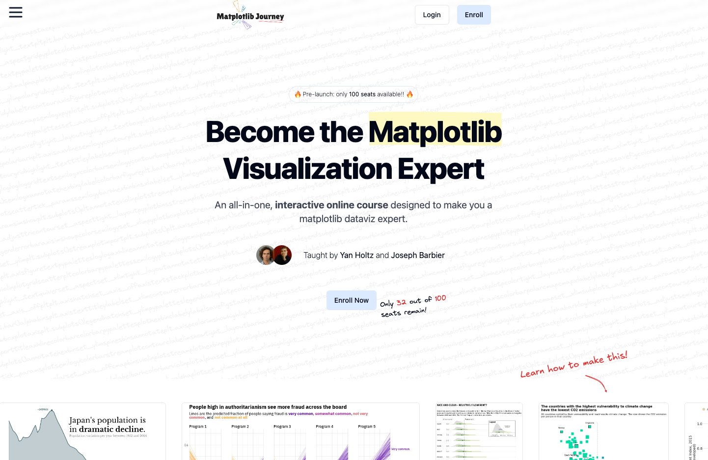
Matplotlib Journey is an interactive online course crafted to transform you into a Matplotlib dataviz expert. It provides a clear, big-picture understanding of how data visualization works in Python, empowering you to grasp any example from the gallery with ease.
🙏 Acknowledgment
This website would no exist without the precious help of those people:
- Maintainers of python viz libraries like
matplotlib,seaborn,plotly,circlify,squarify,pandas,leaflet,networkXand others. - Main contributors who wrote some of the blogposts: Nicolas Rousselet and Ozlem Tok
- Friends: Conor Healy for the logos, Gimzu Debreu for general knowledge about the internet and all others who gave me constructive feedbacks.
- More generally, everybody who gave feedbacks, english corrections, bug reports, opened issues
🙇♂️ How to contribute
Contribution to the python graph gallery are highly encouraged 📢! I'm working hard on this project and would love some help of any kind.
There are 2 main ways to contribute:
- Improve an existing page. It can be anything from correcting an english mistake to a python code reformating.
- 👍🏽 Open an issue on github to explain the bug you've found
- 🔥 Open a pull request on the github repo to suggest a correction
- Create a new chart. Contact me by email, on twitter or open a pull request with a new chart suggestion.
🚨 Grab the Data To Viz poster!
Do you know all the chart types? Do you know which one you should pick? I made a decision tree that answers those questions. You can download it for free!
