Libraries & Dataset
For creating this chart, we will need to load the following libraries:
- matplotlib for creatin the chart
- pandas for loading the dataset
- pypalettes for the color palette
- highlight_text for custom annotations
squarifyfor creating the treemap
# load libraries
import squarify  # pip install squarify (algorithm for treemap)
import matplotlib.pyplot as plt
from pypalettes import load_cmap
import pandas as pd
from highlight_text import fig_text

# set a higher resolution
plt.rcParams["figure.dpi"] = 300

df = pd.read_csv(
    "https://raw.githubusercontent.com/holtzy/The-Python-Graph-Gallery/master/static/data/simple-treemap.csv"
)
df| type | name | value | parent | |
|---|---|---|---|---|
| 0 | leaf | Mark | 90 | Team Dataviz |
| 1 | leaf | Robert | 12 | Team Dataviz |
| 2 | leaf | Emily | 34 | Team Dataviz |
| 3 | leaf | Marion | 53 | Team Dataviz |
| 4 | leaf | Nicolas | 98 | Team DevOps |
| 5 | leaf | Malki | 22 | Team DevOps |
| 6 | leaf | Djé | 12 | Team DevOps |
| 7 | leaf | Mélanie | 45 | Team Sales |
| 8 | leaf | Einstein | 76 | Team Sales |
Simple treemap
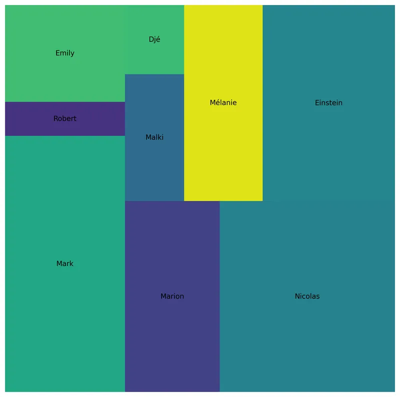
The plot() function from squarify works mainly with 3 arguments:
sizes: a list of values that will be represented by the area of the squareslabel: a list of labels to display on the squaresax: the matplotlib axes where to plot the treemap
# create a figure
fig, ax = plt.subplots(figsize=(10, 10))
ax.set_axis_off()

# add treemap
squarify.plot(sizes=df["value"], label=df["name"], ax=ax)

# display plot
plt.show()Custom colors
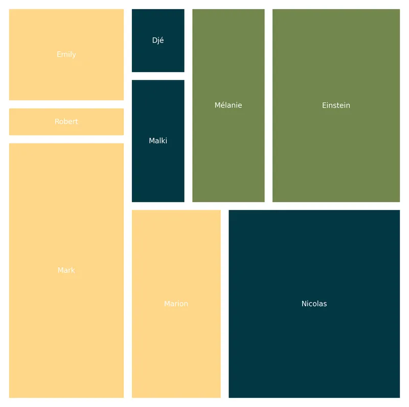
Utilizing the convenient pypalette library, you can effortlessly discover a color palette that suits your requirements.
In this instance, we employ the 'Acadia' palette and subsequently associate it with the parent column in the dataframe. This process generates a collection of colors that will be utilized to enhance the visual appeal of the squares.
Furthermore, we introduce some spacing between the rectangles with the help of pad=True and stipulate the preference for white text by using text_kwargs={'color':'white'}.
# create a color palette
cmap = load_cmap("Acadia")
category_codes, unique_categories = pd.factorize(df["parent"])
colors = [cmap(code) for code in category_codes]

# create a treemap
fig, ax = plt.subplots(figsize=(10, 10))
ax.set_axis_off()
squarify.plot(
    sizes=df["value"],
    label=df["name"],
    color=colors,
    text_kwargs={"color": "white"},
    pad=True,
    ax=ax,
)
plt.show()Custom labels
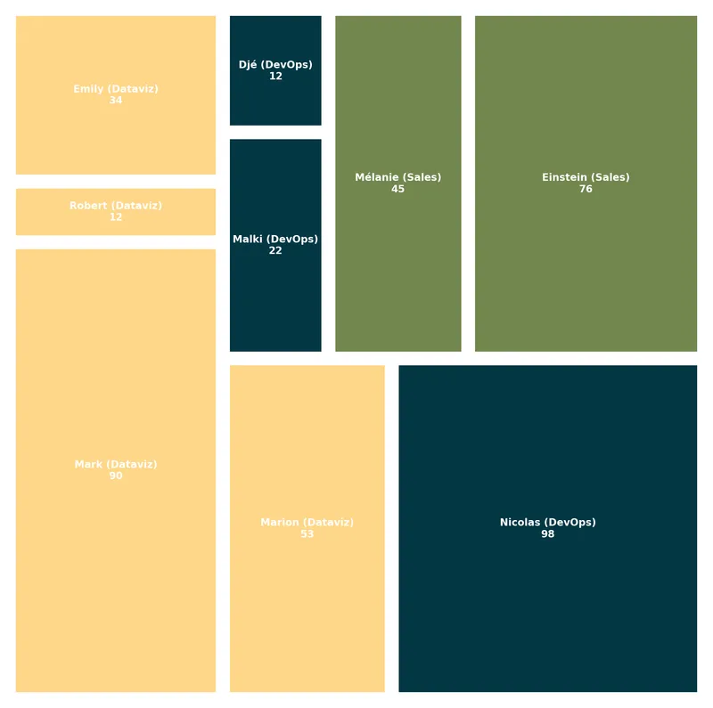
In place of providing only the column of labels to the label argument, we establish a new variable called labels. This variable will encompass the name, the parent, and the value of each individual rectangle.
By doing so, we can present all these pertinent details on the treemap, enhancing its overall comprehensiveness.
# create a color palette
cmap = load_cmap("Acadia")
category_codes, unique_categories = pd.factorize(df["parent"])
colors = [cmap(code) for code in category_codes]

# customize the labels
labels = [
    f"{name} ({parent[5:]})\n{value}"
    for name, value, parent in zip(df["name"], df["value"], df["parent"])
]

# create a treemap
fig, ax = plt.subplots(figsize=(10, 10))
ax.set_axis_off()
squarify.plot(
    sizes=df["value"],
    label=labels,
    color=colors,
    text_kwargs={"color": "white", "fontsize": 8, "fontweight": "bold"},
    pad=True,
    ax=ax,
)
plt.show()Legend with highlight_text
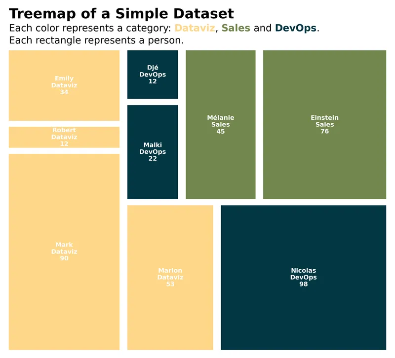
The highlight_text library offers the capability to incorporate various styles within a single string in a matplotlib annotation.
In our particular scenario, we leverage this functionality to introduce a title that associates colors with specific categories and their corresponding labels, thereby enhancing the overall clarity and interpretability of the visualization.
# create a color palette
cmap = load_cmap("Acadia")
category_codes, unique_categories = pd.factorize(df["parent"])
colors = [cmap(code) for code in category_codes]

# customize the labels
labels = [
    f"{name}\n{parent[5:]}\n{value}"
    for name, value, parent in zip(df["name"], df["value"], df["parent"])
]

# create a treemap
fig, ax = plt.subplots(figsize=(10, 8))
ax.set_axis_off()
squarify.plot(
    sizes=df["value"],
    label=labels,
    color=colors,
    text_kwargs={"color": "white", "fontsize": 9, "fontweight": "bold"},
    pad=True,
    ax=ax,
)

# add a title and legend
text = """<Treemap of a Simple Dataset>
Each color represents a category: <Dataviz>, <Sales> and <DevOps>.
Each rectangle represents a person.
"""
fig_text(
    x=0.133,
    y=0.98,
    s=text,
    color="black",
    highlight_textprops=[
        {"fontsize": 20, "fontweight": "bold"},
        {"color": cmap(0), "fontweight": "bold"},
        {"color": cmap(2), "fontweight": "bold"},
        {"color": cmap(1), "fontweight": "bold"},
    ],
    fontsize=14,
    ha="left",
)

plt.show()Going further
You might be interested in:
- make the color of the rectangle proportional to a value
- create an interactive treemap with plotly
- the treemap page of the gallery