

About
This chart displays the percentage of wins and losses of football teams with a lollipop chart, originally created by Cédric Scherer in R. You can find the R version here.
This post is a reproduction of it in Python by Joseph Barbier.
As a teaser, here is the chart we will reproduce:
Libraries
First, we need to install the following libraries:
# libraries
import matplotlib.pyplot as plt
from highlight_text import ax_text, fig_text
import pandas as pd
Dataset
We start by manually creating the dataset and put it in a pandas dataframe.
Then we just need to to divide the number of wins and losses by the total number of games to get the win/loss rate.
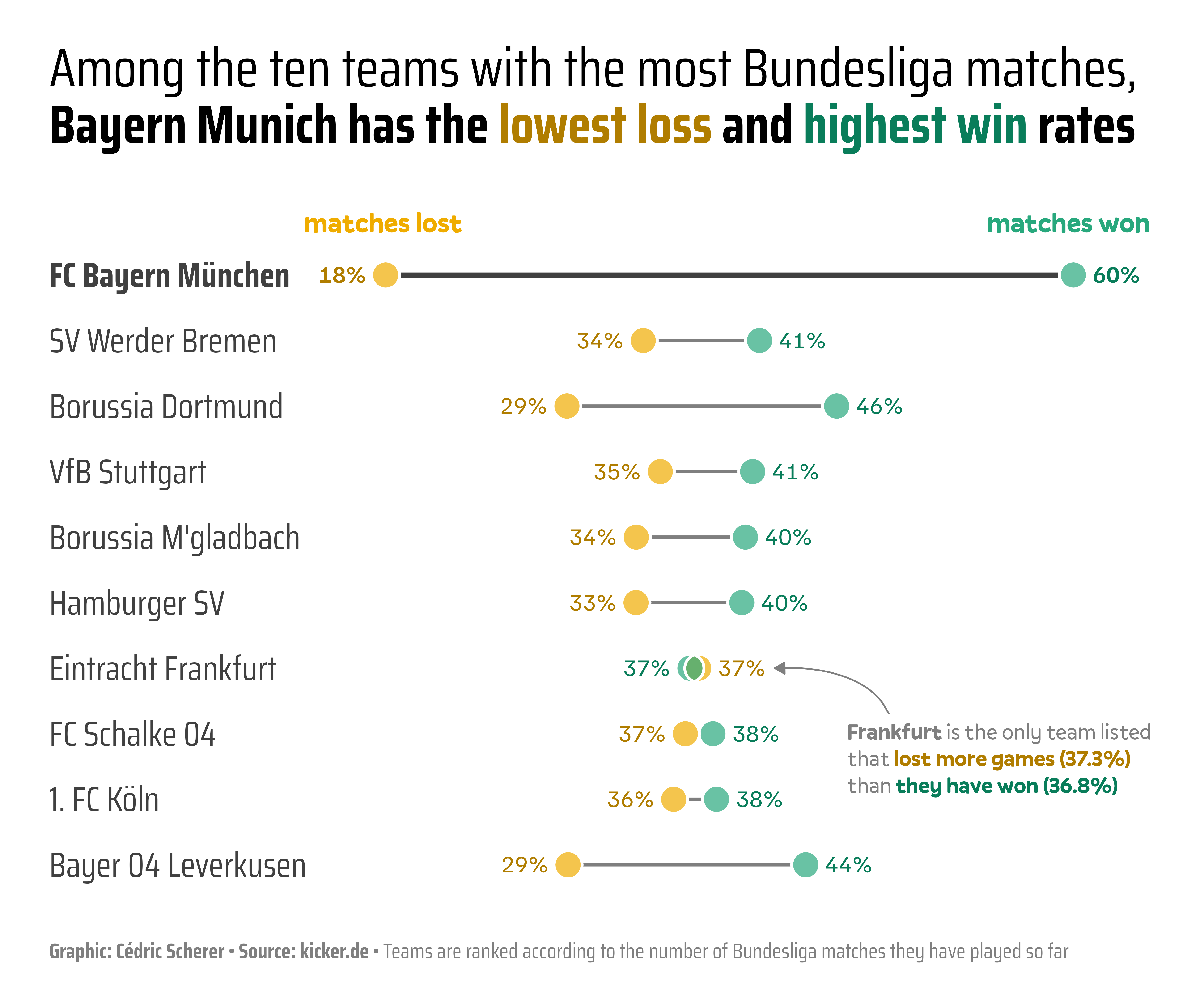
df = pd.DataFrame({
    "team": ["FC Bayern München", "SV Werder Bremen", "Borussia Dortmund", "VfB Stuttgart",
             "Borussia M'gladbach", "Hamburger SV", "Eintracht Frankfurt",
             "FC Schalke 04", "1. FC Köln", "Bayer 04 Leverkusen"],
    "matches": [2000, 1992, 1924, 1924, 1898, 1866, 1856, 1832, 1754, 1524],
    "won": [1206, 818, 881, 782, 763, 746, 683, 700, 674, 669],
    "lost": [363, 676, 563, 673, 636, 625, 693, 669, 628, 447]
})

df['won'] = df['won'] / df['matches']
df['lost'] = df['lost'] / df['matches']
df.sort_values(by='matches', inplace=True)
df.reset_index(drop=True, inplace=True)
df.head()| team | matches | won | lost | |
|---|---|---|---|---|
| 0 | Bayer 04 Leverkusen | 1524 | 0.438976 | 0.293307 |
| 1 | 1. FC Köln | 1754 | 0.384265 | 0.358039 |
| 2 | FC Schalke 04 | 1832 | 0.382096 | 0.365175 |
| 3 | Eintracht Frankfurt | 1856 | 0.367996 | 0.373384 |
| 4 | Hamburger SV | 1866 | 0.399786 | 0.334941 |
Most simple lollipop chart
Since there is no direct way to create a lollipop chart in matplotlib, we need to create it ourselves.
- The code will simply plot individual lines for each team using the
hlines()function and then plot data points on top of it using thescatter()function. - The
hlines()function needs the y-coordinates (which simply is0,1,2,...,n, wherenis the number of team minus 1) and the x-coordinates (which is the win/loss rate). - The
zorderparameter is used to make sure the data points are plotted on top of the lines.
fig, ax = plt.subplots(figsize=(8,5))

# horizontal lines
my_range = range(df['team'].nunique())
ax.hlines(y=my_range, xmin=df['lost'], xmax=df['won'], color='grey', alpha=0.4)

# points
ax.scatter(df['lost'], my_range, zorder=2)
ax.scatter(df['won'], my_range, zorder=2)

plt.show()
Custom style
Let's add the following features to the chart:
- define
color_loseandcolor_winto color the lollipop chart - change the size of the data points with the
sargument - remove the axis with
ax.set_axis_off()
color_lose, color_win = "#EFAC00", "#28A87D"

fig, ax = plt.subplots(figsize=(8,5))

# horizontal lines
my_range = range(df['team'].nunique())
ax.hlines(y=my_range, xmin=df['lost'], xmax=df['won'], color='grey', alpha=0.4)

# points
ax.scatter(df['lost'], my_range, color=color_lose, zorder=2, s=80)
ax.scatter(df['won'], my_range, color=color_win, zorder=2, s=80)

# remove axis
ax.set_axis_off()

plt.show()
Add team names and values
Now we want to add the team names and the percentage of wins and losses to the chart.
- In practice we iterate over the teams with a
forloop and add the text with theax_text()function. - Text formatting such as colors and boldness is done thanks to the highlight_text package
color_lose, color_win = "#EFAC00", "#28A87D"

fig, ax = plt.subplots(figsize=(7,5))

# horizontal lines
my_range = range(df['team'].nunique())
ax.hlines(y=my_range, xmin=df['lost'], xmax=df['won'], color='grey', alpha=0.4)

# points
ax.scatter(df['lost'], my_range, color=color_lose, zorder=2, s=80)
ax.scatter(df['won'], my_range, color=color_win, zorder=2, s=80)

# add team names
n = len(df)
for i in range(df['team'].nunique()):

    # losses
    losses = df['lost'][i]
    ax_text(
        losses-0.012, i,
        f"<{df['lost'][i]*100:.0f}%>",
        ha='right', va='center',
        highlight_textprops=[
            {"color": color_lose,
             "weight": "light"}]
    )

    # wins
    wins = df['won'][i]
    ax_text(
        wins+0.012, i,
        f"<{df['won'][i]*100:.0f}%>",
        ha='left', va='center',
        highlight_textprops=[
            {"color": color_win,
             "weight": "light"}]
    )

    # team names
    team_name = df['team'][i]
    ax_text(0.1, i,
            f"<{team_name}>",
            ha='right', va='center',
            highlight_textprops=[
                {"color": "black",
                 "weight": "light",
                 "size": 12}]
        )

# remove axis
ax.set_axis_off()

plt.tight_layout()
plt.show()
Colors details
In the original post, there is not only yellow and green, but also a darker version of these colors. Even if this may sound like a detail, it is actually an important feature of the chart since it makes it easier to read values.
With that, we take the opportunity to define a special case (with a if statement during the loop) for the FC Bayern München team that we want to highlight. We add a darker horizontal line and a bold team name.
color_lose, color_win = "#EFAC00", "#28A87D"
color_lose_dark, color_win_dark = "#aa7c05", "#1e8563"

fig, ax = plt.subplots(figsize=(7,5))

# horizontal lines
my_range = range(df['team'].nunique())
ax.hlines(y=my_range, xmin=df['lost'], xmax=df['won'], color='grey', alpha=0.4)

# points
ax.scatter(df['lost'], my_range, color=color_lose, zorder=3, s=80)
ax.scatter(df['won'], my_range, color=color_win, zorder=2, s=80)

# add team names
n = len(df)
for i in range(df['team'].nunique()):

    # team names
    team_name = df['team'][i]
    if team_name == "FC Bayern München":
        weight = "bold"
        bayern_munch = df[df['team'] == team_name]
        ax.hlines(y=i, xmin=bayern_munch['lost'], xmax=bayern_munch['won'], linewidth=2, color='black', zorder=1)

    else:
        weight = "normal"
    ax_text(0.1, i,
            f"<{team_name}>",
            ha='right', va='center',
            highlight_textprops=[
                {"color": "black",
                 "fontweight": weight,
                 "size": 12}
            ]
        )

    # losses
    losses = df['lost'][i]
    ax_text(
        losses-0.016, i,
        f"<{df['lost'][i]*100:.0f}%>",
        ha='right', va='center',
        highlight_textprops=[
            {"color": color_lose_dark,
             "weight": weight}
        ]
    )

    # wins
    wins = df['won'][i]
    ax_text(
        wins+0.016, i,
        f"<{df['won'][i]*100:.0f}%>",
        ha='left', va='center',
        highlight_textprops=[
            {"color": color_win_dark,
             "weight": weight}]
    )

# remove axis
ax.set_axis_off()

plt.tight_layout()
plt.show()
Title and annotations
Now that we have the core of the chart, we only need to add a few annotations. Since the original chart has some specific fonts, we have to define them before:
First we load the Familjen Grotesk font:
# find path to font
from matplotlib import font_manager
for fontpath in font_manager.findSystemFonts(fontpaths=None, fontext='ttf'):
    if 'grotesk' in fontpath.lower():
        print(fontpath)

# get font properties
from matplotlib.font_manager import FontProperties
personal_path = '/Users/josephbarbier/Library/Fonts/'

# font
font_path = personal_path + 'FamiljenGrotesk-VariableFont_wght.ttf'
grotesk_font = FontProperties(fname=font_path)

# bold font
font_path_bold = personal_path + 'FamiljenGrotesk-Bold.ttf'
grotesk_font_bold = FontProperties(fname=font_path_bold)
/Users/josephbarbier/Library/Fonts/FamiljenGrotesk-VariableFont_wght.ttf
/Users/josephbarbier/Library/Fonts/FamiljenGrotesk-SemiBold.ttf
/Users/josephbarbier/Library/Fonts/FamiljenGrotesk-Bold.ttf
Then we load the Pally font:
# find path to font
from matplotlib import font_manager
for fontpath in font_manager.findSystemFonts(fontpaths=None, fontext='ttf'):
    if 'pally' in fontpath.lower():
        print(fontpath)

# get font properties
from matplotlib.font_manager import FontProperties
personal_path = '/Users/josephbarbier/Library/Fonts/'

# font
font_path = personal_path + 'Pally-Regular.otf'
pally_font = FontProperties(fname=font_path)

# bold font
font_path_bold = personal_path + 'Pally-Bold.otf'
pally_font_bold = FontProperties(fname=font_path_bold)
/Users/josephbarbier/Library/Fonts/Pally-Regular.otf
/Users/josephbarbier/Library/Fonts/Pally-Bold.otf
/Users/josephbarbier/Library/Fonts/Pally-Medium.otf
Other annotations are added with the ax_text() function. The positionings are defined through trial and error until it looks good.
color_lose, color_win = "#EFAC00", "#28A87D"
color_lose_dark, color_win_dark = "#aa7c05", "#1e8563"

fig, ax = plt.subplots(figsize=(7,5))

# horizontal lines
my_range = range(df['team'].nunique())
ax.hlines(y=my_range, xmin=df['lost'], xmax=df['won'], color='grey', alpha=0.4)

# points
ax.scatter(df['lost'], my_range, color=color_lose, zorder=2, s=80)
ax.scatter(df['won'], my_range, color=color_win, zorder=2, s=80)

# add team names
n = len(df)
for i in range(df['team'].nunique()):

    # team names
    team_name = df['team'][i]
    if team_name == "FC Bayern München":
        font = grotesk_font_bold
        bayern_munch = df[df['team'] == team_name]
        ax.hlines(y=i, xmin=bayern_munch['lost'], xmax=bayern_munch['won'], linewidth=2, color='black', zorder=1)

    else:
        font = grotesk_font
    ax_text(0.1, i,
            f"<{team_name}>",
            ha='right', va='center',
            fontproperties=grotesk_font,
            highlight_textprops=[
                {"color": "black",
                 "font": font,
                 "size": 12}
            ]
        )

    # losses
    losses = df['lost'][i]
    ax_text(
        losses-0.016, i,
        f"<{df['lost'][i]*100:.0f}%>",
        ha='right', va='center',
        fontproperties=grotesk_font,
        highlight_textprops=[
            {"color": color_lose_dark,
             "font": font}
        ]
    )

    # wins
    wins = df['won'][i]
    ax_text(
        wins+0.016, i,
        f"<{df['won'][i]*100:.0f}%>",
        ha='left', va='center',
        fontproperties=grotesk_font,
        highlight_textprops=[
            {"color": color_win_dark,
             "font": font}]
    )

# title
text = "Among the ten teams with the most Bundesliga matches,\n<Bayern Munich has the> <lowest loss> <and> <highest win> <rates>"
fig_text(
    0.05, 1,
    text,
    fontsize=20,
    fontproperties=grotesk_font,
    ha='left', va='center',
    highlight_textprops=[
        {"font": grotesk_font_bold},
        {"color": color_lose_dark,
         "font": grotesk_font_bold},
        {"font": grotesk_font_bold},
        {"color": color_win_dark,
         "font": grotesk_font_bold},
        {"font": grotesk_font_bold},
    ]
)

# legend annotation
text = '<matches lost>'
fig_text(
    0.38, 0.8,
    text,
    fontsize=13,
    ha='center', va='center',
    highlight_textprops=[
        {"color": color_lose,
         "font": pally_font_bold}
    ]
)
text = '<matches won>'
fig_text(
    0.76, 0.8,
    text,
    fontsize=13,
    ha='center', va='center',
    highlight_textprops=[
        {"color": color_win,
         "font": pally_font_bold}
    ]
)

# credit
text = "<Graphic: Cédric Scherer · Source: kicker.de ·> Teams are ranked according to the number of Bundesliga matches they have played so far"
fig_text(
    0.05, 0.04,
    text,
    fontsize=8,
    fontproperties=grotesk_font,
    color='grey',
    ha='left', va='center',
    highlight_textprops=[
        {"font": grotesk_font_bold}
    ]
)

# remove axis
ax.set_axis_off()

# note about Frankfurt
text = "<Frankfurt> is the only team listed\nthat <lost more games (37.3%)>\nthan <they have won (36.8%)>"
fig_text(
    0.75, 0.2,
    text,
    fontsize=12,
    color='grey',
    fontproperties=grotesk_font,
    ha='left', va='center',
    highlight_textprops=[
        {"font": pally_font_bold},
        {"color": color_lose_dark,
         "font": pally_font_bold},
        {"color": color_win_dark,
         "font": pally_font_bold}
    ]
)

# arrow
from matplotlib.patches import FancyArrowPatch
arrow_style = "Simple, tail_width=0.5, head_width=4, head_length=8"
connection_style = "arc3,rad=.3"
arrow_properties = {
    "arrowstyle": arrow_style,
    "color": "grey",
}
tail_position = (0.62, 1.6)
head_position = (0.43, 3)
arrow = FancyArrowPatch(
    tail_position, head_position,
    connectionstyle=connection_style,
    **arrow_properties
)
ax.add_patch(arrow)

plt.tight_layout()
plt.show()
Going further
This article explains how to create a lollipop chart in matplotlib.
You might also be interested in this other beautiful dumbell chart and more generally by how to create beautiful annotations in matplotlib


