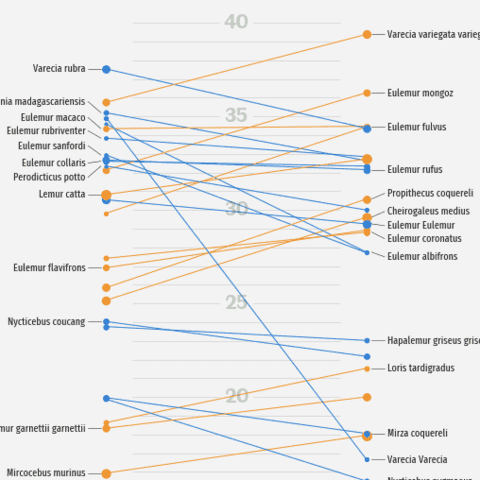
Parallel coordinate plot

A parallel plot plot allows to compare the feature of several individual observations (series) on a set of numeric variables. Interestingly, Pandas is probably the best way to plot a parallel coordinate plot with python. Plotly is a good alternative to plot interactive versions though.
⏱ Quick start
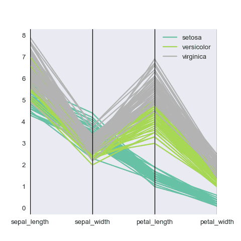
Pandas is probably the best way to make a parallel coordinate plot. This library is most often used for data wrangling, but it offers a parallel_coordinates() function dedicated to it.🔥
# libraries
import pandas
import matplotlib.pyplot as plt
from pandas.plotting import parallel_coordinates

# Take the iris dataset
import seaborn as sns
data = sns.load_dataset('iris')

# Make the plot
parallel_coordinates(data, 'species', colormap=plt.get_cmap("Set2"))
plt.show()
Parallel coordinate chart with Python and Pandas
The following examples are dedicated to the parallel_coordinates() function of Pandas. It shows how to apply the most common types of customization.
If you need to go further, here is the complete pandas documentation
Parallel coordinate chart with Seaborn
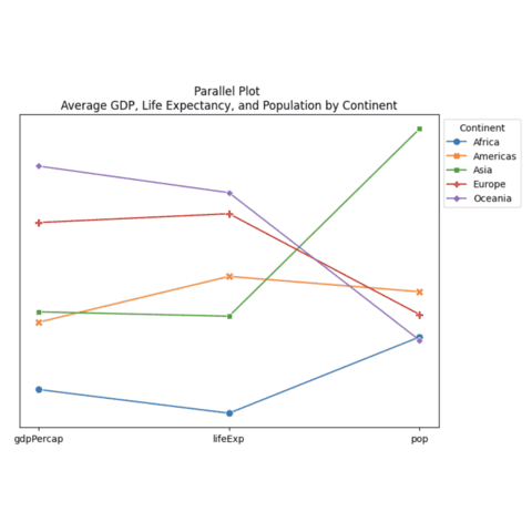
Seaborn and its lineplot() function is another very good alternative when it comes to create parallel coordinate charts with Python.
Used in conjunction with matplotlib, it allows to reach a great level of customization as shown in the example below
 Interactive parallel coordinate with
 plotly
Plotly is a python library that makes the link with Javascript to build interactive charts that you can display in a browser.
The following example is a parallel chart made with this library and the parallel_coordinates() function.
 Best python parallel plot examples
The web is full of astonishing charts made by awesome bloggers, (often using R). The Python graph gallery tries to display (or translate from R) some of the best creations and explain how their source code works. If you want to display your work here, please drop me a word or even better, submit a Pull Request!
🚨 Grab the Data To Viz poster!
Do you know all the chart types? Do you know which one you should pick? I made a decision tree that answers those questions. You can download it for free!

