

About slope charts
A slope chart, also known as a slope graph or a difference chart, is a graphical representation used to display changes in values between two or more data points or categories.
It is particularly useful for comparing the change in values over time, between groups, or across different scenarios.
The chart consists of a series of lines connecting data points, with each line representing the change in value from one point to another.
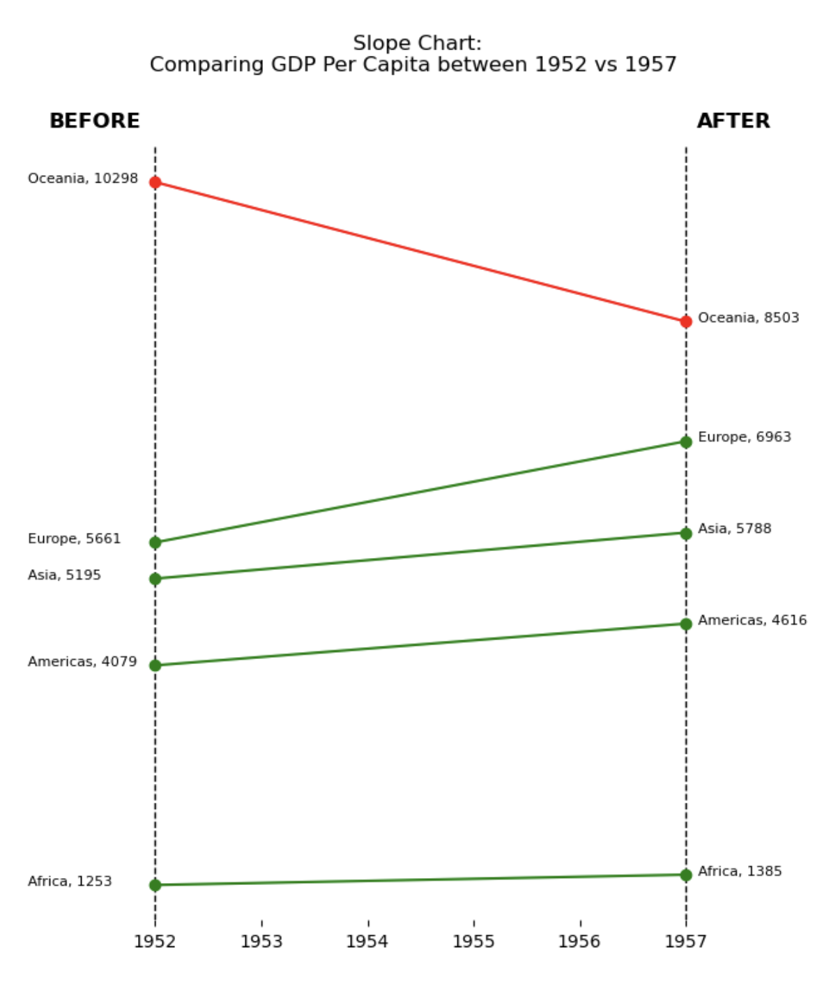
In this article, we will explain how to create the following slope chart, taken from machinelearningplus.com.
Libraries
First, you need to install the following librairies:
- matplotlib is used for creating the slope chart and for customization
- seaborn is used for creating the parallel plot
pandasis used for loading the dataset
# Libraries
import matplotlib.pyplot as plt
import seaborn as sns
import pandas as pd
Dataset
The data used is a famous dataset where each line represents a country, by year, with various measurements, from Gapminder. You can find out more about the dataset on this Kaggle post.
To retrieve the data, we download them directly from this github repository.
url = "https://raw.githubusercontent.com/jennybc/gapminder/master/data-raw/08_gap-every-five-years.tsv"
df = pd.read_csv(url, sep='\t')
Reproducing the slope chart
The very first thing we do is to create a function add_label() that will add the label of the gdp per capita at a given year, for a given country. In this function, we define the x_position according to the year, by shifting to the left on 1952 and to the right otherwise.
Next, we calculate the average gdp/capita of each continent for each date using the pandas groupby() method.
Text and lines are added to the graph using the text() and axvline() functions.
def add_label(continent_name, year):

    # Calculate value (and round it)
    y_position = round(df[year][continent_name])

    # Determine x_position depending on the year
    if year==1952:
        x_position = year - 1.2
    else:
        x_position = year + 0.12

    # Adding the text
    plt.text(x_position, # x-axis position
             y_position, #y-axis position
             f'{continent_name}, {y_position}', # Text
             fontsize=8, # Text size
             color='black', # Text color
            )
# Filter data for the years 1952 and 1957
years = [1952, 1957]
df = df[df['year'].isin(years)]
# Calculate average gdp, per continent, per year
df = df.groupby(['continent', 'year'])['gdpPercap'].mean().unstack()
# (facultative) We artificially change a value to make at least one continent decreasing between the two dates
df.loc['Oceania',1957] = 8503
# Set figsize
plt.figure(figsize=(6, 8))
# Vertical lines for the years
plt.axvline(x=years[0], color='black', linestyle='--', linewidth=1) # 1952
plt.axvline(x=years[1], color='black', linestyle='--', linewidth=1) # 1957
# Add the BEFORE and AFTER
plt.text(1951, 11000, 'BEFORE', fontsize=12, color='black', fontweight='bold')
plt.text(1957.1, 11000, 'AFTER', fontsize=12, color='black', fontweight='bold')
# Plot the line for each continent
for continent in df.index:
# Color depending on the evolution
value_before = df[df.index==continent][years[0]][0] #gdp/cap of the continent in 1952
value_after = df[df.index==continent][years[1]][0] #gdp/cap of the continent in 1957
# Red if the value has decreased, green otherwise
if value_before > value_after:
color='red'
else:
color='green'
# Add the line to the plot
plt.plot(years, df.loc[continent], marker='o', label=continent, color=color)
# Add label of each continent at each year
for continent_name in df.index:
for year in df.columns:
add_label(continent_name, year)
# Add a title ('\n' allow us to jump lines)
plt.title(f'Slope Chart: \nComparing GDP Per Capita between {years[0]} vs {years[1]} \n\n\n')
plt.yticks([]) # Remove y-axis
plt.box(False) # Remove the bounding box around plot
plt.show() # Display the chart
Going further
This article explains how to reproduce the slope chart from this article on machinelearningplus.com (the 18th).
For more examples of how to create or customize your parallel plots with Python, see the parallel plot section. You may also be interested in creating a parallel plot with pandas.


