Lollipop plot

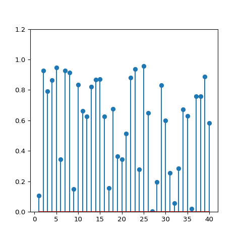
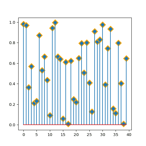
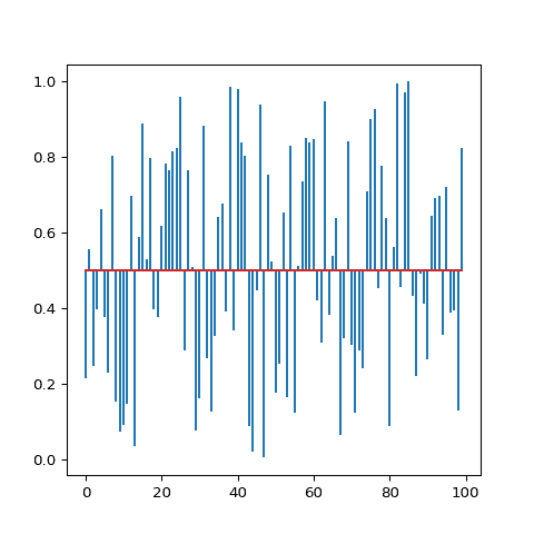
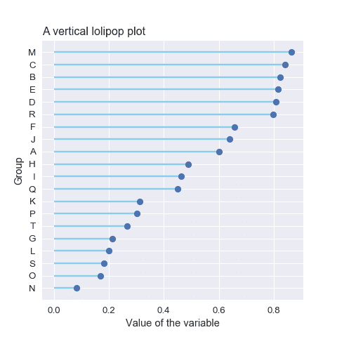
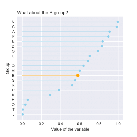
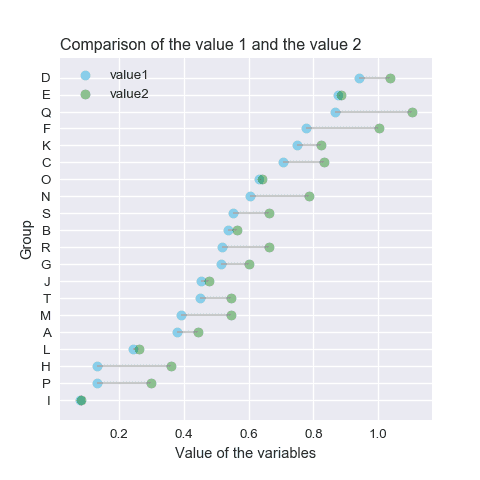
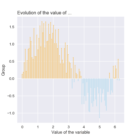
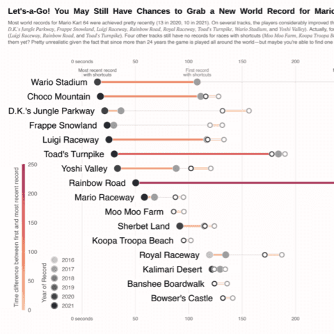
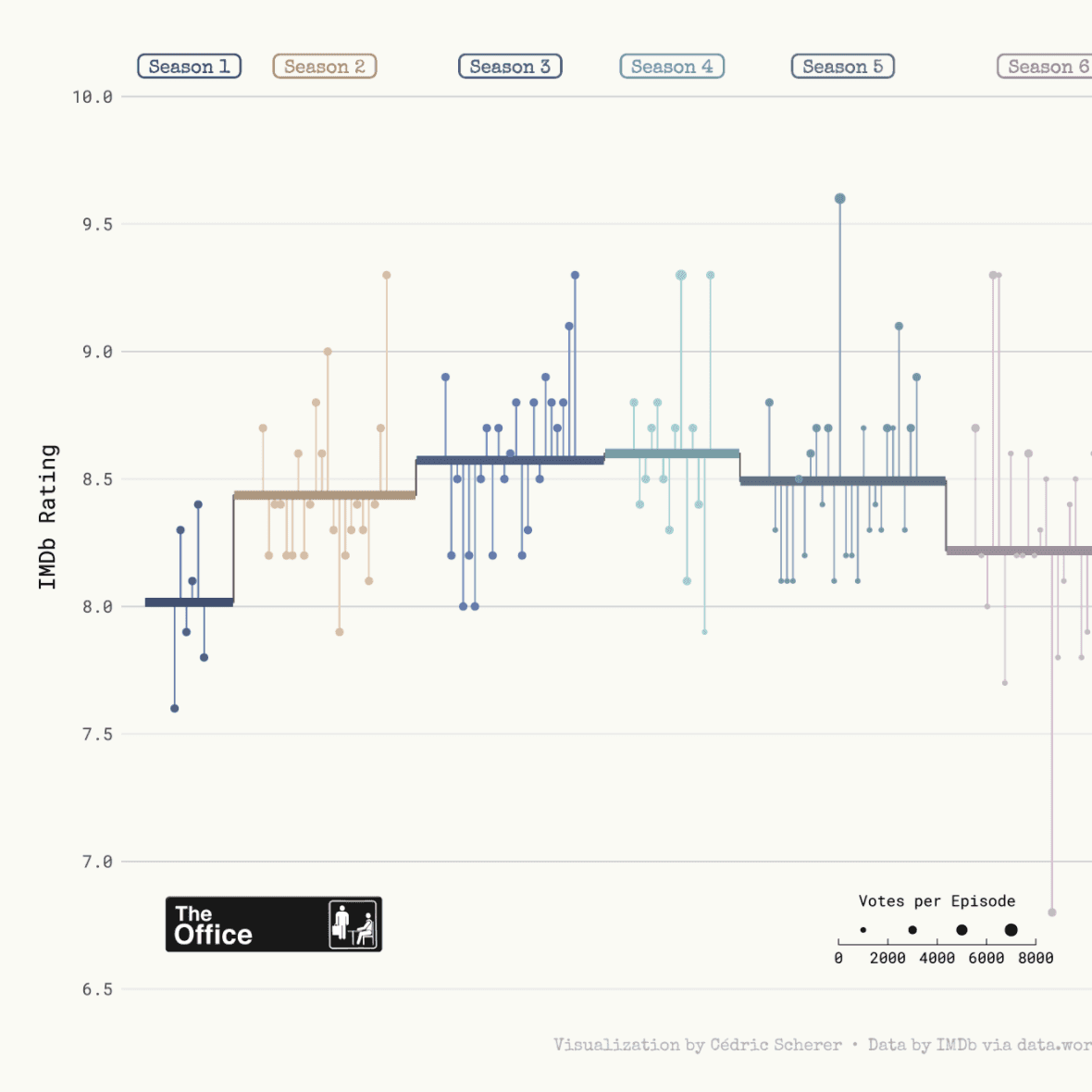
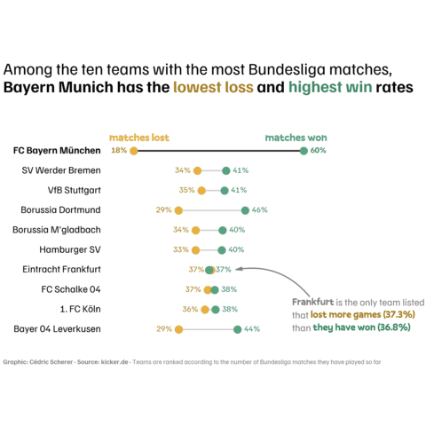
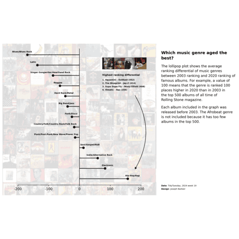
A lollipop chart is an alernative to the more usual barplot. Python allows to build lollipops thanks to the matplotlib library, as shown in the examples below. The strategy here is to use the stem() function or to hack the vline() function depending on your input format.
⏱ Quick start
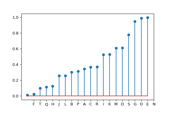
A lollipop plot displays each element of a dataset as a segment and a circle.
This is doable with python and Matplotlib thanks to the stem() function that accepts a data frame as input.🔥
# Create a dataframe
import pandas as pd
df = pd.DataFrame({'group':list(map(chr, range(65, 85))), 'values':np.random.uniform(size=20) })

# Reorder it following the values:
ordered_df = df.sort_values(by='values')
my_range=range(1,len(df.index)+1)

# Make the plot
plt.stem(ordered_df['values'])
plt.xticks( my_range, ordered_df['group'])
 Lollipop plot with
 Matplotlib
Matplotlib is probably the most famous and flexible python library for data visualization. It is appropriate to build any kind of chart, including the lollipop plot thanks to its stem() function.
 Best python lollipop plot examples
The web is full of astonishing charts made by awesome bloggers, (often using R). The Python graph gallery tries to display (or translate from R) some of the best creations and explain how their source code works. If you want to display your work here, please drop me a word or even better, submit a Pull Request!
🚨 Grab the Data To Viz poster!
Do you know all the chart types? Do you know which one you should pick? I made a decision tree that answers those questions. You can download it for free!

