Plotnine: ggplot in python

Plotnine is a library that allows to use the grammar of graphics in Python. It is based on the famous ggplot2 library in R.
Plotnine is a great tool to create beautiful and complex visualizations with a syntax that R users already know and love.
⏱ Quick start
Before using plotnine you need to install it. This can easily be done with pip:
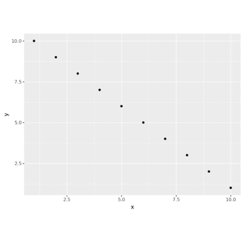
pip install plotnineThe Grammar of Graphics is a way of thinking about how to build graphs. It is based on the idea that you can build a graph by adding layers to it. In this example, we add a layer of points to a graph.
Once installed, you can either import all the functions from the library with from plotnine import * or import only the functions you need with from plotnine import ggplot, geom_point.
# Load plotnine
from plotnine import ggplot, geom_point, aes
import pandas as pd

# Sample data
x = [1,2,3,4,5,6,7,8,9,10]
y = [10,9,8,7,6,5,4,3,2,1]
df = pd.DataFrame({'x':x, 'y':y})

# Create a chart
(
ggplot(df, aes(x='x', y='y')) +
    geom_point()
)
Scatter plot with plotnine
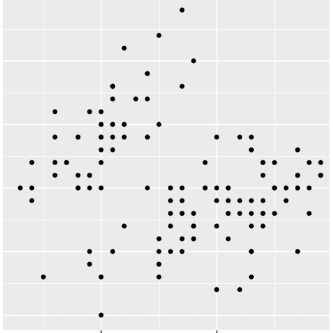
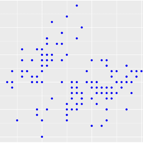
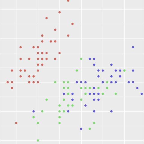
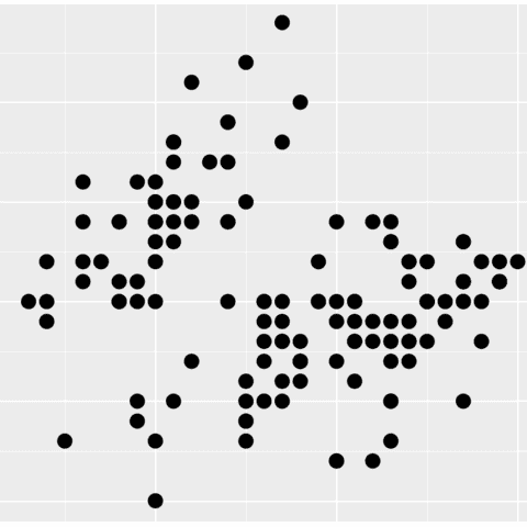
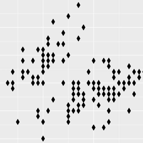
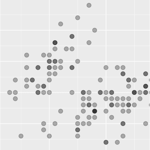
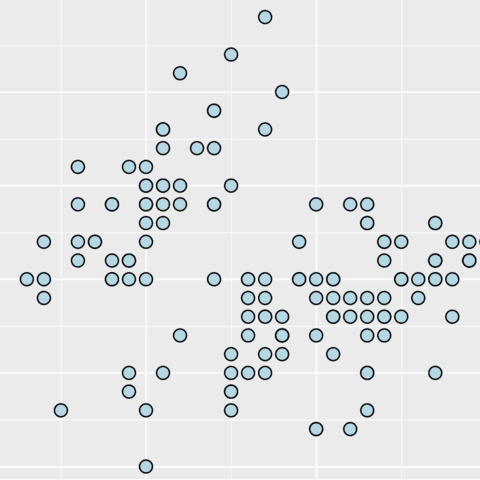
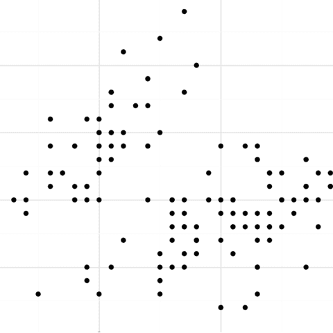
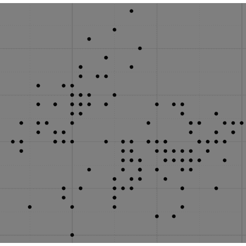
Scatter plots are a great way to visualize the relationship between two numerical variables. The plotnine library makes it easy to thanks to its geom_point() function.
Bar plot with plotnine
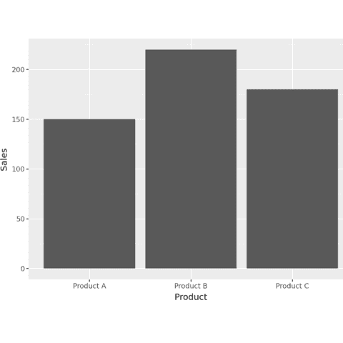
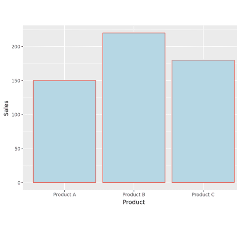
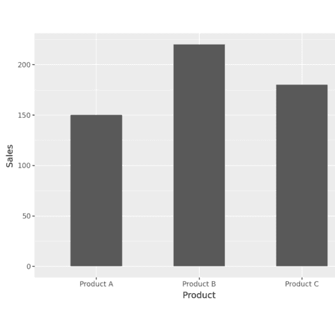
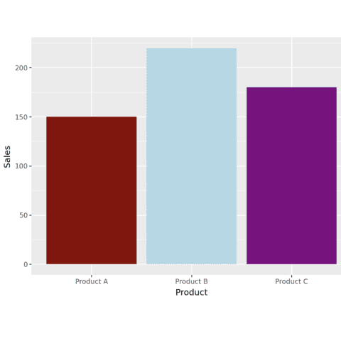
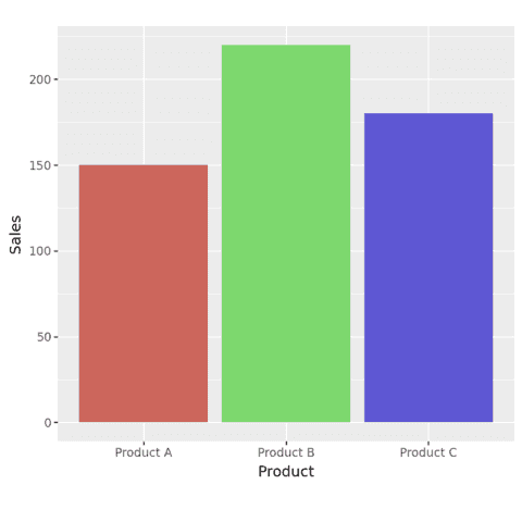
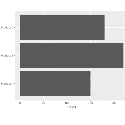
Bar plots are a great way to visualize the relationship between a categorical variable and a numerical one. The plotnine library makes it easy thanks to its geom_bar() function.
The following examples show how to create a basic bar plot with plotnine and how to customize it.
Histogram with plotnine
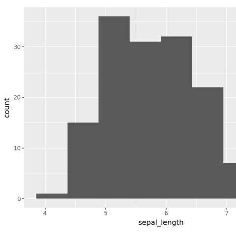
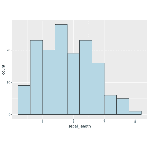
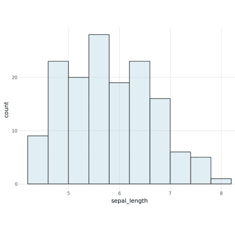
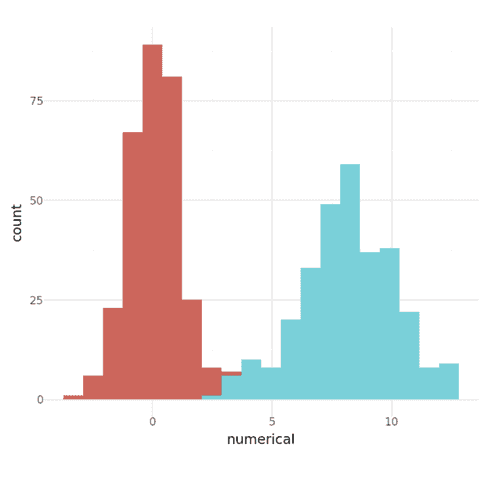
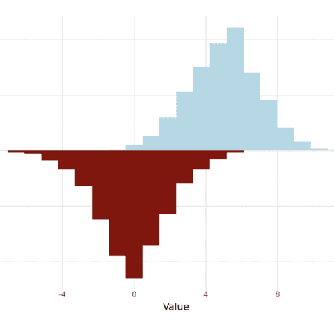
Bar plots are a great way to visualize the distribution of a numerical variable. The plotnine library makes it easy thanks to its geom_histogram() function.
The following examples show how to create a basic histogram with plotnine and how to customize it.
Change theme with plotnine
Plotnine allows to change the theme of the chart. This can easily be done by adding theme_* functions to the chart.
🚨 Grab the Data To Viz poster!
Do you know all the chart types? Do you know which one you should pick? I made a decision tree that answers those questions. You can download it for free!

