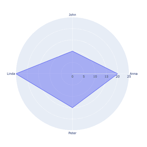
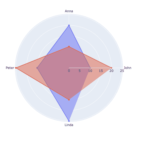
Interactive charts with Plotly

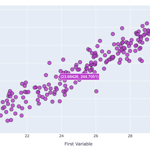
Plotly is a library for making interactive graphs with python. On a plotly chart it is possible to have tooltips for interesting markers, zoom on interesting location, save the chart as png and more 🔥.
Plotly is based on the famous d3.js javascript library, and provides a python wrapper allowing to build stunning interactive charts directly from Python.
Most of the gallery sections provide plotly examples. This post provides a few general tips relative to this mind blowing library.
⏱ Quick start
Before using plotly you need to install it. This can easily be done with pip:
pip install plotlyNow, try to use the following code in a Jupyter Notebook. You will get an interactive graph on which you can zoom, hover points to show a tooltip, save as png and more.
# Load plotly
import plotly.graph_objects as go

# Sample data
x = [1.5, 2.9, 3, 4.2, 5.6]
y = [2.2, 13.3, 4.4, 55.3, 52.1]

# Initialize a figure
fig = go.Figure()

# Add the scatter trace
fig.add_trace(go.Scatter(
    x=x, # Variable in the x-axis
    y=y, # Variable in the y-axis
    mode='markers', # This explicitly states that we want our observations to be represented by points
))

# Show
fig.show()
</> Two distinct APIs
There are 2 main ways to use the plotly python library: plotly express and plotly graph objects.
1️⃣ Quick chart with plotly express 🏃🏿♀️
This is the user-friendly, high-level API, that taps into Plotly's graphical capabilities to facilitate the swift creation graphs. Its streamlined approach empowers users to generate a variety of chart types with minimal code.
This abstraction shields users from intricate technical details, making it an ideal choice for those seeking an efficient visualization solution.
In the following code, just 2 lines of code are needed to create an interactive bar chart, using the function px.bar().
# import the plotly express library
import plotly.express as px

# Some dummy data
categories = ['A', 'B', 'C', 'D', 'E']
values = [15, 22, 18, 12, 28]

# Plot
fig = px.bar(
  x=categories,
  y=values,
)

fig.show()
2️⃣ Fine control with Plotly Graph Objects 🎨
In contrast, the Plotly Graph Objects API presents a finer level of control and customization within the Plotly framework.
A bit more code is required to build the same chart compared to plotly express. But we believe that this API is still very straightforward to use and offers more flexibility.
Compared to the Express API, we need to initiate a figure object (with a slightly more complex syntax) using the function go.Figure and then change the layout of this figure using the function fig.update_layout().
# import the plotly graph objects lib
import plotly.graph_objects as go

# Some dummy data
categories = ['A', 'B', 'C', 'D', 'E']
values = [15, 22, 18, 12, 28]

# Create a bar chart using the Graph Object API
fig = go.Figure(data=[go.Bar(x=categories, y=values)])

# Update layout
fig.update_layout(
  title="Simple Bar Chart",
  xaxis_title="Categories",
  yaxis_title="Values")


fig.show()
Interested in knowing more? You can check the full post on the topic!
Saving a plotly chart
Once you've created a plotly chart you probably want to save it as a standalone html file in order to share it or embed it in another webpage.
This is the code allowing to save a plotly chart. You can read the full process here for instance.
fig.write_html("the/path/to/chart-name.html")Embeding a plotly chart
Once the chart has been saved, you can embed it in a html document using:
<iframe
  src="the/path/to/chart-name.html"
  width="800"
  height="600"
  title="chart name"
  style="border:none">
</iframe>
Title customization
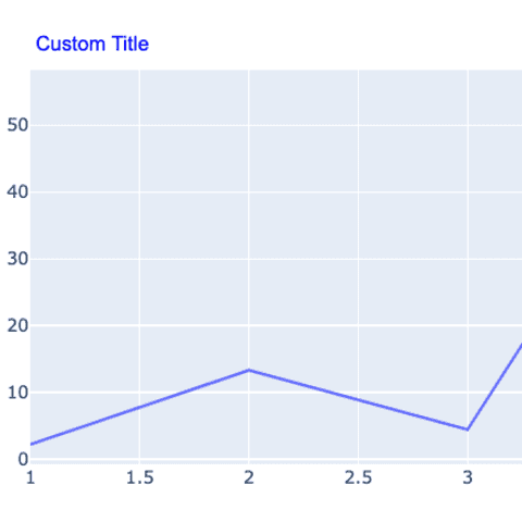
The fig.update_layout() function provides everything you need to customize the title of your chart.
Read the plotly title tutorial to understand how the change the font, color, size and alignment of your title.
Annotation
Annotation is a key part of a great data visualization.
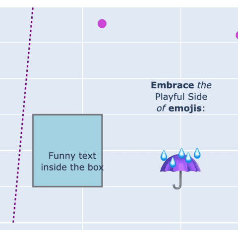
Fortunately, plotly provides a add_annotation() function allowing to add some powerful, custom annotation on charts.
Please read the dedicated annotation tutorial to learn how to use it.
 Plotly graph gallery
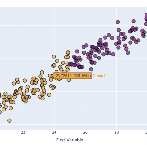
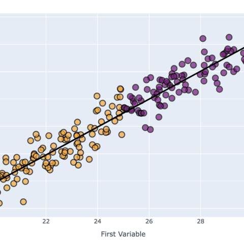
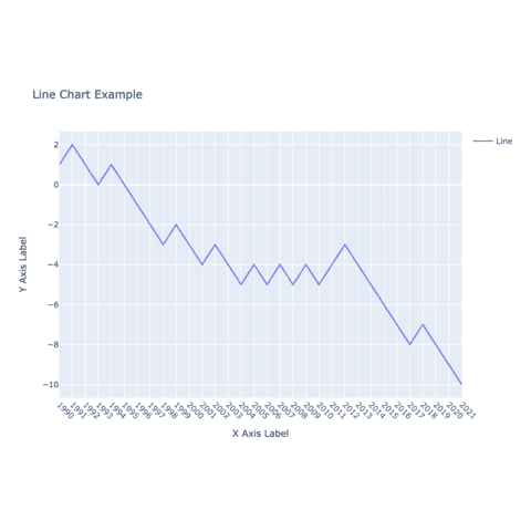
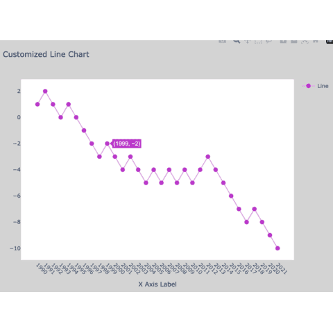
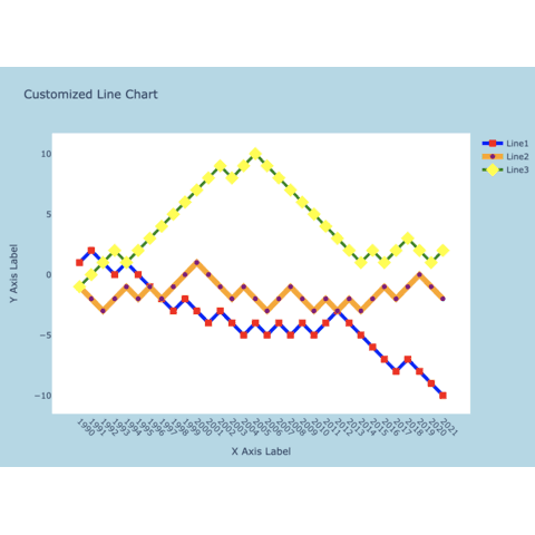
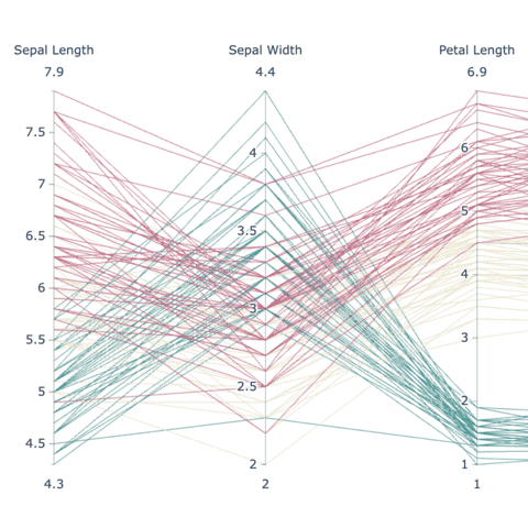
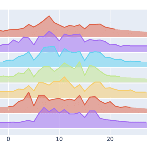
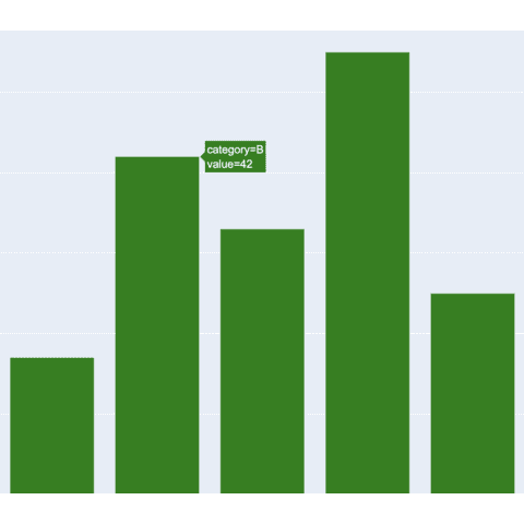
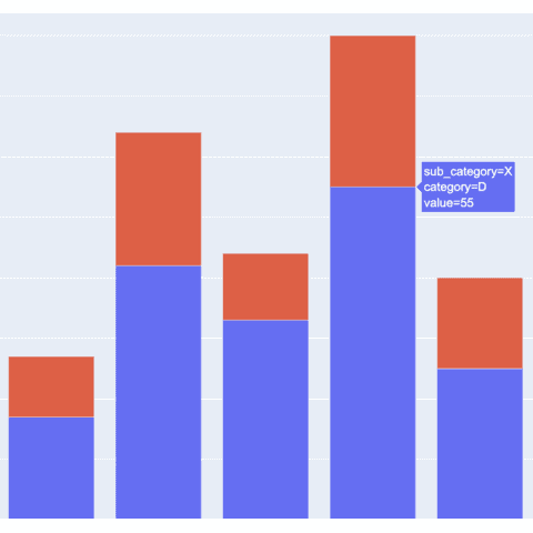
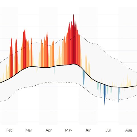
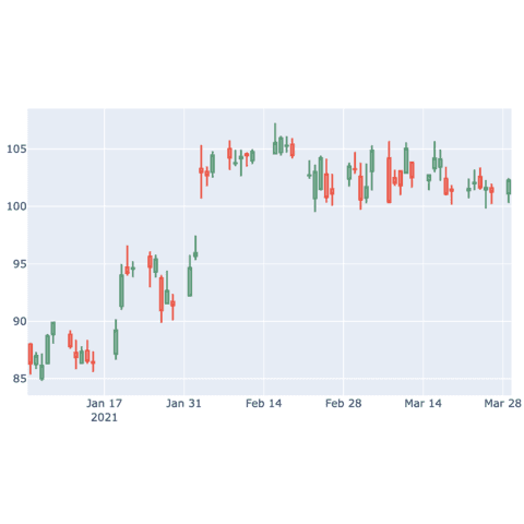
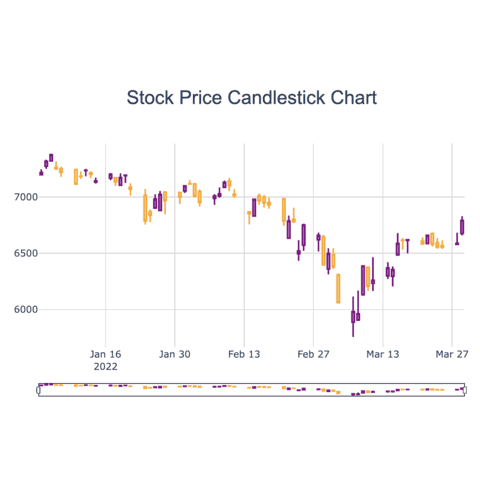
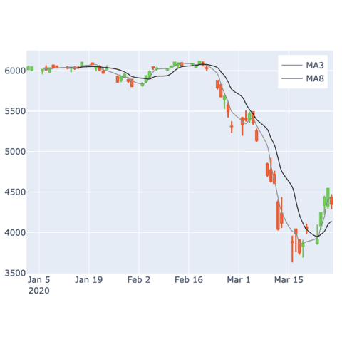
Here is a glimpse of the plotly charts showcased in the gallery:
Above images are static, but all linked blog posts provide the interactive version of the chart. Here is an example with an interactive parallel coordinate chart:
🚨 Grab the Data To Viz poster!
Do you know all the chart types? Do you know which one you should pick? I made a decision tree that answers those questions. You can download it for free!

