Visualizing statistics with Python

Python is not only great at data visualization, but it is also powerful for running statistical analysis, providing a comprehensive toolkit for both beginners and seasoned statisticians to extract meaningful insights from complex datasets.
This section shows how to visualize the results of your statistical analysis, like Principal Component Analysis (PCA), linear modeling, ANOVA, t-tests and more.
It does not focus on how to run the test, but on how to make clean outputto present your findings in a appealing manner.
Principal Component Analysis (PCA)
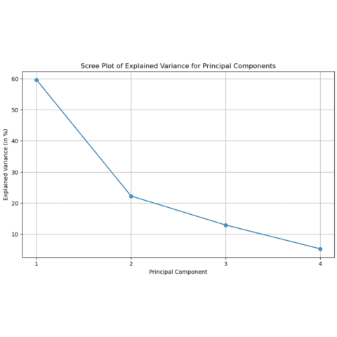
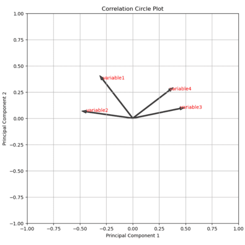
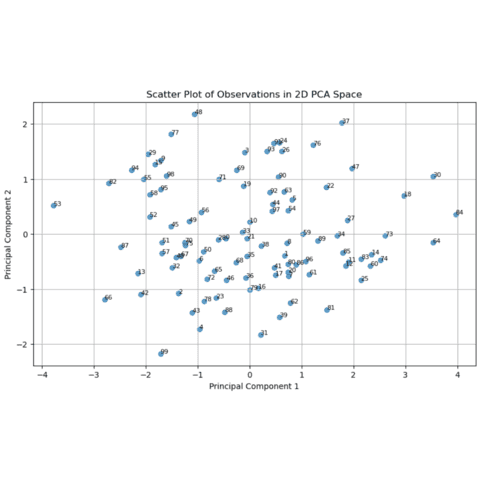
Principal Component Analysis (PCA) is a transformative technique widely used in the realm of data science to reduce the dimensionality of large datasets while preserving as much variance as possible. By transforming the original variables into a new set of orthogonal components, PCA offers a concise yet informative perspective, making it easier to visualize and analyze high-dimensional data.
Python is a powerful tool when it comes to PCA thanks to its scikit-learn library.
The following post teaches how to perform a PCA with scikit-learn and focus on how to build clean outputs using matplotlib.
Analysis of Variance(ANOVA)
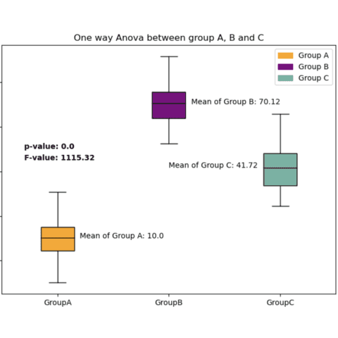
Analysis of Variance (ANOVA) is a statistical method used to test the differences between two or more group means to determine if they are statistically significant.
It helps to identify whether the independent variable has a significant impact on the dependent variable across different groups, thereby allowing for the comparison of multiple groups simultaneously.
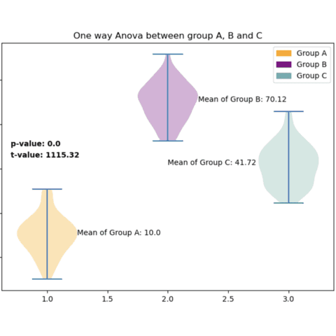
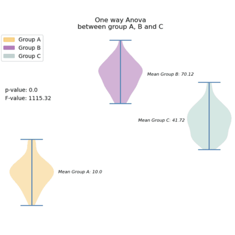
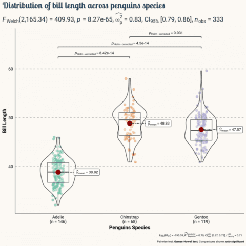
Anova results are usually represented as a boxplot or a violin plot, with each box representing a specific group. The following examples show how to create such boxplots, adding the ANOVA results, and offering some variations.
Hypothesis testing
Statistical hypothesis testing is a key technique in the realm of data analysis.
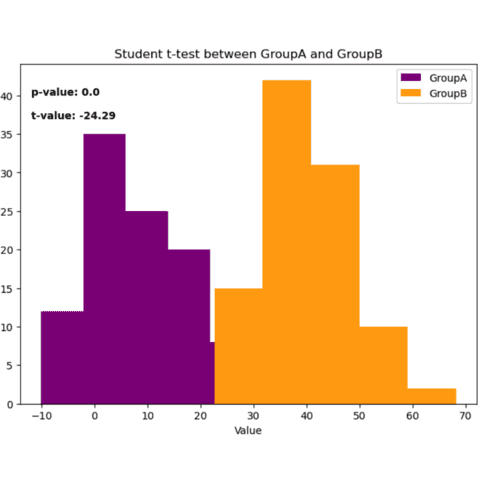
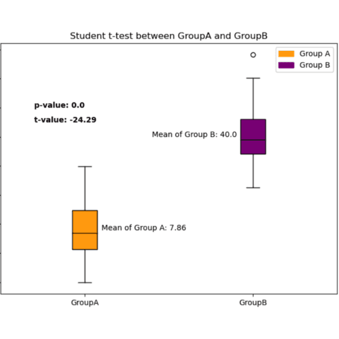
The posts below explain how to display the results of your hypothesis tests on your graphs, so as to represent your results in the most elegant way possible.
We'll use the scipy library to run the tests and matplotlibto display the results.
Linear Regression
Linear regression is a statistical technique that aims to model the relationship between a dependent variable and one or more independent variables by fitting a linear equation to observed data.
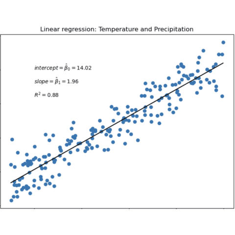
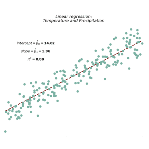
With scikit-learn you can easily run a linear regression and visualize the results with matplotlib.
The following post teaches how to perform a linear regression with scikit-learn and focus on how to build clean outputs using matplotlib.
🚨 Grab the Data To Viz poster!
Do you know all the chart types? Do you know which one you should pick? I made a decision tree that answers those questions. You can download it for free!

