Histogram

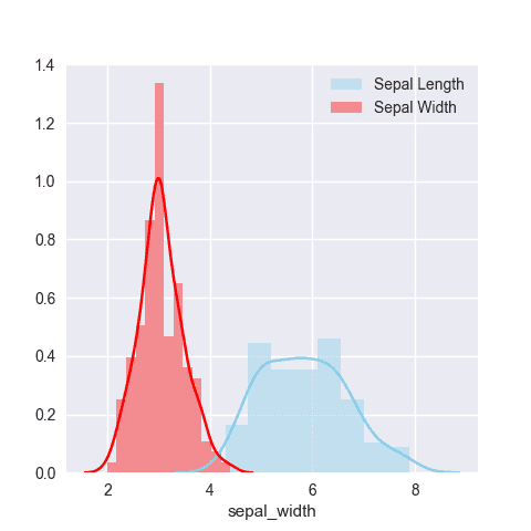
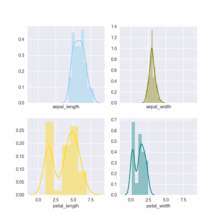
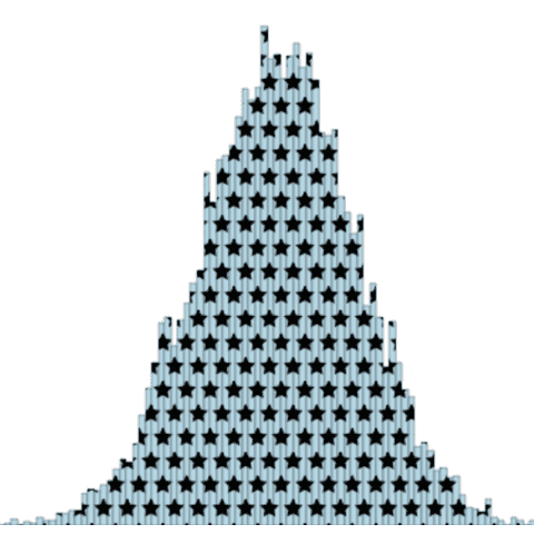
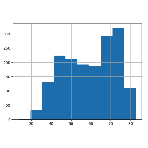
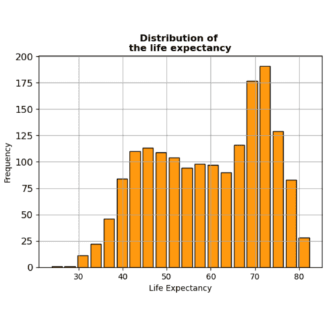
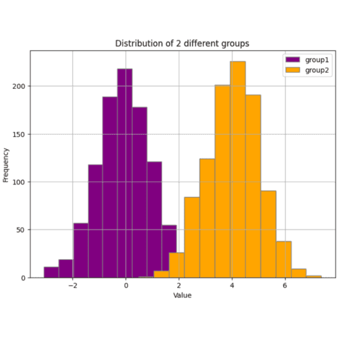
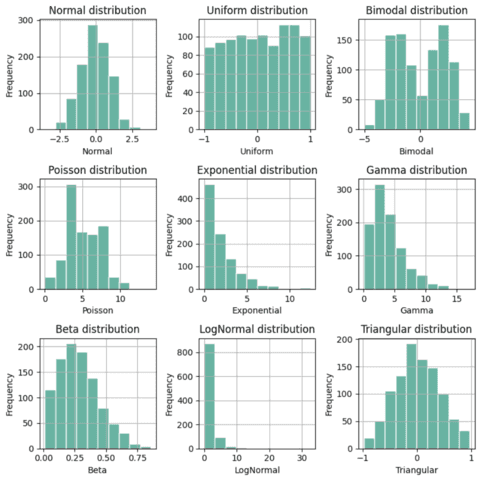
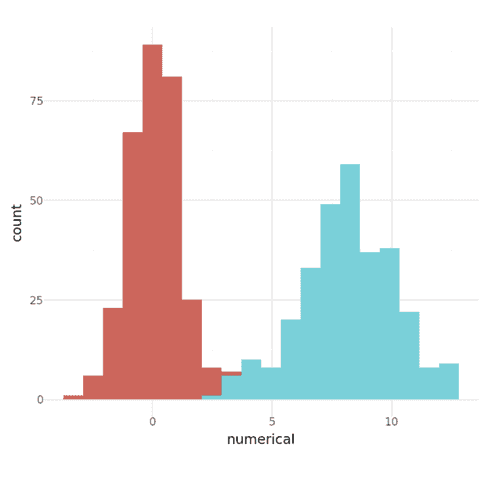
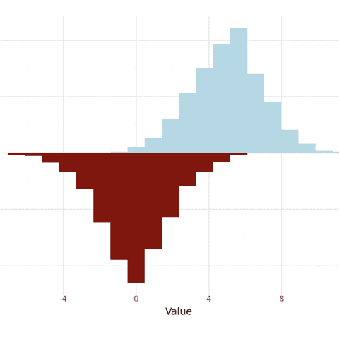
A Histogram represents the distribution of a numeric variable for one or several groups. The values are split in bins, each bin is represented as a bar.
This page showcases many histograms built with python, using the most popular libraries like seaborn and matplotlib.
Examples start with very simple, beginner-friendly histograms and progressively increase in complexity. At the end of the page, some polished & publication-ready histograms are provided, ready to be used in your next project 🔥!
⏱ Quick start (Seaborn)
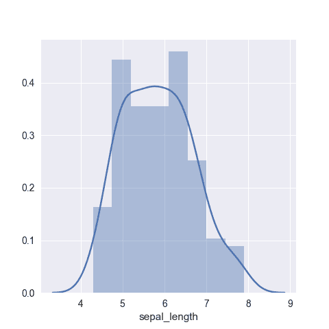
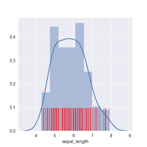
Seaborn is definitely the best library to quickly build a histogram thanks to its displot().
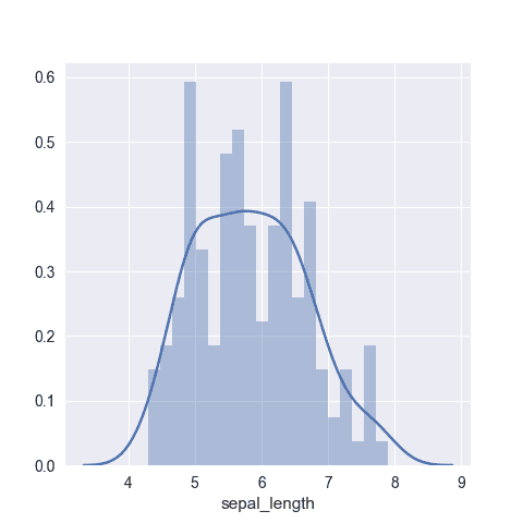
Note the importance of the bins parameter: try several values to see which represents your data the best. 🔥
# library & dataset
import seaborn as sns
df = sns.load_dataset('iris')

# Plot the histogram thanks to the displot function
sns.displot( data=df["sepal_length"], kde=True )
 Histogram charts with
 Seaborn
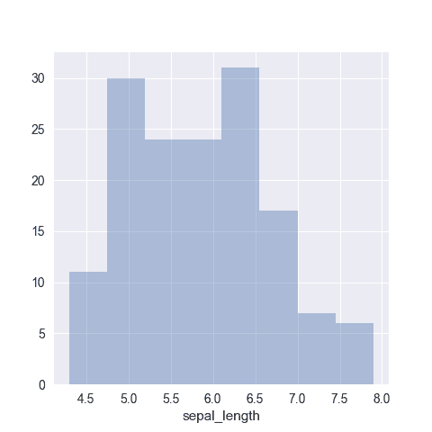
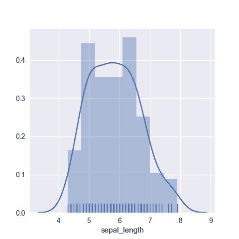
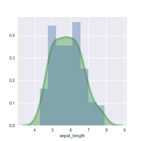
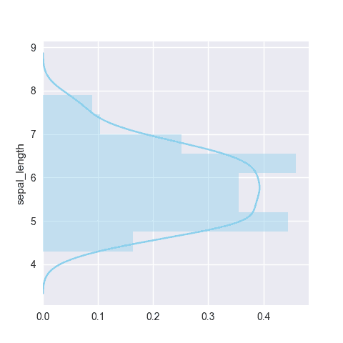
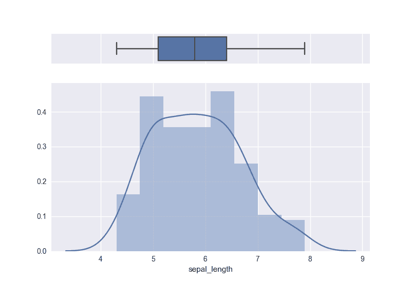
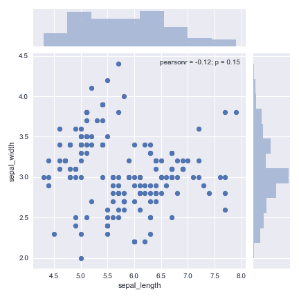
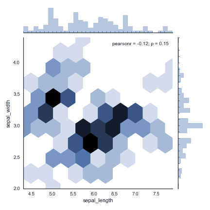
Seaborn is a python library allowing to make better charts easily. It is well adapted to build histogram thanks to its displot function. The following charts will guide you through its usage, going from a very basic histogram to something much more customized.
 Quick start (Matplotlib)
Matplotlib can also build decent histograms easily. It provides a hist() function that accept a vector of numeric values as input.
It also provides all the options you can think of to customize the binning and the genreral appearance.
# library & dataset
import matplotlib.pyplot as plt
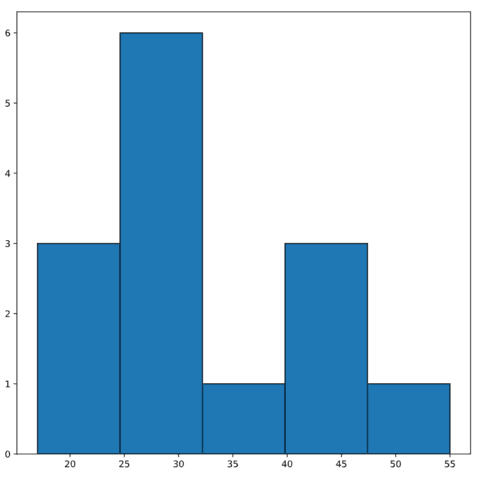
hours = [17, 20, 22, 25, 26, 27, 30, 31, 32, 38, 40, 40, 45, 55]

# Initialize layout
fig, ax = plt.subplots(figsize = (9, 9))

#plot
ax.hist(hours, bins=5, edgecolor="black");
🔎 hist() function parameters→ see full doc
→ Description
The hist() function of matplotlib creates a histogram to visualize the distribution of a dataset. It plots rectangular bars with heights proportional to the frequency of values in data bins.
→ Arguments
Description
Sets the color of the histogram bars.
Possible values → string
Can be a color name, a Hex code, or an RGB value. Learn more about colors.
Code Example
import matplotlib.pyplot as plt
import numpy as np

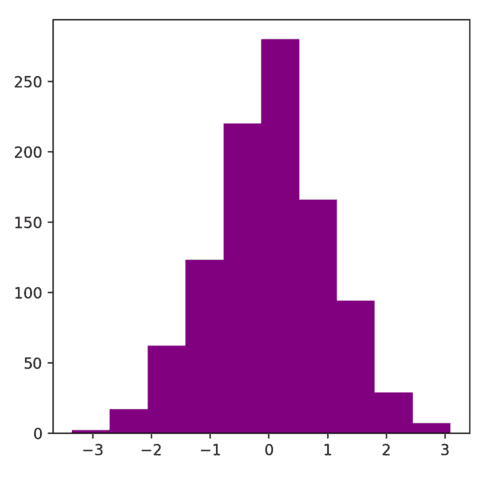
data = np.random.randn(1000)
fig, ax = plt.subplots()
ax.hist(data, color="purple")
plt.show() Histograms with
 Matplotlib
As usual matplotlib is perfectly skilled to build nice histogram, but require some more work camparing to seaborn to get a good looking figure.
The examples below should help you to get started with matplotlib histograms. They go from a very basic version and then show how to customize it, like adding annotation.
 Quick start (Pandas)
Pandas can build decent histograms easily. It provides different functions like hist() and plot() that need a pandas dataframe (or series) as input.
Since it's based on matplotlib, it provides all the options you can think of to customize the binning and the genreral appearance.
# library & dataset
import pandas as pd
import matplotlib.pyplot as plt

time = [17, 25, 42, 35, 26, 27, 20, 11, 22, 32, 35, 30, 45, 55]

# Convert to a pandas format
time = pd.Series(time)

#plot
time.hist()
plt.show
 Histograms with
 Pandas
Pandas is not the most common Python library to build histograms, but it can be used to build decent ones. It provides different functions like hist() and plot() from matplotlib.
The examples below should help you to get started with basic pandas histograms.
 Histograms with
 Plotnine
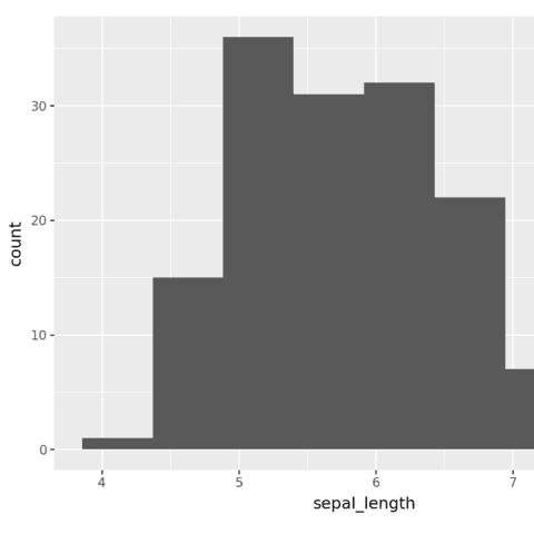
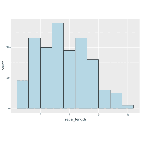
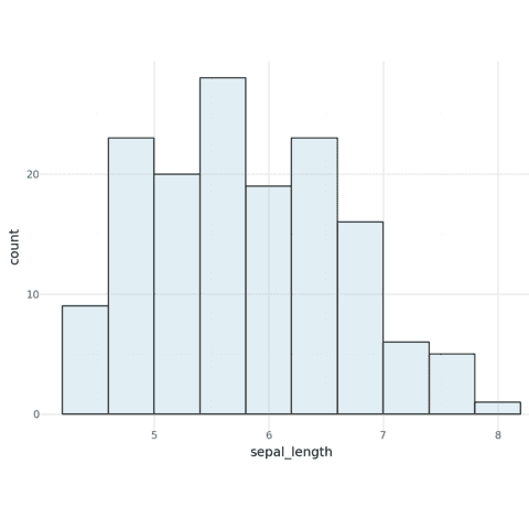
Plotnine allows us to use the grammar-of-graphics to build histograms. It provides a geom_histogram() function that can be used to build histograms.
The examples below should help you to get started with basic plotnine histograms.
 Best python histogram examples
The web is full of astonishing charts made by awesome bloggers, (often using R). The Python graph gallery tries to display (or translate from R) some of the best creations and explain how their source code works. If you want to display your work here, please drop me a word or even better, submit a Pull Request!
🚨 Grab the Data To Viz poster!
Do you know all the chart types? Do you know which one you should pick? I made a decision tree that answers those questions. You can download it for free!

