Pandas for data visualization

Pandas is a popular open-source Python library used for data manipulation and analysis. It provides data structures and functions that make working with structured data, such as tabular data (like Excel spreadsheets orSQL tables), easy and intuitive.
Although not best known for this functionality, Pandas can be used to create graphs and visualize data, thanks to its lightweight syntax and matplotlib functions.
⏱ Quick start
pandas plotting features are a wrapper around the matplotlib library, which is the most popular python library for data visualization.
The plot function is the most basic function to create a chart with pandas. It is a wrapper around the matplotlib.pyplot.plot function.
# library
import pandas as pd
import matplotlib.pyplot as plt

# Create data
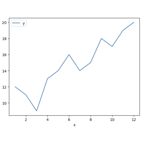
values=[12, 11, 9, 13, 14, 16, 14, 15, 18, 17, 19, 20]
df=pd.DataFrame({'x': range(1,13), 'y': values })

# plot
df.plot('x', 'y') // This is the plot function of pandas
plt.show()
 Three distinct syntaxes
There are 3 ways to build a chart with pandas: the plot method, the function name methods (like line, bar or hist) and the plot + function name method.
➡️ plot method
In this case, we have to specify the kind of chart we want to create. The plot method is a wrapper around the matplotlib.pyplot.plot function. The kind argument is used to specify the type of chart we want to create.
df.plot('x', 'y', kind='line')
plt.show()
➡️ function name method
The function name method is a bit more straightforward. We just have to call the right function name to create the chart we want. Matplotlib has various functions to create different types of charts. For example, theline function is used to create line charts.
df.line('x', 'y')
plt.show()
➡️ plot + function name method
This method is a combination of the previous two. We use the plot method and need the function nameright after it.
df.plot.line('x', 'y')
plt.show()
The function name method is the most straightforward and the one we recommend. Most posts on the gallery use this method.
 Chart examples with Pandas
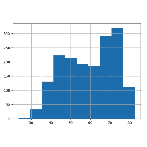
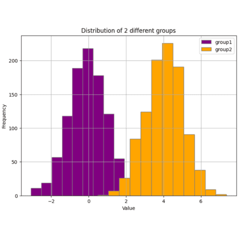
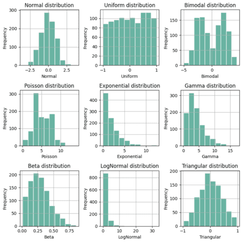
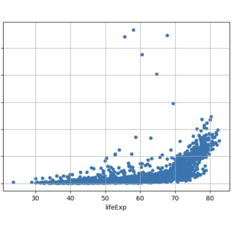
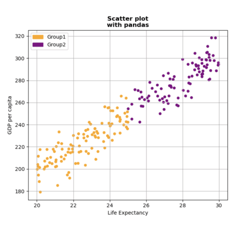
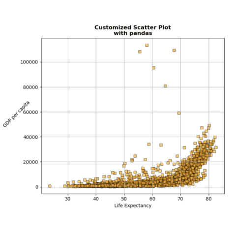
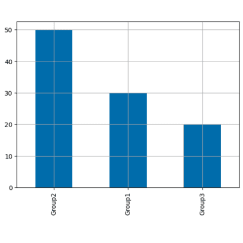
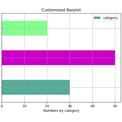
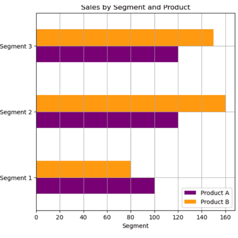
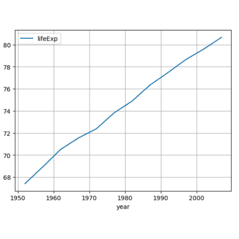
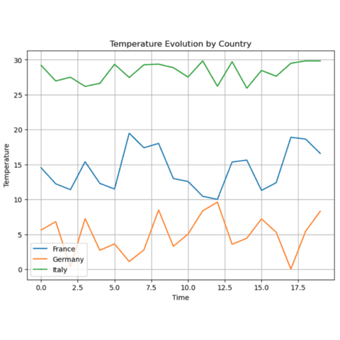
Pandas offers a wide range of nice charts. Here is a selection of examples that you can find on the gallery. Click on the images to see the code!
🚨 Grab the Data To Viz poster!
Do you know all the chart types? Do you know which one you should pick? I made a decision tree that answers those questions. You can download it for free!

