About
This plot is a histogram. This post is a translation to Python by Joseph B..
Thanks to him for accepting sharing his work here!
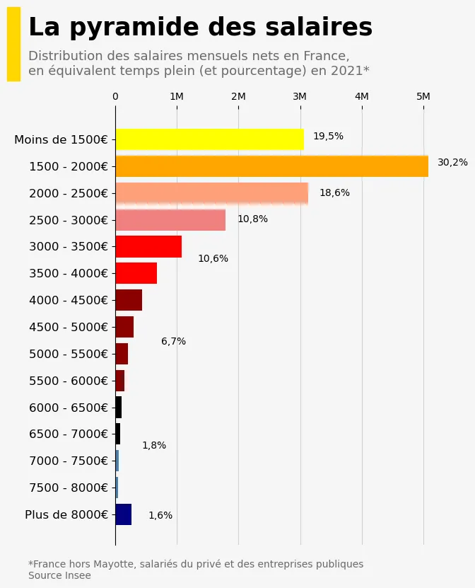
As a teaser, here is the plot we’re gonna try building:

Libraries
For creating this chart, we will need a whole bunch of libraries!
import matplotlib.pyplot as plt # plotting the chart
import matplotlib.patches as patches # add yellow rectangle
import pandas as pd # data manipulation
from matplotlib.patches import RectangleDataset
The data can be accessed using the url below.
url = 'https://raw.githubusercontent.com/holtzy/The-Python-Graph-Gallery/master/static/data/insee_salaries.csv'
df = pd.read_csv(url)Creating the chart
Here's the following things we do in order to customize our histogram:
- We initialize a cartesian coordinate layout for the plot and set the background color of both the plot and figure to
"whitesmoke" - Defines a list of colors to be used for each bar in the histogram
- Creates the horizontal histogram using the
ax.barh()method, wheredf['range']represents the horizontal positions of the bars, anddf['people']represents the heights of the bars. The specified colors are used for the bars - Adds vertical grid lines to the chart with specified linestyle, opacity, and axis
- Sets the title, subtitle, and details/credit text for the chart using the
fig.text()function. It also specifies the font size, color, and alignment for these text elements. - Removes the
spines(border lines) from the chart's top, right, and bottom edges to give it a clean appearance - Changes the position and labels of the y-axis ticks and moves the x-axis ticks to the top of the chart
- Adds a yellow rectangle to the figure using Matplotlib's
patches.Rectangle()to highlight a specific area - Adds percentage labels at various positions on the chart using the
ax.text()function
Finally, it displays the chart using plt.show().
# Initialize layout in polar coordinates
fig, ax = plt.subplots(figsize=(6, 8))

# Add grey background in the ax and fig
ax.set_facecolor('whitesmoke')
fig.set_facecolor('whitesmoke')

# Define colors to use for each bar
colors = ['navy', 'steelblue', 'steelblue', 'black', 'black', 'darkred',
          'darkred', 'darkred', 'darkred', 'red', 'red', 'lightcoral', 'lightsalmon',
          'orange', 'yellow', 'lightyellow']

# Create the plot
ax.barh(df['range'], df['people'],
        color=colors, # colors that we want
        zorder=2, # specify that the bars is drawn after the grid
       )

# Add a vertical grey line at the relative position
ax.grid(linestyle='-', # type of lines
        alpha=0.5, # opacity
        axis='x', # specify that we only want vertical lines
       )

# Title of our graph
title = 'La pyramide des salaires'
fig.text(-0.08, 1.01, # relative postion
         title,
         fontsize=25, # High font size for style
         fontweight = 'bold',
         ha='left', # align to the left
         family='dejavu sans'
        )

# Subtitle of our graph
subtitle = 'Distribution des salaires mensuels nets en France,\nen équivalent temps plein (et pourcentage) en 2021*'
fig.text(-0.08, 0.94, # relative postion
         subtitle,
         fontsize=13, # High font size for style
         color='dimgrey',
         ha='left', # align to the left
         family='dejavu sans'
        )

# Details and Credit
text = '*France hors Mayotte, salariés du privé et des entreprises publiques\nSource Insee'
fig.text(-0.08, 0.05, # relative postion
         text,
         fontsize=10, # High font size for style
         color='dimgrey',
         ha='left', # align to the left
         family='dejavu sans'
        )

# Remove the spines (border lines) from the chart
ax.spines['top'].set_visible(False)
ax.spines['right'].set_visible(False)
ax.spines['bottom'].set_visible(False)

# Change axis position and labels
ax.tick_params(axis='y', labelsize=12)
ax.set_xticklabels(['0', '1M', '2M', '3M', '4M', '5M', '6M'])
ax.xaxis.tick_top()

# Add yellow rectangle
rectangle_color = 'gold'
rect = patches.Rectangle((-0.13, 0.93), 0.03, 0.13,
                         linewidth=1, edgecolor=rectangle_color,
                         facecolor=rectangle_color, transform=fig.transFigure)
fig.patches.append(rect)

# Add percents
ax.text(0.6,0.93, # relative position
        '19,5%', # label
        transform=ax.transAxes,
        size=10, # text size
       )
ax.text(0.98,0.87, # relative position
        '30,2%', # label
        transform=ax.transAxes,
        size=10, # text size
       )
ax.text(0.62,0.8, # relative position
        '18,6%', # label
        transform=ax.transAxes,
        size=10, # text size
       )
ax.text(0.37,0.74, # relative position
        '10,8%', # label
        transform=ax.transAxes,
        size=10, # text size
       )
ax.text(0.25,0.65, # relative position
        '10,6%', # label
        transform=ax.transAxes,
        size=10, # text size
       )
ax.text(0.14,0.46, # relative position
        '6,7%', # label
        transform=ax.transAxes,
        size=10, # text size
       )
ax.text(0.08,0.22, # relative position
        '1,8%', # label
        transform=ax.transAxes,
        size=10, # text size
       )
ax.text(0.1,0.06, # relative position
        '1,6%', # label
        transform=ax.transAxes,
        size=10, # text size
       )

# Display the final chart
plt.show()Going further
This article explains how to reproduce a histogram with nice customization features and annotations.
For more examples of advanced customization, check out this other nice chart with annotations. Also, you might be interested in adding an image to your chart.