Timeseries

Timeseries charts refer to all charts representing the evolution of a numeric value. Line chart, streamgraph, barplot, area chart: they all can be used for timeseries visualization. This section displays many timeseries examples made with Python, Matplotlib and other libraries.
⏱ Quick start
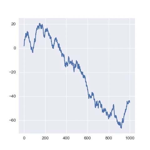
Making a simple line chart with matplotlib is pretty straightforward thanks to the plot() function.
If you provide only a series of values, it will consider that these values are ordered and will use values from 1 to n to create the X axis.🔥
For more control on the chart, see the dedicated section below.
# libraries
  import matplotlib.pyplot as plt
  import numpy as np

  # create data
  values=np.cumsum(np.random.randn(1000,1))

  # use the plot function
  plt.plot(values)
Area charts for timeseries
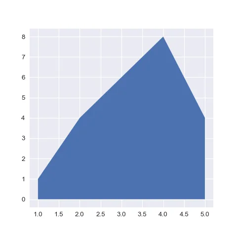
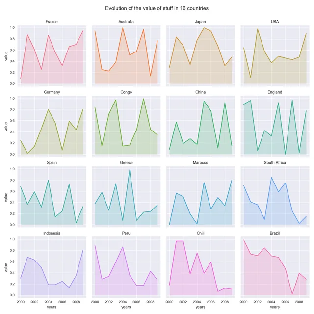
Area charts are very often used for timeseries visualization. They are particularly adapted when there is only 1 series to display. When several groups must be displayed, they can still be used using faceting.
Line charts for timeseries
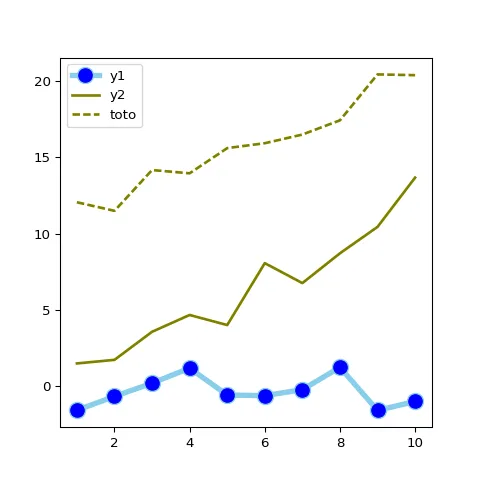
Line charts are probably the most common type of viz for timeseries. They are particularly adapted when several groups must be displayed to compare their evolution. But mind the spaghetti plot: too many groups make the figure unreadable.
Line chart with multiple groups
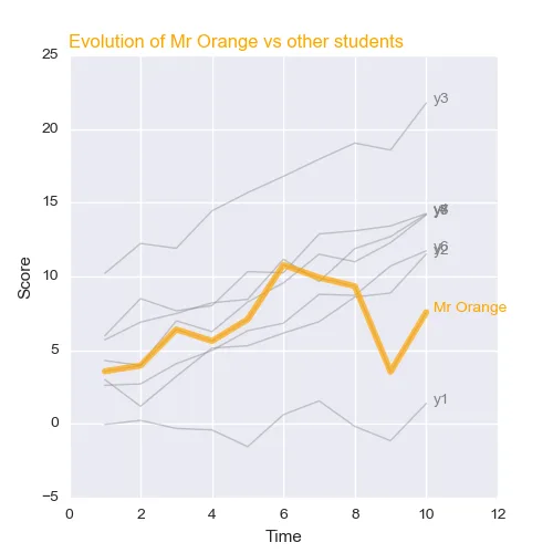
How to customize the matplotlib line plot appearance: width, stroke, color, style..
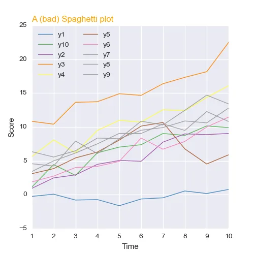
Line chart with multiple groups
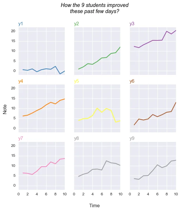
Line chart and small multiple (variation)
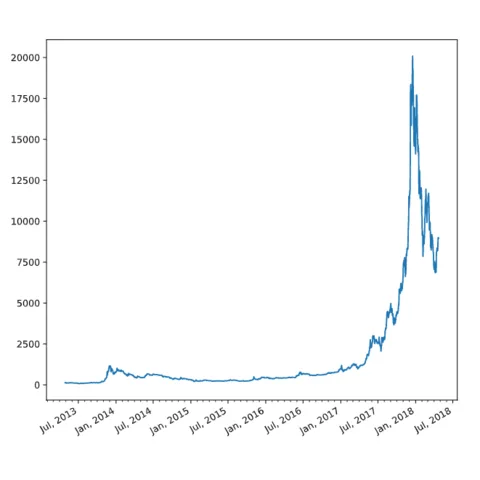
How to deal with the date format. How to represent those dates properly on the X axis.
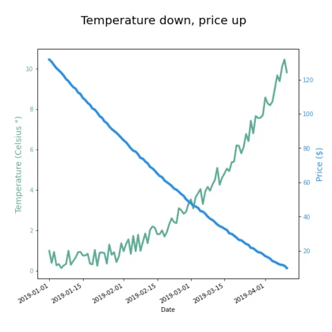
How to build a dual Y axis line chart to display 2 series with different units.
Heatmap for timeseries
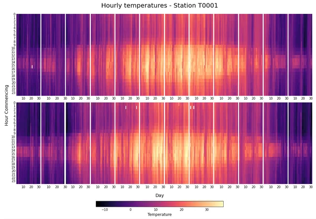
A heatmap can be used to display some temporal data. Here is an example using matplotlib where the evolution of a temperature is displayed over the hour of the day (Y axis) and the day of the year (X axis) organized by month.
Calendar Heatmap
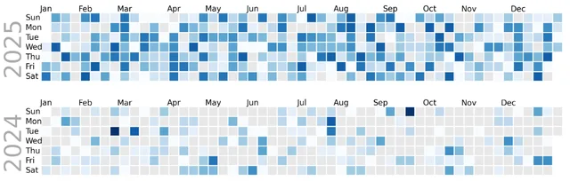
A calendar heatmap is a great way to use heatmap to represent the evolution of a variable measured daily. It's quite straightforward to build thanks to the dayplot library.
Bump Chart
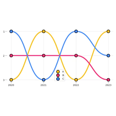
Bump charts are useful when the focus is on comparing relative rankings—who is ahead of whom—rather than the exact magnitude of the differences.
It's easy to create using the bumplot package!
Candlesticks
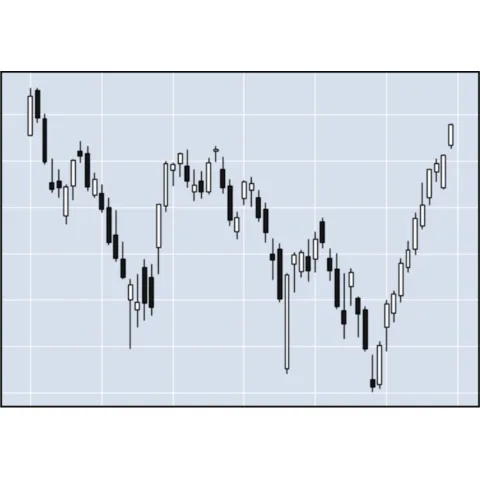
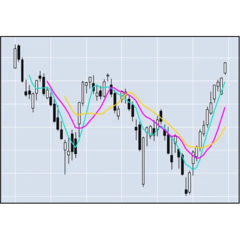
A candlestick chart is a style of financial chart used to describe price movements. Each "candlestick" typically shows one day, with the Open, High, Low, and Close (OHLC) values for each day.
Here are examples using mplfinance from matplotlib to display the evolution of different prices.
 Best python timeseries examples
A set of publication ready charts for timeseries. They are made with Python and libraries like Matplotlib or Plotly and use a high level of customization.
The first example is a line chart showing how to add labels at the end of each series for better readability. The second shows how to use lollipop to display the evolution of a deviation around a trend. The last one shows how to use an area over a flexible baseline to display the deviation around a historical reference period.
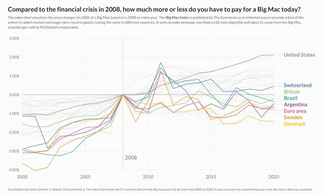
How to add labels at the end of each line with matplotlib. Definitely better than using a legend!
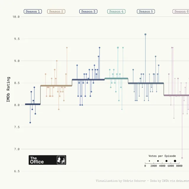
A highly customized lollipop chart made with Python and Matplotlib to display a timeseries.
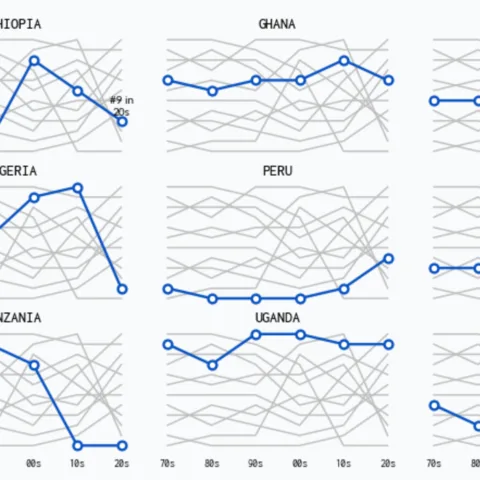
A multipanel connected scatterplot, with several groups displayed and one highlighted per panel.
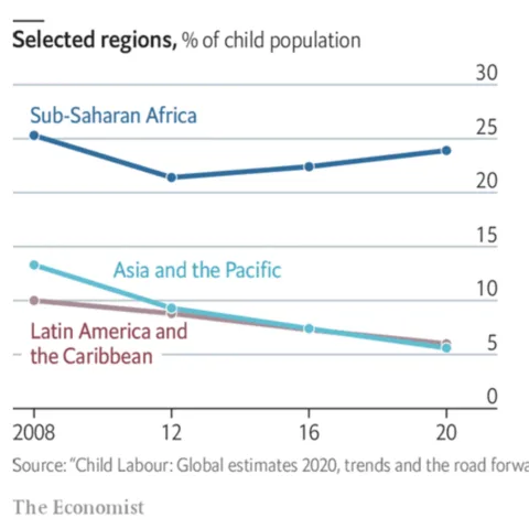
Learn how to mimick The Economist's style with a figure combining both a line and an area chart.
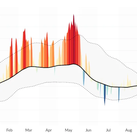
Learn how to how to build an area over flexible baseline chart to show deviations from a reference or baseline.
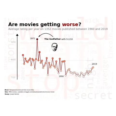
How to build a line chart on top of a wordcloud with Python and Matplotlib.
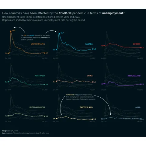
Multiple line charts with highlights
Related chart types



💡 Out of dataviz inspiration?
I have spent years collecting the most beautiful data visualizations out there. Get the list of my top 300 dataviz projects, hand-picked, for free.
I respect your privacy. Unsubscribe anytime.