
About
This plot is a multiple line chart, generally used to show the evolution of a variable over time. In our case, it displays the evolution of unemployment rates in different regions in the world. Each line represents a region, and the y-axis represents the unemployment rate.
It has been originally designed by Joseph Barbier. Thanks to him for sharing his work!
As a teaser, here is the plot we’re gonna try building:
Libraries
For creating this chart, we will need a whole bunch of libraries!
- matplotlib: to customize the appearance of the chart
- pandas: to handle the data
- highlight_text for the annotations
# data manipulation
import pandas as pd

# create the charts
import matplotlib.pyplot as plt

# annotations
from highlight_text import ax_text, fig_text

# custom fonts
from matplotlib import font_manager
from matplotlib.font_manager import FontProperties

# arrows
from matplotlib.patches import FancyArrowPatch
Dataset
The data can be accessed using the url below.
The chart mainly relies on df, but rent and rent_words are used for annotation purposes.
path = 'https://raw.githubusercontent.com/holtzy/The-Python-Graph-Gallery/master/static/data/economic_data.csv'

# open and clean dataset
df = pd.read_csv(path)

# convert to a date format
df['date'] = pd.to_datetime(df['date'])

# remove percentage sign and convert to float
col_to_update = ['unemployment rate', 'cpi yoy', 'core cpi', 'gdp yoy', 'interest rates']
for col in col_to_update:
   df[col] = df[col].str.replace('%', '').astype(float)

# display first rows
df.head()| country | date | manufacturing pmi | services pmi | consumer confidence | interest rates | cpi yoy | core cpi | unemployment rate | gdp yoy | ticker | open | high | low | close | |
|---|---|---|---|---|---|---|---|---|---|---|---|---|---|---|---|
| 0 | australia | 2020-01-01 | 49.6 | 50.6 | 93.4 | 0.75 | 2.2 | 1.7 | 5.2 | 1.2 | audusd | 0.7021 | 0.7031 | 0.6682 | 0.6691 |
| 1 | australia | 2020-02-01 | 50.2 | 49.0 | 95.5 | 0.75 | 2.2 | 1.7 | 5.1 | 1.2 | audusd | 0.6690 | 0.6776 | 0.6434 | 0.6509 |
| 2 | australia | 2020-03-01 | 49.7 | 38.5 | 91.9 | 0.50 | 2.2 | 1.7 | 5.2 | 1.2 | audusd | 0.6488 | 0.6686 | 0.5507 | 0.6135 |
| 3 | australia | 2020-04-01 | 44.1 | 19.5 | 75.6 | 0.25 | -0.3 | 1.2 | 6.3 | -6.1 | audusd | 0.6133 | 0.6571 | 0.5979 | 0.6510 |
| 4 | australia | 2020-05-01 | 44.0 | 26.9 | 88.1 | 0.25 | -0.3 | 1.2 | 7.0 | -6.1 | audusd | 0.6511 | 0.6684 | 0.6371 | 0.6666 |
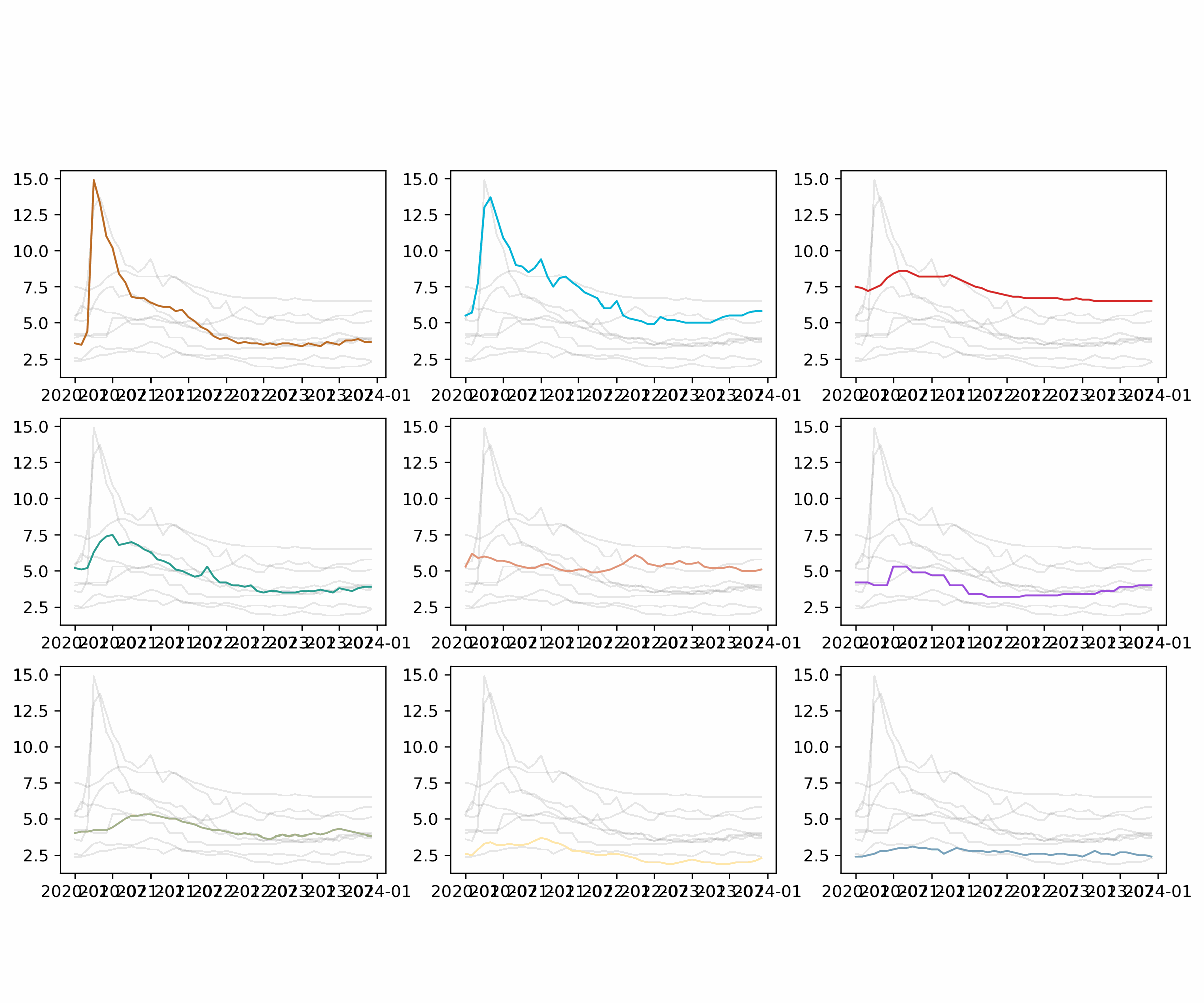
Basic small multiples
Small multiples are a type of chart that shows the same type of information for different categories. In this case, we will create a small multiple of line charts, one for each category (country) in the dataset.
It's very important that the number of distinct values in the category (country in this case) is the same as the number of subplots. Otherwise, the plot will not be created correctly. In our case we have 9 countries/regions, so we will create 9 subplots (3 rows and 3 columns).
# parameters
dpi = 150
category = 'country'
year = 'date'
value = 'unemployment rate'

countries = df.groupby(category)[value].max().sort_values(ascending=False).index.tolist()

fig, axs = plt.subplots(nrows=3, ncols=3, figsize=(12, 8), dpi=dpi)

for i, (group, ax) in enumerate(zip(countries, axs.flat)):

   # filter main and other groups
   filtered_df = df[df[category] == group]
   other_groups = df[category].unique()[df[category].unique() != group]

   # Plot other groups with lighter colors
   for other_group in other_groups:
      other_y = df[value][df[category] == other_group]
      other_x = df[year][df[category] == other_group]
      ax.plot(other_x, other_y, color='grey', alpha=0.2)

   # Plot the main group
   x = filtered_df[year]
   y = filtered_df[value]
   ax.plot(x, y, color='black')

plt.show()
Customize axis
A simple way to make a chart more appealing is to remove the axis. This can be done using the set_axis_off() function.
We also specify the y axis limits by expanding the range a bit. This is done using the set_ylim() function.
# parameters
dpi = 150
category = 'country'
year = 'date'
value = 'unemployment rate'

countries = df.groupby(category)[value].max().sort_values(ascending=False).index.tolist()

fig, axs = plt.subplots(nrows=3, ncols=3, figsize=(12, 8), dpi=dpi)

for i, (group, ax) in enumerate(zip(countries, axs.flat)):

   # filter main and other groups
   filtered_df = df[df[category] == group]
   other_groups = df[category].unique()[df[category].unique() != group]

   # Plot other groups with lighter colors
   for other_group in other_groups:
      other_y = df[value][df[category] == other_group]
      other_x = df[year][df[category] == other_group]
      ax.plot(other_x, other_y, color='grey', alpha=0.2)

   # Plot the main group
   x = filtered_df[year]
   y = filtered_df[value]
   ax.plot(x, y, color='black')

   # Custom axes
   ax.set_axis_off()
   ax.set_ylim(df[value].min()-0.2, df[value].max()+0.3)

plt.show()
Custom colors
In order to have a color per group we need to define a list of colors of the same length as the number of groups. In our case, we manually define 9 different colors. The colors are then accessed using the colors[i] syntax inside the for loop.
We also change the background color of the plot to make it more appealing.
# parameters
dpi = 150
category = 'country'
year = 'date'
value = 'unemployment rate'
background_color = '#001219'
linewidth_main = 1.2
colors = [
    '#bc6c25','#00b4d8','#d62828',
    '#2a9d8f','#e29578','#9d4edd',
    '#a3b18a','#ffe6a7','#78a1bb'
]

# custom order for the countries
countries = df.groupby(category)[value].max().sort_values(ascending=False).index.tolist()

fig, axs = plt.subplots(nrows=3, ncols=3, figsize=(12, 8), dpi=dpi)
fig.set_facecolor(background_color)

for i, (group, ax) in enumerate(zip(countries, axs.flat)):

   # Set the background color
   ax.set_facecolor(background_color)

   # filter main and other groups
   filtered_df = df[df[category] == group]
   other_groups = df[category].unique()[df[category].unique() != group]

   # Plot other groups with lighter colors
   for other_group in other_groups:
      other_y = df[value][df[category] == other_group]
      other_x = df[year][df[category] == other_group]
      ax.plot(other_x, other_y, color='grey', alpha=0.2, linewidth=linewidth_main)

   # Plot the main group
   x = filtered_df[year]
   y = filtered_df[value]
   ax.plot(x, y, color=colors[i], linewidth=linewidth_main, zorder=10)

   # Custom axes
   ax.set_axis_off()
   ax.set_ylim(df[value].min()-0.2, df[value].max()+0.3)

plt.show()
Highligh first and last value
For each subplot, we will highlight the first and last value of the line. This is done by adding a dot at the first and last value of the line. We also add a text annotation next to the dot to make it more explicit.
# parameters
dpi = 150
category = 'country'
year = 'date'
value = 'unemployment rate'
background_color = '#001219'
linewidth_main = 1.2
colors = [
    '#bc6c25','#00b4d8','#d62828',
    '#2a9d8f','#e29578','#9d4edd',
    '#a3b18a','#ffe6a7','#78a1bb'
]

# font
personal_path = '/Users/josephbarbier/Library/Fonts/'
font_path = personal_path + 'FiraSans-Light.ttf'
font = FontProperties(fname=font_path)
bold_font = FontProperties(fname=personal_path + 'FiraSans-Medium.ttf')

countries = df.groupby(category)[value].max().sort_values(ascending=False).index.tolist()

fig, axs = plt.subplots(nrows=3, ncols=3, figsize=(12, 8), dpi=dpi)
fig.set_facecolor(background_color)

for i, (group, ax) in enumerate(zip(countries, axs.flat)):

   # Set the background color
   ax.set_facecolor(background_color)

   # filter main and other groups
   filtered_df = df[df[category] == group]
   other_groups = df[category].unique()[df[category].unique() != group]

   # Plot other groups with lighter colors
   for other_group in other_groups:
      other_y = df[value][df[category] == other_group]
      other_x = df[year][df[category] == other_group]
      ax.plot(other_x, other_y, color='grey', alpha=0.2, linewidth=linewidth_main)

   # Plot the main group
   x = filtered_df[year]
   y = filtered_df[value]
   ax.plot(x, y, color=colors[i], linewidth=linewidth_main, zorder=10)

   # Custom axes
   ax.set_axis_off()
   ax.set_ylim(df[value].min()-0.2, df[value].max()+0.3)

   # Plot first and last data point
   filtered_df = filtered_df.sort_values(by=year)
   last_value = filtered_df.iloc[-1][value]
   last_date = filtered_df.iloc[-1][year]
   first_value = filtered_df.iloc[0][value]
   first_date = filtered_df.iloc[0][year]
   ax.scatter(
      [first_date, last_date],
      [first_value, last_value],
      s=20, color=colors[i],
   )
   ax_text(
      last_date + pd.Timedelta(days=40), last_value+0.4,
      f'{round(last_value,1)}',
      fontsize=9, color=colors[i],
      font=bold_font,
      ax=ax
   )
   ax_text(
      first_date - pd.Timedelta(days=130), first_value+0.4,
      f'{round(first_value,1)}',
      fontsize=9, color=colors[i],
      font=bold_font,
      ax=ax
   )

plt.show()
Highlight the USA and Canada
In order to highlight the USA and Canada, we add a if group in ['united states', 'canada']: statement inside the for loop. This way, we can apply a different style to these two countries.
In practice we add another dot and another text annotation at their highest value.
# parameters
dpi = 150
category = 'country'
year = 'date'
value = 'unemployment rate'
background_color = '#001219'
linewidth_main = 1.2
colors = [
    '#bc6c25','#00b4d8','#d62828',
    '#2a9d8f','#e29578','#9d4edd',
    '#a3b18a','#ffe6a7','#78a1bb'
]

# font
personal_path = '/Users/josephbarbier/Library/Fonts/'
font_path = personal_path + 'FiraSans-Light.ttf'
font = FontProperties(fname=font_path)
bold_font = FontProperties(fname=personal_path + 'FiraSans-Medium.ttf')

countries = df.groupby(category)[value].max().sort_values(ascending=False).index.tolist()

fig, axs = plt.subplots(nrows=3, ncols=3, figsize=(12, 8), dpi=dpi)
fig.set_facecolor(background_color)

for i, (group, ax) in enumerate(zip(countries, axs.flat)):

   # Set the background color
   ax.set_facecolor(background_color)

   # filter main and other groups
   filtered_df = df[df[category] == group]
   other_groups = df[category].unique()[df[category].unique() != group]

   # Plot other groups with lighter colors
   for other_group in other_groups:
      other_y = df[value][df[category] == other_group]
      other_x = df[year][df[category] == other_group]
      ax.plot(other_x, other_y, color='grey', alpha=0.2, linewidth=linewidth_main)

   # Plot the main group
   x = filtered_df[year]
   y = filtered_df[value]
   ax.plot(x, y, color=colors[i], linewidth=linewidth_main, zorder=10)

   # Custom axes
   ax.set_axis_off()
   ax.set_ylim(df[value].min()-0.2, df[value].max()+0.3)

   # Plot first and last data point
   filtered_df = filtered_df.sort_values(by=year)
   last_value = filtered_df.iloc[-1][value]
   last_date = filtered_df.iloc[-1][year]
   first_value = filtered_df.iloc[0][value]
   first_date = filtered_df.iloc[0][year]
   ax.scatter(
      [first_date, last_date],
      [first_value, last_value],
      s=20, color=colors[i],
   )
   ax_text(
      last_date + pd.Timedelta(days=40), last_value+0.4,
      f'{round(last_value,1)}',
      fontsize=9, color=colors[i],
      font=bold_font,
      ax=ax
   )
   ax_text(
      first_date - pd.Timedelta(days=130), first_value+0.4,
      f'{round(first_value,1)}',
      fontsize=9, color=colors[i],
      font=bold_font,
      ax=ax
   )

   # add USA and Canada max value
   if group in ['united states', 'canada']:
      maxrate = df[df['country']==group][value].max()
      date_maxrate = df[(df['country']==group) & (df['unemployment rate']==maxrate)][year]
      ax.plot(
         date_maxrate, maxrate,
         marker='o', markersize=5, color=colors[i], zorder=10
      )
      ax_text(
         date_maxrate + pd.Timedelta(days=50), maxrate+0.8,
         f'{round(maxrate,1)}',
         fontsize=9, color=colors[i],
         font=bold_font,
         ax=ax
      )

plt.show()
Add country name
Then, we add the country name at the top of each subplot. This is done using the ax_text() function from the highlight_text library.
# parameters
dpi = 150
category = 'country'
year = 'date'
value = 'unemployment rate'
background_color = '#001219'
linewidth_main = 1.2
y_adj = 4 # make country names higher
colors = [
    '#bc6c25','#00b4d8','#d62828',
    '#2a9d8f','#e29578','#9d4edd',
    '#a3b18a','#ffe6a7','#78a1bb'
]

# font
personal_path = '/Users/josephbarbier/Library/Fonts/'
font_path = personal_path + 'FiraSans-Light.ttf'
font = FontProperties(fname=font_path)
bold_font = FontProperties(fname=personal_path + 'FiraSans-Medium.ttf')

countries = df.groupby(category)[value].max().sort_values(ascending=False).index.tolist()

fig, axs = plt.subplots(nrows=3, ncols=3, figsize=(12, 8), dpi=dpi)
fig.set_facecolor(background_color)

for i, (group, ax) in enumerate(zip(countries, axs.flat)):

   # Set the background color
   ax.set_facecolor(background_color)

   # filter main and other groups
   filtered_df = df[df[category] == group]
   other_groups = df[category].unique()[df[category].unique() != group]

   # Plot other groups with lighter colors
   for other_group in other_groups:
      other_y = df[value][df[category] == other_group]
      other_x = df[year][df[category] == other_group]
      ax.plot(other_x, other_y, color='grey', alpha=0.2, linewidth=linewidth_main)

   # Plot the main group
   x = filtered_df[year]
   y = filtered_df[value]
   ax.plot(x, y, color=colors[i], linewidth=linewidth_main, zorder=10)

   # Custom axes
   ax.set_axis_off()
   ax.set_ylim(df[value].min()-0.2, df[value].max()+0.3)

   # Plot first and last data point
   filtered_df = filtered_df.sort_values(by=year)
   last_value = filtered_df.iloc[-1][value]
   last_date = filtered_df.iloc[-1][year]
   first_value = filtered_df.iloc[0][value]
   first_date = filtered_df.iloc[0][year]
   ax.scatter(
      [first_date, last_date],
      [first_value, last_value],
      s=20, color=colors[i],
   )
   ax_text(
      last_date + pd.Timedelta(days=40), last_value+0.4,
      f'{round(last_value,1)}',
      fontsize=9, color=colors[i],
      font=bold_font,
      ax=ax
   )
   ax_text(
      first_date - pd.Timedelta(days=130), first_value+0.4,
      f'{round(first_value,1)}',
      fontsize=9, color=colors[i],
      font=bold_font,
      ax=ax
   )

   # add USA and Canada max value
   if group in ['united states', 'canada']:
      maxrate = df[df['country']==group][value].max()
      date_maxrate = df[(df['country']==group) & (df['unemployment rate']==maxrate)][year]
      ax.plot(
         date_maxrate, maxrate,
         marker='o', markersize=5, color=colors[i], zorder=10
      )
      ax_text(
         date_maxrate + pd.Timedelta(days=50), maxrate+0.8,
         f'{round(maxrate,1)}',
         fontsize=9, color=colors[i],
         font=bold_font,
         ax=ax
      )

   # Display country names
   ax_text(
      19700, df[value].mean()+y_adj,
      f'<{group.upper()}>',
      va='top', ha='right',
      fontsize=10, font=bold_font,
      color=colors[i], ax=ax
   )

plt.show()
Basic annotations: title, credit and reference date
Once again, we simply use the highlight_text library to add a title, a credit and a reference date to the plot.
# parameters
dpi = 150
category = 'country'
year = 'date'
value = 'unemployment rate'
background_color = '#001219'
text_color = 'white'
linewidth_main = 1.2
y_adj = 4 # make country names higher
colors = [
    '#bc6c25','#00b4d8','#d62828',
    '#2a9d8f','#e29578','#9d4edd',
    '#a3b18a','#ffe6a7','#78a1bb'
]

# font
personal_path = '/Users/josephbarbier/Library/Fonts/'
font_path = personal_path + 'FiraSans-Light.ttf'
font = FontProperties(fname=font_path)
bold_font = FontProperties(fname=personal_path + 'FiraSans-Medium.ttf')

countries = df.groupby(category)[value].max().sort_values(ascending=False).index.tolist()

fig, axs = plt.subplots(nrows=3, ncols=3, figsize=(12, 8), dpi=dpi)
fig.set_facecolor(background_color)

for i, (group, ax) in enumerate(zip(countries, axs.flat)):

   # Set the background color
   ax.set_facecolor(background_color)

   # filter main and other groups
   filtered_df = df[df[category] == group]
   other_groups = df[category].unique()[df[category].unique() != group]

   # Plot other groups with lighter colors
   for other_group in other_groups:
      other_y = df[value][df[category] == other_group]
      other_x = df[year][df[category] == other_group]
      ax.plot(other_x, other_y, color='grey', alpha=0.2, linewidth=linewidth_main)

   # Plot the main group
   x = filtered_df[year]
   y = filtered_df[value]
   ax.plot(x, y, color=colors[i], linewidth=linewidth_main, zorder=10)

   # Custom axes
   ax.set_axis_off()
   ax.set_ylim(df[value].min()-0.2, df[value].max()+0.3)

   # Plot first and last data point
   filtered_df = filtered_df.sort_values(by=year)
   last_value = filtered_df.iloc[-1][value]
   last_date = filtered_df.iloc[-1][year]
   first_value = filtered_df.iloc[0][value]
   first_date = filtered_df.iloc[0][year]
   ax.scatter(
      [first_date, last_date],
      [first_value, last_value],
      s=20, color=colors[i],
   )
   ax_text(
      last_date + pd.Timedelta(days=40), last_value+0.4,
      f'{round(last_value,1)}',
      fontsize=9, color=colors[i],
      font=bold_font,
      ax=ax
   )
   ax_text(
      first_date - pd.Timedelta(days=130), first_value+0.4,
      f'{round(first_value,1)}',
      fontsize=9, color=colors[i],
      font=bold_font,
      ax=ax
   )

   # add USA and Canada max value
   if group in ['united states', 'canada']:
      maxrate = df[df['country']==group][value].max()
      date_maxrate = df[(df['country']==group) & (df['unemployment rate']==maxrate)][year]
      ax.plot(
         date_maxrate, maxrate,
         marker='o', markersize=5, color=colors[i], zorder=10
      )
      ax_text(
         date_maxrate + pd.Timedelta(days=50), maxrate+0.8,
         f'{round(maxrate,1)}',
         fontsize=9, color=colors[i],
         font=bold_font,
         ax=ax
      )

   # Display country names
   ax_text(
      19700, df[value].mean()+y_adj,
      f'<{group.upper()}>',
      va='top', ha='right',
      fontsize=10, font=bold_font,
      color=colors[i], ax=ax
   )

   # Reference dates (Jan 2020 and Dec 2023)
   ax_text(
      18350, df[value].min()-0.5,
      'Jan 2020',
      va='top', ha='right',
      fontsize=7, font=font,
      color='grey', ax=ax
   )
   ax_text(
      19800, df[value].min()-0.5,
      'Dec 2023',
      va='top', ha='right',
      fontsize=7, font=font,
      color='grey', ax=ax
   )

# credit
credit = """
<Design:> @joseph_barbier
<Data:> kaggle.com/datasets/keneticenergy/economic-data-life-after-covid
"""
fig_text(
   0.1, 0.01,
   credit,
   fontsize=7,
   ha='left', va='center',
   color=text_color, font=font,
   highlight_textprops=[
      {'font': bold_font},
      {'font': bold_font}
   ],
   fig=fig
)

# title
start_x_position = df.iloc[0][year]
end_x_position = df.iloc[-1][year]
title = f"""
Evolution of <{value}> between <{str(start_x_position)[:4]}> and <{str(end_x_position)[:4]}>
"""
title = f"""
How countries have been affected by the <COVID-19> pandemic in terms of <unemployment>?
<Unemployment rates (in %) in different regions between 2020 and 2023.>
<Regions are sorted by their maximum unemployment rate during the period.>
"""
fig_text(
   0.1, 1,
   title,
   fontsize=15,
   ha='left', va='center',
   color=text_color, font=font,
   highlight_textprops=[
      {'font': bold_font},
      {'font': bold_font},
      {'color': 'lightgrey', 'fontsize': 12},
      {'color': 'lightgrey', 'fontsize': 12}
   ],
   fig=fig
)

plt.show()
Final chart with annotations
# parameters
dpi = 300
category = 'country'
year = 'date'
value = 'unemployment rate'
background_color = '#001219'
text_color = 'white'
linewidth_main = 1.2
y_adj = 4
colors = [
    '#bc6c25','#00b4d8','#d62828',
    '#2a9d8f','#e29578','#9d4edd',
    '#a3b18a','#ffe6a7','#78a1bb'
]

# font
personal_path = '/Users/josephbarbier/Library/Fonts/'
font_path = personal_path + 'FiraSans-Light.ttf'
font = FontProperties(fname=font_path)
bold_font = FontProperties(fname=personal_path + 'FiraSans-Medium.ttf')

fig, axs = plt.subplots(3, 3, figsize=(12, 8), dpi=dpi)
fig.set_facecolor(background_color)

# default order for the countries
countries = df[category].unique()

# custom order for the countries
countries = df.groupby('country')['unemployment rate'].max().sort_values(ascending=False).index.tolist()

for i, (group, ax) in enumerate(zip(countries, axs.flat)):

   # Set the background color
   ax.set_facecolor(background_color)

   # Filter for the group
   filtered_df = df[df[category] == group]
   other_groups = df[category].unique()[df[category].unique() != group]

   # Plot last data point
   filtered_df = filtered_df.sort_values(by=year)
   last_value = filtered_df.iloc[-1][value]
   last_date = filtered_df.iloc[-1][year]
   first_value = filtered_df.iloc[0][value]
   first_date = filtered_df.iloc[0][year]
   ax.scatter(
      [first_date, last_date],
      [first_value, last_value],
      s=20, color=colors[i],
   )
   ax_text(
      last_date + pd.Timedelta(days=40), last_value+0.4,
      f'{round(last_value,1)}',
      fontsize=9, color=colors[i],
      font=bold_font,
      ax=ax
   )
   ax_text(
      first_date - pd.Timedelta(days=130), first_value+0.4,
      f'{round(first_value,1)}',
      fontsize=9, color=colors[i],
      font=bold_font,
      ax=ax
   )

   # Plot other groups with lighter colors
   for other_group in other_groups:
      other_y = df[value][df[category] == other_group]
      other_x = df[year][df[category] == other_group]
      ax.plot(other_x, other_y, color='grey', alpha=0.2, linewidth=linewidth_main)

   # Plot the main group
   x = filtered_df[year]
   y = filtered_df[value]
   ax.plot(x, y, color=colors[i], linewidth=linewidth_main, zorder=10)

   # add USA and Canada max value
   if group in ['united states', 'canada']:
      maxrate = df[df['country']==group][value].max()
      date_maxrate = df[(df['country']==group) & (df['unemployment rate']==maxrate)][year]
      ax.plot(
         date_maxrate, maxrate,
         marker='o', markersize=5, color=colors[i], zorder=10
      )
      ax_text(
         date_maxrate + pd.Timedelta(days=50), maxrate+0.8,
         f'{round(maxrate,1)}',
         fontsize=9, color=colors[i],
         font=bold_font,
         ax=ax
      )


   # Custom axes
   ax.set_axis_off()
   ax.set_ylim(df[value].min()-0.2, df[value].max()+0.3)

   # Display country names
   ax_text(
      19700, df[value].mean()+y_adj,
      f'<{group.upper()}>',
      va='top', ha='right',
      fontsize=10, font=bold_font,
      color=colors[i], ax=ax
   )

   # Reference dates (Jan 2020 and Dec 2023)
   ax_text(
      18350, df[value].min()-0.5,
      'Jan 2020',
      va='top', ha='right',
      fontsize=7, font=font,
      color='grey', ax=ax
   )
   ax_text(
      19800, df[value].min()-0.5,
      'Dec 2023',
      va='top', ha='right',
      fontsize=7, font=font,
      color='grey', ax=ax
   )

# credit
credit = """
<Design:> @joseph_barbier
<Data:> kaggle.com/datasets/keneticenergy/economic-data-life-after-covid
"""
fig_text(
   0.1, 0.01,
   credit,
   fontsize=7,
   ha='left', va='center',
   color=text_color, font=font,
   highlight_textprops=[
      {'font': bold_font},
      {'font': bold_font}
   ],
   fig=fig
)

# title
start_x_position = df.iloc[0][year]
end_x_position = df.iloc[-1][year]
title = f"""
Evolution of <{value}> between <{str(start_x_position)[:4]}> and <{str(end_x_position)[:4]}>
"""
title = f"""
How countries have been affected by the <COVID-19> pandemic in terms of <unemployment>?
<Unemployment rates (in %) in different regions between 2020 and 2023.>
<Regions are sorted by their maximum unemployment rate during the period.>
"""
fig_text(
   0.1, 1,
   title,
   fontsize=15,
   ha='left', va='center',
   color=text_color, font=font,
   highlight_textprops=[
      {'font': bold_font},
      {'font': bold_font},
      {'color': 'lightgrey', 'fontsize': 12},
      {'color': 'lightgrey', 'fontsize': 12}
   ],
   fig=fig
)

# arrow function
def draw_arrow(tail_position, head_position, invert=False, radius=0.5):
    kw = dict(arrowstyle="Simple, tail_width=0.5, head_width=4, head_length=8", color=text_color, lw=0.5)
    if invert:
        connectionstyle = f"arc3,rad=-{radius}"
    else:
        connectionstyle = f"arc3,rad={radius}"
    a = FancyArrowPatch(
        tail_position, head_position,
        connectionstyle=connectionstyle,
        transform=fig.transFigure,
        **kw
    )
    fig.patches.append(a)

# arrows for the USA and Canada
draw_arrow((0.23, 0.86), (0.16, 0.9), invert=False, radius=0.5)
draw_arrow((0.346, 0.855), (0.413, 0.865), invert=True, radius=0.4)
maxrate_canada = df[df['country']=='canada']['unemployment rate'].max()
maxrate_usa = df[df['country']=='united states']['unemployment rate'].max()
text = f"""
The <USA> and <Canada> experienced high levels
of unemployment rates during <COVID-19>, with
peaks in April 2020.
"""
fig_text(
   0.29, 0.82,
   text,
   fontsize=7,
   ha='center', va='center',
   color=text_color, font=font,
   highlight_textprops=[
      {'color': colors[0], 'font':bold_font},
      {'color': colors[1], 'font':bold_font},
      {'font': bold_font}
   ],
   fig=fig
)

# arrows for Japan and Switzerland
draw_arrow((0.625, 0.324), (0.72, 0.15), invert=True, radius=0.4)
draw_arrow((0.46, 0.32), (0.44, 0.15), invert=False, radius=0.3)
text = f"""
<Switzerland> and <Japan> managed to keep
their unemployment rates relatively low by
keeping them under <4%> during the pandemic.
"""
fig_text(
   0.55, 0.31,
   text,
   fontsize=7,
   ha='center', va='center',
   color=text_color, font=font,
   highlight_textprops=[
      {'color': colors[7], 'font':bold_font},
      {'color': colors[8], 'font':bold_font},
      {'font': bold_font},
   ],
   fig=fig
)

fig.savefig(f'../../static/graph/web-small-multiple-with-highlights.png', bbox_inches='tight', dpi=dpi)
plt.show()
Going further
You migth be interested in:
- this beautiful small multiple connected scatter plot
- this small multiple line chart with reference lines