Area Chart

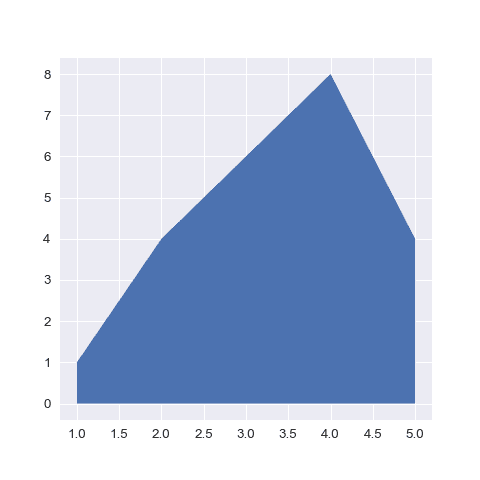
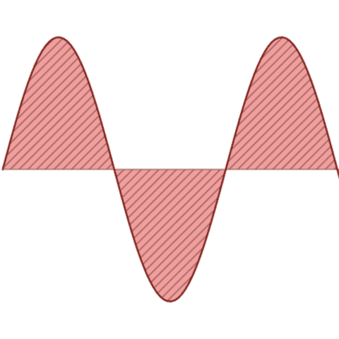
An area chart is really similar to a line chart, except that the area between the x axis and the line is filled in with color or shading. It represents the evolution of a numeric variable. This section starts by considering matplotlib and seaborn as tools to build area charts. It then shows a few other options for timeseries.
⏱ Quick start
There are 2 main ways to build an area chart with Matplotlib. In both case it requires 2 numeric vectors of values as input.
- The
fill_between()function - The
stackplot()function that is more useful for stacked area charts
# library
import numpy as np
import matplotlib.pyplot as plt

# Create data
x=range(1,6)
y=[1,4,6,8,4]

# Area plot
plt.fill_between(x, y)
plot.show()
 Area chart with
 Matplotlib
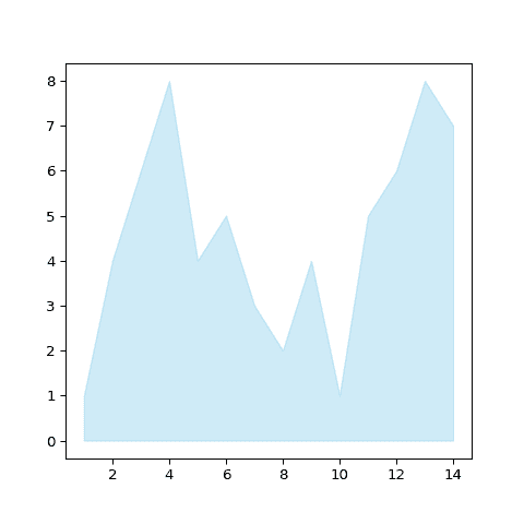
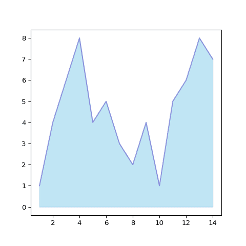
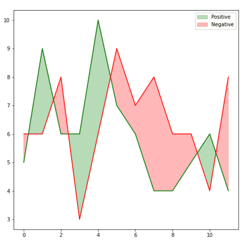
Matplotlib is a great fit to build an area chart thanks to its fill_between() function. Here are a few examples explaining its basics and how to apply some common customization.
 Area chart with
 Seaborn
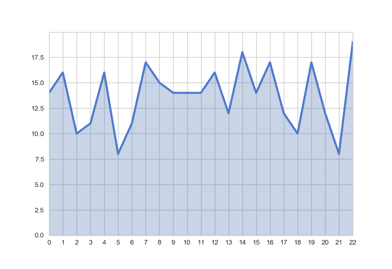
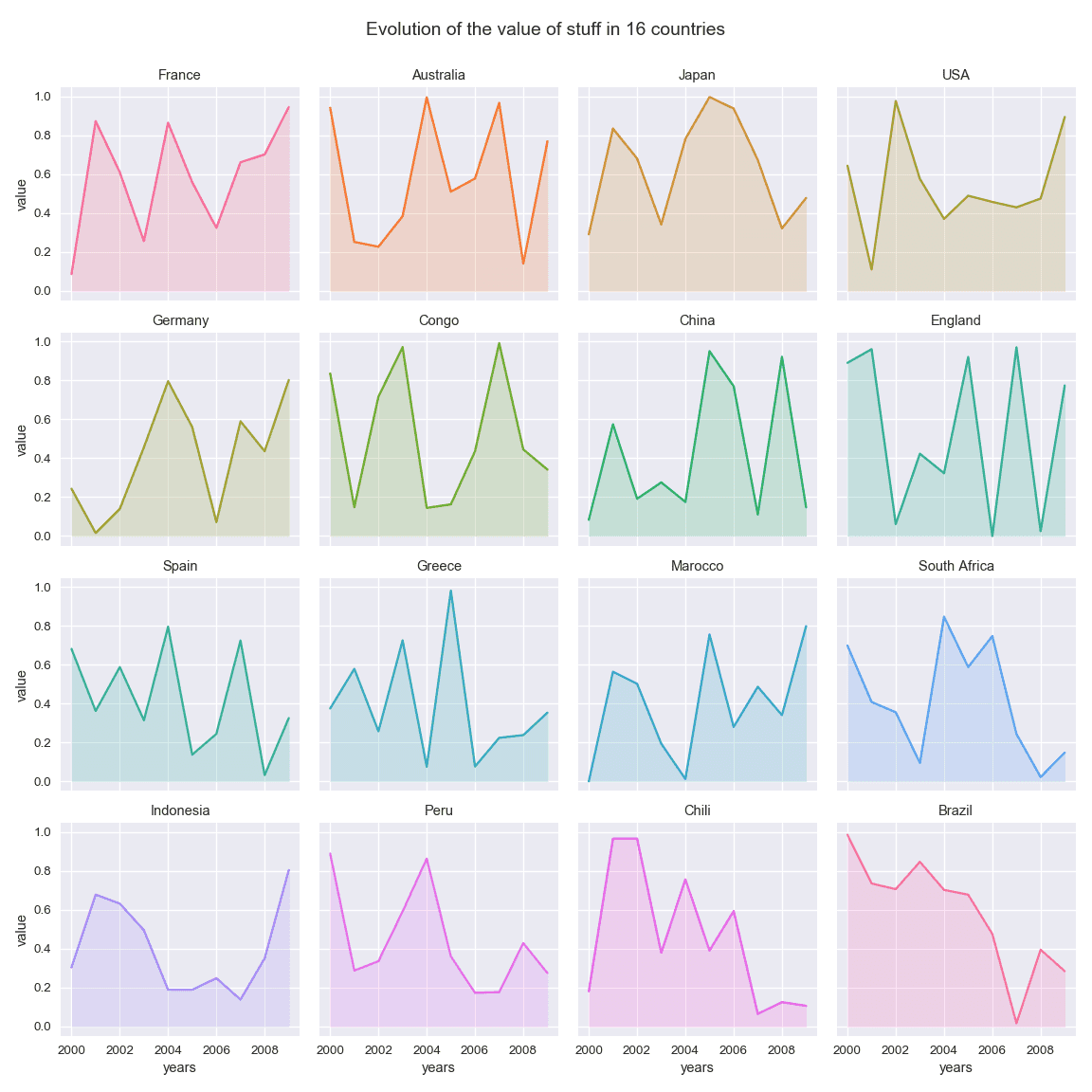
Seaborn is another great alternative to build an area chart with python. The below examples show how to start basic, apply usual customization, and use the small multiple technique for when you have several groups to compare.
 Best area chart examples
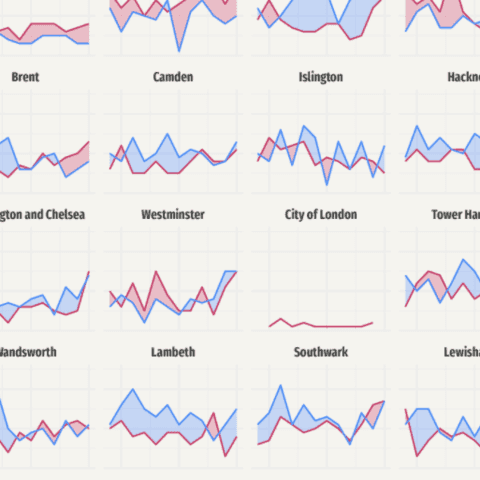
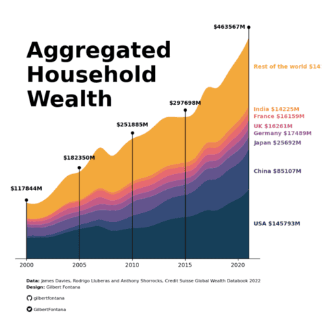
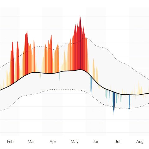
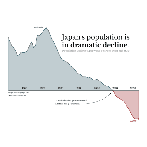
The web is full of astonishing charts made by awesome bloggers, (often using R). The Python graph gallery tries to display (or translate from R) some of the best creations and explain how their source code works. If you want to display your work here, please drop me a word or even better, submit a Pull Request!
🚨 Grab the Data To Viz poster!
Do you know all the chart types? Do you know which one you should pick? I made a decision tree that answers those questions. You can download it for free!

