Candlestick
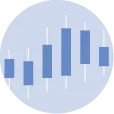
A candlestick chart is a style of financial chart used to describe price movements of a security, derivative, or currency.
In python there are 2 main ways to build a candlestick chart. The mplfinance package is built on top of matplotlib and is great to create static versions. Plotly has a specific function to create interactive candlestick charts.
This page provides several examples of candlestick charts using those 2 libraries. Linked tutorial should help you create your own candlestick in a short amount of time.
⏱ Quick start
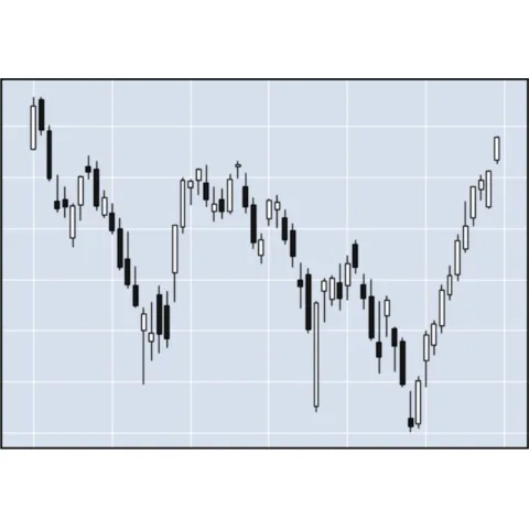
mplfinance is the best library to quickly build a static candlestick chart.
It comes with a dedicated plot() function that has a type argument that can be set to candle:
#libraries
import mplfinance as mpf
import yfinance as yf #(for the dataset)

# Define the stock symbol and date range
stock_symbol = "AAPL"  # Example: Apple Inc.
start_date = "2022-01-01"
end_date = "2022-03-30"

# Load historical data
stock_data = yf.download(stock_symbol, start=start_date, end=end_date)

# plot
mpf.plot(stock_data, type='candle') Candlestick with
 mplfinance
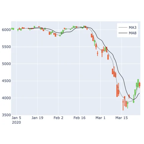
mplfinance is a set of matplotlib utilities for the visualization, and visual analysis, of financial data. Its official documentation is available on github.
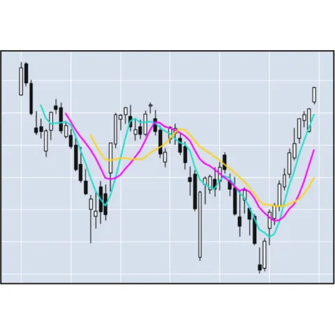
Building a candlestick chart with mplfinance is made easy thanks to its mpf.plot() function that has a type argument that can be set to candle.
Check the example below to understand how to build it from your dataset:
 Candlestick with
 Plotly
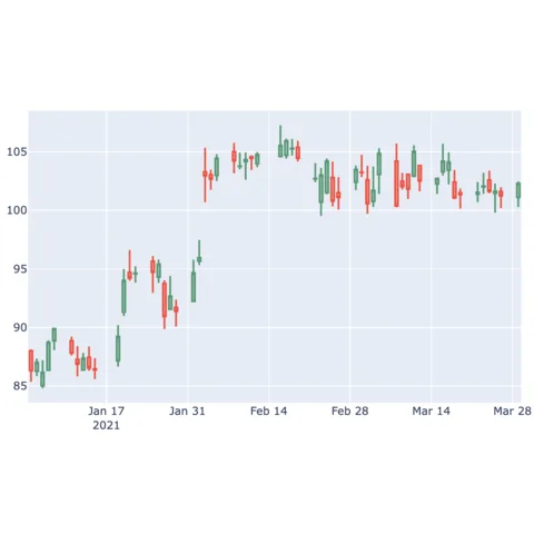
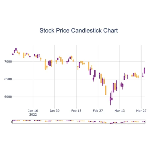
Plotly is a python library made to create interactive charts. It is particularly poweful when it comes to create interactive candlestick graphs.
On the clandlestick example below, you can zoom by selecting a specific area on the chart or using the minimap. On top of that, hovering a specific timestamp will give you all its price details.
See codeBuilding a candlestick chart with Plotly is made easy thanks to its go.Candlestick() function. It takes as input a fig object that can be customized with a layout object.
Check the example below to understand how to build it from your dataset:
Related chart types




💡 Out of dataviz inspiration?
I have spent years collecting the most beautiful data visualizations out there. Get the list of my top 300 dataviz projects, hand-picked, for free.
I respect your privacy. Unsubscribe anytime.