Line Chart

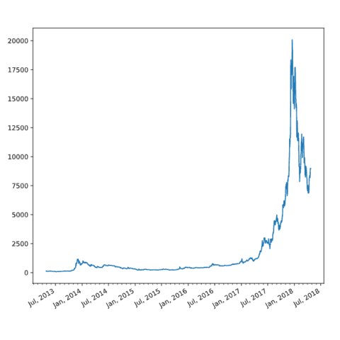
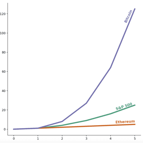
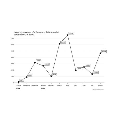
A line chart displays the evolution of one or several numeric variables. It is often used to represend time series.
The line chart is one of the most common chart type. As a result, all the most common python data visualization libraries like matplotlib, seaborn or plotly allow to build it.
This page displays many line chart examples made with those tools. It goes from basic line chart tutorials to highly customized, polished examples 🔥.
⏱ Quick start
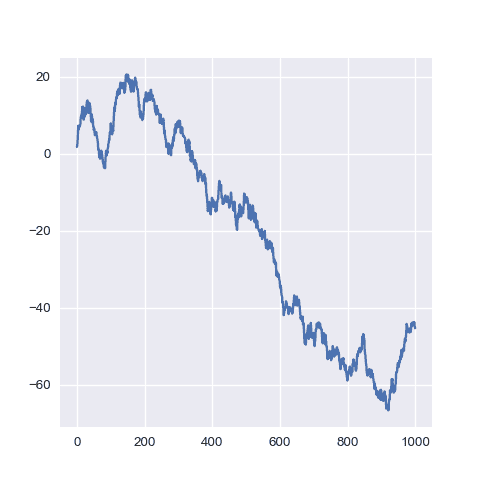
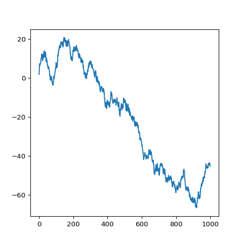
Making a simple line chart with matplotlib is pretty straightforward thanks to the plot() function.
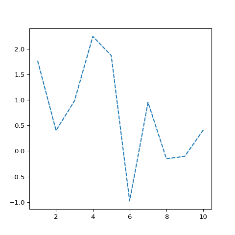
If you provide only a series of values, it will consider that these values are ordered and will use values from 1 to n to create the X axis.🔥
For more control on the chart, see the dedicated section below.
# libraries
import matplotlib.pyplot as plt
import numpy as np

# create data
values=np.cumsum(np.random.randn(1000,1))

# use the plot function
plt.plot(values)
 Line chart with
 Matplotlib
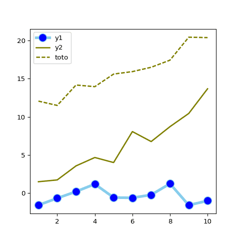
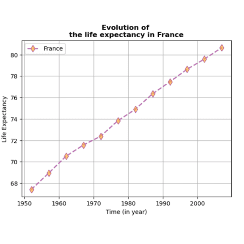
Matplotlib is a great fit to build line charts thanks to its plot() function.
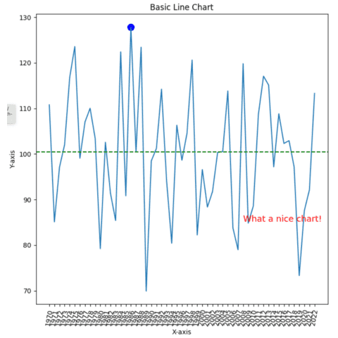
The first chart of this section explains how to use plot() from any kind of data input format. The next one goes deep into chart customization (line width, color aspect and more).
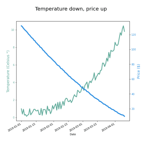
Another common need is to build a dual Y axis line chart, but be mindful of the caveats that go with it.
🔎 plot() function parameters→ see full doc
→ Description
The plot() function of matplotlib is a versatile plotting function that can create various types of plots, including line plots, scatter plots, and step plots. It's one of the most fundamental plotting functions in matplotlib.
→ Arguments
Description
Positions of the data points along the x-axis.
Possible values → array-like
The x and y arrays must have the same length and contain numerical values.
Code Example
import matplotlib.pyplot as plt
import numpy as np

x = np.linspace(0, 10, 100)
y = np.sin(x)

fig, ax = plt.subplots()
ax.plot(x=x, y=y)
plt.show() Line chart with several groups (
Matplotlib)
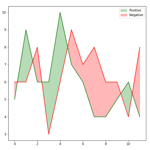
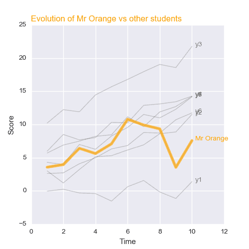
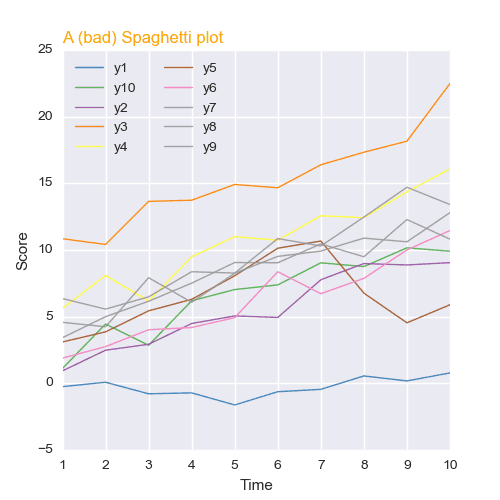
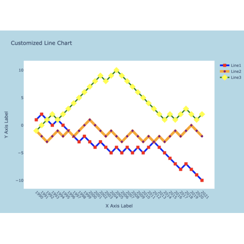
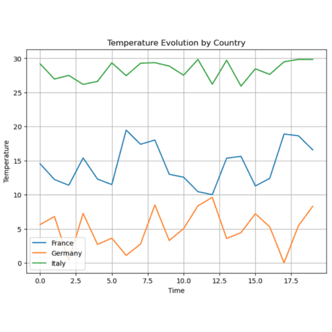
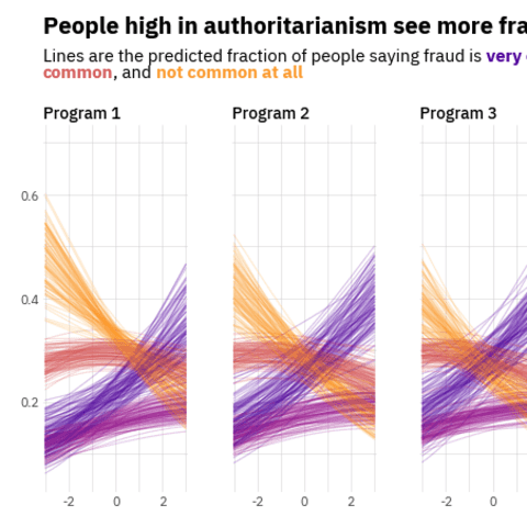
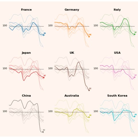
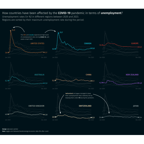
A line chart with multiple groups allows to show the evolution of several items on the same figure.
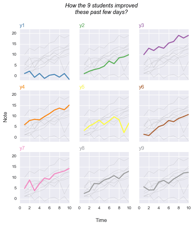
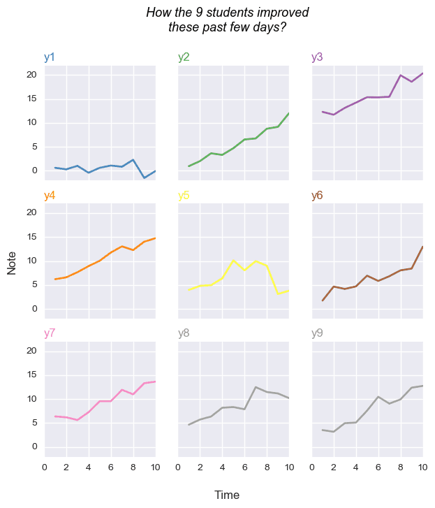
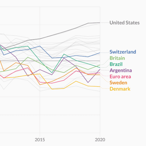
It is powerful but can quickly turn into a spaghetti chart: when too many lines are displayed they get cluttered and hard to read. Moreover, make sure to use inline labeling instead of a side legend that is very annoying to read.
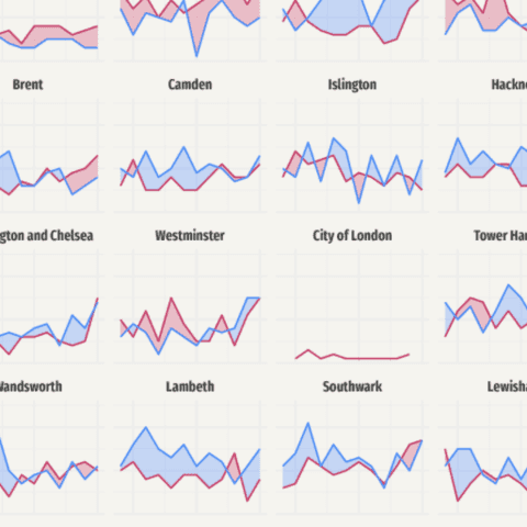
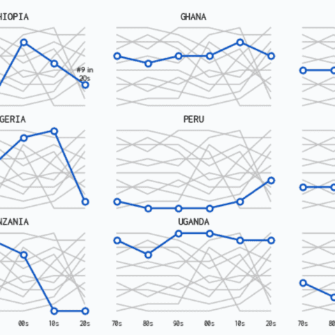
The examples below explain how to build a line chart with multiple groups, and what are the alternatives to show your data a better way.
 Line chart with Seaborn
Seaborn is another very good alternative when it comes to create line charts in Python. It comes with a powerful lineplot() function that does most of the work for us.
 Interactive line chart with plotly
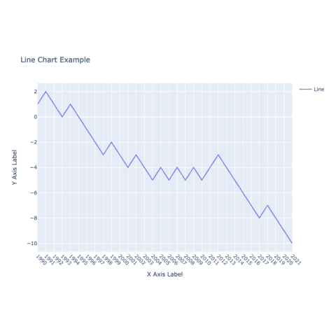
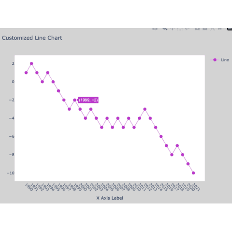
If you are looking for an interactive version of a line chart with Python, plotly is definitely the library you need.
Its API is very straightforward to understand, and the output allows to zoom on the chart and have tooltip for markers:
 Line chart with Pandas
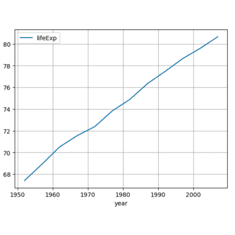
Pandas offers a simple and efficient way to create line charts directly from DataFrames, eliminating the need for complex data manipulation.
Its integration with Matplotliballows for extensive customization, making it a versatile choice for quick data visualization tasks.
 Best python line chart examples
The web is full of astonishing charts made by awesome bloggers, (often using R). The Python graph gallery tries to display (or translate from R) some of the best creations and explain how their source code works. If you want to display your work here, please drop me a word or even better, submit a Pull Request!
🚨 Grab the Data To Viz poster!
Do you know all the chart types? Do you know which one you should pick? I made a decision tree that answers those questions. You can download it for free!

