Libraries & Dataset
Let's get started by creating some fake data and load a few libraries:
import matplotlib.pyplot as plt
import pandas as pd

data = {
   'time':range(12),
   'income':[5, 9, 6, 6, 10, 7, 6, 4, 4, 5, 6, 4],
   'expenses':[6, 6, 8, 3, 6, 9, 7, 8, 6, 6, 4, 8]
}
df = pd.DataFrame(data)
df.head()| time | income | expenses | |
|---|---|---|---|
| 0 | 0 | 5 | 6 |
| 1 | 1 | 9 | 6 |
| 2 | 2 | 6 | 8 |
| 3 | 3 | 6 | 3 |
| 4 | 4 | 10 | 6 |
Plot
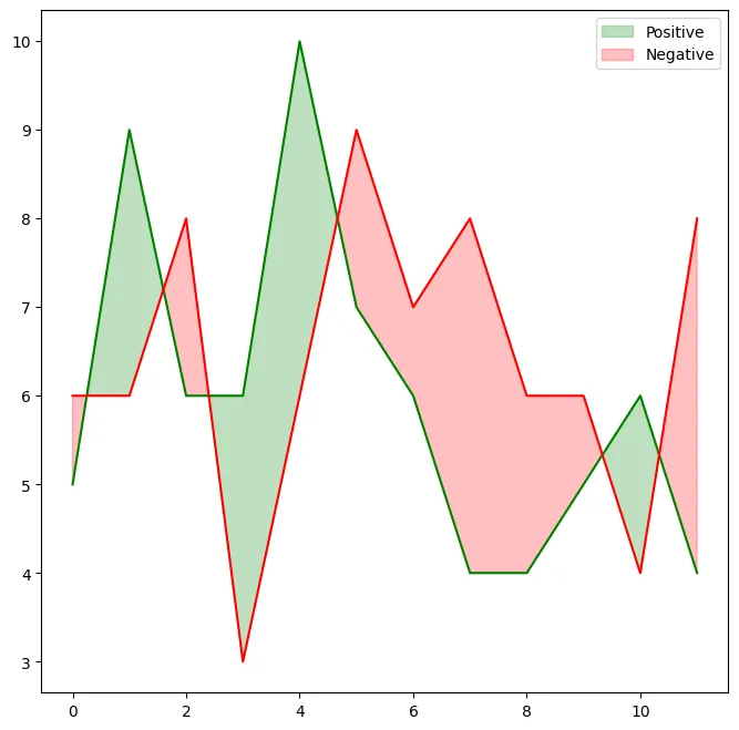
The code mainly relies on the fill_between(), that will fill the space given points.
# Initialize figure and axis
fig, ax = plt.subplots(figsize=(8, 8))

# Plot lines
ax.plot(df['time'], df['income'], color="green")
ax.plot(df['time'], df['expenses'], color="red")

# Fill area when income > expenses with green
ax.fill_between(
    df['time'], df['income'], df['expenses'], where=(df['income'] > df['expenses']),
    interpolate=True, color="green", alpha=0.25,
    label="Positive"
)

# Fill area when income <= df['expenses'] with red
ax.fill_between(
    df['time'], df['income'], df['expenses'], where=(df['income'] <= df['expenses']),
    interpolate=True, color="red", alpha=0.25,
    label="Negative"
)

ax.legend()
plt.show()Change interpolate value
Setting interpolate to True calculates the intersection point between the two lines and extends the filled region up to this point, which results in the better looking filled area.
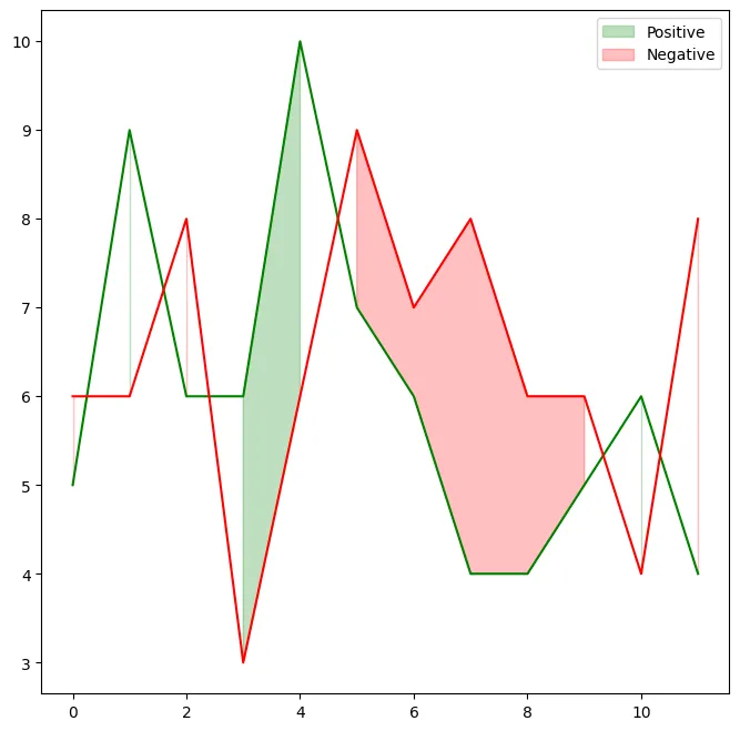
Let's see how it look when it's False:
# Initialize figure and axis
fig, ax = plt.subplots(figsize=(8, 8))

# Plot lines
ax.plot(df['time'], df['income'], color="green")
ax.plot(df['time'], df['expenses'], color="red")

# Fill area when income > expenses with green
ax.fill_between(
    df['time'], df['income'], df['expenses'], where=(df['income'] > df['expenses']),
    interpolate=False, color="green", alpha=0.25,
    label="Positive"
)

# Fill area when income <= df['expenses'] with red
ax.fill_between(
    df['time'], df['income'], df['expenses'], where=(df['income'] <= df['expenses']),
    interpolate=False, color="red", alpha=0.25,
    label="Negative"
)

ax.legend()
plt.show()Going further
You might be interested in:
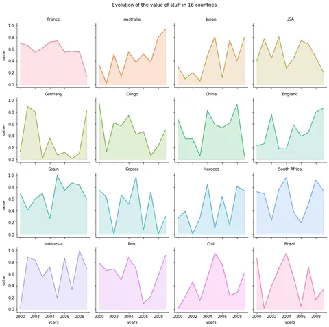
- area chart with small multiples
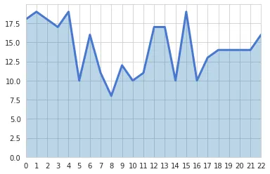
- real life usecase of an area chart