
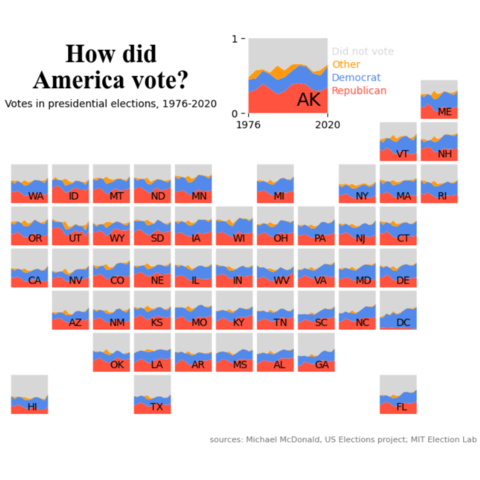
Chart we want to reproduce
As a teaser for this post, let's see what the final picture will look like:
Libraries
First, you need to install the following librairies:
- matplotlib is used for creating the chart and add customization features
pandasis used to put the data into a dataframe and data manipulation
And that's it!
# Libraries
import pandas as pd
import matplotlib.pyplot as plt
Dataset
For this reproduction, we're going to retrieve the data directly from the gallery's Github repo. This means we just need to give the right url as an argument to pandas' read_csv() function to retrieve the data.
data_url = 'https://raw.githubusercontent.com/holtzy/the-python-graph-gallery/master/static/data/america-vote.csv'
df = pd.read_csv(data_url)
Create the figure and axes
We'll start by creating the core of this chart: a 8 rows and 11 columns figure, with a total of 8x11=88 axes!
The complexity of this chart lies in the fact that we have to specify that some of these axes will not be used. The most intuitive way of doing this is to define a list of tuples, containing the positions of the axes we don't want to keep.
In our case, I set them to the respective positions in the code, although this has absolutely no impact on the output. It simply makes it easier to see which axes will actually be deleted. For example:
axis (0,0)designates the axis in the first row and first columnaxis (0,1)designates the axis in the first row and second columnaxis (2,5)designates the axis in the third row and fifth column, and so on.
Once we've done that, we'll make a nested loop (a loop within a loop) that will iterate over all our axes, testing whether they're in the list of axes to be deleted, and deleting them or not if necessary. Axes that are not deleted will still have a title added with their position for greater readability.
# Create a figure with 8x11 axes
nrows, ncols = 8, 11
fig, axs = plt.subplots(nrows=nrows, ncols=ncols,
                        figsize=(8, 6))

# define positions of rows that we want off
rows_to_remove = [(0,0), (0,1), (0,2), (0,3), (0,4), (0,5),        (0,7), (0,8), (0,9),
                  (1,0), (1,1), (1,2), (1,3), (1,4), (1,5), (1,6), (1,7), (1,8),
                                                     (2,5),        (2,7),
                                                                                        (3,10),
                                                                                        (4,10),
                  (5,0),                                                                (5,10),
                  (6,0), (6,1),                                           (6,8), (6,9), (6,10),
                         (7,1), (7,2),        (7,4), (7,5), (7,6), (7,7), (7,8),        (7,10)]

# Iteare over each ax
for row in range(nrows):
    for col in range(ncols):

        # test the presence of the current ax in the list defined above
        if (row, col) in rows_to_remove:
            axs[row, col].axis('off')

        # add a title and remove axis labels
        else:
            axs[row, col].set_title(f'({row}, {col})',
                                    fontsize=6)

            # Remove axis labels
            axs[row, col].set_xticks([])
            axs[row, col].set_yticks([])

# Display the plot
plt.show()
Add the first letters of each state
To add the country names corresponding to the correct axis, we:
- create a list of countries
- the order of the list must be constructed with the idea in mind that our code iterates over the first row, all the columns in that row, then the second row and so on.
- in the
elseof our code, we use theannotate()function on the axis on which we are iterating to add the letters of the state - we use the relative positions (
xy=(0.5, 0.1)) on each axis so that the letters are all positioned in the same place - define a
statevariable which will increase by 1 each time we come across an axis for which we want to add letters. This variable is used to retrieve the letters of the right state at each iteration.
# Create a figure with 8x11 axes
nrows, ncols = 8, 11
fig, axs = plt.subplots(nrows=nrows, ncols=ncols,
                        figsize=(8, 6))

# define positions of rows that we want off
rows_to_remove = [(0,0), (0,1), (0,2), (0,3), (0,4), (0,5),        (0,7), (0,8), (0,9),
                  (1,0), (1,1), (1,2), (1,3), (1,4), (1,5), (1,6), (1,7), (1,8),
                                                     (2,5),        (2,7),
                                                                                        (3,10),
                                                                                        (4,10),
                  (5,0),                                                                (5,10),
                  (6,0), (6,1),                                           (6,8), (6,9), (6,10),
                         (7,1), (7,2),        (7,4), (7,5), (7,6), (7,7), (7,8),        (7,10)]

# define first letters of each state
letters_state = ['AK', 'ME', 'VT', 'NH', 'WA', 'ID', 'MT', 'ND', 'MN', 'MI', 'NY',
                 'MA', 'RI', 'OR', 'UT', 'WY', 'SD', 'IA', 'WI', 'OH', 'PA',
                 'NJ', 'CT', 'CA', 'NV', 'CO', 'NE', 'IL', 'IN', 'WV', 'VA',
                 'MD', 'DE', 'AZ', 'NM', 'KS', 'MO', 'KY', 'TN', 'SC', 'NC',
                 'DC', 'OK', 'LA', 'AR', 'MS', 'AL', 'GA', 'HI', 'TX', 'FL']

# Iteare over each ax
state = 0
for row in range(nrows):
    for col in range(ncols):

        # test the presence of the current ax in the list defined above
        if (row, col) in rows_to_remove:
            axs[row, col].axis('off')

        # all axes we want to keep
        else:

            # Remove axis labels
            axs[row, col].set_xticks([])
            axs[row, col].set_yticks([])

            # add state's letters
            letters = letters_state[state]
            axs[row, col].annotate(letters, xy=(0.5, 0.1),
                                   xycoords='axes fraction')
            state += 1


# Display the plot
plt.show()
Stacked line chart
Adding all the stacked line charts in each axe:
- We filter data in a DataFrame
dfwhere thestatecolumn matches thelettersin order to only get data about the right state - We pivots the filtered data into a new DataFrame called
state_data. This means we rearrange the data so thatyearbecomes the index,'party'becomes the columns (each distinct label in party becomes a new column), andpctvalues are placed in the corresponding cells. If a combination of 'year' and 'party' is missing, we fill the cell with 0 - We reset the index of
state_data, effectively making 'year' a regular column again - We creates a stacked line chart: the chart is stacked, which means that each line represents a party (
republican,democrat,other,did not vote) and the lines are stacked on top of each other for each year
# colors for the charts
colors = ['tomato', 'cornflowerblue', 'orange', 'gainsboro']

# Create a figure with 8x11 axes
nrows, ncols = 8, 11
fig, axs = plt.subplots(nrows=nrows, ncols=ncols,
                        figsize=(8, 6))

# define positions of rows that we want off
rows_to_remove = [(0,0), (0,1), (0,2), (0,3), (0,4), (0,5),        (0,7), (0,8), (0,9),
                  (1,0), (1,1), (1,2), (1,3), (1,4), (1,5), (1,6), (1,7), (1,8),
                                                     (2,5),        (2,7),
                                                                                        (3,10),
                                                                                        (4,10),
                  (5,0),                                                                (5,10),
                  (6,0), (6,1),                                           (6,8), (6,9), (6,10),
                         (7,1), (7,2),        (7,4), (7,5), (7,6), (7,7), (7,8),        (7,10)]

# define first letters of each state
letters_state = ['AK', 'ME', 'VT', 'NH', 'WA', 'ID', 'MT', 'ND', 'MN', 'MI', 'NY',
                 'MA', 'RI', 'OR', 'UT', 'WY', 'SD', 'IA', 'WI', 'OH', 'PA',
                 'NJ', 'CT', 'CA', 'NV', 'CO', 'NE', 'IL', 'IN', 'WV', 'VA',
                 'MD', 'DE', 'AZ', 'NM', 'KS', 'MO', 'KY', 'TN', 'SC', 'NC',
                 'DC', 'OK', 'LA', 'AR', 'MS', 'AL', 'GA', 'HI', 'TX', 'FL']

# Iteare over each ax
state = 0
for row in range(nrows):
    for col in range(ncols):

        # test the presence of the current ax in the list defined above
        if (row, col) in rows_to_remove:
            axs[row, col].axis('off')

        # all axes we want to keep
        else:

            # Remove axis labels
            axs[row, col].set_xticks([])
            axs[row, col].set_yticks([])

            # add state's letters
            letters = letters_state[state]
            axs[row, col].annotate(letters, xy=(0.5, 0.1),
                                   xycoords='axes fraction')
            state += 1

            # filter on state data
            state_data = df[df['state']==letters]

            #pivot data
            state_data = state_data.pivot_table(index='year', columns='party',
                                                values='pct', aggfunc='first',
                                                fill_value=0)
            state_data.reset_index(inplace=True)

            # create the stacked line chart
            axs[row, col].stackplot(state_data['year'], state_data['republican'],
                                    state_data['democrat'], state_data['other'],
                                    state_data['did not vote'], colors=colors)


# Display the plot
plt.show()
Final chart
All that's missing is a few annotations and changing the size of one chart, but the hard part's over!
Thanks to the text() function, you can easily add annotations of different sizes and styles. For example, in fig.text(0.3, 0.90, 'some text', ...):
- the first argument specifies that the text must be at 30% to the right and the second at 90% upwards
- we center the text using the
haandvaarguments - we change the text size using the
fontsizeargument - we use a dictionnary of properties
font_paramsfor the title that defines the font and other properties to use
To change the size of the 'AK' graph, we perform a special case in our loop at position (0,6) to apply the set_position() function. It specifies the new position and dimensions of the graph in question.
We also take the opportunity to apply a different text size for the letters 'AK' for this chart.
# colors for the charts
colors = ['tomato', 'cornflowerblue', 'orange', 'gainsboro']

# Create a figure with 8x11 axes
nrows, ncols = 8, 11
fig, axs = plt.subplots(nrows=nrows, ncols=ncols,
                        figsize=(8, 6))
fig.subplots_adjust(wspace=0.01, hspace=0.03)

# define positions of rows that we want off
rows_to_remove = [(0,0), (0,1), (0,2), (0,3), (0,4), (0,5),        (0,7), (0,8), (0,9),
                  (1,0), (1,1), (1,2), (1,3), (1,4), (1,5), (1,6), (1,7), (1,8),
                                                     (2,5),        (2,7),
                                                                                        (3,10),
                                                                                        (4,10),
                  (5,0),                                                                (5,10),
                  (6,0), (6,1),                                           (6,8), (6,9), (6,10),
                         (7,1), (7,2),        (7,4), (7,5), (7,6), (7,7), (7,8),        (7,10)]

# define first letters of each state
letters_state = ['AK', 'ME', 'VT', 'NH', 'WA', 'ID', 'MT', 'ND', 'MN', 'MI', 'NY',
                 'MA', 'RI', 'OR', 'UT', 'WY', 'SD', 'IA', 'WI', 'OH', 'PA',
                 'NJ', 'CT', 'CA', 'NV', 'CO', 'NE', 'IL', 'IN', 'WV', 'VA',
                 'MD', 'DE', 'AZ', 'NM', 'KS', 'MO', 'KY', 'TN', 'SC', 'NC',
                 'DC', 'OK', 'LA', 'AR', 'MS', 'AL', 'GA', 'HI', 'TX', 'FL']

# Iteare over each ax
state = 0
for row in range(nrows):
    for col in range(ncols):

        # test the presence of the current ax in the list defined above
        if (row, col) in rows_to_remove:
            axs[row, col].axis('off')

        # all axes we want to keep
        else:

            # Remove axis labels
            axs[row, col].set_xticks([])
            axs[row, col].set_yticks([])

            # add state's letters
            letters = letters_state[state]

            # special case for the bigger chart of AK
            if (row, col) == (0, 6):
                axs[row, col].set_position([0.53, 0.8, 0.15, 0.18])
                axs[row, col].annotate(letters, xy=(0.6, 0.1),
                                   xycoords='axes fraction', fontsize=18)
                # Add axis labels
                axs[row, col].set_xticks([1976, 2020])
                axs[row, col].set_yticks([0, 1])
            else:
                axs[row, col].annotate(letters, xy=(0.45, 0.1),
                                   xycoords='axes fraction')

            state += 1

            # filter on state data
            state_data = df[df['state']==letters]

            #pivot data
            state_data = state_data.pivot_table(index='year', columns='party',
                                                values='pct', aggfunc='first',
                                                fill_value=0)
            state_data.reset_index(inplace=True)

            # create the stacked line chart
            axs[row, col].stackplot(state_data['year'], state_data['republican'],
                                    state_data['democrat'], state_data['other'],
                                    state_data['did not vote'], colors=colors)

            # remove spines around axe
            axs[row, col].spines[['right', 'top', 'left', 'bottom']].set_visible(False)


# Source, title and subtitle
title = 'How did\nAmerica vote?'
font_params = {'fontfamily': 'serif',
               'fontname': 'Times New Roman',
               'fontsize': 25, 'weight': 'bold'}
fig.text(0.3, 0.90, title,
         ha='center', va='center',
         **font_params)
fig.text(0.3, 0.82, 'Votes in presidential elections, 1976-2020',
         ha='center', va='center',
         fontsize=10)
fig.text(0.7, 0.05, 'sources: Michael McDonald, US Elections project; MIT Election Lab',
         ha='center', va='center',
         fontsize=8, color='grey')

# Legend in the 'AK'
fig.text(0.68, 0.94, 'Did not vote',
         va='center',
         fontsize=10, color='gainsboro')
fig.text(0.68, 0.91, 'Other',
         va='center',
         fontsize=10, color='orange')
fig.text(0.68, 0.88, 'Democrat',
         va='center',
         fontsize=10, color='cornflowerblue')
fig.text(0.68, 0.85, 'Republican',
         va='center',
         fontsize=10, color='tomato')

# Display the plot
plt.show()
Going further
This article explains how to reproduce a geographical map with stacked line chart with annotations, custom style and nice features.
For more examples of advanced customization in line charts, check out this amazing stacked line chart. Also, you might be interested in a line chart with labels at end of each line.