
About cartograms
To give you a visual idea, here is the cartogram we will step-by-step create in this post:
Libraries & Data
For creating this chart, we will need to load the following libraries:
- matplotlib for plotting the chart
geopandasandgeoplot: for spatial data plotting- pandas for loading the data
- pypalettes: for the color palette
- highlight_text for the annotations
# matplotlib tools
import matplotlib.pyplot as plt
from matplotlib.font_manager import FontProperties

# map libraries
import geopandas as gpd
import geoplot as gplt
import geoplot.crs as gcrs

# colors
from pypalettes import load_cmap

# annotations
from highlight_text import fig_text, ax_text

# data manipulation
import pandas as pd

# increase resolution
plt.rcParams['figure.dpi'] = 300
plt.rcParams['savefig.dpi'] = 300
Dataset
Let's start by loading shape data:
world = gpd.read_file('https://raw.githubusercontent.com/holtzy/The-Python-Graph-Gallery/master/static/data/all_world.geojson')
world.head()| name | geometry | |
|---|---|---|
| 0 | Fiji | MULTIPOLYGON (((180.00000 -16.06713, 180.00000... |
| 1 | Tanzania | POLYGON ((33.90371 -0.95000, 34.07262 -1.05982... |
| 2 | W. Sahara | POLYGON ((-8.66559 27.65643, -8.66512 27.58948... |
| 3 | Canada | MULTIPOLYGON (((-122.84000 49.00000, -122.9742... |
| 4 | United States of America | MULTIPOLYGON (((-122.84000 49.00000, -120.0000... |
Then we load data about the Asian population and surfaces
# get asian population dataset
url = 'https://raw.githubusercontent.com/holtzy/The-Python-Graph-Gallery/master/static/data/asia.csv'
asia = pd.read_csv(url)
asia.head()| Country | Total Population | Surface Area (sq. km) | |
|---|---|---|---|
| 0 | Russia | 1.444444e+08 | 17098250.0 |
| 1 | China | 1.425671e+09 | 9600013.0 |
| 2 | India | 1.428628e+09 | 3287259.0 |
| 3 | Kazakhstan | 1.960663e+07 | 2724902.0 |
| 4 | Saudi Arabia | 3.694702e+07 | 2149690.0 |
Once we have our 2 datasets, we can merge them and create pop_norm_surface column as a measure of population density:
# merge the datasets together
data = world.merge(asia, how='right', left_on='name', right_on='Country')

# filter the data
data = data[['Country', 'geometry', 'Total Population', 'Surface Area (sq. km)']]
data = data[~data['Country'].isin(['Russia', 'Bangladesh', 'Lebanon'])]
data.dropna(inplace=True)
data['pop_norm_surface'] = data['Total Population'] / data['Surface Area (sq. km)']

# display first rows
data.columns = ['Country', 'geometry', 'pop', 'surfaces', 'pop_norm_surface']
data.head()| Country | geometry | pop | surfaces | pop_norm_surface | |
|---|---|---|---|---|---|
| 1 | China | MULTIPOLYGON (((109.47521 18.19770, 108.65521 ... | 1.425671e+09 | 9600013.0 | 148.507231 |
| 2 | India | POLYGON ((97.32711 28.26158, 97.40256 27.88254... | 1.428628e+09 | 3287259.0 | 434.595407 |
| 3 | Kazakhstan | POLYGON ((87.35997 49.21498, 86.59878 48.54918... | 1.960663e+07 | 2724902.0 | 7.195354 |
| 4 | Saudi Arabia | POLYGON ((34.95604 29.35655, 36.06894 29.19749... | 3.694702e+07 | 2149690.0 | 17.187141 |
| 5 | Indonesia | MULTIPOLYGON (((141.00021 -2.60015, 141.01706 ... | 2.775341e+08 | 1916862.0 | 144.785656 |
Simple map of Asia
Let's start by a creating a simple version of our chart:
- create a figure and axe using the
figure()andadd_subplot()functions - create the cartogram with the
cartogram()function from geoplot. We specify that we want the size and the color of each country to be mapped with thepop_norm_surfacecolumn of our dataset (aka density population) - create the background map with the
popyplot()function from geoplot
And that's it!
fig = plt.figure(figsize=(12, 7))
ax = fig.add_subplot(111, projection=gcrs.PlateCarree())

gplt.cartogram(
   data, projection=gcrs.PlateCarree(),
   scale='pop_norm_surface', hue='pop_norm_surface', limits=(0,1),
   ax=ax
)
gplt.polyplot(data, ax=ax)
plt.show()
Custom colors
Now we can add a bit of customization:
- load a color map using pypalettes
- use the
set_facecolor()function to change the background color of the graph - change the color of the background map
- reduce the
linewidthargument from 1 to 0.1
# colors
cmap = load_cmap("Antennarius_multiocellatus", cmap_type='continuous', reverse=True)
background_color = '#edf2f4'
text_color = '#14213d'
map_color = 'white'

fig = plt.figure(figsize=(12, 7))
ax = fig.add_subplot(111, projection=gcrs.PlateCarree())
fig.set_facecolor(background_color)
ax.set_facecolor(background_color)

gplt.cartogram(
   data, projection=gcrs.PlateCarree(), cmap=cmap,
   scale='pop_norm_surface', hue='pop_norm_surface', limits=(0,1),
   ax=ax
)
gplt.polyplot(data, facecolor=map_color, edgecolor='black', linewidth=0.1, ax=ax)
plt.show()
Title, subtitle and source
Now we need to add a bit of explanation about the chart:
- we load custom fonts. Learn more about it this post
- we use the
fig_text()function from highlight_text to add the title, subtitle and source
# load the fonts
personal_path = '/Users/josephbarbier/Library/Fonts/' # change this to your own path
other_font = FontProperties(fname=personal_path + 'FiraSans-Light.ttf')
other_bold_font = FontProperties(fname=personal_path + 'FiraSans-Medium.ttf')
# colors
cmap = load_cmap("Antennarius_multiocellatus", cmap_type='continuous', reverse=True)
background_color = '#edf2f4'
text_color = '#14213d'
map_color = 'white'
# initiate figure and axes
fig = plt.figure(figsize=(12, 7))
ax = fig.add_subplot(111, projection=gcrs.PlateCarree())
fig.set_facecolor(background_color)
ax.set_facecolor(background_color)
# create the cartogram and background map
gplt.cartogram(
data, projection=gcrs.PlateCarree(), cmap=cmap,
scale='pop_norm_surface', hue='pop_norm_surface', limits=(0,1),
ax=ax
)
gplt.polyplot(data, facecolor=map_color, edgecolor='black', linewidth=0.12, ax=ax)
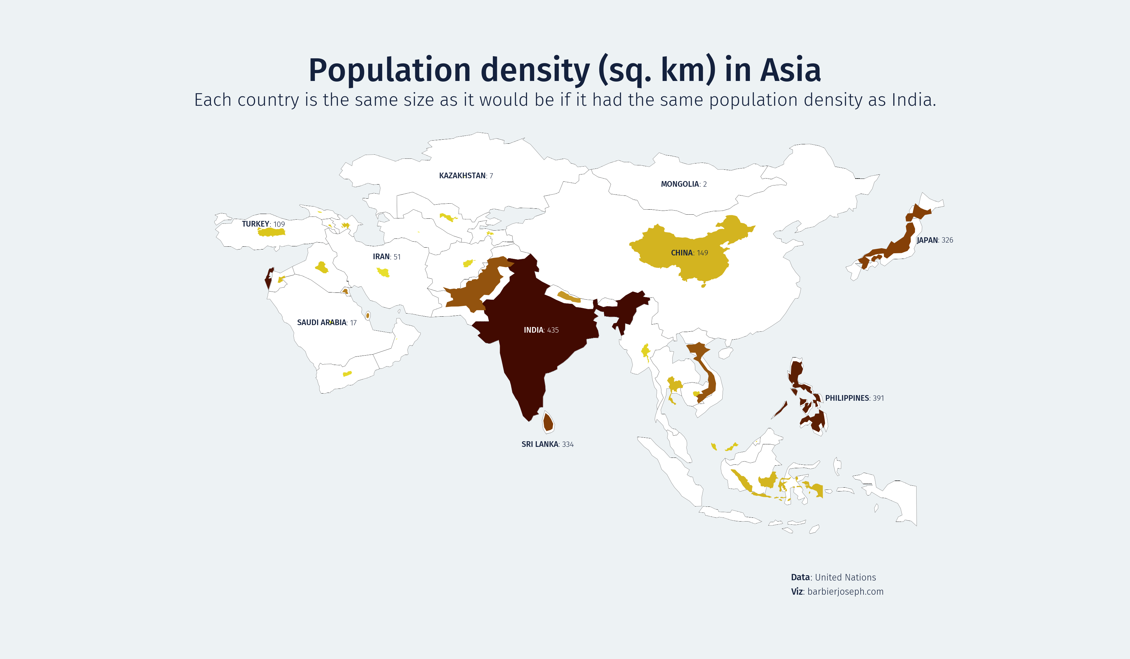
fig_text( # title
x=0.5, y=0.92, s="Population density (sq. km) in Asia",
fontsize=25, ha='center', font=other_bold_font, color=text_color
)
fig_text( # subtitle
x=0.5, y=0.86, s="Each country is the same size as it would be if it had the same population density as India.",
fontsize=14, ha='center', font=other_font, color=text_color
)
fig_text( # credit and source
x=0.7, y=0.13, s="<Data>: United Nations\n<Viz>: barbierjoseph.com",
font=other_font, fontsize=7, color=text_color,
highlight_textprops=[{'font': other_bold_font}, {'font': other_bold_font}]
)
plt.show()
Annotations of countries
data_projected = data.to_crs(epsg=4326): This line is converting the geospatial data to a common coordinate system (WGS84, used by GPS) for easier manipulation.data_projected['centroid'] = data_projected.geometry.centroid: This line is calculating the centroid (geometric center) of each geometry in the data and storing it in a new column 'centroid'.data['centroid'] = data_projected['centroid'].to_crs(data.crs): This line is converting the centroids back to the original coordinate system of the data.- The
countrieslist contains the names of countries to be annotated. - The for loop iterates over each country in the
countrieslist. For each country, it finds the centroid, adjusts its position if necessary, retrieves a value associated with the country, and then adds a text annotation at the adjusted centroid position on a map (not shown in the code).
# adjustement mapping for label positions
adjustments = {
   'Japan': (6, 0),
   'Philippines': (8, 0),
   'Sri Lanka': (0, -3.5),
   'Turkey': (-1, 1.2),
   'China': (0, -1),
   'Iran': (0, 2.4)
}

# load the fonts
personal_path = '/Users/josephbarbier/Library/Fonts/' # change this to your own path
other_font = FontProperties(fname=personal_path + 'FiraSans-Light.ttf')
other_bold_font = FontProperties(fname=personal_path + 'FiraSans-Medium.ttf')

# colors
cmap = load_cmap("Antennarius_multiocellatus", cmap_type='continuous', reverse=True)
background_color = '#edf2f4'
text_color = '#14213d'
map_color = 'white'

# create a figure object
fig = plt.figure(figsize=(12, 7))
ax = fig.add_subplot(111, projection=gcrs.PlateCarree())
fig.set_facecolor(background_color)
ax.set_facecolor(background_color)

# Generate the cartogram
gplt.cartogram(
   data, projection=gcrs.PlateCarree(), cmap=cmap,
   scale='pop_norm_surface', hue='pop_norm_surface', limits=(0,1),
   ax=ax
)
gplt.polyplot(data, facecolor=map_color, edgecolor='black', linewidth=0.1, ax=ax)

# get the centroids
import warnings ; warnings.filterwarnings("ignore") # mask warning about geometry attribute
data_projected = data.to_crs(epsg=4326)
data_projected['centroid'] = data_projected.geometry.centroid
data['centroid'] = data_projected['centroid'].to_crs(data.crs)
countries = ['China', 'India', 'Japan', 'Mongolia', 'Kazakhstan', 'Turkey', 'Philippines', 'Sri Lanka', 'Saudi Arabia', 'Iran']

# annotate each country
for country in countries:
   centroid = data.loc[data['Country'] == country, 'centroid'].values[0]
   x, y = centroid.coords[0]
   x, y = (x + adjustments[country][0], y + adjustments[country][1]) if country in adjustments else (x, y)
   value = data.loc[data['Country'] == country, 'pop_norm_surface'].values[0]
   color = 'white' if country=='India' else text_color
   ax_text(
      x=x, y=y, s=f"<{country.upper()}>: {value:.0f}", fontsize=6, font=other_font, color=color,
      ha='center', va='center', ax=ax, highlight_textprops=[{'font': other_bold_font}]
   )

fig_text( # title
   x=0.5, y=0.92, s="Population density (sq. km) in Asia",
   fontsize=25, ha='center', font=other_bold_font, color=text_color
)
fig_text( # subtitle
   x=0.5, y=0.86, s="Each country is the same size as it would be if it had the same population density as India.",
   fontsize=14, ha='center', font=other_font, color=text_color
)
fig_text( # credit and source
   x=0.7, y=0.13, s="<Data>: United Nations\n<Viz>: barbierjoseph.com",
   font=other_font, fontsize=7, color=text_color,
   highlight_textprops=[{'font': other_bold_font}, {'font': other_bold_font}]
)

# save and show the plot
plt.savefig('../../static/graph/592-non-contiguous-cartogram-in-python.png', dpi=300)
plt.show()
Going further
You might be interested in:
- multiple choropleth maps on the same figure
- how to create a tile map with matplotlib
- the cartogram section