Bubble plot

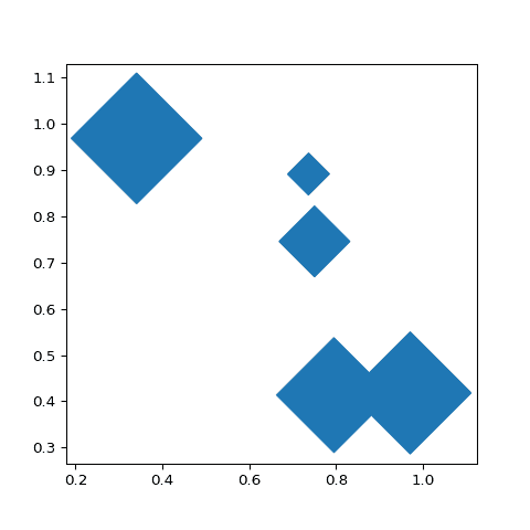
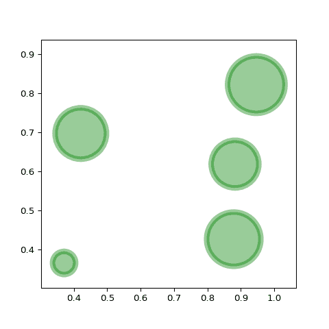
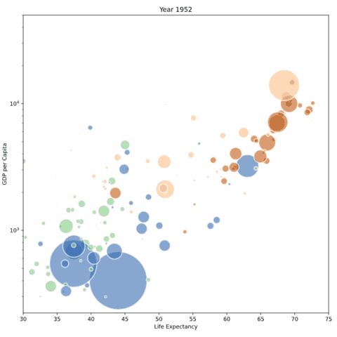
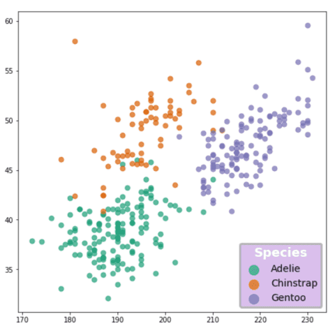
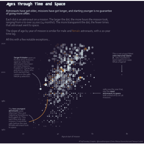
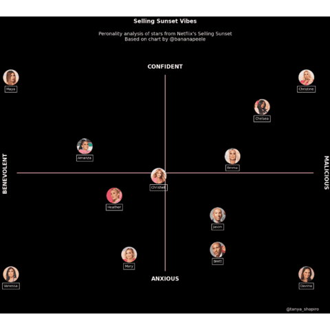
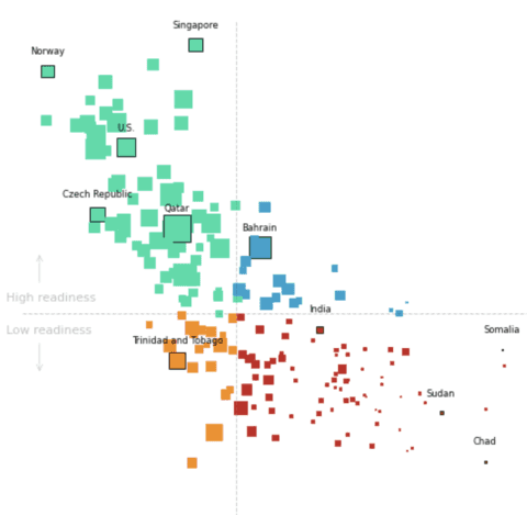
A bubble plot is a scatterplot where the circle size is mapped to the value of a third numeric variable. This section shows many bubble plots made with Python, using both the Matplotlib and Seaborn libraries.
⏱ Quick start
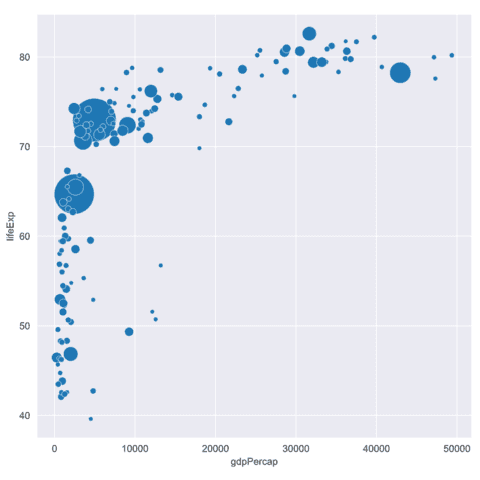
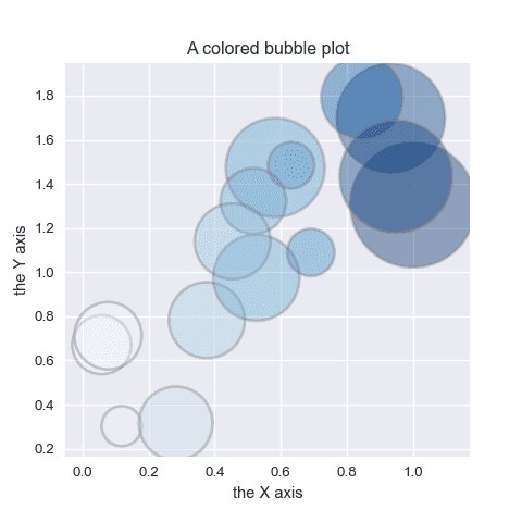
The scatterplot() function of seaborn also allows to build bubble charts. Indeed, it has a size parameter that controls circle size according to a numeric variable of the dataset.🔥
# libraries
import matplotlib.pyplot as plt
import seaborn as sns
from gapminder import gapminder # data set

# data
data = gapminder.loc[gapminder.year == 2007]

# use the scatterplot function to build the bubble map
sns.scatterplot(data=data, x="gdpPercap", y="lifeExp", size="pop", legend=False, sizes=(20, 2000))

# show the graph
plt.show()
 Bubble plot with
 Seaborn
Seaborn is the best tool to quickly build a quality bubble chart. The example below are based on the famous gapminder dataset that shows the relationship between gdp per capita, life expectancy and population of world countries.
The examples below start simple by calling the scatterplot() function with the minimum set of parameters. It then show how to change bubble colors to represent a fourth variable, improve general styling, tweak the legend and more.
🔎 scatterplot() function parameters→ see full doc
→ Description
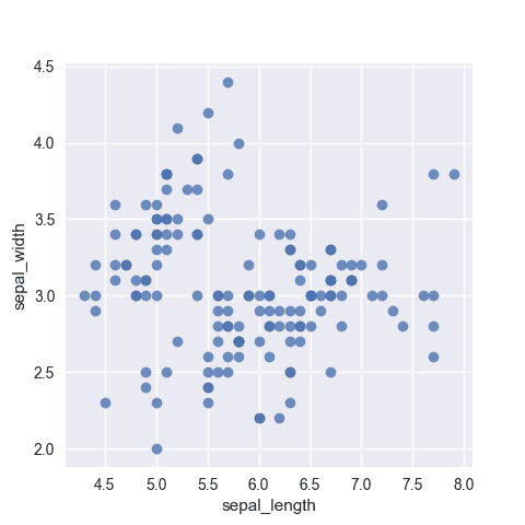
The scatterplot() function of seaborn creates a scatter plot to visualize the relationship between two continuous variables. It displays each observation as a point on a two-dimensional plane.
→ Arguments
Description
Dataframe-like (pandas, numpy, polars...) with the columns we want to plot.
Possible values → dataframe
It just has to be a pandas.DataFrame (columns are variables),numpy.ndarray (rows/columns are variables), or any mapping/sequence (dictionaries/lists)
Supports both long-form (each variable in its own column) and wide-form (variables in separate columns; reshaped internally).
Code Example
# Library & Dataset
import seaborn as sns
df = sns.load_dataset('iris')

# Plot
sns.scatterplot(
  data=df,
  x='sepal_length',
  y='sepal_width'
)
plt.show() Bubble plot with
 Matplotlib
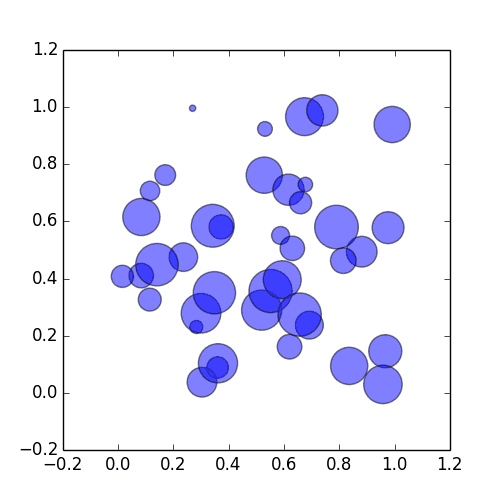
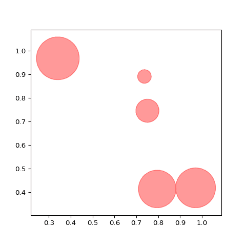
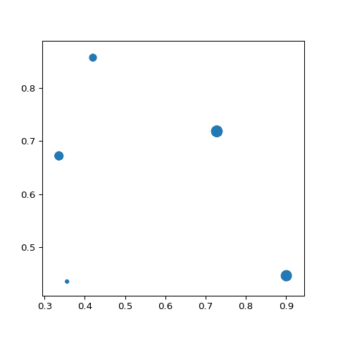
As for scatterplots, Matplotlib will help us build a bubble plot thanks to the the plt.scatter() function. This function provides a s parameter allowing to pass a third variable that will be mapped to the markers size.
Note that it is a common practice to map a fourth variable to the markers colors thanks to the c parameter. This way, you're now looking a 4 variables in the same time, on the same chart 🎉.
A very common task when it comes to bubble chart is to add a proper legend to explain what colors and sizes mean. The blogpost below is a deep-dive into matplotlib legend and should be of great help for this
 Best python bubble chart examples
The web is full of astonishing charts made by awesome bloggers, (often using R). The Python graph gallery tries to display (or translate from R) some of the best creations and explain how their source code works. If you want to display your work here, please drop me a word or even better, submit a Pull Request!
🚨 Grab the Data To Viz poster!
Do you know all the chart types? Do you know which one you should pick? I made a decision tree that answers those questions. You can download it for free!

