Libraries & Dataset
Let's start by load a few libraries and the dataset.
- matplotlib: for displaying the plot
- pandas: for data manipulation
- seaborn: for the
sns.scatterplot()function
import matplotlib.pyplot as plt
import seaborn as sns
import pandas as pd

gapminder = pd.read_csv(
    'https://raw.githubusercontent.com/holtzy/The-Python-Graph-Gallery/master/static/data/gapminderData.csv'
)
data = gapminder.loc[gapminder.year == 2007]Most Basic Bubble Chart
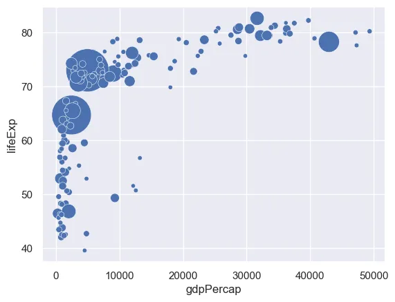
A bubble plot is basically a scatterplot with an additional dimension: size of points. Using seaborn library, a bubble plot can be constructed using the scatterplot() function. In the example, the following parameters are used to build a basic bubble plot:
data: Input data structurex: The data position on the x axisy: The data position on the y axissize: Grouping variable that will produce points with different sizesalpha: Transparancy ratio
Here, the gapminder data set is used and the relationship between life expectancy (y) and gdp per capita (x) of world countries is represented. The population of each country is represented through dot size.
sns.set_theme(style="darkgrid")

# use the scatterplot function to build the bubble map
sns.scatterplot(
    data=data,
    x="gdpPercap",
    y="lifeExp",
    size="pop",
    legend=False,
    sizes=(20, 2000)
)

# show the graph
plt.show()Control Bubble Size
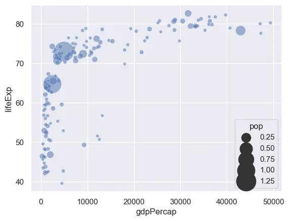
You can control the size of bubbles using the sizes argument. You should pass the minimum and maximum size to use such that other values are normalized within this range.
sns.set_theme(style="darkgrid")

# use the scatterplot function
min, max = 20, 800
sns.scatterplot(
    data=data,
    x="gdpPercap",
    y="lifeExp",
    size="pop",
    alpha=0.5,
    sizes=(min, max),
)

# show the graph
plt.show()Bubble color
We added a third dimension to our scatterplot with the sizes of bubbles. Now, we will add a forth dimension by mapping colors to variables. Here, the continent of each country is used to control bubble color and passed to the function with the hue argument.
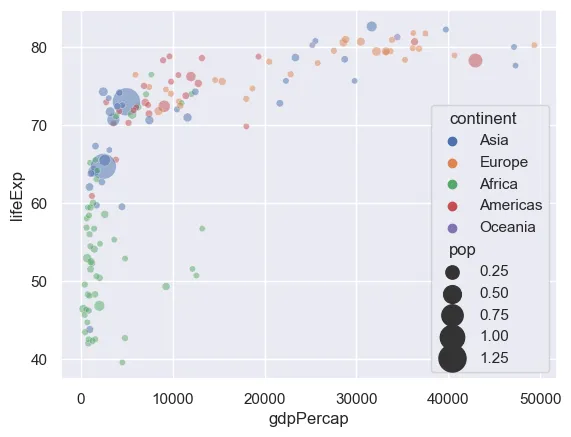
sns.set_theme(style="darkgrid")

# use the scatterplot function
sns.scatterplot(
    data=data,
    x="gdpPercap",
    y="lifeExp",
    size="pop",
    hue="continent",
    alpha=0.5,
    sizes=(20, 400)
)

# show the graph
plt.show()Going further
This post explains how to build and customize a bubble plot using the seaborn library.
You might be interested in this excellent real life use case of a bubble plot and how to use more advanced customizations of a bubble plot.