
📍 Libraries & Dataset
This example is based on the famous gapminder dataset. It provides the average life expectancy, gdp per capita and population size for more than 100 countries. It is available online here and I've stored a copy on the gallery github repo
Let's load it in python and have a look to the 3 first rows.
import matplotlib.pyplot as plt
from matplotlib.animation import FuncAnimation
import pandas as pd
import numpy as np

data = pd.read_csv('https://raw.githubusercontent.com/holtzy/The-Python-Graph-Gallery/master/static/data/gapminderData.csv')
data['continent'] = pd.Categorical(data['continent'])
data.head()| country | year | pop | continent | lifeExp | gdpPercap | |
|---|---|---|---|---|---|---|
| 0 | Afghanistan | 1952 | 8425333.0 | Asia | 28.801 | 779.445314 |
| 1 | Afghanistan | 1957 | 9240934.0 | Asia | 30.332 | 820.853030 |
| 2 | Afghanistan | 1962 | 10267083.0 | Asia | 31.997 | 853.100710 |
| 3 | Afghanistan | 1967 | 11537966.0 | Asia | 34.020 | 836.197138 |
| 4 | Afghanistan | 1972 | 13079460.0 | Asia | 36.088 | 739.981106 |
💭 Bubble chart
Let's build a bubble chart for the first year of the dataset (1952). If you're interested in how to make bubble charts with python, the gallery has a dedicated section for it.
Let's build one using the scatter() function of matplotlib:
fig, ax = plt.subplots(figsize=(10, 10))

# Subset of the data for year 1952
data1952 = data[data.year == 1952]

# Scatterplot
ax.scatter(
    x = data1952['lifeExp'],
    y = data1952['gdpPercap'],
    s = data1952['pop']/50000,
    c = data1952['continent'].cat.codes,
    cmap = "Accent",
    alpha = 0.6,
    edgecolors = "white",
    linewidth = 2
)

# Add titles (main and on axis)
plt.yscale('log')
ax.set_xlabel("Life Expectancy")
ax.set_ylabel("GDP per Capita")
ax.set_title("Year 1952")
ax.set_ylim(100,50000)
ax.set_xlim(30, 75)

plt.show()
🎥 Animation
An animation is basically a set of static images visualized one after the other.
Fortunately, matplotlib has a built-in function to create animations: FuncAnimation. It requires a figure and a function to update the figure at each iteration.
The core of the animation is made via the update() function that will be called at each iteration. It will update the position of the bubbles according to the year of the dataset. What we have to do is to subset our dataset for each year, and update the position of the bubbles accordingly.
fig, ax = plt.subplots(figsize=(10, 10), dpi=120)

def update(frame):
    # Clear the current plot to redraw
    ax.clear()

    # Filter data for the specific year
    yearly_data = data.loc[data.year == frame, :]

    # Scatter plot for that year
    ax.scatter(
        x=yearly_data['lifeExp'],
        y=yearly_data['gdpPercap'],
        s=yearly_data['pop']/100000,
        c=yearly_data['continent'].cat.codes,
        cmap="Accent",
        alpha=0.6,
        edgecolors="white",
        linewidths=2
    )

    # Updating titles and layout
    ax.set_title(f"Global Development in {frame}")
    ax.set_xlabel("Life Expectancy")
    ax.set_ylabel("GDP per Capita")
    ax.set_yscale('log')
    ax.set_ylim(100, 100000)
    ax.set_xlim(20, 90)

    return ax

ani = FuncAnimation(fig, update, frames=data['year'].unique())
ani.save('../../static/animations/gapminder-1.gif', fps=1)
You now know how to create a simple animation with matplotlib!
Smooth animation
The previous animation is a bit rough. We can make it smoother by interpolating the position of the bubbles between two years. This can be done by the interpolate() function of the pandas library.
The code for the animation stays the same, but we have to update our dataframe before the animation. Let's do it:
interp_data = pd.DataFrame()

multiple = 10
for country in data['country'].unique():

   # prepare a temporary dataframe and subset
   temp_df = pd.DataFrame()
   country_df = data[data['country']==country]

   # interpolate the data
   years = np.linspace(country_df['year'].min(), country_df['year'].max(), len(country_df) * multiple-(multiple-1))
   pops = np.linspace(country_df['pop'].min(), country_df['pop'].max(), len(country_df) * multiple-(multiple-1))
   lifeExps = np.linspace(country_df['lifeExp'].min(), country_df['lifeExp'].max(), len(country_df) * multiple-(multiple-1))
   gdps = np.linspace(country_df['gdpPercap'].min(), country_df['gdpPercap'].max(), len(country_df) * multiple-(multiple-1))
   continents = [country_df['continent'].values[0]] * len(years)

   # add the data to the temporary dataframe
   temp_df['year'] = years
   temp_df['pop'] = pops
   temp_df['lifeExp'] = lifeExps
   temp_df['gdpPercap'] = gdps
   temp_df['continent'] = continents
   temp_df['country'] = country

   # append the temporary dataframe to the final dataframe
   interp_data = pd.concat([interp_data, temp_df])
   interp_data['continent'] = pd.Categorical(interp_data['continent'])

interp_data.head()| year | pop | lifeExp | gdpPercap | continent | country | |
|---|---|---|---|---|---|---|
| 0 | 1952.0 | 8.425333e+06 | 28.801000 | 635.341351 | Asia | Afghanistan |
| 1 | 1952.5 | 8.638647e+06 | 28.937609 | 638.456534 | Asia | Afghanistan |
| 2 | 1953.0 | 8.851962e+06 | 29.074218 | 641.571716 | Asia | Afghanistan |
| 3 | 1953.5 | 9.065276e+06 | 29.210827 | 644.686899 | Asia | Afghanistan |
| 4 | 1954.0 | 9.278591e+06 | 29.347436 | 647.802081 | Asia | Afghanistan |
The following code is almost the same as before: we only change the fps parameter of the FuncAnimation function to make the animation display more frames per second.
Note: this can take a bit of time to compute, depending on your computer.
fig, ax = plt.subplots(figsize=(10, 10), dpi=120)

def update(frame):
    # Clear the current plot to redraw
    ax.clear()

    # Filter data for the specific year
    yearly_data = interp_data.loc[interp_data.year == frame, :]

    # Scatter plot for that year
    ax.scatter(
        x=yearly_data['lifeExp'],
        y=yearly_data['gdpPercap'],
        s=yearly_data['pop']/100000,
        c=yearly_data['continent'].cat.codes,
        cmap="Accent",
        alpha=0.6,
        edgecolors="white",
        linewidths=2
    )

    # Updating titles and layout
    ax.set_title(f"Global Development in {round(frame)}")
    ax.set_xlabel("Life Expectancy")
    ax.set_ylabel("GDP per Capita")
    ax.set_yscale('log')
    ax.set_ylim(100, 100000)
    ax.set_xlim(20, 90)

    return ax

ani = FuncAnimation(fig, update, frames=interp_data['year'].unique())
ani.save('../../static/animations/gapminder-2.gif', fps=10)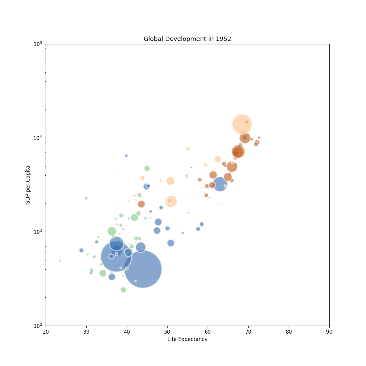
Going further
If you want to go further, have a look at this animation with a stacked area chart


