

About
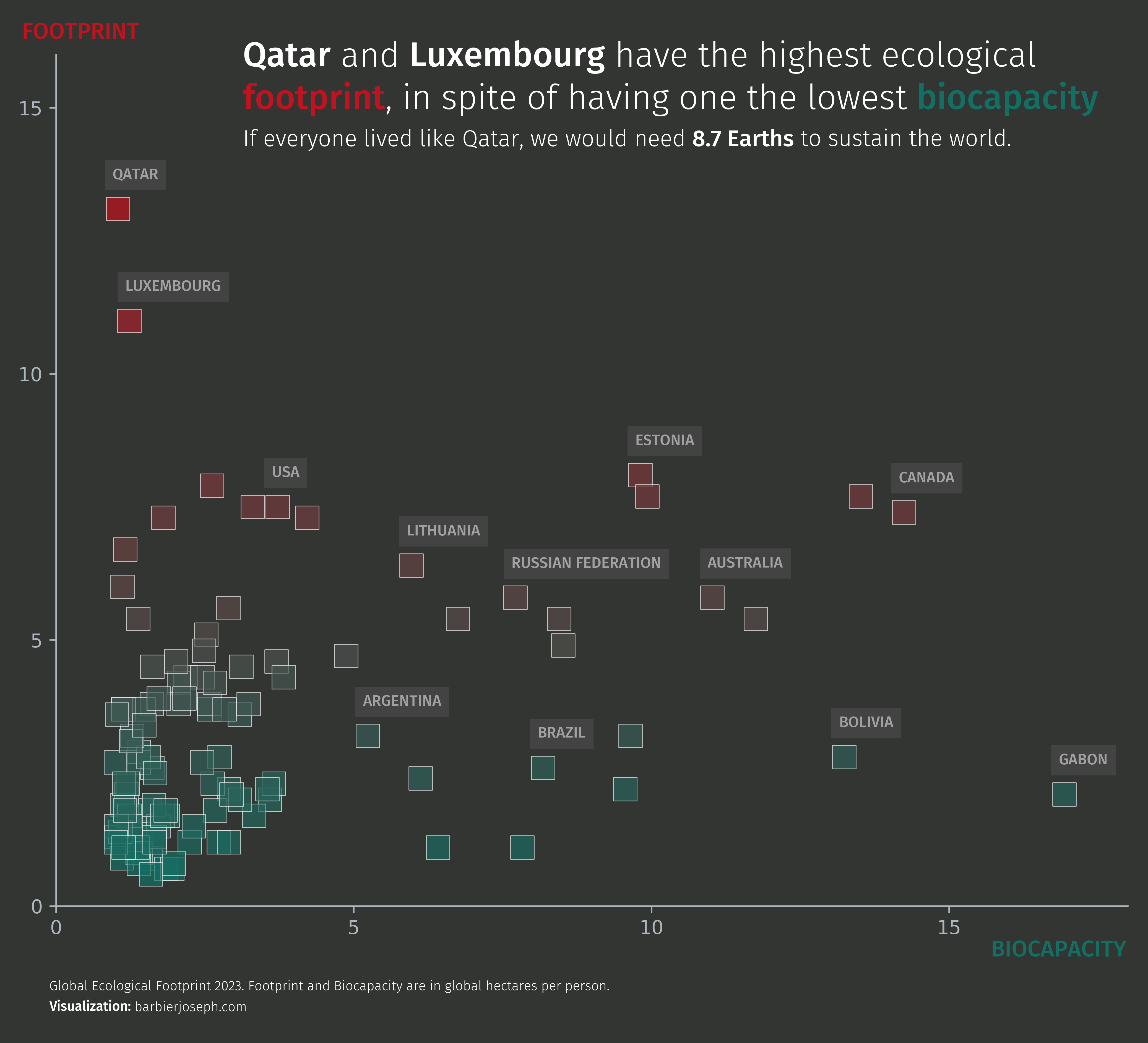
This plot is a scatter plot showing the relationship between the footprint and the biocapacity of different countries.
It was made by Joseph Barbier. Thanks to him for accepting sharing his work here!
Let's see what the final picture will look like:
Libraries
First, we need to install the following librairies:
# Libraries
import pandas as pd
import matplotlib.pyplot as plt
from matplotlib.colors import LinearSegmentedColormap
from highlight_text import fig_text
from adjustText import adjust_text
from matplotlib.font_manager import FontProperties
Dataset
For this reproduction, we're going to retrieve the data directly from the gallery's Github repo. This means we just need to give the right url as an argument to pandas' read_csv() function to retrieve the data.
url = 'https://raw.githubusercontent.com/holtzy/the-python-graph-gallery/master/static/data/footprint.csv'
df = pd.read_csv(url)
df = df[df['biocapacity']< 60]
df.head()| lifexp | country | region | gdpCapita | populationMillions | footprint | biocapacity | ecoReserve | earthsRequired | ratio | |
|---|---|---|---|---|---|---|---|---|---|---|
| 0 | 76.0 | Albania | Other Europe | 14889.0 | 2.9 | 2.1 | 1.176752 | -0.894486 | 1.371485 | 1.784573 |
| 1 | 62.0 | Angola | Africa | 6304.0 | 35.0 | 0.9 | 1.588191 | 0.730346 | 0.568029 | 0.566682 |
| 2 | 75.0 | Argentina | South America | 22117.0 | 46.0 | 3.2 | 5.231663 | 2.011045 | 2.132556 | 0.611660 |
| 3 | 83.0 | Australia | Asia-Pacific | 53053.0 | 26.1 | 5.8 | 11.021401 | 5.244362 | 3.825307 | 0.526249 |
| 4 | 81.0 | Austria | EU-27 | 55460.0 | 9.1 | 5.6 | 2.893775 | -2.732866 | 3.725721 | 1.935189 |
Basic scatter plot
The core of the chart is simply based on the scatter() funtion from matplotlib. You can learn more about it in the dedicated section of the gallery.
# parameters
x_col = 'biocapacity'
y_col = 'footprint'
c = 'earthsRequired'

fig, ax = plt.subplots(figsize=(10, 8), dpi=500)

ax.scatter(
   df[x_col],
   df[y_col],
   c=df[c],
   s=150,
   edgecolor='white',
   alpha=0.7,
   marker='s',
   linewidth=0.4
)

plt.show()
Custom colors
We first want to create a cmap that will be used with the earthsRequired column. This column will be used to color the points of the scatter plot. Thanks to its LinearSegmentedColormap class, the matplotlib.colors module allows us to create a custom colormap. We can then use it with the scatter() function by setting the c argument to the column we want to use for the colors.
def create_gradient_colormap(colors):
   cmap = LinearSegmentedColormap.from_list("custom_gradient", colors, N=256)
   return cmap

colors = ['#136f63', '#c1121f']
cmap = create_gradient_colormap(colors)
cmap

Once we have our colormap, we define other colors that will be used for the annotations and the spines of the plot.
# parameters
background_color = '#333533'
text_color = 'white'
light_text_color = '#adb5bd'
x_col = 'biocapacity'
y_col = 'footprint'
c = 'earthsRequired'

fig, ax = plt.subplots(figsize=(10, 8), dpi=500)
fig.set_facecolor(background_color)
ax.set_facecolor(background_color)
ax.spines[['top', 'right']].set_visible(False)
ax.spines['bottom'].set_color(light_text_color)
ax.spines['left'].set_color(light_text_color)
ax.tick_params(axis='x', colors=light_text_color)
ax.tick_params(axis='y', colors=light_text_color)

ax.scatter(
   df[x_col],
   df[y_col],
   c=df[c],
   s=150,
   cmap=cmap,
   edgecolor='white',
   alpha=0.7,
   marker='s',
   linewidth=0.4
)

plt.show()
Title and labels
Now that we have the main components of the plot, we can add simple annotations. This mainly relies on the fig_text() from the highlight_text package. You can learn more about it in the gallery.
def create_gradient_colormap(colors):
   cmap = LinearSegmentedColormap.from_list("custom_gradient", colors, N=256)
   return cmap

# font
personal_path = '/Users/josephbarbier/Library/Fonts/'
font_path = personal_path + 'FiraSans-Light.ttf'
font = FontProperties(fname=font_path)
bold_font = FontProperties(fname=personal_path + 'FiraSans-Medium.ttf')

# parameters
colors = ['#136f63', '#c1121f']
cmap = create_gradient_colormap(colors)
background_color = '#333533'
text_color = 'white'
light_text_color = '#adb5bd'
x_col = 'biocapacity'
y_col = 'footprint'
c = 'earthsRequired'

fig, ax = plt.subplots(figsize=(10, 8), dpi=500)
fig.set_facecolor(background_color)
ax.set_facecolor(background_color)
ax.spines[['top', 'right']].set_visible(False)
ax.spines['bottom'].set_color(light_text_color)
ax.spines['left'].set_color(light_text_color)
ax.tick_params(axis='x', colors=light_text_color)
ax.tick_params(axis='y', colors=light_text_color)

ax.scatter(
   df[x_col],
   df[y_col],
   c=df[c],
   s=150,
   cmap=cmap,
   edgecolor='white',
   alpha=0.7,
   marker='s',
   linewidth=0.4
)

# title
qatar_color = cmap(df.loc[df['country'] == 'Qatar', c].values[0]/df[c].max())
luxembourg_color = cmap(df.loc[df['country'] == 'Luxembourg', c].values[0]/df[c].max())
qatar_earths = df.loc[df['country'] == 'Qatar', 'earthsRequired'].values[0]
luxembourg_earths = df.loc[df['country'] == 'Luxembourg', 'earthsRequired'].values[0]
text = f"""
<Qatar> and <Luxembourg> have the highest ecological\n<footprint>, in spite of having one the lowest <biocapacity>
"""
fig_text(
   0.26,
   0.9,
   text,
   fontsize=18,
   color=text_color,
   font=font,
   ha='left',
   va='top',
   highlight_textprops=[
      {'font':bold_font},
      {'font':bold_font},
      {'font':bold_font, 'color':colors[1]},
      {'font':bold_font, 'color':colors[0]}
   ],
   ax=ax
)
text = f"""
If everyone lived like Qatar, we would need <{qatar_earths:.1f} Earths> to sustain the world.
"""
fig_text(
   0.26,
   0.82,
   text,
   fontsize=12,
   color=text_color,
   font=font,
   ha='left',
   va='top',
   highlight_textprops=[
      {'font':bold_font}
   ],
   ax=ax
)

# credit and about
text = """
Global Ecological Footprint 2023. Footprint and Biocapacity are in global hectares per person.
<Visualization:> barbierjoseph.com
"""
fig_text(
   0.12,
   0.05,
   text,
   fontsize=7,
   font=font,
   color=text_color,
   ha='left',
   va='top',
   highlight_textprops=[
      {'font':bold_font}
   ],
   ax=ax
)

# label for axis
fig_text(
   0.85, 0.08,
   'Biocapacity'.upper(),
   fontsize=12,
   font=bold_font,
   color=colors[0],
   ha='center',
   va='top',
   ax=ax
)
fig_text(
   0.1, 0.9,
   'Footprint'.upper(),
   fontsize=12,
   font=bold_font,
   color=colors[1],
   ha='left',
   va='center',
   ax=ax
)

plt.show()
Highlight specific countries
Now, in order to add a bit of storytelling to the plot, we can highlight specific countries. This is done by adding a label next to the point of interest.
- We start by defining a list of countries that we want to highlight. We then loop over this list and add an annotation to the plot for each country.
- The
ax.text()function is used to add the annotation. We can specify the position of the annotation with thexandyarguments and the text with thetextargument. - Then, thanks to the
boxargument, we can add a box around the annotation. For example:
bbox=dict(facecolor='grey', edgecolor='none', alpha=0.2) will create a grey box with a 0.2 transparency around the annotation.
def create_gradient_colormap(colors):
   cmap = LinearSegmentedColormap.from_list("custom_gradient", colors, N=256)
   return cmap

# parameters
colors = ['#136f63', '#db3a34']
colors = ['#136f63', '#c1121f']
cmap = create_gradient_colormap(colors)
background_color = '#333533'
text_color = 'white'
light_text_color = '#adb5bd'
countries_to_annote = [
   'Australia', 'Bolivia', 'Canada',
   'Gabon', 'Brazil', 'Argentina',
   'Estonia', 'Luxembourg', 'Qatar',
   'United States of America',
   'Lithuania', 'Russian Federation',
]
x_col = 'biocapacity'
y_col = 'footprint'
c = 'earthsRequired'

# font
personal_path = '/Users/josephbarbier/Library/Fonts/'
font_path = personal_path + 'FiraSans-Light.ttf'
font = FontProperties(fname=font_path)
bold_font = FontProperties(fname=personal_path + 'FiraSans-Medium.ttf')

fig, ax = plt.subplots(figsize=(10, 8), dpi=500)
fig.set_facecolor(background_color)
ax.set_facecolor(background_color)
ax.spines[['top', 'right']].set_visible(False)
ax.spines['bottom'].set_color(light_text_color)
ax.spines['left'].set_color(light_text_color)
ax.tick_params(axis='x', colors=light_text_color)
ax.tick_params(axis='y', colors=light_text_color)
ax.set_xticks([0, 5, 10, 15])
ax.set_yticks([0, 5, 10, 15])
ax.set_xlim(0, 18)
ax.set_ylim(0, 16)

scatter = ax.scatter(
   df[x_col],
   df[y_col],
   c=df[c],
   s=150,
   cmap=cmap,
   edgecolor='white',
   alpha=0.7,
   marker='s',
   linewidth=0.4
)

labels = []
for country in countries_to_annote:
   x = df.loc[df['country'] == country, x_col].values[0]
   y = df.loc[df['country'] == country, y_col].values[0]
   color = text_color
   if country == 'United States of America':
      country = 'USA'
   text = ax.text(
      x-0.11,
      y+0.8,
      country.upper(),
      fontsize=8,
      font=bold_font,
      color=color,
      alpha=0.5,
      ha='left',
      va='top',
      zorder=10,
      bbox=dict(facecolor='grey', edgecolor='none', alpha=0.2)
   )
   labels.append(text)

adjust_text(
   labels,
   ax=ax
)

# title
qatar_color = cmap(df.loc[df['country'] == 'Qatar', c].values[0]/df[c].max())
luxembourg_color = cmap(df.loc[df['country'] == 'Luxembourg', c].values[0]/df[c].max())
qatar_earths = df.loc[df['country'] == 'Qatar', 'earthsRequired'].values[0]
luxembourg_earths = df.loc[df['country'] == 'Luxembourg', 'earthsRequired'].values[0]
text = f"""
<Qatar> and <Luxembourg> have the highest ecological\n<footprint>, in spite of having one the lowest <biocapacity>
"""
fig_text(
   0.26,
   0.9,
   text,
   fontsize=18,
   color=text_color,
   font=font,
   ha='left',
   va='top',
   highlight_textprops=[
      {'font':bold_font},
      {'font':bold_font},
      {'font':bold_font, 'color':colors[1]},
      {'font':bold_font, 'color':colors[0]}
   ],
   ax=ax
)
text = f"""
If everyone lived like Qatar, we would need <{qatar_earths:.1f} Earths> to sustain the world.
"""
fig_text(
   0.26,
   0.82,
   text,
   fontsize=12,
   color=text_color,
   font=font,
   ha='left',
   va='top',
   highlight_textprops=[
      {'font':bold_font}
   ],
   ax=ax
)

# credit and about
text = """
Global Ecological Footprint 2023. Footprint and Biocapacity are in global hectares per person.
<Visualization:> barbierjoseph.com
"""
fig_text(
   0.12,
   0.05,
   text,
   fontsize=7,
   font=font,
   color=text_color,
   ha='left',
   va='top',
   highlight_textprops=[
      {'font':bold_font}
   ],
   ax=ax
)

# label for axis
fig_text(
   0.85, 0.08,
   'Biocapacity'.upper(),
   fontsize=12,
   font=bold_font,
   color=colors[0],
   ha='center',
   va='top',
   ax=ax
)
fig_text(
   0.1, 0.9,
   'Footprint'.upper(),
   fontsize=12,
   font=bold_font,
   color=colors[1],
   ha='left',
   va='center',
   ax=ax
)

plt.savefig('../../static/graph/web-scatter-with-customized-annotations.png', bbox_inches='tight', dpi=500)
plt.show()
Going further
You might be interested in:
- creating a bubble plot with specific highlight and difference marker size
- a scatter plot where dots are images
- adding a regression line to the scatter plot


