
About
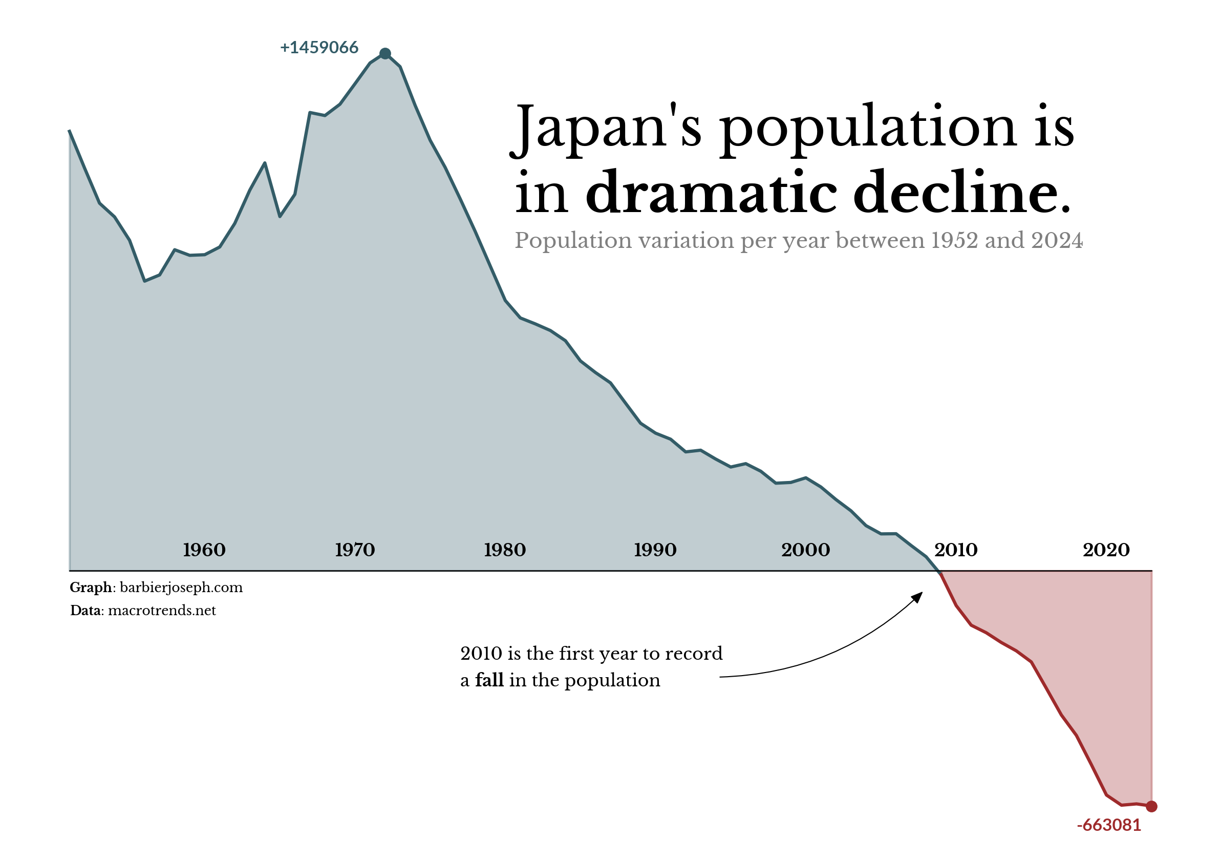
An area chart is a kind of line chart where the area between the x-axis and the line if filled in a given color. This chart shows the evolution of Japan's population change between 1952 and 2024.
This chart has been created by Joseph Barbier. Thanks to him for accepting sharing its work here!
As a teaser, here is the plot we’re gonna try building:
Libraries
First, we need to load the following libraries:
- matplotlib: for creating the plot
- pandas: for data manipulation
- highlight_text: for annotations
- pyfonts for the fonts
- drawarrow for the arrows
import pandas as pd
import matplotlib.pyplot as plt
from pyfonts import load_google_font
from drawarrow import ax_arrow
from highlight_text import fig_text, ax_text
Dataset
For this reproduction, we're going to retrieve the data directly from the gallery's Github repo. This means we just need to give the right url as an argument to pandas' read_csv() function to retrieve the data.
url = "https://raw.githubusercontent.com/holtzy/The-Python-Graph-Gallery/master/static/data/japan-population.csv"
df = pd.read_csv(url)
df.head()| date | pop_var | flag | |
|---|---|---|---|
| 0 | 1952 | 1238290.0 | False |
| 1 | 1953 | 1135376.0 | False |
| 2 | 1954 | 1035879.0 | False |
| 3 | 1955 | 997262.0 | False |
| 4 | 1956 | 931279.0 | False |
Simple area chart
An area chart consists of 2 main elements:
- the main line (added via the
plot()function) - the filled area (added via the
fill_between()function, with a lower opacity)
fig, ax = plt.subplots(dpi=300, figsize=(10, 7))

ax.plot(df["date"], df["pop_var"])
ax.fill_between(df["date"], df["pop_var"], alpha=0.3)

plt.show()
2 colors for positive and negative values
Since there’s no built-in method to change the color based on a value, so we create two area charts:
- First chart: spans from the start date to
year_index(the year is when the value drops below 0, and we find this info with theflagcolumn). - Second chart: spans from
year_indexto the end date.
Apply different colors to each chart, and done!
fig, ax = plt.subplots(dpi=300, figsize=(10, 7))

year_index = df[df["flag"]].date.values[0]

# before
color = "#335c67"
before_df = df[df["date"] <= year_index]
ax.plot(before_df["date"], before_df["pop_var"], color=color)
ax.fill_between(before_df["date"], before_df["pop_var"], alpha=0.3, color=color)

# after
color = "#9e2a2b"
after_df = df[df["date"] >= year_index]
ax.plot(after_df["date"], after_df["pop_var"], color=color)
ax.fill_between(after_df["date"], after_df["pop_var"], alpha=0.3, color=color)

plt.show()
Customize axes
Enhance the plot with the following steps:
- Use
ax.set_axis_off()to remove all axes. - Load two fonts: one regular, one bold thanks to pyfonts
- Highlight the highest and lowest values with
scatter()andtext(). - Use a
forloop andtext()to label all dates in the chart's center. - Add a horizontal black line along the x-axis.
font = load_google_font("Libre Baskerville")
boldfont = load_google_font("Libre Baskerville", weight="bold")
digit_font = load_google_font("Lato", weight="bold")

fig, ax = plt.subplots(dpi=300, figsize=(10, 7))
ax.set_axis_off()

year_index = df[df["flag"]].date.values[0]

# before
color = "#335c67"
year_index = df[df["flag"]].date.values[0]
before_df = df[df["date"] <= year_index]
ax.plot(before_df["date"], before_df["pop_var"], color=color)
ax.fill_between(before_df["date"], before_df["pop_var"], alpha=0.3, color=color)
max_year = df[df["pop_var"] == df["pop_var"].max()].date.values[0]
max_value = df[df["pop_var"] == df["pop_var"].max()].pop_var.values[0]
ax.scatter(x=max_year, y=max_value, color=color, s=20)
ax.text(
    x=max_year - 7,
    y=max_value,
    s=f"+{max_value:.0f}",
    font=digit_font,
    size=8,
    color=color,
)

# after
color = "#9e2a2b"
after_df = df[df["date"] >= year_index]
ax.plot(after_df["date"], after_df["pop_var"], color=color)
ax.fill_between(after_df["date"], after_df["pop_var"], alpha=0.3, color=color)
min_year = df[df["pop_var"] == df["pop_var"].min()].date.values[0]
min_value = df[df["pop_var"] == df["pop_var"].min()].pop_var.values[0]
ax.scatter(x=min_year, y=min_value, color=color, s=20)
ax.text(
    x=min_year - 5,
    y=min_value - 70000,
    s=f"{min_value:.0f}",
    font=digit_font,
    size=8,
    color=color,
)

ax.plot([1952, 2024], [0, 0], color="black", linewidth=0.6)
year_range = range(1960, 2021, 10)
for year in year_range:
    ax.text(x=year + 1, y=40000, s=f"{year}", font=boldfont, size=8, ha="center")

plt.show()
Final chart with annotations
All the part is done, now we just have to:
- add title, subtitle and credit/source using highlight_text and pyfonts for loading the fonts
- add a specific annotation about the year 2010 with an arrow from drawarrow
font = load_google_font("Libre Baskerville")
boldfont = load_google_font("Libre Baskerville", weight="bold")
digit_font = load_google_font("Lato", weight="bold")
arrow_props = dict(color="black", width=0.5, head_width=2, head_length=5, radius=0.2)

fig, ax = plt.subplots(dpi=300, figsize=(10, 7))
ax.set_axis_off()

# before
color = "#335c67"
year_index = df[df["flag"]].date.values[0]
before_df = df[df["date"] <= year_index]
ax.plot(before_df["date"], before_df["pop_var"], color=color)
ax.fill_between(before_df["date"], before_df["pop_var"], alpha=0.3, color=color)
max_year = df[df["pop_var"] == df["pop_var"].max()].date.values[0]
max_value = df[df["pop_var"] == df["pop_var"].max()].pop_var.values[0]
ax.scatter(x=max_year, y=max_value, color=color, s=20)
ax.text(
    x=max_year - 7,
    y=max_value,
    s=f"+{max_value:.0f}",
    font=digit_font,
    size=8,
    color=color,
)

# after
color = "#9e2a2b"
after_df = df[df["date"] >= year_index]
ax.plot(after_df["date"], after_df["pop_var"], color=color)
ax.fill_between(after_df["date"], after_df["pop_var"], alpha=0.3, color=color)
min_year = df[df["pop_var"] == df["pop_var"].min()].date.values[0]
min_value = df[df["pop_var"] == df["pop_var"].min()].pop_var.values[0]
ax.scatter(x=min_year, y=min_value, color=color, s=20)
ax.text(
    x=min_year - 5,
    y=min_value - 70000,
    s=f"{min_value:.0f}",
    font=digit_font,
    size=8,
    color=color,
)

ax.plot([1952, 2024], [0, 0], color="black", linewidth=0.6)
year_range = range(1960, 2021, 10)
for year in year_range:
    ax.text(x=year + 1, y=40000, s=f"{year}", font=boldfont, size=8, ha="center")

s = "Japan's population is\nin <dramatic decline>."
fig_text(
    x=0.45,
    y=0.8,
    s=s,
    font=font,
    highlight_textprops=[{"font": boldfont}],
    fontsize=25,
    ha="left",
    va="top",
)

s = "Population variation per year between 1952 and 2024"
fig_text(x=0.45, y=0.68, s=s, font=font, fontsize=9.8, ha="left", va="top", alpha=0.5)

s = "<Graph>: barbierjoseph.com\n<Data>: macrotrends.net"
ax_text(
    x=1952,
    y=-30000,
    s=s,
    font=font,
    fontsize=6,
    ha="left",
    highlight_textprops=[{"font": boldfont}] * 2,
)

s = "2010 is the first year to record\na <fall> in the population"
ax_text(
    x=1978,
    y=-210000,
    s=s,
    font=font,
    fontsize=8,
    ha="left",
    highlight_textprops=[{"font": boldfont}],
)
ax_arrow(
    tail_position=(1995, -300000), head_position=(2009, -50000), ax=ax, **arrow_props
)

plt.savefig(
    "../../static/graph/web-area-chart-with-different-colors-for-positive-and-negative-values.png",
    dpi=300,
    bbox_inches="tight",
)
plt.show()
Going further
You might be interested in:
- the area chart section of the gallery
- how to create arrow with an inflexion point in a plot
- how to make a beautiful stacked area chart