
About
Stacked area chart is a graphical representation of data that shows the composition of a variable over time. The area between the x-axis and the lines is filled with colors to represent different categories of data.
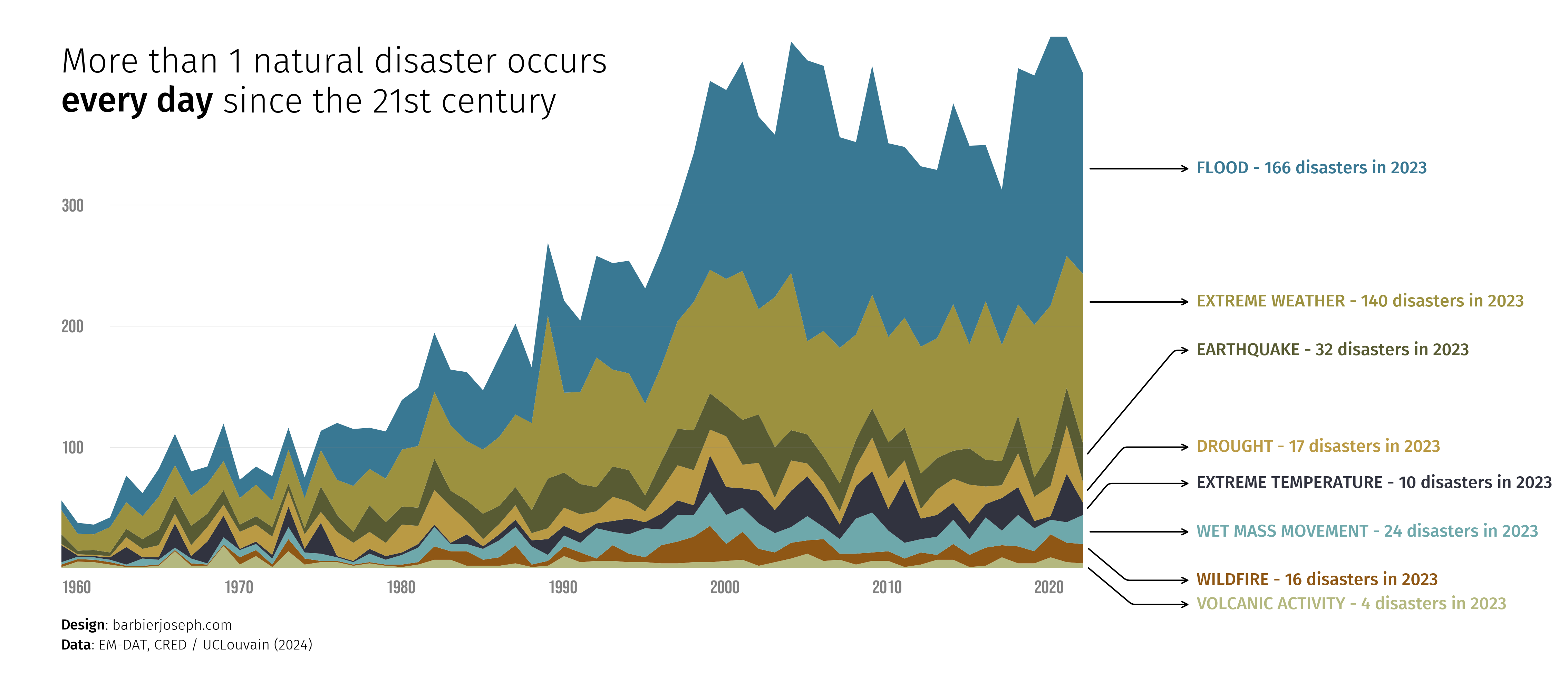
The following example shows the evolution of natural disasters over the years by type of disaster.
This chart has been created by Joseph Barbier. Thanks to him for accepting sharing its work here!
As a teaser, here is the plot we’re gonna try building:
Libraries
First, we need to install the following libraries:
- matplotlib: for plot customization
- seaborn: for creating the plot
- pandas: for data manipulation
- highlight_text: for annotations
- pypalettes: for the colors of the plot
- pyfonts: for the fonts
- drawarrow: for the arrows with an inflection point
import pandas as pd
import numpy as np
import matplotlib.pyplot as plt
from pypalettes import load_palette
from highlight_text import fig_text, ax_text
from pyfonts import load_google_font
from drawarrow import ax_arrow
Dataset
The type of data needed when creating a stacked area chart is a time series.
Specifically, our dataset needs a column for the time variable (usually the x-axis) and a column for each category we want to represent (usually the y-axis). In this case, we have one column per disaster type.
url = "https://raw.githubusercontent.com/holtzy/The-Python-Graph-Gallery/master/static/data/disaster-events.csv"
df = pd.read_csv(url)


def remove_agg_rows(entity: str):
    if entity.lower().startswith("all disasters"):
        return False
    else:
        return True


df = df.replace("Dry mass movement", "Drought")
df = df[df["Entity"].apply(remove_agg_rows)]
df = df[~df["Entity"].isin(["Fog", "Glacial lake outburst flood"])]
df = df.pivot_table(index="Entity", columns="Year", values="Disasters").T
df.loc[1900, :] = df.loc[1900, :].fillna(0)
df = df[df.index >= 1960]
df = df[df.index <= 2023]
df = df.interpolate(axis=1)
df.head()| Entity | Drought | Earthquake | Extreme temperature | Extreme weather | Flood | Volcanic activity | Wet mass movement | Wildfire |
|---|---|---|---|---|---|---|---|---|
| Year | ||||||||
| 1960 | 1.0 | 8.0 | 14.0 | 20.0 | 8.0 | 1.0 | 2.0 | 2.0 |
| 1961 | 1.0 | 3.0 | 1.0 | 14.0 | 9.0 | 5.5 | 2.0 | 2.0 |
| 1962 | 1.0 | 4.0 | 1.0 | 13.0 | 8.0 | 5.0 | 2.0 | 2.0 |
| 1963 | 1.0 | 3.0 | 2.0 | 21.0 | 8.0 | 3.0 | 2.0 | 2.0 |
| 1964 | 8.0 | 7.0 | 14.5 | 22.0 | 22.0 | 1.0 | 1.0 | 1.0 |
Simple stacked area
This first version of the plot is made via the ax.stackplot() function from matplotlib. It is the simplest way to create a stacked area chart
# initialize the figure
fig, ax = plt.subplots(figsize=(14, 7), dpi=300)

# define the x-axis variable and order the columns
columns = df.sum().sort_values().index.to_list()
x = df.index

# create the stacked area plot
areas = np.stack(df[columns].values, axis=-1)
ax.stackplot(x, areas)

# display the plot
plt.show()
Custom axes
Since default axes are not very attractive, we start by removing them with the ax.set_axis_off() function.
The x and y labels will be displayed using the highlight_text package, which simplifies the process of adding text annotations to a plot.
In practice, we use for loops to add the labels to the plot with the desired values.
# initialize the figure
fig, ax = plt.subplots(figsize=(14, 7), dpi=300)
ax.set_axis_off()

# define the x-axis variable and order the columns
columns = df.sum().sort_values().index.to_list()
x = df.index

# create the stacked area plot
areas = np.stack(df[columns].values, axis=-1)
ax.stackplot(x, areas)

# add label for the x-axis
for year in range(1960, 2030, 10):
    ax_text(x=year, y=-10, s=f"{year}", va="top", ha="left", fontsize=13, color="grey")

# add label for the y-axis
for value in range(100, 400, 100):
    ax_text(
        x=1960, y=value, s=f"{value}", va="center", ha="left", fontsize=13, color="grey"
    )

# display the plot
plt.show()
Custom the colors
The palette used is from the pypalettes library. We use its load_cmap() function to get a list of colors (in hexadecimal format) that we will use to fill the areas.
We add an additional step to manually define a mapping between colors and the columns. For example, we want natural disasters related to floods to be blue, and those about volcanoes to be red, etc. Unfortunately, there is no magic way to do this other than manually defining a dictionary (named color_mapping in this case).
Then, we simply specify the colors parameter of the ax.stackplot() function with the list of colors we want to use.
# initialize the figure
fig, ax = plt.subplots(figsize=(14, 7), dpi=300)
ax.set_axis_off()

# define the x-axis variable and order the columns
columns = df.sum().sort_values().index.to_list()
x = df.index

# defines color map and mapping with columns
colors = load_palette("Dali")
color_mapping = {
    "Flood": colors[4],
    "Volcanic activity": colors[0],
    "Wildfire": colors[6],
    "Drought": colors[7],
    "Extreme temperature": colors[5],
    "Wet mass movement": colors[3],
    "Earthquake": colors[2],
    "Extreme weather": colors[1],
}
colors = [color_mapping[col] for col in columns]

# create the stacked area plot
areas = np.stack(df[columns].values, axis=-1)
ax.stackplot(x, areas, colors=colors)

# add label for the x-axis
for year in range(1960, 2030, 10):
    ax_text(x=year, y=-10, s=f"{year}", va="top", ha="left", fontsize=13, color="grey")

# add label for the y-axis
for value in range(100, 400, 100):
    ax_text(
        x=1960, y=value, s=f"{value}", va="center", ha="left", fontsize=13, color="grey"
    )

# display the plot
plt.show()
Add title and source with custom fonts
The next step is to add a title and a source to the plot. We use the highlight_text package to achieve this because it allows for different text styling within the same string.
However, before doing this, we load 2 custom fonts thanks to pyfonts to ensure a better-looking title and source.
Finally, we use the fig_text() function from the highlight_text package to add the title and source to the plot.
# set up the font properties
font = load_google_font("Bebas Neue")
other_font = load_google_font("Fira Sans", weight="light")
other_bold_font = load_google_font("Fira Sans", weight="medium")

# initialize the figure
fig, ax = plt.subplots(figsize=(14, 7), dpi=300)
ax.set_axis_off()

# define the x-axis variable and order the columns
columns = df.sum().sort_values().index.to_list()
x = df.index

# defines color map and mapping with columns
colors = load_palette("Dali")
color_mapping = {
    "Flood": colors[4],
    "Volcanic activity": colors[0],
    "Wildfire": colors[6],
    "Drought": colors[7],
    "Extreme temperature": colors[5],
    "Wet mass movement": colors[3],
    "Earthquake": colors[2],
    "Extreme weather": colors[1],
}
colors = [color_mapping[col] for col in columns]

# create the stacked area plot
areas = np.stack(df[columns].values, axis=-1)
ax.stackplot(x, areas, colors=colors)

# add label for the x-axis
for year in range(1960, 2030, 10):
    ax_text(
        x=year,
        y=-10,
        s=f"{year}",
        va="top",
        ha="left",
        fontsize=13,
        font=font,
        color="grey",
    )

# add label for the y-axis
for value in range(100, 400, 100):
    ax_text(
        x=1960,
        y=value,
        s=f"{value}",
        va="center",
        ha="left",
        fontsize=13,
        font=font,
        color="grey",
    )

# add title
fig_text(
    s="More than 1 natural disaster occurs\n<every day> since the 21st century",
    x=0.16,
    y=0.83,
    fontsize=24,
    ha="left",
    va="top",
    color="black",
    font=other_font,
    fig=fig,
    highlight_textprops=[{"font": other_bold_font}],
)

# source and credit
text = """
<Design>: barbierjoseph.com
<Data>: EM-DAT, CRED / UCLouvain (2024)
"""
fig_text(
    s=text,
    x=0.16,
    y=0.05,
    fontsize=10,
    ha="left",
    va="top",
    color="black",
    fontproperties=other_font,
    highlight_textprops=[{"font": other_bold_font}, {"font": other_bold_font}],
)

# display the plot
plt.show()
Reference lines and inline labels
Instead of using the default matplotlib legend (called with ax.legend()), we add inline labels to the right of the chart that have the same colors as the areas. We use the highlight_text package to achieve this.
As before, finding the position of the labels requires trial and error.
# set up the font properties
font = load_google_font("Bebas Neue")
other_font = load_google_font("Fira Sans", weight="light")
other_bold_font = load_google_font("Fira Sans", weight="medium")

# initialize the figure
fig, ax = plt.subplots(figsize=(14, 7), dpi=300)
ax.set_axis_off()

# define the x-axis variable and order the columns
columns = df.sum().sort_values().index.to_list()
x = df.index

# defines color map and mapping with columns
colors = load_palette("Dali")
color_mapping = {
    "Flood": colors[4],
    "Volcanic activity": colors[0],
    "Wildfire": colors[6],
    "Drought": colors[7],
    "Extreme temperature": colors[5],
    "Wet mass movement": colors[3],
    "Earthquake": colors[2],
    "Extreme weather": colors[1],
}
colors = [color_mapping[col] for col in columns]

# create the stacked area plot
areas = np.stack(df[columns].values, axis=-1)
ax.stackplot(x, areas, colors=colors)

# add label for the x-axis
for year in range(1960, 2030, 10):
    ax_text(
        x=year,
        y=-10,
        s=f"{year}",
        va="top",
        ha="left",
        fontsize=13,
        font=font,
        color="grey",
    )

# add label for the y-axis
for value in range(100, 400, 100):
    ax_text(
        x=1960,
        y=value,
        s=f"{value}",
        va="center",
        ha="left",
        fontsize=13,
        font=font,
        color="grey",
    )
    ax.plot([1963, 2023], [value, value], color="grey", lw=0.1)

# add title
fig_text(
    s="More than 1 natural disaster occurs\n<every day> since the 21st century",
    x=0.16,
    y=0.83,
    fontsize=24,
    ha="left",
    va="top",
    color="black",
    font=other_font,
    fig=fig,
    highlight_textprops=[{"font": other_bold_font}],
)

# source and credit
text = """
<Design>: barbierjoseph.com
<Data>: EM-DAT, CRED / UCLouvain (2024)
"""
fig_text(
    s=text,
    x=0.16,
    y=0.05,
    fontsize=10,
    ha="left",
    va="top",
    color="black",
    fontproperties=other_font,
    highlight_textprops=[{"font": other_bold_font}, {"font": other_bold_font}],
)

# add inline labels
y_pos = [330, 220, 180, 100, 70, 30, -10, -30]
for i in range(len(y_pos)):
    country = columns[::-1][i]
    val_2023 = int(df.loc[2023, country])
    ax_text(
        x=2030,
        y=y_pos[i],
        s=f"{country.upper()} - {val_2023} disasters in 2023",
        va="center",
        ha="left",
        font=other_bold_font,
        fontsize=12,
        color=colors[7 - i],
    )

# display the plot
plt.show()
Arrows with inflexion points
And finally, we add arrows to the plot that point to the inflexion points. This method effectively highlights which areas correspond to which disasters. This is possible thanks to the drawarrow library.
# set up the font properties
font = load_google_font("Bebas Neue")
other_font = load_google_font("Fira Sans", weight="light")
other_bold_font = load_google_font("Fira Sans", weight="medium")

# initialize the figure
fig, ax = plt.subplots(figsize=(14, 7), dpi=300)
ax.set_axis_off()

# define the x-axis variable and order the columns
columns = df.sum().sort_values().index.to_list()
x = df.index

# defines color map and mapping with columns
colors = load_palette("Dali")
color_mapping = {
    "Flood": colors[4],
    "Volcanic activity": colors[0],
    "Wildfire": colors[6],
    "Drought": colors[7],
    "Extreme temperature": colors[5],
    "Wet mass movement": colors[3],
    "Earthquake": colors[2],
    "Extreme weather": colors[1],
}
colors = [color_mapping[col] for col in columns]

# create the stacked area plot
areas = np.stack(df[columns].values, axis=-1)
ax.stackplot(x, areas, colors=colors)

# add label for the x-axis
for year in range(1960, 2030, 10):
    ax_text(
        x=year,
        y=-10,
        s=f"{year}",
        va="top",
        ha="left",
        fontsize=13,
        font=font,
        color="grey",
    )

# add label for the y-axis
for value in range(100, 400, 100):
    ax_text(
        x=1960,
        y=value,
        s=f"{value}",
        va="center",
        ha="left",
        fontsize=13,
        font=font,
        color="grey",
    )
    ax.plot([1963, 2023], [value, value], color="grey", lw=0.1)

# add title
fig_text(
    s="More than 1 natural disaster occurs\n<every day> since the 21st century",
    x=0.16,
    y=0.83,
    fontsize=24,
    ha="left",
    va="top",
    color="black",
    font=other_font,
    fig=fig,
    highlight_textprops=[{"font": other_bold_font}],
)

# source and credit
text = """
<Design>: barbierjoseph.com
<Data>: EM-DAT, CRED / UCLouvain (2024)
"""
fig_text(
    s=text,
    x=0.16,
    y=0.05,
    fontsize=10,
    ha="left",
    va="top",
    color="black",
    fontproperties=other_font,
    highlight_textprops=[{"font": other_bold_font}, {"font": other_bold_font}],
)

# add inline labels
y_pos = [330, 220, 180, 100, 70, 30, -10, -30]
for i in range(len(y_pos)):
    country = columns[::-1][i]
    val_2023 = int(df.loc[2023, country])
    ax_text(
        x=2030,
        y=y_pos[i],
        s=f"{country.upper()} - {val_2023} disasters in 2023",
        va="center",
        ha="left",
        font=other_bold_font,
        fontsize=12,
        color=colors[7 - i],
    )

# add inflexion arrows
x_axis_start = 2023
x_axis_end = 2030
radius = 10
arrow_props = {"clip_on": False, "color": "black", "fill_head": False}
ax_arrow(
    tail_position=(x_axis_start, 330), head_position=(x_axis_end, 330), **arrow_props
)
ax_arrow(
    tail_position=(x_axis_start, 220), head_position=(x_axis_end, 220), **arrow_props
)
ax_arrow(
    tail_position=(x_axis_start, 90),
    head_position=(x_axis_end, 180),
    inflection_position=(2040, 180),
    **arrow_props,
)
ax_arrow(
    tail_position=(x_axis_start, 60),
    head_position=(x_axis_end, 100),
    inflection_position=(2040, 100),
    **arrow_props,
)
ax_arrow(
    tail_position=(x_axis_start, 45),
    head_position=(x_axis_end, 70),
    inflection_position=(2040, 70),
    **arrow_props,
)
ax_arrow(
    tail_position=(x_axis_start, 30), head_position=(x_axis_end, 30), **arrow_props
)
ax_arrow(
    tail_position=(x_axis_start, 20),
    head_position=(x_axis_end, -10),
    inflection_position=(2040, -10),
    **arrow_props,
)
ax_arrow(
    tail_position=(x_axis_start, 4),
    head_position=(x_axis_end, -30),
    inflection_position=(2040, -30),
    **arrow_props,
)

plt.savefig(
    "../../static/graph/web-stacked-area-with-inflexion-arrows.png",
    bbox_inches="tight",
    dpi=300,
)
plt.show()
Going further
You might be interested in:
- the stacked area chart section of the gallery
- how to create arrow with an inflexion point in a plot
- how to use the highlight_text package to add annotations to a plot
- how to create beaufitul streamgraphs
- this small multiple line chart