About
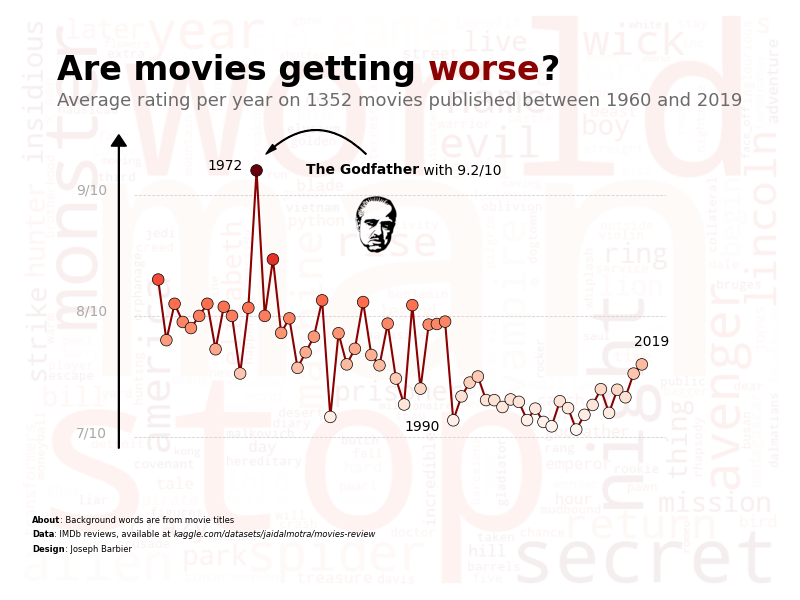
This plot is a combination of a wordcloud and a line-chart. It shows the evolution of the average rating of different movies since the 1960, with the title of the movies in the background for the wordcloud.
The chart was made by Joseph B.. Thanks to him for accepting sharing his work here!
Let's see what the final picture will look like:

Libraries
First, you need to load a whole bunch of libraries:
# data
import numpy as np
import pandas as pd
from PIL import Image

# plot
from wordcloud import WordCloud
import matplotlib.pyplot as plt
import matplotlib
import seaborn as sns
from mpl_toolkits.axes_grid1.inset_locator import inset_axes

# annotations
from highlight_text import fig_text, ax_text
from matplotlib.patches import FancyArrowPatch
Dataset
For this reproduction, we're going to retrieve the data directly from the gallery's Github repo. This means we just need to give the right url as an argument to pandas' read_csv() function to retrieve the data.
The dataset contains one row per movie and its rating.
# Open the dataset from Github
url = "https://raw.githubusercontent.com/holtzy/the-python-graph-gallery/master/static/data/movies-review.csv"
df = pd.read_csv(url, usecols=['name', 'year', 'type', 'rating'])
df.head()| name | year | rating | type | |
|---|---|---|---|---|
| 0 | The Dark Knight | 2008 | 9.0 | Action |
| 1 | Pulp Fiction | 1994 | 8.9 | Crime |
| 2 | The Godfather | 1972 | 9.2 | Crime |
| 3 | Se7en | 1995 | 8.6 | Crime |
| 4 | The Silence of the Lambs | 1991 | 8.6 | Crime |
Text for the wordcloud
Let's start by create the background of the whole chart.
For this we use the wordcloud library. We need to create a string that contains all the titles of the movies. We will use the name column of the dataset for this.
Then, we make it less opaque by setting the alpha parameter to a low value.
# create a large string with all the titles
titles_combined = ' '.join(df['name'])
titles_combined = list(set(titles_combined.split(' ')))
titles_combined = [word.lower() for word in titles_combined if len(word) > 3]
to_remove = ['man', 'world']  # remove some words that are not relevant
titles_combined = [word for word in titles_combined if word not in to_remove]
titles_combined = ' '.join(titles_combined)

# initiate a figure
fig, ax = plt.subplots(1, 1, figsize=(8, 6))

# create the wordcloud for the background
wordcloud = WordCloud(
    width=800, height=600,
    background_color='white',
    colormap='Reds',
    contour_width=1,
    contour_color='black',
    random_state=2  # fix randomness
).generate(titles_combined)
ax.imshow(wordcloud, interpolation='bilinear', alpha=0.07)
ax.set_axis_off()

# display chart
plt.tight_layout()
plt.show()
Line chart on top
For a dedicated post on how to add a chart on top of another, check this post.
# create a large string with all the titles
titles_combined = ' '.join(df['name'])
titles_combined = list(set(titles_combined.split(' ')))
titles_combined = [word.lower() for word in titles_combined if len(word) > 3]
to_remove = ['man', 'world']  # remove some words that are not relevant
titles_combined = [word for word in titles_combined if word not in to_remove]
titles_combined = ' '.join(titles_combined)

# initiate a figure
fig, ax = plt.subplots(1, 1, figsize=(8, 6))

# create the wordcloud for the background
wordcloud = WordCloud(
    width=800, height=600,
    background_color='white',
    colormap='Reds',
    contour_width=1,
    contour_color='black',
    random_state=2  # fix randomness
).generate(titles_combined)
ax.imshow(wordcloud, interpolation='bilinear', alpha=0.07)
ax.set_axis_off()

# create inside axe
sub_ax = inset_axes(
    parent_axes=ax,
    width="70%",
    height="50%",
    loc='center',
    borderpad=1
)

# compute average rating per year
avg_rating = df.groupby('year')['rating'].mean().reset_index()
sns.lineplot(
    data=avg_rating,
    x='year', y='rating',
    color='darkred',
    ax=sub_ax,
    zorder=5
)

# display chart
plt.tight_layout()
plt.show()
/var/folders/m2/jfzxyg4s0xz3jyw5f94r7tcm0000gn/T/ipykernel_29511/3519991070.py:44: UserWarning: This figure includes Axes that are not compatible with tight_layout, so results might be incorrect.
plt.tight_layout()
Add points on the line and remove axis
The main interest of the wordcloud in the background is only to be fully visible. For this, we have to remove the background of the axis on the top.
We also add individual points on the line to make it more readable. Colors of the dots with be proportional to the rating of the movie in order to highlight the pattern.
# create a large string with all the titles
titles_combined = ' '.join(df['name'])
titles_combined = list(set(titles_combined.split(' ')))
titles_combined = [word.lower() for word in titles_combined if len(word) > 3]
to_remove = ['man', 'world']  # remove some words that are not relevant
titles_combined = [word for word in titles_combined if word not in to_remove]
titles_combined = ' '.join(titles_combined)

# initiate a figure
fig, ax = plt.subplots(1, 1, figsize=(8, 6))

# create the wordcloud for the background
wordcloud = WordCloud(
    width=800, height=600,
    background_color='white',
    colormap='Reds',
    contour_width=1,
    contour_color='black',
    random_state=2  # fix randomness
).generate(titles_combined)
ax.imshow(wordcloud, interpolation='bilinear', alpha=0.07)
ax.set_axis_off()

# create inside axe
sub_ax = inset_axes(
    parent_axes=ax,
    width="70%",
    height="50%",
    loc='center',
    borderpad=1
)

# compute average rating per year
avg_rating = df.groupby('year')['rating'].mean().reset_index()
sns.lineplot(
    data=avg_rating,
    x='year', y='rating',
    color='darkred',
    ax=sub_ax,
    zorder=5
)

# add scatter plot on top
cmap = matplotlib.colormaps['Reds']
sub_ax.scatter(
    x=avg_rating['year'],
    y=avg_rating['rating'],
    cmap=cmap,
    c=avg_rating['rating'],
    s=70,
    edgecolor='black',
    linewidth=0.5,
    zorder=10,
)

# remove background from line chart
sub_ax.set_axis_off()

# display chart
plt.tight_layout()
plt.show()
/var/folders/m2/jfzxyg4s0xz3jyw5f94r7tcm0000gn/T/ipykernel_29511/956014063.py:60: UserWarning: This figure includes Axes that are not compatible with tight_layout, so results might be incorrect.
plt.tight_layout()
Scale and reference values
The chart is starting to look really nice, but it lacks scale and context. We can add a reference lines and text to give more information to the reader.
# create a large string with all the titles
titles_combined = ' '.join(df['name'])
titles_combined = list(set(titles_combined.split(' ')))
titles_combined = [word.lower() for word in titles_combined if len(word) > 3]
to_remove = ['man', 'world']  # remove some words that are not relevant
titles_combined = [word for word in titles_combined if word not in to_remove]
titles_combined = ' '.join(titles_combined)

# initiate a figure
fig, ax = plt.subplots(1, 1, figsize=(8, 6))

# create the wordcloud for the background
wordcloud = WordCloud(
    width=800, height=600,
    background_color='white',
    colormap='Reds',
    contour_width=1,
    contour_color='black',
    random_state=2  # fix randomness
).generate(titles_combined)
ax.imshow(wordcloud, interpolation='bilinear', alpha=0.07)
ax.set_axis_off()

# create inside axe
sub_ax = inset_axes(
    parent_axes=ax,
    width="70%",
    height="50%",
    loc='center',
    borderpad=1
)

# compute average rating per year
avg_rating = df.groupby('year')['rating'].mean().reset_index()
sns.lineplot(
    data=avg_rating,
    x='year', y='rating',
    color='darkred',
    ax=sub_ax,
    zorder=5
)

# add scatter plot on top
cmap = matplotlib.colormaps['Reds']
sub_ax.scatter(
    x=avg_rating['year'],
    y=avg_rating['rating'],
    cmap=cmap,
    c=avg_rating['rating'],
    s=70,
    edgecolor='black',
    linewidth=0.5,
    zorder=10,
)

# remove background from line chart
sub_ax.set_axis_off()

# display references
max_rate = 9
min_rate = 7
mid_rate = 8
sub_ax.axhline(y=max_rate, color='lightgrey', linestyle='--', lw=0.6)
sub_ax.axhline(y=min_rate, color='lightgrey', linestyle='--', lw=0.6)
sub_ax.axhline(y=mid_rate, color='lightgrey', linestyle='--', lw=0.6)
sub_ax.text(
    1950, max_rate, f"{max_rate:.0f}/10",
    fontsize=10, color='darkgrey'
)
sub_ax.text(
    1950, min_rate, f"{min_rate:.0f}/10",
    fontsize=10, color='darkgrey'
)
sub_ax.text(
    1950, mid_rate, f"{mid_rate:.0f}/10",
    fontsize=10, color='darkgrey'
)

# vertical line arrow for y axis of the subax
ax.arrow(
    0.13, 0.24, 0, 0.53,
    head_width=0.02, head_length=0.02,
    fc='black', ec='black',
    transform=ax.transAxes
)

# display chart
plt.tight_layout()
plt.show()
/var/folders/m2/jfzxyg4s0xz3jyw5f94r7tcm0000gn/T/ipykernel_29511/3469529372.py:88: UserWarning: This figure includes Axes that are not compatible with tight_layout, so results might be incorrect.
plt.tight_layout()
It's already looking better!
Add title and credits
What would be a great without its title? Let's add it to the chart thanks to highlight_text package. For a dedicated explanation of how it works, check this post.
# create a large string with all the titles
titles_combined = ' '.join(df['name'])
titles_combined = list(set(titles_combined.split(' ')))
titles_combined = [word.lower() for word in titles_combined if len(word) > 3]
to_remove = ['man', 'world']  # remove some words that are not relevant
titles_combined = [word for word in titles_combined if word not in to_remove]
titles_combined = ' '.join(titles_combined)

# initiate a figure
fig, ax = plt.subplots(1, 1, figsize=(8, 6))

# create the wordcloud for the background
wordcloud = WordCloud(
    width=800, height=600,
    background_color='white',
    colormap='Reds',
    contour_width=1,
    contour_color='black',
    random_state=2  # fix randomness
).generate(titles_combined)
ax.imshow(wordcloud, interpolation='bilinear', alpha=0.07)
ax.set_axis_off()

# create inside axe
sub_ax = inset_axes(
    parent_axes=ax,
    width="70%",
    height="50%",
    loc='center',
    borderpad=1
)

# compute average rating per year
avg_rating = df.groupby('year')['rating'].mean().reset_index()
sns.lineplot(
    data=avg_rating,
    x='year', y='rating',
    color='darkred',
    ax=sub_ax,
    zorder=5
)

# add scatter plot on top
cmap = matplotlib.colormaps['Reds']
sub_ax.scatter(
    x=avg_rating['year'],
    y=avg_rating['rating'],
    cmap=cmap,
    c=avg_rating['rating'],
    s=70,
    edgecolor='black',
    linewidth=0.5,
    zorder=10,
)

# remove background from line chart
sub_ax.set_axis_off()

# display references
max_rate = 9
min_rate = 7
mid_rate = 8
sub_ax.axhline(y=max_rate, color='lightgrey', linestyle='--', lw=0.6)
sub_ax.axhline(y=min_rate, color='lightgrey', linestyle='--', lw=0.6)
sub_ax.axhline(y=mid_rate, color='lightgrey', linestyle='--', lw=0.6)
sub_ax.text(
    1950, max_rate, f"{max_rate:.0f}/10",
    fontsize=10, color='darkgrey'
)
sub_ax.text(
    1950, min_rate, f"{min_rate:.0f}/10",
    fontsize=10, color='darkgrey'
)
sub_ax.text(
    1950, mid_rate, f"{mid_rate:.0f}/10",
    fontsize=10, color='darkgrey'
)

# vertical line arrow for y axis of the subax
ax.arrow(
    0.13, 0.24, 0, 0.53,
    head_width=0.02, head_length=0.02,
    fc='black', ec='black',
    transform=ax.transAxes
)

# title
lower_bound = 1960
upper_bound = 2019
text = f"""
Are movies getting <worse>?
<Average rating per year on {df.shape[0]} movies published between {lower_bound} and {upper_bound}>
"""
fig_text(
    0.5, 0.92,
    text, color='black',
    fontweight='bold',
    fontsize=24,
    highlight_textprops=[
        {"color": 'darkred'},
        {"fontsize": 13,
         "color": 'darkgrey',
         "fontweight": 'normal'}
    ],
    ha='center'
)

# credit
text = """
<About>: Background words are from movie titles
<Data>: IMDb reviews, available at <kaggle.com/datasets/jaidalmotra/movies-review>
<Design>: Joseph Barbier
"""
fig_text(
    0.04, 0.15,
    text, color='black',
    fontsize=6,
    highlight_textprops=[
        {"fontweight": 'bold'},
        {"fontweight": 'bold'},
        {"fontstyle": 'italic'},
        {"fontweight": 'bold'}
    ],
)

# display chart
plt.tight_layout()
plt.show()
/var/folders/m2/jfzxyg4s0xz3jyw5f94r7tcm0000gn/T/ipykernel_29511/138348101.py:127: UserWarning: This figure includes Axes that are not compatible with tight_layout, so results might be incorrect.
plt.tight_layout()
Final annotations + Image of the Godfather
And finally, we can add some annotations to the chart to give more information to the reader. We can also add an image of the Godfather to make the chart more appealing.
For a dedicated post on how to add an image to a chart, check this post.
For a dedicated post on how to add an arrow, check this post.
# create a large string with all the titles
titles_combined = ' '.join(df['name'])
titles_combined = list(set(titles_combined.split(' ')))
titles_combined = [word.lower() for word in titles_combined if len(word) > 3]
to_remove = ['man', 'world']  # remove some words that are not relevant
titles_combined = [word for word in titles_combined if word not in to_remove]
titles_combined = ' '.join(titles_combined)

# initiate a figure
fig, ax = plt.subplots(1, 1, figsize=(8, 6))

# create the wordcloud for the background
wordcloud = WordCloud(
    width=800, height=600,
    background_color='white',
    colormap='Reds',
    contour_width=1,
    contour_color='black',
    random_state=2  # fix randomness
).generate(titles_combined)
ax.imshow(wordcloud, interpolation='bilinear', alpha=0.07)
ax.set_axis_off()

# create inside axe
sub_ax = inset_axes(
    parent_axes=ax,
    width="70%",
    height="50%",
    loc='center',
    borderpad=1
)

# compute average rating per year
avg_rating = df.groupby('year')['rating'].mean().reset_index()
sns.lineplot(
    data=avg_rating,
    x='year', y='rating',
    color='darkred',
    ax=sub_ax,
    zorder=5
)

# add scatter plot on top
cmap = matplotlib.colormaps['Reds']
sub_ax.scatter(
    x=avg_rating['year'],
    y=avg_rating['rating'],
    cmap=cmap,
    c=avg_rating['rating'],
    s=70,
    edgecolor='black',
    linewidth=0.5,
    zorder=10,
)

# remove background from line chart
sub_ax.set_axis_off()

# display references
max_rate = 9
min_rate = 7
mid_rate = 8
sub_ax.axhline(y=max_rate, color='lightgrey', linestyle='--', lw=0.6)
sub_ax.axhline(y=min_rate, color='lightgrey', linestyle='--', lw=0.6)
sub_ax.axhline(y=mid_rate, color='lightgrey', linestyle='--', lw=0.6)
sub_ax.text(
    1950, max_rate, f"{max_rate:.0f}/10",
    fontsize=10, color='darkgrey'
)
sub_ax.text(
    1950, min_rate, f"{min_rate:.0f}/10",
    fontsize=10, color='darkgrey'
)
sub_ax.text(
    1950, mid_rate, f"{mid_rate:.0f}/10",
    fontsize=10, color='darkgrey'
)

# vertical line arrow for y axis of the subax
ax.arrow(
    0.13, 0.24, 0, 0.53,
    head_width=0.02, head_length=0.02,
    fc='black', ec='black',
    transform=ax.transAxes
)

# title
lower_bound = 1960
upper_bound = 2019
text = f"""
Are movies getting <worse>?
<Average rating per year on {df.shape[0]} movies published between {lower_bound} and {upper_bound}>
"""
fig_text(
    0.5, 0.92,
    text, color='black',
    fontweight='bold',
    fontsize=24,
    highlight_textprops=[
        {"color": 'darkred'},
        {"fontsize": 13,
         "color": '#6b6b6b',
         "fontweight": 'normal'}
    ],
    ha='center'
)

# credit
text = """
<About>: Background words are from movie titles
<Data>: IMDb reviews, available at <kaggle.com/datasets/jaidalmotra/movies-review>
<Design>: Joseph Barbier
"""
fig_text(
    0.04, 0.15,
    text, color='black',
    fontsize=6,
    highlight_textprops=[
        {"fontweight": 'bold'},
        {"fontweight": 'bold'},
        {"fontstyle": 'italic'},
        {"fontweight": 'bold'}
    ],
)

# image of godfather
path = 'https://raw.githubusercontent.com/holtzy/The-Python-Graph-Gallery/master/static/data/godfather-for-chart.png'
image = np.array(Image.open(path))
image = image / 255
ax_image = fig.add_axes([0.42, 0.55, 0.1, 0.15])
ax_image.imshow(image)  # display
ax_image.set_axis_off()  # remove axis

# text about the godfather
godf_rate = df[df['name'].str.contains('The Godfather')]['rating'].values[0]
ax_text(
    1990, 9.2,
    f"<The Godfather> with {godf_rate:.1f}/10",
    color='black',
    fontsize=10,
    ha='center',
    va='center',
    highlight_textprops=[
        {"fontweight": 'bold'}
    ],
    ax=sub_ax
)

# arrow


def draw_arrow(tail_position, head_position, invert=False):
    kw = dict(
        arrowstyle="Simple, tail_width=0.5, head_width=4, head_length=8", color="k")
    if invert:
        connectionstyle = "arc3,rad=-.5"
    else:
        connectionstyle = "arc3,rad=.5"
    a = FancyArrowPatch(tail_position, head_position,
                        connectionstyle=connectionstyle,
                        transform=fig.transFigure,
                        **kw)
    fig.patches.append(a)


draw_arrow((0.46, 0.74), (0.33, 0.74))

# highlight specific years
sub_ax.text(
    1966, 9.2, '1972',
    fontsize=10, color='black'
)
sub_ax.text(
    1990, 7.05, '1990',
    fontsize=10, color='black'
)
sub_ax.text(
    2018, 7.75, '2019',
    fontsize=10, color='black'
)

# display chart
plt.tight_layout()
fig.savefig('../../static/graph/web-stacked-charts.png')
plt.show()
/var/folders/m2/jfzxyg4s0xz3jyw5f94r7tcm0000gn/T/ipykernel_29511/697973869.py:179: UserWarning: This figure includes Axes that are not compatible with tight_layout, so results might be incorrect.
plt.tight_layout()
Going further
This article explains how to reproduce a combination of a wordcloud and a line-chart using matplotlib.
You might be interested in this beautiful line chart and how to change the shape of a wordcloud.


