
About
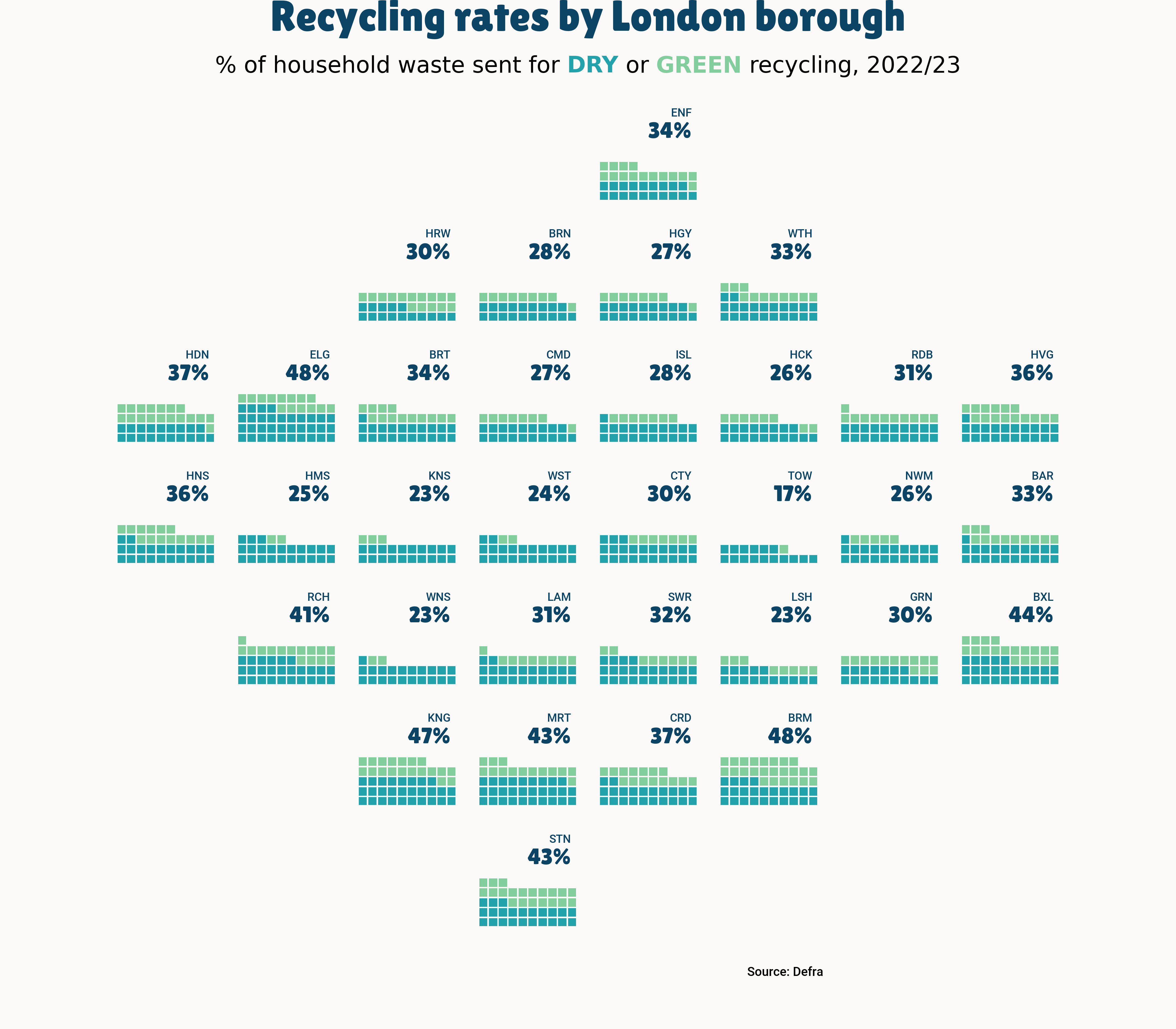
This plot is a waffle chart, with small mutliples. It shows the recycling rates per London borough. The size of each square is proportional to the recycling rate. The chart is made with the pywaffle library.
The chart was made by Lisa Hornung. Thanks to her for accepting sharing her work here!
Let's see what the final picture will look like:
Libraries
First, you need to install the following librairies:
- matplotlib is used for creating the chart and add customization features
- pandas is used to read the data
- pywaffle is used to create the waffle chart
flexitext: to add beautiful annotations to the chart
And that's it!
import pandas as pd
import matplotlib.pyplot as plt
from pywaffle import Waffle
from flexitext import flexitext
from matplotlib import font_manager
Dataset
For this reproduction, we're going to retrieve the data directly from the gallery's Github repo. This means we just need to give the right url as an argument to pandas' read_csv() function to retrieve the data.
url = "https://raw.githubusercontent.com/holtzy/the-python-graph-gallery/master/static/data/london_recycling.csv"

df = pd.read_csv(url)
df.head()| household_waste_recycled_dry_perc | household_waste_recycled_green_perc | household_waste_not_recycled_perc_est | Display_name | |
|---|---|---|---|---|
| 0 | 21.0 | 12.0 | 67.0 | BAR |
| 1 | 19.0 | 9.0 | 72.0 | BRN |
| 2 | 21.0 | 13.0 | 66.0 | BRT |
| 3 | 19.0 | 8.0 | 73.0 | CMD |
| 4 | 34.0 | 14.0 | 52.0 | ELG |
Initialize parameters
Before creating the plot, we first need to define different elements:
- the layout of the small multiples
layout = [
    ["___","___","___","___","ENF","___","___","___"],
    ["___","___","HRW","BRN","HGY","WTH","___","___"],
    ["HDN","ELG","BRT","CMD","ISL","HCK","RDB","HVG"],
    ["HNS","HMS","KNS","WST","CTY","TOW","NWM","BAR"],
    ["___","RCH","WNS","LAM","SWR","LSH","GRN","BXL"],
    ["___","___","KNG","MRT","CRD","BRM","___","___"],
    ["___","___","___","STN","___","___","___","___"],
]- the font: remember to change
my_pathvalue to the path of the font on your computer. You can learn more about font management in this post
# load fonts
my_path = '/Users/josephbarbier/Library/Fonts'
label_font = font_manager.FontProperties(fname=f'{my_path}/Roboto-Medium.ttf')
title_font = font_manager.FontProperties(fname=f'{my_path}/LilitaOne-Regular.ttf')- a color mapping
colors = {
   "dry": "#22A2AA",
   "green": "#81CE9C",
   "none": "#fbfaf9",
   "value": "#0B4465",
   "bg": "#fbfaf9"
}
We can now develop the plot! The main step is to generate a figure with a grid of subplots. After that, we iterate through each axis to construct a waffle chart.
# layout
scale_factor = 1.8
fig, axs = plt.subplot_mosaic(layout, figsize=(8*scale_factor,7*scale_factor), empty_sentinel="___")
plt.subplots_adjust(wspace=0.25, hspace=0.25, left=0.05, right=0.95, bottom=0.05)
fig.set_facecolor(colors["bg"])

plt.show()
We easily recognize the shape of the layout defined above!
Fill the grid
Once the grid is created, we can fill it with the waffle charts. We iterate through each axis to create a waffle chart. We use the pywaffle library to create the waffle chart. We also add a title to each subplot.
# setup
columns =  [
    'household_waste_recycled_dry_perc',
    'household_waste_recycled_green_perc',
    'household_waste_not_recycled_perc_est'
]

# layout
scale_factor = 1.8
fig, axs = plt.subplot_mosaic(layout, figsize=(8*scale_factor,7*scale_factor), empty_sentinel="___")
plt.subplots_adjust(wspace=0.25, hspace=0.25, left=0.1, right=0.9, top=0.9, bottom=0.1)
fig.set_facecolor(colors["bg"])


# plot data
for ax in axs:
    data_filtered = df[df["Display_name"]==ax]
    y_values = data_filtered[columns].values.tolist()[0]
    Waffle.make_waffle(
        ax=axs[ax],
        rows=10,
        values=y_values,
        colors=[colors["dry"],
        colors["green"],
        colors["none"]],
        interval_ratio_x=0.35,
        interval_ratio_y=0.35,
        vertical=True,
        zorder=1
    )

    #display % value and borough
    axs[ax].text(
        0.95,
        0.8,
        str(int(y_values[0] + y_values[1]))+"%",
        ha="right",
        va='top',
        fontsize=20,
        color=colors["value"],
        fontproperties=title_font
    )
    axs[ax].text(
        0.95,
        0.95,
        ax,
        fontsize=10,
        ha="right",
        va='top',
        color=colors["value"],
        zorder=3,
        fontproperties=label_font
    )

# title and footer
fig.text(
    0.5,
    1,
    "Recycling rates by London borough",
    fontsize=38,
    ha='center',
    va="top",
    fontweight="bold",
    fontproperties=title_font,
    color=colors["value"]
)
fig.text(
    0.7,
    0.055,
    "Source: Defra",
    fontsize=11,
    ha='right',
    va="center",
    fontweight="normal",
    fontproperties=label_font,
    linespacing=1.5, color="black"
)
subtitle = (
    "<size:20>% of household waste sent for "
    "<color:#22A2AA, weight:bold>DRY</> or <color:#81CE9C, weight:bold>GREEN</> recycling, 2022/23</>"
)
flexitext(0.5, 1-0.075, subtitle, va="bottom", ha="center", xycoords="figure fraction")

plt.savefig("../../static/graph/web-waffle-with-small-multiples.png", dpi=300)
plt.show()
Going further
This article explains how to reproduce a small multiple waffle chart with annotations, colormap and nice other features.
You might be interested in:
- the waffle chart section of the gallery