Libraries
First, we need to install the following libraries:
- matplotlib: for plot customization
- pandas: for data manipulation
- geopandas: for geodata manipulation and plotting
- pypalettes: for the colors
- pyfonts: for the fonts
import geopandas as gpd
import matplotlib.pyplot as plt
from pypalettes import load_cmap
from pyfonts import load_google_fontDataset
First of all, we need two sets of data: one for the counties and one for the states.
path = "https://raw.githubusercontent.com/holtzy/The-Python-Graph-Gallery/master/static/data/us-counties-employmentrate.geojson"
path = "../../static/data/us-counties-employmentrate.geojson"
uscounties = gpd.read_file(path)
uscounties.head()| NAME_ALT | ADM2_CODE | state | county | rate | quartile | geometry | |
|---|---|---|---|---|---|---|---|
| 0 | Whatcom County | USA-53073 | Washington | Whatcom County | 6.3 | 3 | MULTIPOLYGON (((-122.75302 48.99251, -122.6532... |
| 1 | Okanogan County | USA-53047 | Washington | Okanogan County | 6.1 | 3 | POLYGON ((-120.85196 48.99251, -120.67495 48.9... |
| 2 | Ferry County | USA-53019 | Washington | Ferry County | 9.8 | 4 | POLYGON ((-118.83688 48.99251, -118.69668 48.9... |
| 3 | Stevens County | USA-53065 | Washington | Stevens County | 7.9 | 4 | POLYGON ((-118.21996 48.99251, -118.03723 48.9... |
| 4 | Pend Oreille County | USA-53051 | Washington | Pend Oreille County | 8.9 | 4 | POLYGON ((-117.42951 48.99251, -117.37787 48.9... |
path = "https://raw.githubusercontent.com/holtzy/The-Python-Graph-Gallery/master/static/data/us-states-employmentrate.geojson"
path = "../../static/data/us-states-employmentrate.geojson"
usstates = gpd.read_file(path)
usstates.head()| state | rate | quartile | geometry | |
|---|---|---|---|---|
| 0 | Alabama | 6.449254 | 4 | MULTIPOLYGON (((-87.41958 30.4796, -87.42683 3... |
| 1 | Alaska | 7.036000 | 4 | MULTIPOLYGON (((-141.00556 69.65095, -141.0054... |
| 2 | Arizona | 8.533333 | 4 | POLYGON ((-111.00627 31.32718, -111.06712 31.3... |
| 3 | Arkansas | 4.496000 | 1 | POLYGON ((-90.30422 35.00008, -90.30124 34.995... |
| 4 | California | 6.527586 | 4 | MULTIPOLYGON (((-114.72428 32.71284, -114.7645... |
Simple double map
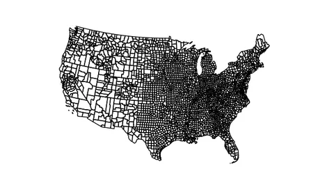
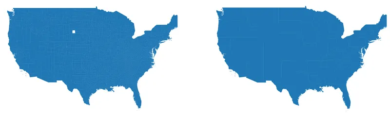
We start by creating a figure with 2 subplots.
The first subplot will contain the map with counties, and the second subplot will contain the map with states.
fig, axs = plt.subplots(ncols=2, dpi=300, figsize=(15, 10))

uscounties.plot(ax=axs[0])
usstates.plot(ax=axs[1])

for i in range(2):
    ax = axs[i]

    ax.set_xlim(-126, -68)
    ax.set_ylim(24, 50)
    ax.set_axis_off()

plt.show()Custom color map
Customizing colors is super easy thanks to pypalettes!
Here, we want to use the ‘Coconut’ palette and specify the column from our previous data images to map to the palette (here "quartile").

cmap = load_cmap("Coconut", cmap_type="continuous")
cmap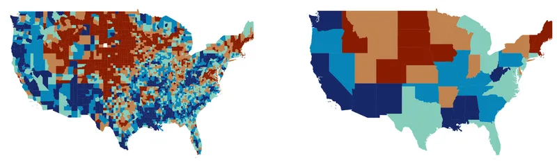
fig, axs = plt.subplots(ncols=2, dpi=300, figsize=(15, 10))

map_args = dict(column="quartile", cmap=cmap)
uscounties.plot(ax=axs[0], **map_args)
usstates.plot(ax=axs[1], **map_args)

for i in range(2):
    ax = axs[i]

    ax.set_xlim(-126, -68)
    ax.set_ylim(24, 50)
    ax.set_axis_off()

plt.show()Title and description
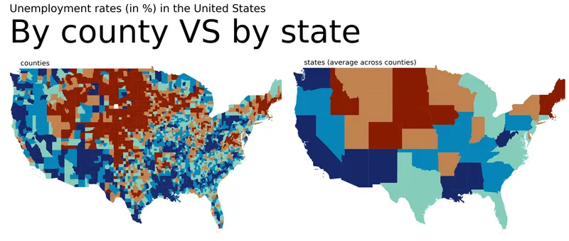
The title and description are added using the text() function. We also add a short label for each map (‘counties’ and ‘states’) in the for loop.
cmap = load_cmap("Coconut", cmap_type="continuous")

fig, axs = plt.subplots(ncols=2, dpi=300, figsize=(15, 10))

map_args = dict(column="quartile", cmap=cmap)
uscounties.plot(ax=axs[0], **map_args)
usstates.plot(ax=axs[1], **map_args)

metrics = ["counties", "states (average across counties)"]
for i in range(2):
    ax = axs[i]

    ax.set_xlim(-126, -68)
    ax.set_ylim(24, 50)
    ax.set_axis_off()

    ax.text(
        x=0.06,
        y=0.98,
        s=f"{metrics[i]}",
        transform=ax.transAxes,
        size=13,
    )

fig.text(
    x=0.02,
    y=0.78,
    s="By county VS by state",
    ha="left",
    size=60,
)
fig.text(
    x=0.02,
    y=0.86,
    s="Unemployment rates (in %) in the United States",
    ha="left",
    size=20,
)

plt.tight_layout()
plt.show()Better annotations with custom font
The default matplotlib font isn't the best, so we need other fonts using pyfonts! You don't need to install anything, all you need is an internet connection.
We load 3 differents fonts: a light one, a bold one and an italic one.
fontlight = load_google_font("Urbanist", weight="light")
fontbold = load_google_font("Urbanist", weight="bold")
fontitalic = load_google_font("Urbanist", weight="light", italic=True)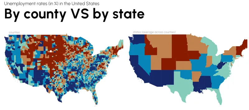
cmap = load_cmap("Coconut", cmap_type="continuous")

fig, axs = plt.subplots(ncols=2, dpi=300, figsize=(15, 10))

map_args = dict(column="quartile", cmap=cmap)
test = uscounties.plot(ax=axs[0], **map_args)
usstates.plot(ax=axs[1], **map_args)

metrics = ["counties", "states (average across counties)"]
for i in range(2):
    ax = axs[i]

    ax.set_xlim(-126, -68)
    ax.set_ylim(24, 50)
    ax.set_axis_off()

    ax.text(
        x=0.06,
        y=0.98,
        s=f"{metrics[i]}",
        transform=ax.transAxes,
        size=13,
        font=fontitalic,
        color="#949494",
    )

fig.text(x=0.02, y=0.81, s="By county VS by state", ha="left", size=60, font=fontbold)
fig.text(
    x=0.02,
    y=0.89,
    s="Unemployment rates (in %) in the United States",
    ha="left",
    size=20,
    font=fontlight,
    color="#282828",
)

plt.tight_layout()
plt.show()Legend
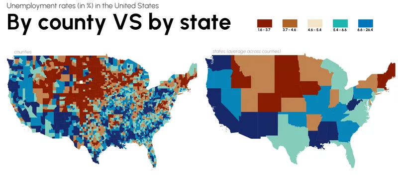
This step is a little more complex than the previous one, as it requires the use of matplotlib's Patch class.
First, we define the extent of each block in the legend:
quartile_ranges = [
    (uscounties["rate"].quantile(0), uscounties["rate"].quantile(0.2)),
    (uscounties["rate"].quantile(0.2), uscounties["rate"].quantile(0.4)),
    (uscounties["rate"].quantile(0.4), uscounties["rate"].quantile(0.6)),
    (uscounties["rate"].quantile(0.6), uscounties["rate"].quantile(0.8)),
    (uscounties["rate"].quantile(0.8), uscounties["rate"].quantile(1)),
]
quartile_ranges[(np.float64(1.6), np.float64(3.7)),
(np.float64(3.7), np.float64(4.6)),
(np.float64(4.6), np.float64(5.4)),
(np.float64(5.4), np.float64(6.6)),
(np.float64(6.6), np.float64(26.4))]
We then create a list of legend elements (a list of squares of different colours):
from matplotlib.patches import Patch

legend_elements = [
    Patch(
        facecolor=cmap.colors[i],
        edgecolor="none",
    )
    for i in range(5)
]
legend_elements[<matplotlib.patches.Patch at 0x12ef38ec0>,
<matplotlib.patches.Patch at 0x12faca5d0>,
<matplotlib.patches.Patch at 0x12faca490>,
<matplotlib.patches.Patch at 0x12faca350>,
<matplotlib.patches.Patch at 0x12faca0d0>]
Finally, we add the legend elements using the legend() function, and the labels that go with them using the ax.text() function:
cmap = load_cmap("Coconut", cmap_type="continuous")

fig, axs = plt.subplots(ncols=2, dpi=300, figsize=(15, 10))

map_args = dict(column="quartile", cmap=cmap)
test = uscounties.plot(ax=axs[0], **map_args)
usstates.plot(ax=axs[1], **map_args)

metrics = ["counties", "states (average across counties)"]
for i in range(2):
    ax = axs[i]

    ax.set_xlim(-126, -68)
    ax.set_ylim(24, 50)
    ax.set_axis_off()

    ax.text(
        x=0.06,
        y=0.98,
        s=f"{metrics[i]}",
        transform=ax.transAxes,
        size=13,
        font=fontitalic,
        color="#949494",
    )

fig.text(x=0.02, y=0.81, s="By county VS by state", ha="left", size=60, font=fontbold)
fig.text(
    x=0.02,
    y=0.89,
    s="Unemployment rates (in %) in the United States",
    ha="left",
    size=20,
    font=fontlight,
    color="#282828",
)

for i, element in enumerate(legend_elements):
    axs[1].text(
        0.325 + i * 0.13,
        1.18,  # Adjust the x, y positions
        f"{quartile_ranges[i][0]:.1f} - {quartile_ranges[i][1]:.1f}",
        horizontalalignment="center",
        verticalalignment="top",
        transform=axs[1].transAxes,
        font=fontbold,
    )

fig.legend(
    handles=legend_elements,
    bbox_to_anchor=(0.95, 0.86),
    prop=fontbold,
    handlelength=4,
    fancybox=False,
    frameon=False,
    handleheight=3,
    labelspacing=0.8,
    ncol=len(legend_elements),
    labels=[""] * len(legend_elements),
)

plt.tight_layout()
plt.savefig(
    "../../static/graph/web-two-maps-with-different-granulaties.png",
    dpi=300,
    bbox_inches="tight",
)
plt.show()Going further
This post shows how to create a double maps with different granularities.
You might be interested in:
- creating legends for choropleth maps
- how to make a bubble map
- how to combine a choropleth map and a barplot