Load geo data
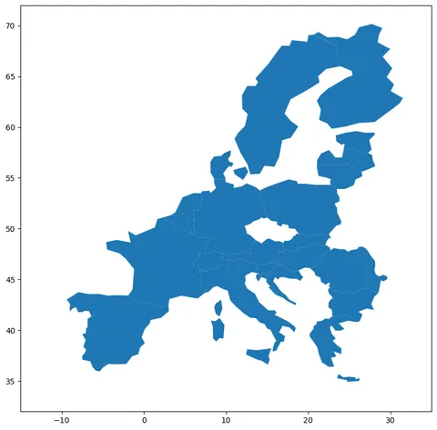
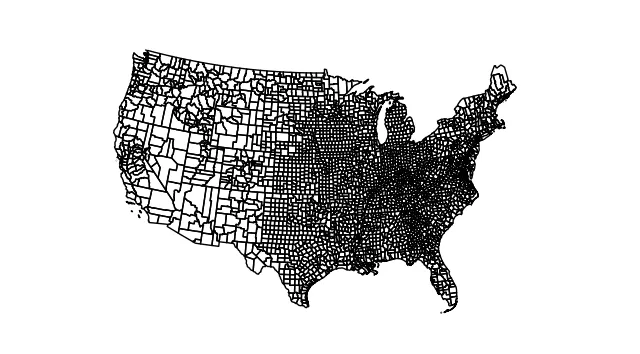
This post shows how to build a choropleth map for US counties. County border coordinates have been found here and stored on github here. Let's load this data stored at geojson format with geopandas, and draw a map with it thanks to geoplot.
# Import the geopandas and geoplot libraries
import geopandas as gpd
import geoplot.crs as gcrs
import geoplot as gplt
import matplotlib.pyplot as plt

# Load the json file with county coordinates
geoData = gpd.read_file(
    'https://raw.githubusercontent.com/holtzy/The-Python-Graph-Gallery/master/static/data/US-counties.geojson'
)

# Make sure the "id" column is an integer
geoData.id = geoData['id'].astype(int)

# Remove Alaska, Hawaii and Puerto Rico.
statesToRemove = ['02', '15', '72']
geoData = geoData[~geoData.STATE.isin(statesToRemove)]

# Basic plot with just county outlines
gplt.polyplot(
    geoData,
    projection=gcrs.AlbersEqualArea()
)
plt.show()Note: if you need more explanation on this step, there is this dedicated post. More generally, have a look to the background map section of the python graph gallery.
Load numeric data
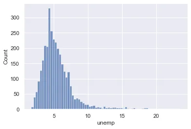
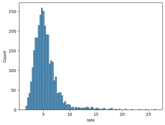
A choropleth map shows the distribution of a numeric variable on each items of a map. Let's consider the unemployment rate of each US county. Data comes from the Bureau of Labor Statistics, found here and stored here.
We load it directly in python using the following code:
# library
import pandas as pd
import seaborn as sns
import matplotlib.pyplot as plt

# Read file
data = pd.read_csv(
    'https://raw.githubusercontent.com/holtzy/The-Python-Graph-Gallery/master/static/data/unemployment-x.csv')

# Show the distribution of unemployment rate
sns.histplot(data["rate"])
plt.show()Merge spatial & numeric data
Both source of information need to be merged in order to be represented on the same figure. This can be done thanks to the merge() function.
fullData = geoData.merge(
    data,
    left_on=['id'],  # identifier from geodataframe
    right_on=['id']  # identifier from dataframe
)
fullData.head(3)| id | GEO_ID | STATE | COUNTY | NAME | LSAD | CENSUSAREA | geometry | state | county | rate | |
|---|---|---|---|---|---|---|---|---|---|---|---|
| 0 | 1001 | 0500000US01001 | 01 | 001 | Autauga | County | 594.436 | POLYGON ((-86.49677 32.34444, -86.71790 32.402... | Alabama | Autauga County | 5.1 |
| 1 | 1009 | 0500000US01009 | 01 | 009 | Blount | County | 644.776 | POLYGON ((-86.57780 33.76532, -86.75914 33.840... | Alabama | Blount County | 5.1 |
| 2 | 1017 | 0500000US01017 | 01 | 017 | Chambers | County | 596.531 | POLYGON ((-85.18413 32.87053, -85.12342 32.772... | Alabama | Chambers County | 5.0 |
Choropleth map with GeoPlot
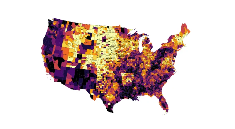
Now, the choropleth() function of the geoplot library allows to build the choropleth pretty easily. The hue parameter expects the name of the column we want to use to control the color of each county.
The hardest part is probably to pick the right type of color palette. Geoplot comes with both continuous and categorical binning schemes, i.e. methods that split a sequence of observations into some number of bins.
import cartopy.crs as ccrs
import matplotlib.pyplot as plt

# for color mapping with 10 different colors
import mapclassify as mc
scheme = mc.Quantiles(fullData['rate'], k=10)

# Map
gplt.choropleth(
    fullData,
    projection=gcrs.AlbersEqualArea(),
    hue="rate",
    scheme=scheme, cmap='inferno_r',
    linewidth=.1,
    edgecolor='black',
    figsize=(12, 8)
)

plt.show()Going further
This post explains how to create a choropleth map in python.
You might be interested in:
- this choropleth map with labels inside states
- how to create an interactive choropleth map