Choropleth map

A choropleth map displays divided geographical areas or regions that are coloured in relation to a numeric variable. This section explains how to build static choropleth with geopandas and geoplot, and interactive versions with tools like folium and plotly.
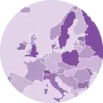
Choropleth map with Geopandas and GeoPlot
Geoplot is a python library for geospatial data visualization. It works pretty well with geopandas, another library made to deal with geospatial data objects.
Geoplot has a choropleth() function that allows to build a choropleth map easily as shown in the example below.


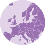
Folium for google maps style choropleth maps
Folium is a wrapper of the Leaflet.js javascript library. It brings the power of javascript for data visualization, but still allows to do some data wrangling with Python. Building a choropleth with Folium is quite straightforward thanks to thechoropleth() function.
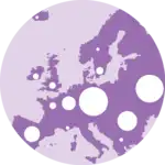
Plotly for interactive choropleth maps
Plotly is a powerful library for interactive data visualization. It allows to build choropleth maps with thechoropleth() function.
Try to hover the map below to see the value of each country. You can also zoom in and out, and move the map around.
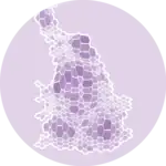
Matplotlib for static choropleth maps
Matplotlib allows to build static choropleth maps with the geopandas library. The below example shows how to build a choropleth map of European countries with geopandasand matplotlib.


🚨 Grab the Data To Viz poster!
Do you know all the chart types? Do you know which one you should pick? I made a decision tree that answers those questions. You can download it for free!
