About
A choropleth map is a map combined where colors are proportional to values in each region.
This chart has been created by Joseph Barbier, thanks to him for sharing his work here!
Libraries
First, we need to load the following libraries:
import matplotlib.pyplot as plt
import geopandas as gpd
import pandas as pd
from pyfonts import load_google_font
from pypalettes import load_cmapDataset
Here we need to load 2 datasets:
- one with map data (shape of each state)
- one with data for each state
And then we merge them:
path = "https://raw.githubusercontent.com/holtzy/The-Python-Graph-Gallery/refs/heads/master/static/data/usa-salary.csv"
path = "../../static/data/usa-salary.csv"
df_salary = pd.read_csv(path)

path = "https://raw.githubusercontent.com/holtzy/The-Python-Graph-Gallery/refs/heads/master/static/data/us.geojson"
path = "../../static/data/us.geojson"
gdf = gpd.read_file(path).merge(df_salary, on="state")

gdf = gdf[gdf["salary"] < 100]  # remove district of columbia
gdf = gdf[gdf["state"] != "Alaska"]
gdf = gdf[gdf["state"] != "Hawaii"]
gdf.head()| state | geometry | salary | |
|---|---|---|---|
| 0 | Alabama | MULTIPOLYGON (((-87.41958 30.4796, -87.42683 3... | 59.605 |
| 2 | Arizona | POLYGON ((-111.00627 31.32718, -111.06712 31.3... | 66.340 |
| 3 | Arkansas | POLYGON ((-90.30422 35.00008, -90.30124 34.995... | 54.658 |
| 4 | California | MULTIPOLYGON (((-114.72428 32.71284, -114.7645... | 74.819 |
| 5 | Colorado | POLYGON ((-109.04633 40.99983, -108.88932 40.9... | 77.331 |
We add a centroid column (approximation of the center of the state) that will be used later to add individual state labels:
gdf_projected = gdf.to_crs(epsg=3035)
gdf_projected["centroid"] = gdf_projected.geometry.centroid
gdf["centroid"] = gdf_projected["centroid"].to_crs(gdf.crs)
gdf.head()| state | geometry | salary | centroid | |
|---|---|---|---|---|
| 0 | Alabama | MULTIPOLYGON (((-87.41958 30.4796, -87.42683 3... | 59.605 | POINT (-86.81841 32.78448) |
| 2 | Arizona | POLYGON ((-111.00627 31.32718, -111.06712 31.3... | 66.340 | POINT (-111.63132 34.30186) |
| 3 | Arkansas | POLYGON ((-90.30422 35.00008, -90.30124 34.995... | 54.658 | POINT (-92.43851 34.90643) |
| 4 | California | MULTIPOLYGON (((-114.72428 32.71284, -114.7645... | 74.819 | POINT (-119.36883 37.27561) |
| 5 | Colorado | POLYGON ((-109.04633 40.99983, -108.88932 40.9... | 77.331 | POINT (-105.52816 39.02442) |
Basic choropleth map
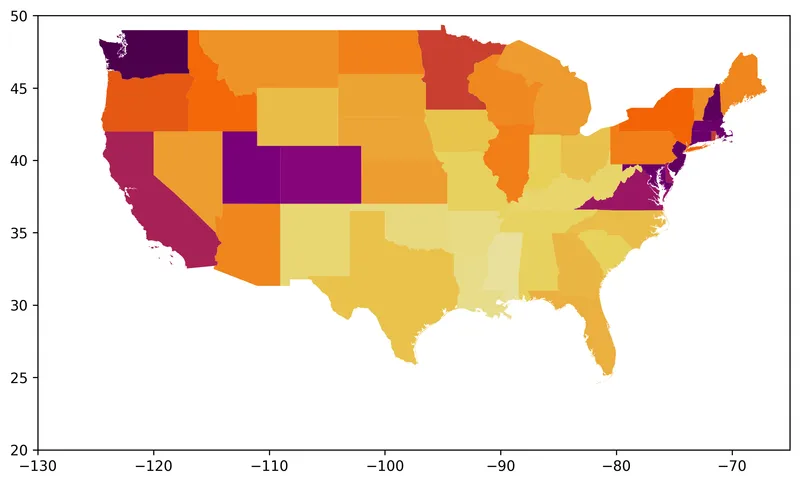
The key steps here are:
- create a colormap (
cmap) with the color range we want - create a matplotlib Figure with
fig, ax = plt.subplots() - plot the choropleth map with
gdf.plot()
cmap = load_cmap("enara", cmap_type="continuous", reverse=True)
edgecolor = "white"
linewidth = 0

fig, ax = plt.subplots(figsize=(8, 8), dpi=300)

ax.set_xlim(-130, -65)
ax.set_ylim(20, 50)

gdf.plot(ax=ax, column="salary", cmap=cmap, edgecolor=edgecolor, linewidth=linewidth)

fig.tight_layout()Add barplot
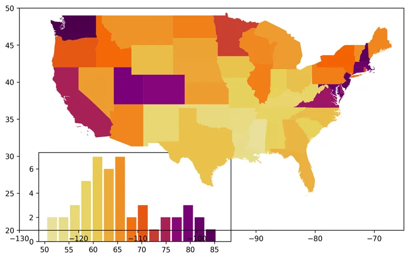
In order to add the barplot, we use the ax.inset_axes() function to create a subplot (smaller) that will contain our barplot.
If you're not familiar with complex layouts in Matplotlib, please check this dedicated lesson where we explain the concept in depth!
Then we customize it a bit so that it uses the right color scale and looks nice.
cmap = load_cmap("enara", cmap_type="continuous", reverse=True)
edgecolor = "white"
linewidth = 0

fig, ax = plt.subplots(figsize=(8, 8), dpi=300)

gdf.plot(ax=ax, column="salary", cmap=cmap, edgecolor=edgecolor, linewidth=linewidth)

ax.set_xlim(-130, -65)
ax.set_ylim(20, 50)

bar_ax = ax.inset_axes(bounds=[0.05, -0.05, 0.5, 0.4], zorder=-1)
n, bins, _ = bar_ax.hist(gdf["salary"], bins=15, alpha=0)
colors = [cmap((val - min(bins)) / (max(bins) - min(bins))) for val in bins]
bar_ax.bar(
    bins[:-1], n, color=colors, width=2, edgecolor=edgecolor, linewidth=linewidth
)

fig.tight_layout()Clean the Axes of map and barplot
Here we remove all spines (border of each plot) and clean up the labels in the histogram.
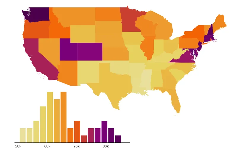
cmap = load_cmap("enara", cmap_type="continuous", reverse=True)
edgecolor = "white"
linewidth = 0

fig, ax = plt.subplots(figsize=(8, 8), dpi=300)

gdf.plot(ax=ax, column="salary", cmap=cmap, edgecolor=edgecolor, linewidth=linewidth)

ax.set_xlim(-130, -65)
ax.set_ylim(20, 50)
ax.axis("off")

bar_ax = ax.inset_axes(bounds=[0.05, -0.05, 0.5, 0.4], zorder=-1)
n, bins, _ = bar_ax.hist(gdf["salary"], bins=15, alpha=0)
colors = [cmap((val - min(bins)) / (max(bins) - min(bins))) for val in bins]
bar_ax.bar(
    bins[:-1], n, color=colors, width=2, edgecolor=edgecolor, linewidth=linewidth
)
bar_ax.spines[["top", "left", "right"]].set_visible(False)
bar_ax.set_yticks([])
x_ticks = list(range(50, 90, 10))
x_tick_labels = [f"{val}k" for val in x_ticks]
bar_ax.set_xticks(x_ticks, labels=x_tick_labels, size=8)
bar_ax.tick_params(axis="x", length=0, pad=5)

fig.tight_layout()Add individual state labels
The easiest way to find the center of each country is to use the centroid attribute of the geometry column in the geo dataframe. These coordinates can then be used to add annotations to the map.
Since the default font isn't very attractive, we load a font for the annotations. We can then use the load_google_font() function from pyfonts to load the fonts from Google font.
Just before adding the annotations, we define an adjustment dictionary to help us improve the approximate position of the annotations. This is necessary because centroids aren't always ideally positioned for annotations.
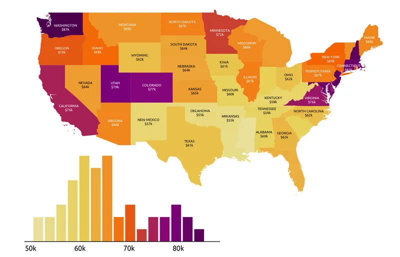
font2 = load_google_font("Ubuntu")
cmap = load_cmap("enara", cmap_type="continuous", reverse=True)
edgecolor = "white"
linewidth = 0
text_color = "white"

fig, ax = plt.subplots(figsize=(8, 8), dpi=300)

gdf.plot(ax=ax, column="salary", cmap=cmap, edgecolor=edgecolor, linewidth=linewidth)

ax.set_xlim(-130, -65)
ax.set_ylim(20, 50)
ax.axis("off")

bar_ax = ax.inset_axes(bounds=[0.05, -0.05, 0.5, 0.4], zorder=-1)
n, bins, _ = bar_ax.hist(gdf["salary"], bins=15, alpha=0)
colors = [cmap((val - min(bins)) / (max(bins) - min(bins))) for val in bins]
bar_ax.bar(
    bins[:-1], n, color=colors, width=2, edgecolor=edgecolor, linewidth=linewidth
)
bar_ax.spines[["top", "left", "right"]].set_visible(False)
bar_ax.set_yticks([])
x_ticks = list(range(50, 90, 10))
x_tick_labels = [f"{val}k" for val in x_ticks]
bar_ax.set_xticks(x_ticks, labels=x_tick_labels, size=8, font=font2)
bar_ax.tick_params(axis="x", length=0, pad=5)

exclude = {
    "Indiana",
    "Michigan",
    "Mississippi",
    "Florida",
    "New Jersey",
    "West Virginia",
    "South Carolina",
    "Louisiana",
    "Massachusetts",
    "Vermont",
    "Connedgecolorticut",
    "Maryland",
    "Delaware",
    "Rhode Island",
    "New Hampshire",
}
states_to_annotate = [state for state in gdf.state.to_list() if state not in exclude]

adjustments = {
    "California": (0, -1),
    "Kentucky": (0, -0.2),
    "Washington": (0.5, -0.4),
    "Virginia": (0, -0.2),
    "Idaho": (0, -0.4),
    "New York": (0, -0.2),
}

for state in states_to_annotate:
    centroid = gdf.loc[gdf["state"] == state, "centroid"].values[0]
    x_val, y_val = centroid.coords[0]
    try:
        x_val += adjustments[state][0]
        y_val += adjustments[state][1]
    except KeyError:
        pass
    value = gdf.loc[gdf["state"] == state, "salary"].values[0]
    if value <= 65:
        color_text = "black"
    else:
        color_text = text_color
    ax.text(
        x=x_val,
        y=y_val,
        s=f"{state.upper()}\n${value:.0f}k",
        fontsize=5,
        font=font2,
        color=color_text,
        ha="center",
        va="center",
    )

fig.tight_layout()Add last annotations
The title, credit and source annotations are added via the fig.text() function at the end:
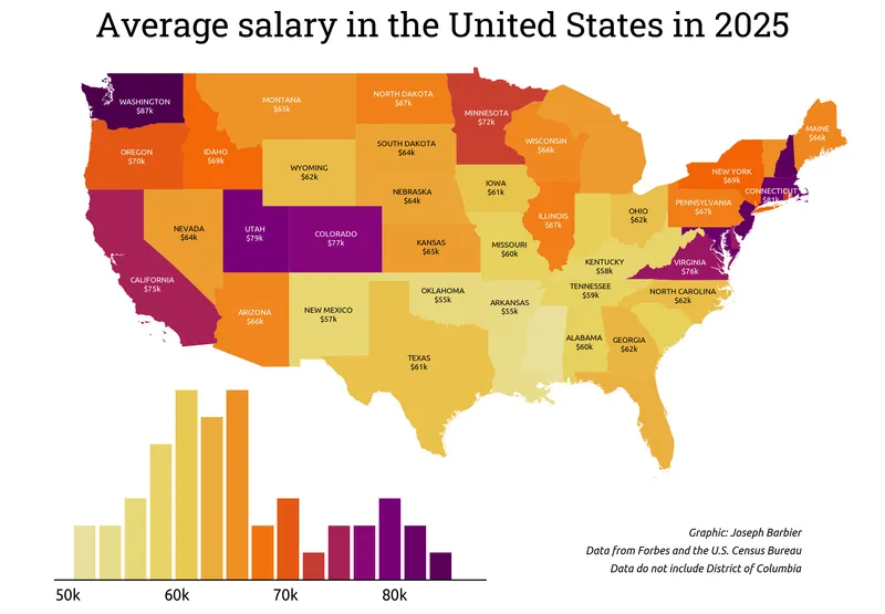
font1 = load_google_font("Ubuntu", italic=True)
font2 = load_google_font("Ubuntu")
cmap = load_cmap("enara", cmap_type="continuous", reverse=True)
edgecolor = "white"
linewidth = 0
text_color = "white"

fig, ax = plt.subplots(figsize=(8, 8), dpi=300)

gdf.plot(ax=ax, column="salary", cmap=cmap, edgecolor=edgecolor, linewidth=linewidth)

ax.set_xlim(-130, -65)
ax.set_ylim(20, 50)
ax.axis("off")

bar_ax = ax.inset_axes(bounds=[0.05, -0.05, 0.5, 0.4], zorder=-1)
n, bins, _ = bar_ax.hist(gdf["salary"], bins=15, alpha=0)
colors = [cmap((val - min(bins)) / (max(bins) - min(bins))) for val in bins]
bar_ax.bar(
    bins[:-1], n, color=colors, width=2, edgecolor=edgecolor, linewidth=linewidth
)
bar_ax.spines[["top", "left", "right"]].set_visible(False)
bar_ax.set_yticks([])
x_ticks = list(range(50, 90, 10))
x_tick_labels = [f"{val}k" for val in x_ticks]
bar_ax.set_xticks(x_ticks, labels=x_tick_labels, size=8, font=font2)
bar_ax.tick_params(axis="x", length=0, pad=5)

exclude = {
    "Indiana",
    "Michigan",
    "Mississippi",
    "Florida",
    "New Jersey",
    "West Virginia",
    "South Carolina",
    "Louisiana",
    "Massachusetts",
    "Vermont",
    "Connedgecolorticut",
    "Maryland",
    "Delaware",
    "Rhode Island",
    "New Hampshire",
}
states_to_annotate = [state for state in gdf.state.to_list() if state not in exclude]

adjustments = {
    "California": (0, -1),
    "Kentucky": (0, -0.2),
    "Washington": (0.5, -0.4),
    "Virginia": (0, -0.2),
    "Idaho": (0, -0.4),
    "New York": (0, -0.2),
}

for state in states_to_annotate:
    centroid = gdf.loc[gdf["state"] == state, "centroid"].values[0]
    x_val, y_val = centroid.coords[0]
    try:
        x_val += adjustments[state][0]
        y_val += adjustments[state][1]
    except KeyError:
        pass
    value = gdf.loc[gdf["state"] == state, "salary"].values[0]
    if value <= 65:
        color_text = "black"
    else:
        color_text = text_color
    ax.text(
        x=x_val,
        y=y_val,
        s=f"{state.upper()}\n${value:.0f}k",
        fontsize=5,
        font=font2,
        color=color_text,
        ha="center",
        va="center",
    )

fig.text(
    x=0.5,
    y=0.8,
    s="Average salary in the United States in 2025",
    ha="center",
    size=22,
    font=load_google_font("Roboto Slab"),
)

credit_params = dict(x=0.9, ha="right", size=7, font=font1, va="bottom")
fig.text(y=0.24, s="Graphic: Joseph Barbier", **credit_params)
fig.text(y=0.22, s="Data from Forbes and the U.S. Census Bureau", **credit_params)
fig.text(y=0.2, s="Data do not include District of Columbia", **credit_params)

fig.tight_layout()

fig.savefig(
    "../../static/graph/web-choropleth-map-with-histogram.png",
    dpi=300,
    bbox_inches="tight",
)Going further
You might be interested in:
- the choropleth map section of the gallery
- this other choropleth + barplot example
- how to create an interactive choropleth map
- learn matplotlib easily with Matplotlib Journey