About
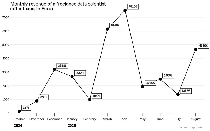
This plot is a line chart showing the salary evolution of Joseph Barbier, a freelance data scientist. Thanks to him for accepting sharing his work here!
Let's see what the final picture will look like:

Libraries
We only need matplotlib and pyfonts for this plot, that we can import with:
import matplotlib.pyplot as plt
from pyfonts import set_default_font, load_google_fontinstall pyfonts with pip install pyfonts
Dataset
The data is just 2 Python lists:
months = [
    "October",
    "November",
    "December",
    "January",
    "February",
    "March",
    "April",
    "May",
    "June",
    "July",
    "August",
]

values = [
    127,
    893,
    3188,
    2664,
    992,
    6140,
    7520,
    1939,
    2486,
    1358,
    4659,
]Basic line chart
We combine ax.scatter() with ax.plot() to showcase both the variation and individual points in the chart.
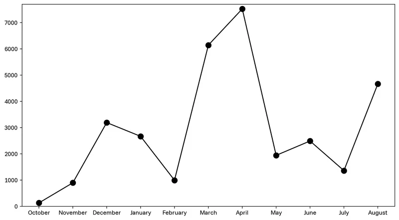
fig, ax = plt.subplots(figsize=(11, 6), dpi=200)

ax.plot(months, values, color="black")
ax.scatter(months, values, s=80, color="black")
ax.set_ylim(0, 7700)
plt.show()Style the Axes
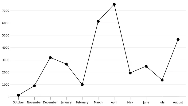
To make the Axes look better, we:
- remove top, left and right spines
- remove y ticks
- add horizontal background grid
fig, ax = plt.subplots(figsize=(11, 6), dpi=200)

ax.plot(months, values, color="black")
ax.scatter(months, values, s=80, color="black")
ax.set_ylim(0, 7700)

ax.spines[["top", "left", "right"]].set_visible(False)
ax.tick_params(axis="x", pad=5, size=10)
ax.tick_params(axis="y", size=0)
ax.grid(axis="y", zorder=-2, alpha=0.3)

plt.show()Labels and fonts
We add individual labels using a simple for loop and the ax.text() function.
Here we use pyfonts to load fonts from Google fonts and we set the default font to "Funnel Sans", and load its bold version for the year labels.
font = load_google_font("Funnel Sans")
font_bold = load_google_font("Funnel Sans", weight=800)
set_default_font(font)

fig, ax = plt.subplots(figsize=(11, 6), dpi=200)

ax.set_ylim(0, 7700)
ax.spines[["top", "left", "right"]].set_visible(False)
ax.tick_params(axis="x", pad=5, size=10)
ax.tick_params(axis="y", size=0)
ax.grid(axis="y", zorder=-2, alpha=0.3)

ax.plot(months, values, color="black")
ax.scatter(months, values, s=80, color="black")

for i, value in enumerate(values):
    ax.text(
        x=i + 0.2,
        y=value + 200,
        s=f"{int(value)}€",
        bbox=dict(facecolor="white", alpha=0.9),
        zorder=100,
    )

ax.text(
    x=-0.5,
    y=8100,
    s="Monthly revenue of a freelance data scientist\n(after taxes, in Euro)",
    size=15,
    va="top",
)
ax.text(x=-0.3, y=-1000, s="2024", size=12, font=font_bold)
ax.text(x=2.75, y=-1000, s="2025", size=12, font=font_bold)
ax.text(
    x=10.4,
    y=-1100,
    s="barbierjoseph.com",
    style="italic",
    size=9,
    color="grey",
    ha="right",
)

plt.savefig("../../static/graph/web-minimalist-black-and-white-line-chart.png", dpi=300)
plt.show()