Connected Scatterplot

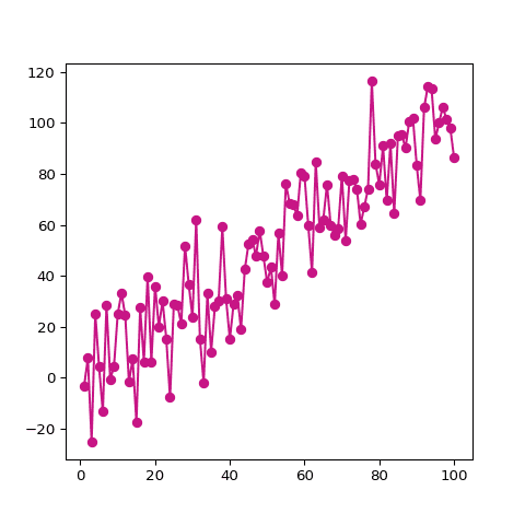
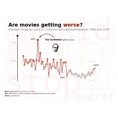
A connected scatterplot is a line chart where each data point is shown by a circle or any type of marker. This section explains how to build a connected scatterplot with Python, using both the Matplotlib and the Seaborn libraries.
⏱ Quick start
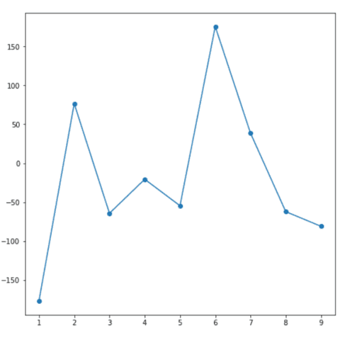
Building a connected scatterplot with Python and Matplotlib is a breeze thanks to the plot() function. The 2 first argumenst are the X and Y values respectively, which can be stored in a pandas data frame.
The linestyle and marker arguments allow to use line and circles to make it look like a connected scatterplot. It means everything is very close to a line chart or a scatterplot that are extensively described in the gallery.
# libraries
  import matplotlib.pyplot as plt
  import numpy as np
  import pandas as pd

  # data
  df = pd.DataFrame({
      'x_axis': range(1,10),
      'y_axis': np.random.randn(9)*80+range(1,10)
  })

  # plot
  plt.plot('x_axis', 'y_axis', data=df, linestyle='-', marker='o')
  plt.show()
⚠️ Two types of connected scatterplot
There are two types of connected scatterplot, and it often creates confusion.
The first is simply a lineplot with dots added on top of it. It takes as input 2 numeric variables only. The second shows the relationship between 2 numeric variables across time. It requires 3 numeric variables as input.
Confusing? Visit data-to-viz to clarify..
 Connected scatterplot with
 Seaborn
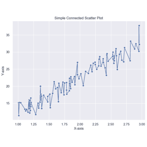
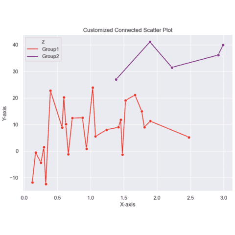
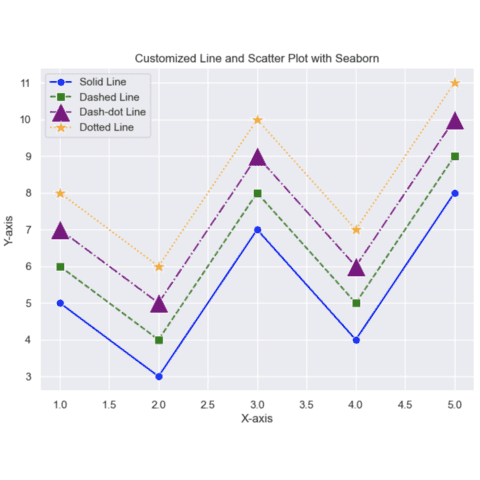
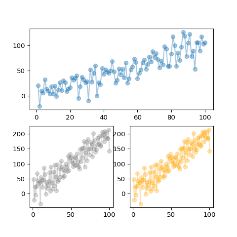
Building a connected scatterplot with Seaborn looks pretty much the same as for a line chart. It is made thanks to the lineplot() function.
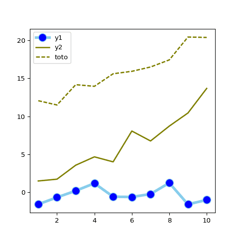
Click the following images to get a long form tutorial on how to create a basic connected scatterplot with Seaborn, how to draw multiple groups and how to customize the lines and the markers.
 Connected scatterplot with
 Matplotlib
As for scatterplots, Matplotlib will help us build a bubble plot thanks to the the plt.scatter() function. This function provides a s parameter allowing to pass a third variable that will be mapped to the markers size.
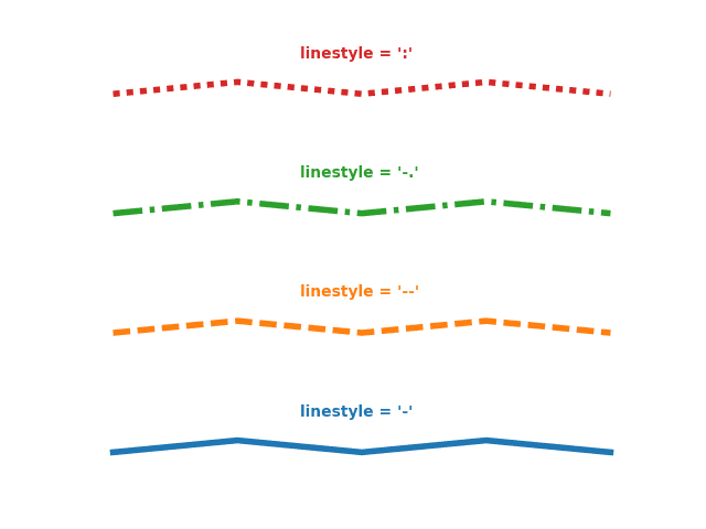
Cheatsheet: line customization with Matplotlib and the linestyle parameter.
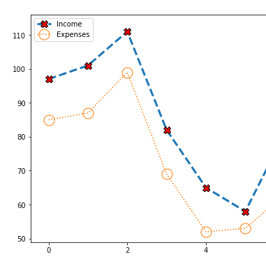
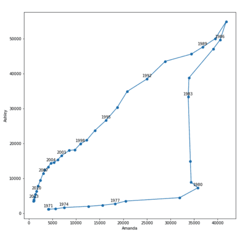
 Connected scatterplot for 2 variables
As explained above, a connected scatterplot can also be base on 3 numeric variables. It allows to study the evolution of 2 variables (placed on the X and on the Y axis).
 Best python connected scatterplot examples
The web is full of astonishing charts made by awesome bloggers, (often using R). The Python graph gallery tries to display (or translate from R) some of the best creations and explain how their source code works. If you want to display your work here, please drop me a word or even better, submit a Pull Request!
🚨 Grab the Data To Viz poster!
Do you know all the chart types? Do you know which one you should pick? I made a decision tree that answers those questions. You can download it for free!

