

Create your own continuous colormap
With matplotlib, you can easily work with your own custom qualitative palettes thanks to the ListedColormap() class.
Here's how you can create one:
from matplotlib.colors import LinearSegmentedColormap

# Define your custom color palette
custom_colors = [
   '#023047', # first color
   '#ffb703' # last color
]

# Create a ListedColormap
custom_cmap = LinearSegmentedColormap.from_list("custom_gradient", custom_colors)
custom_cmap

And in order to use it, it's pretty easy. We just have to specify: cmap=custom_cmap (since that's the named with gave it), and done!
import matplotlib.pyplot as plt
import numpy as np
import pandas as pd

size = 30
x = np.random.randn(size),
y = np.random.randn(size),

# Iniate a figure for the scatter plot
fig, ax = plt.subplots(dpi=300)

# Create a scatter plot
ax.scatter(x, y, c=y, s=300, cmap=custom_cmap)

# Add a colorbar
cbar = plt.colorbar(ax.collections[0], ax=ax, orientation='vertical')
cbar.set_label('Color', fontsize=12)

# Display the plot
plt.show()
Create your own categorical colormap
For creating categorical palettes, you have to use the ListedColormap() class. Here's how you can create one:
from matplotlib.colors import ListedColormap

# Define your custom color palette
custom_colors = ['#264653', '#2a9d8f', '#e9c46a', '#f4a261', '#e76f51']

# Create a ListedColormap
custom_cmap = ListedColormap(custom_colors)
custom_cmap

And in order to use it, it's pretty much the same as before. The difference is that we use the color argument and pass it the custom_cmap.colors, which is a list with the colors.
# load libraries
import pandas as pd
import matplotlib.pyplot as plt

# some simple data
x = ['Paul', 'Pierre', 'Marie', 'Sophie', 'Franck']
y = [15, 17, 21, 28, 34]

# create a bar plot
fig, ax = plt.subplots(figsize=(8,8), dpi=300)
ax.barh(x, y, color=custom_cmap.colors)
plt.show()
Create Palettes vs. Use Existing Ones
Even though color is a crucial element in a chart, you don't have to do everything yourself. Many people have already created thousands of excellent colormaps specifically for this purpose.
Creating a good color palette is far more challenging than it seems and requires a solid understanding of color compatibility.
Fortunately, Matplotlib provides a variety of categorical palettes and continuous ones, and the pypalettes library adds 2,500 additional palettes. With these tools, you're sure to find your dream palette.
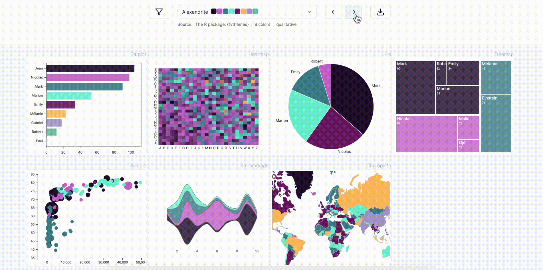
Note: The gallery has a dedicated page to browse all these palettes, so go check it out here.
Going further
Palette finder
Browse the color palette finder to find your dream palette!
Related
- the color section of the gallery
- learn how to use a colormaps
- available named colors in Matplotlib


