

Palettes
When working with colors, it's important to understand the difference between
- sequential palettes, which are used for ordered/numerical data that progresses from low to high
- diverging palettes, which are used for ordered/numerical data that has a critical midpoint, such as zero
- qualitative palettes, which are used for unordered/categorical data
In this post, we'll focus on sequential and diverging palettes. These palettes are used to represent ordered data, such as a range of temperatures or a scale of emotions.
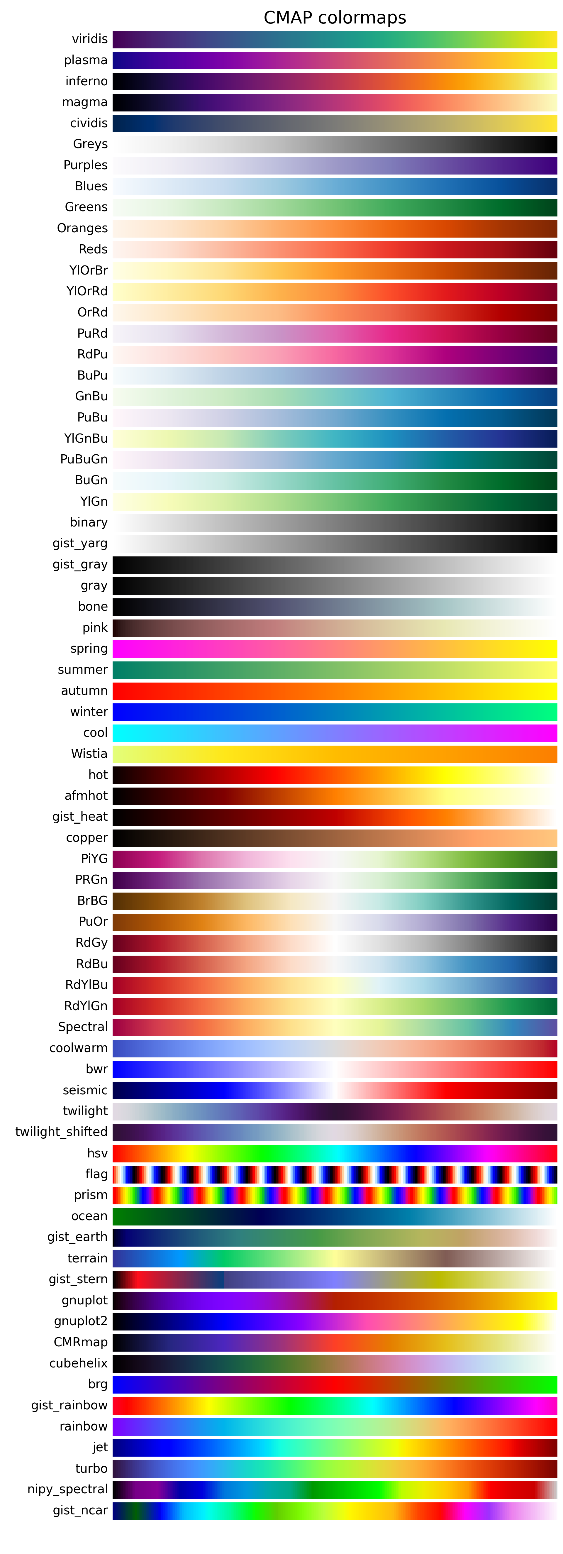
Available palettes by default
Here are the available default continuous palettes in matplotlib:
How to use a continuous palette
Sequential palettes
Sequential palettes are used for ordered data that progresses from low to high. For example, a sequential palette can be used to represent a range of temperatures.
Diverging palettes
Diverging palettes are used for ordered data that has a critical midpoint, such as zero. For example, a diverging palette can be used to represent a scale of emotions, where zero represents a neutral emotion.
Let's see how these palettes look in practice:
import matplotlib.pyplot as plt- this is a sequential palette:
plt.get_cmap('Purples')
We easily see the progression from low to high values.
- this is a diverging palette:
plt.get_cmap('Spectral')
Here we see the midpoint at zero, with values diverging in both directions.
Now that we understand the difference between sequential and diverging palettes, let's see how to use them in Python using matplotlib. Here's what to do:
- Load the necessary libraries
# Load libraries
import matplotlib.pyplot as plt
import pandas as pd
import numpy as np
import random

# Fix random seed for reproducibility
np.random.seed(1)- Create some data
# Create some data
size = 30
data = pd.DataFrame({
   'x': np.random.randn(size),
   'y': np.random.randn(size),
   'z': np.random.randn(size)
})
data.head()| x | y | z | |
|---|---|---|---|
| 0 | 1.624345 | -0.691661 | -0.754398 |
| 1 | -0.611756 | -0.396754 | 1.252868 |
| 2 | -0.528172 | -0.687173 | 0.512930 |
| 3 | -1.072969 | -0.845206 | -0.298093 |
| 4 | 0.865408 | -0.671246 | 0.488518 |
- Create 2 scatter plots with both palettes
# Iniate a figure for the scatter plot
fig, axs = plt.subplots(ncols=2, dpi=300, figsize=(10, 5))

# Define our colormaps
cmap1 = plt.get_cmap('Purples')
cmap2 = plt.get_cmap('Spectral')

# Left chart
axs[0].scatter(data['x'], data['y'], c=data['z'], s=300, cmap=cmap1)
axs[0].set_title('Purples colormap')

# Right chart
axs[1].scatter(data['x'], data['y'], c=data['z'], s=300, cmap=cmap2)
axs[1].set_title('Spectral colormap')

# Display the plot
plt.show()
Going further
Palette finder
Browse the color palette finder to find your dream palette!
Related
- the color section of the gallery
- discover the categorical palettes available in Matplotlib
- available named colors in Matplotlib


