

Palettes
When working with colors, it's important to understand the difference between
- sequential palettes, which are used for ordered/numerical data that progresses from low to high
- diverging palettes, which are used for ordered/numerical data that has a critical midpoint, such as zero
- qualitative palettes, which are used for unordered/categorical data
In this post, we'll focus on qualitative palettes. These palettes are used to represent unordered/categorical data, such as different species of animals or different types of fruits.
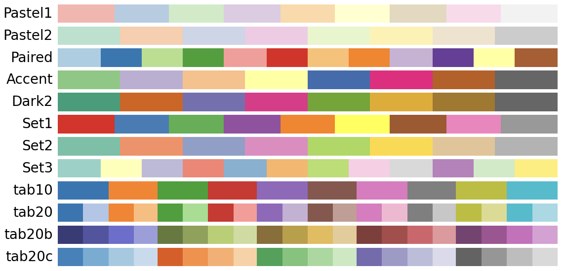
Available palettes by default
Here are the available default qualitative palettes in matplotlib:
How to use a qualitative palette
Now let's see how to use them in practice. We start by looking at how they look and then choose the one that fits our taste the best.
import matplotlib.pyplot as pltplt.get_cmap('Pastel1')
plt.get_cmap('tab20')
plt.get_cmap('Accent')
Let's say you like the Accent palette and want to use to color the points in a scatter plot in matplotlib. Here's how you can do it:
- Load the necessary libraries
# Load libraries
import matplotlib.pyplot as plt
import pandas as pd
import numpy as np
import random

# Fix random seed for reproducibility
np.random.seed(1)- Create some data
# Create some data
size = 30
data = pd.DataFrame({
   'x': np.random.randn(size),
   'y': np.random.randn(size),
   'cat': random.choices(['A', 'B', 'C'], k=size)
})
data.head()| x | y | cat | |
|---|---|---|---|
| 0 | 1.624345 | -0.691661 | A |
| 1 | -0.611756 | -0.396754 | B |
| 2 | -0.528172 | -0.687173 | B |
| 3 | -1.072969 | -0.845206 | C |
| 4 | 0.865408 | -0.671246 | B |
- Create a scatter plot with the
Accentpalette
# Iniate a figure for the scatter plot
fig, ax = plt.subplots(dpi=300)

# Define our colormap
cmap = plt.get_cmap('Accent')

# Create a scatter plot with Accent colormap
for i, (cat, df) in enumerate(data.groupby('cat')):
   ax.scatter(df['x'], df['y'], label=cat, color=cmap(i), s=100)

# Add a legend
ax.legend()

# Display the plot
plt.show()
Going further
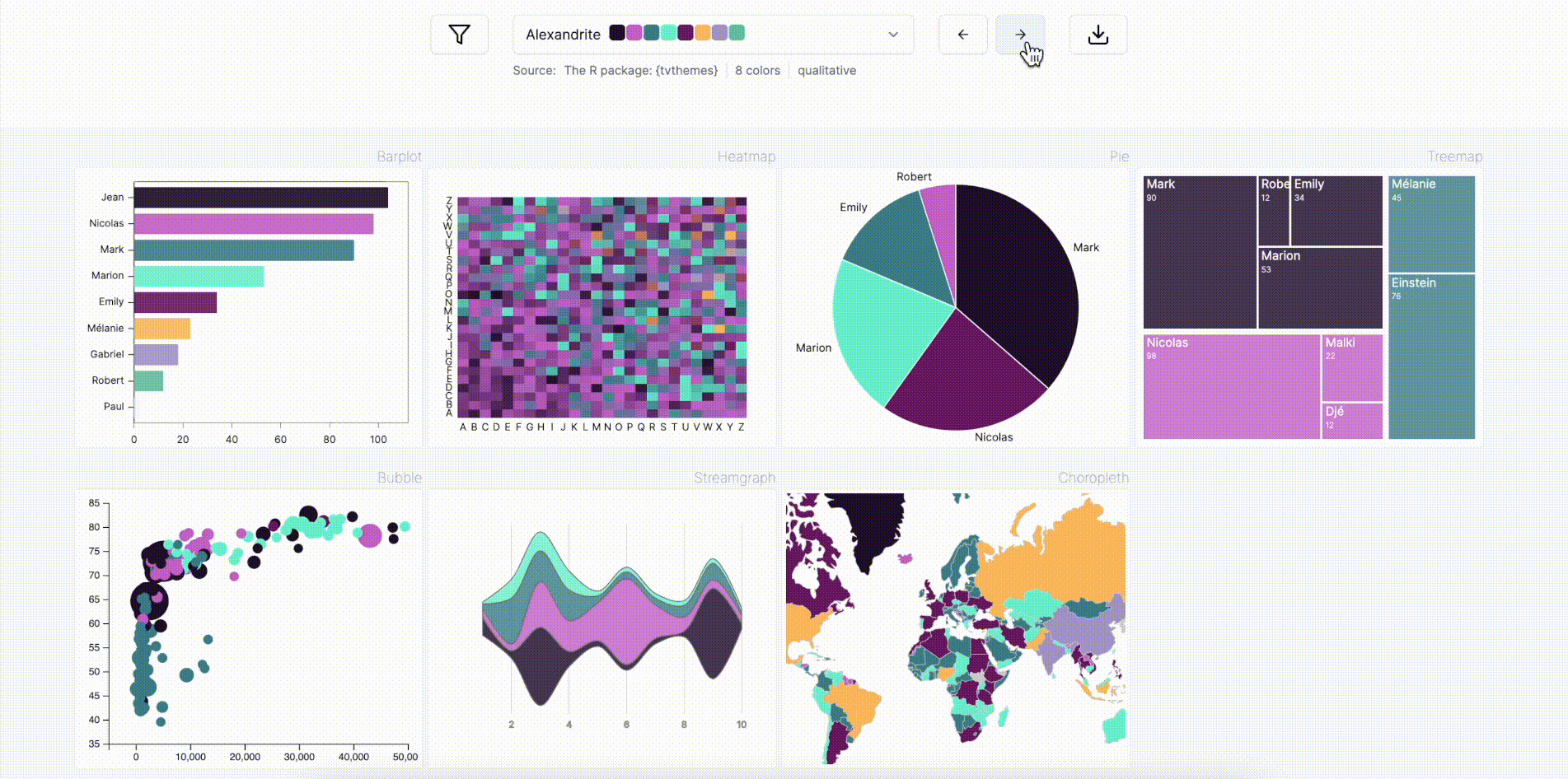
Palette finder
Browse the color palette finder to find your dream palette!
Related
- the color section of the gallery
- discover the continuous palettes available in Matplotlib
- available named colors in Matplotlib


