Animation

An animation is a sequence of images displayed one after the other. It is a powerful way to show a process or a change over time.
This page shows how to build animated charts with Python and Matplotlib.
⏱ Quick start
An animated chart can be build with python using the FuncAnimation() function from matplotlib. We follow these steps:
- Load libraries
- Open a dataset
- Define an
updatefunction used to build each frame of the animation - Create the animation with
FuncAnimation()and save it withsave()
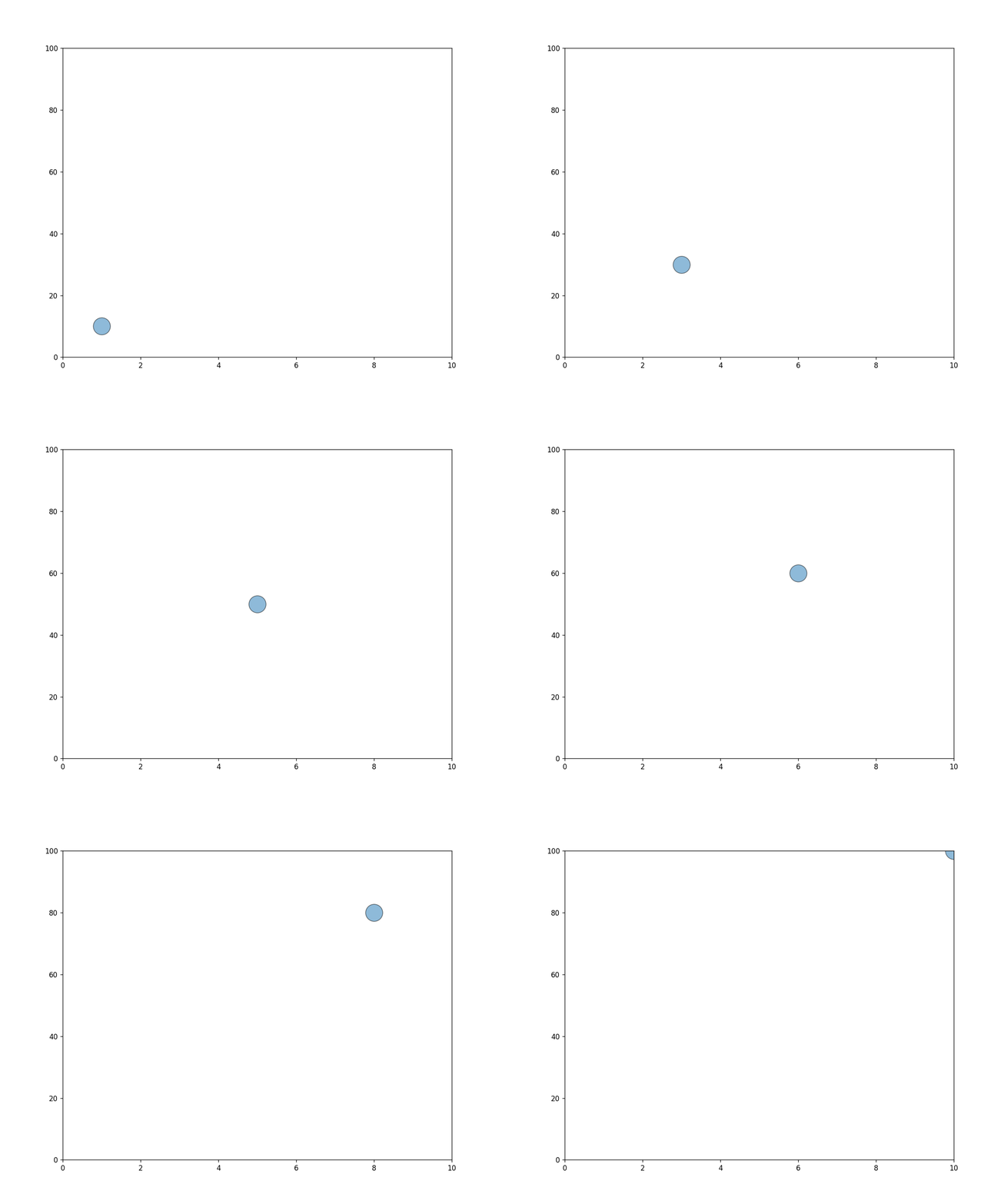
# libraries
import matplotlib.pyplot as plt
from matplotlib.animation import FuncAnimation

# initiate figure
fig, ax = plt.subplots(figsize=(10, 8), dpi=120)

def update(frame):
    ax.clear()
    ax.scatter(
      1+frame, 10+frame*10,
      s=600, alpha=0.5,
      edgecolors="black"
    )
    ax.set_xlim(0, 10)
    ax.set_ylim(0, 100)
    return fig, ax

ani = FuncAnimation(fig, update, frames=range(10))
ani.save("my_animation.gif", fps=5)💡 Animation ≠ Interaction
There is a common confusion between what animated and interactive charts are:
- Animated means a sequence of several static images is displayed. The user can't do anything except watching those images.
- Interactive means the user can interact with the chart: zoom in, hover over a shape to get a tooltip, click to have a menu... The user is not a spectator anymore, but also an actor.

Matplotlib and FuncAnimation()
The FuncAnimation() function, a component of the matplotlib.animation module, facilitates the creation of animations by repeatedly invoking a function that updates the plot content with each iteration.
Typically, you start by establishing a figure and an axis. Following this, an update() function is defined to modify the plot's content at every animation cycle.
To complete the process, you generate the animation using FuncAnimation() and subsequently store it using the save() function.
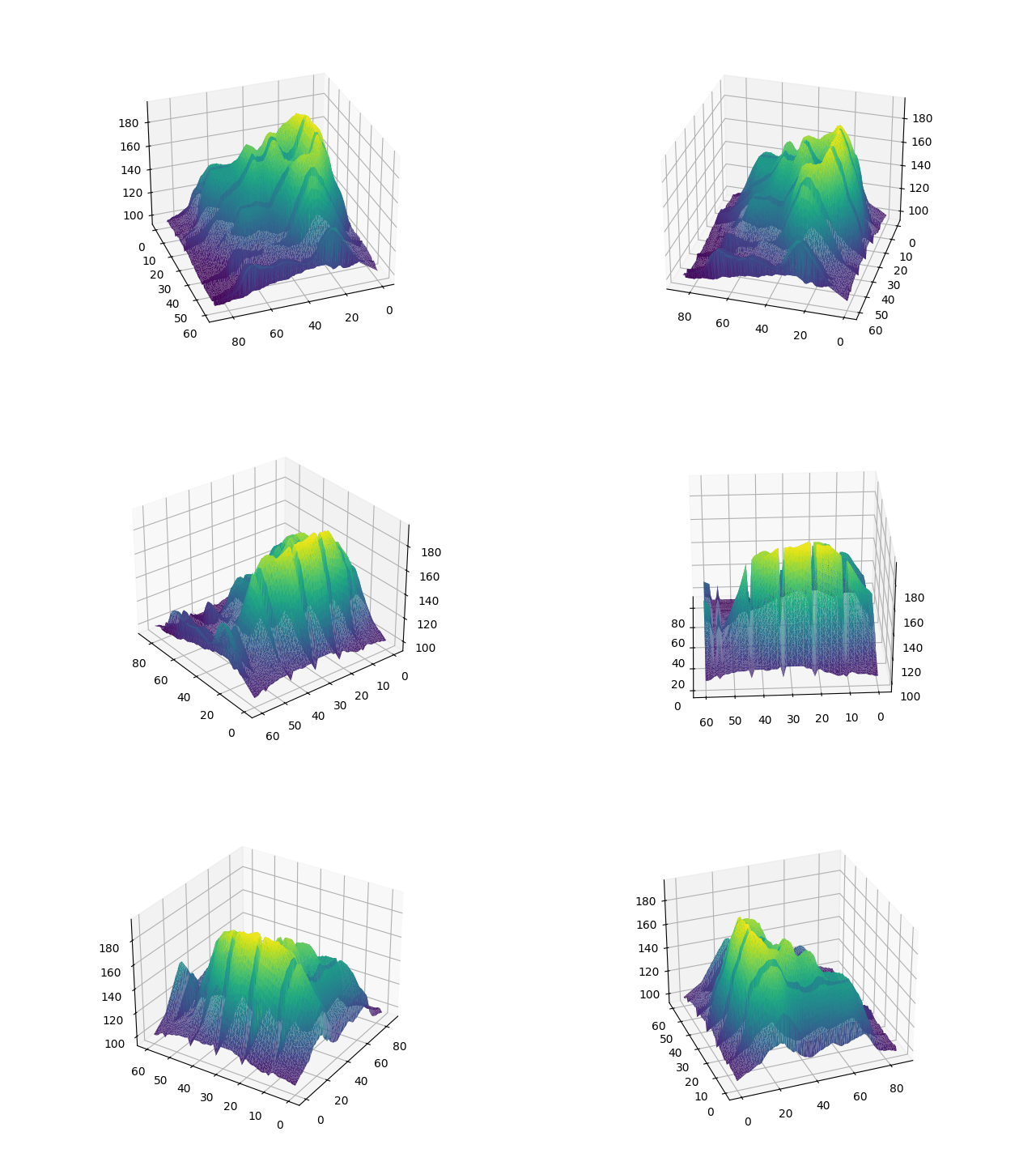
The process is pretty much the same for a 3d chart. Here is an example with an animated volcano plot. Each iteration of the loop changes the camera angle, giving this feeling of travelling around the volcano.
Advanced uses cases
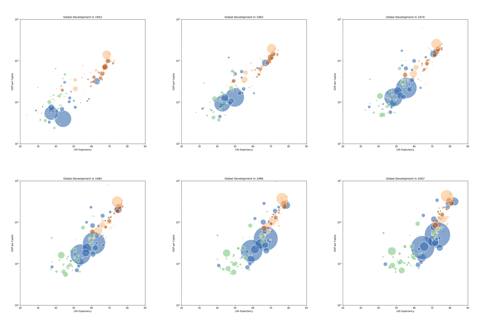
Animated charts can be highly impactful when illustrating a process or change over time. Here are a few examples that demonstrate their effectiveness.
This real life example illustrates the power of animated charts. The chart is a stacked area chart with a text that is written through the animation.
See code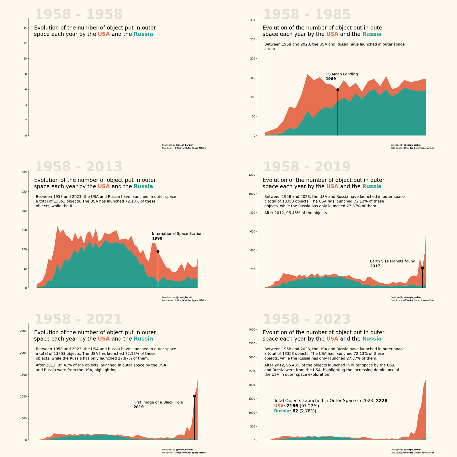
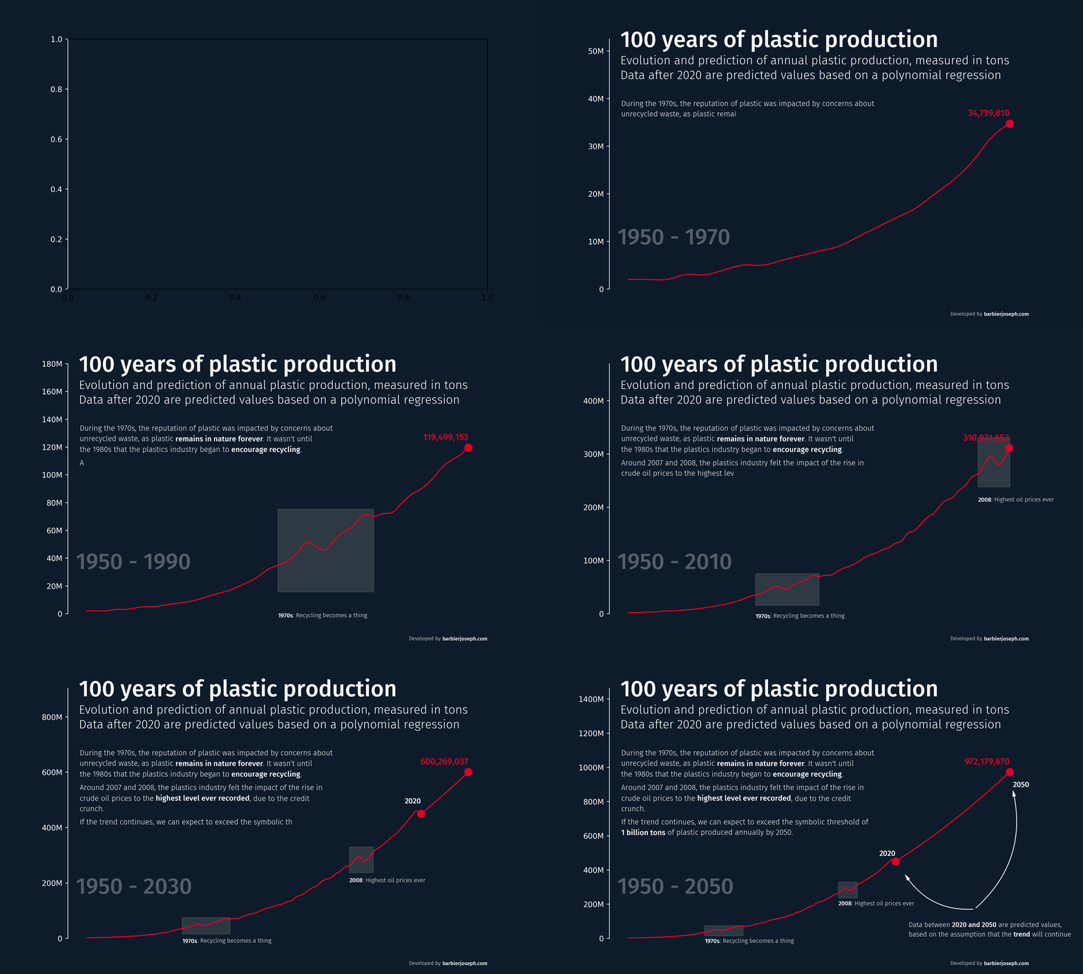
This line chart, or race chart, shows the evolution of the of global plastic production over time with a smooth animation and highlighted text.
See codeRelated chart types






💡 Out of dataviz inspiration?
I have spent years collecting the most beautiful data visualizations out there. Get the list of my top 300 dataviz projects, hand-picked, for free.
I respect your privacy. Unsubscribe anytime.