Libraries & Data
For creating the charts, we will need to load the following libraries:
- matplotlib for creating the chart and the arrows
- pandas for loading the data
- geopandas for loading the world boundaries
cartopyfor changing the projections
import pandas as pd
import matplotlib.pyplot as plt

import geopandas as gpd
import cartopy.crs as ccrs

# set a higher resolution
plt.rcParams['figure.dpi'] = 300

# load the world dataset
url = "https://raw.githubusercontent.com/holtzy/The-Python-Graph-Gallery/master/static/data/all_world.geojson"
world = gpd.read_file(url)
world.head()| name | geometry | |
|---|---|---|
| 0 | Fiji | MULTIPOLYGON (((180.00000 -16.06713, 180.00000... |
| 1 | Tanzania | POLYGON ((33.90371 -0.95000, 34.07262 -1.05982... |
| 2 | W. Sahara | POLYGON ((-8.66559 27.65643, -8.66512 27.58948... |
| 3 | Canada | MULTIPOLYGON (((-122.84000 49.00000, -122.9742... |
| 4 | United States of America | MULTIPOLYGON (((-122.84000 49.00000, -120.0000... |
What's a projection
How can we make a 2D version of a 3D object like the Earth? This challenge is tackled through map projections, which transform the Earth's spherical surface into a flat map. Projections are crucial because they inevitably distort some aspects of the Earth's surface, such as shape, area, distance, or direction.
The choice of projection can significantly alter the message conveyed by a map; for instance, using a Mercator projection preserves direction but distorts the size of landmasses, making regions near the poles appear disproportionately large and potentially misleading viewers about the true scale of countries.
Default map
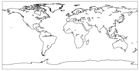
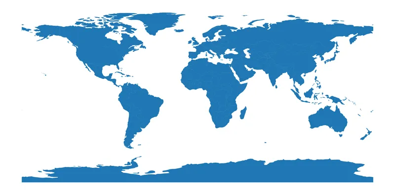
Let's check how the default matplotlib/geopandas map looks like by using the plot() method on our previous dataset:
fig, ax = plt.subplots(figsize=(12, 8))

ax.set_axis_off() # remove border around the axes
world.plot(ax=ax)

plt.show()This projection is called PlateCarree. The default Matplotlib map plot often shows countries with varying shapes. Countries near the equator appear relatively normal, while those farther from the equator, especially near the poles, look distorted.
This occurs because the projection stretches landmasses more as they move away from the equator, causing countries near the poles to spread horizontally along the x-axis.
The mercator projection
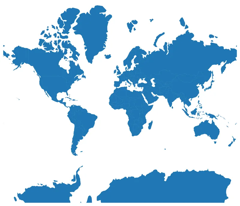
One of the most famous projection is called "Mercator". The Mercator projection maintains accurate direction by representing lines of constant course as straight segments, but it distorts size and shape increasingly towards the poles.

To change our previous chart projection to the Mercator projection, we follow these steps:
- initiate a
projectionvariable using thecrsmodule fromcartopy - change the polygon values in our
worldgeodataframe - pass our projection to
subplot_kw
projection = ccrs.Mercator()
world_merc = world.to_crs(projection.proj4_init)

fig, ax = plt.subplots(figsize=(12, 8), subplot_kw={"projection": projection})

ax.set_axis_off() # remove border around the axes
world_merc.plot(ax=ax)

plt.show()Our map looks way better, but the main problem with Mercator is that, for example, Greenland appears to be larger than Africa when in fact it is 14 times smaller!
Bubble maps and projections
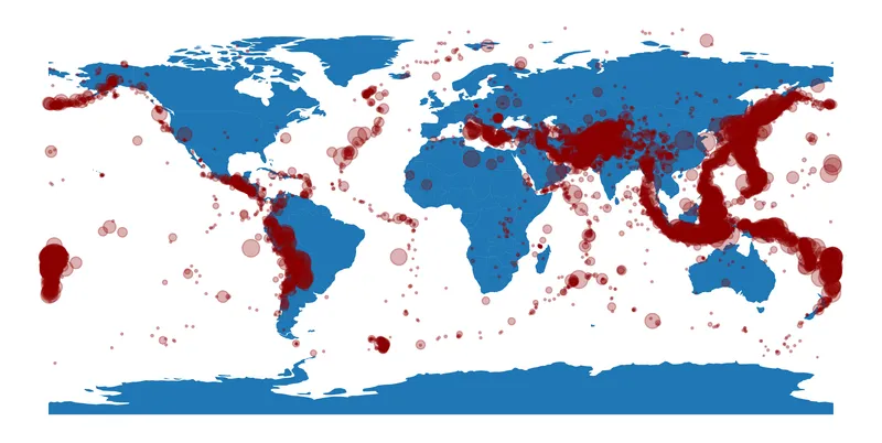
A common map type is the bubble map, which overlays a scatter plot on a map, using longitudes as x-axis values and latitudes as y-axis values. However, simply changing the map projection doesn’t automatically adjust the scatter plot points accordingly.
Changing the projection alters the representation of the world's shape, thus shifting the actual locations of given latitudes and longitudes. Consequently, we must recalculate the new positions of each scatter plot point. Let's begin by loading a dataset with earthquake positions:
#Load data
url = "https://raw.githubusercontent.com/holtzy/The-Python-Graph-Gallery/master/static/data/earthquakes.csv"
df = pd.read_csv(url)
df = df[df['Depth (km)']>=0.01] # depth of at least 10 meters
df.sort_values(by='Depth (km)', ascending=False, inplace=True)
df.head()| Date | Time (utc) | Region | Magnitude | Depth (km) | Latitude | Longitude | Mode | Map | year | |
|---|---|---|---|---|---|---|---|---|---|---|
| 7961 | 20/02/2019 | 06:50:47 | Banda Sea | 5.0 | 2026 | -6.89 | 129.15 | A | - | 2019.0 |
| 6813 | 07/07/2019 | 07:50:53 | Eastern New Guinea Reg, P.N.G. | 5.4 | 1010 | -5.96 | 147.90 | A | - | 2019.0 |
| 8293 | 17/01/2019 | 14:01:50 | Fiji Islands | 4.7 | 689 | -18.65 | 179.44 | A | - | 2019.0 |
| 11258 | 03/01/2018 | 06:42:58 | Fiji Islands Region | 5.5 | 677 | -19.93 | -178.89 | A | - | 2018.0 |
| 9530 | 06/09/2018 | 18:22:24 | Fiji Islands Region | 5.8 | 672 | -18.88 | 179.30 | A | - | 2018.0 |
Now we add the earthquakes on our first map:
fig, ax = plt.subplots(figsize=(12, 8))

ax.set_axis_off()
world.plot(ax=ax)
ax.scatter(
   x=df['Longitude'], y=df['Latitude'], s=df['Depth (km)']/3,
   color='darkred', alpha=0.3
)

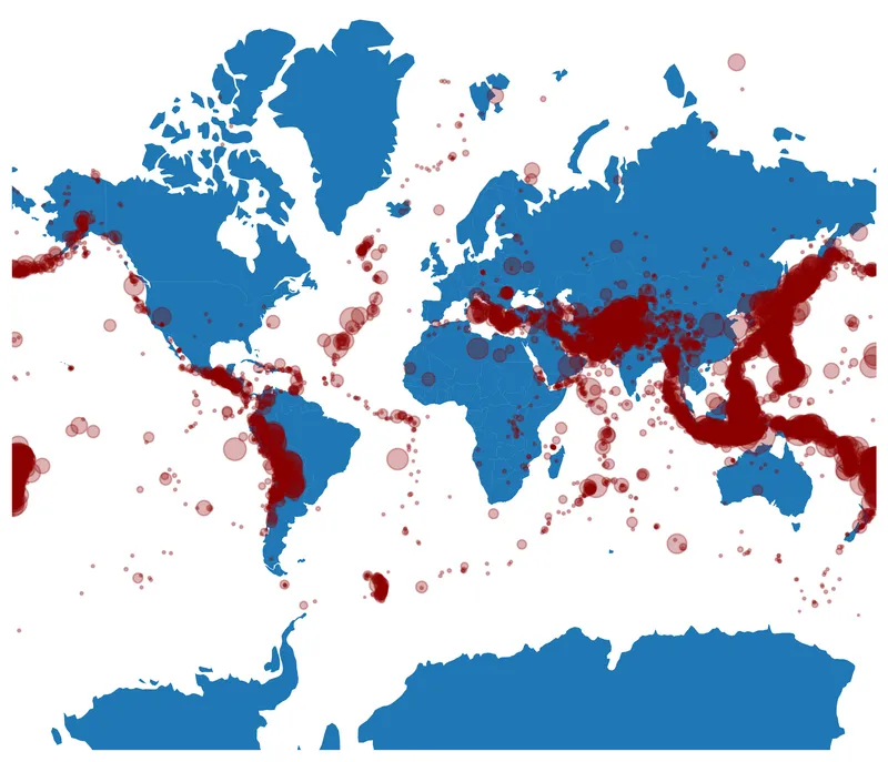
plt.show()If we want to use the Mercator projection in our bubble map, we have to do multiple things:
- define the wanted projection with Mercator ->
projection = ccrs.Mercator() - specify that our current data projection is PlateCarree
previous_proj = ccrs.PlateCarree() - transform the positions ->
new_coords = projection.transform_points(previous_proj, df['Longitude'].values, df['Latitude'].values) - change our background map projection ->
world_merc = world.to_crs(projection.proj4_init)
Everything else stays the same: we just use new_coords when creating the scatter plot!
projection = ccrs.Mercator()
previous_proj = ccrs.PlateCarree()
new_coords = projection.transform_points(previous_proj, df['Longitude'].values, df['Latitude'].values)
world_merc = world.to_crs(projection.proj4_init)

fig, ax = plt.subplots(figsize=(12, 8), dpi=300, subplot_kw={'projection':projection})

ax.set_axis_off()
world_merc.plot(ax=ax)

# transform the coordinates to the projection's CRS
ax.scatter(
   x=new_coords[:, 0], y=new_coords[:, 1], s=df['Depth (km)']/3,
   color='darkred', alpha=0.3
)

plt.show()Other projections
The number of different projections is in fact very large. Below is an exhaustive list of the projections available in cartopy (the first ones are the most common ones, and recommended for most use cases):z
PlateCarree(): most basic projectionAlbersEqualArea(): preserves area, conicalAzimuthalEquidistant(): preserves distance from centerEquidistantConic(): preserves distance along meridiansLambertConformal(): preserves shape, conicalLambertCylindrical(): equal-area cylindricalMercator(): preserves direction, exaggerates polesMiller(): compromise between Mercator and cylindricalMollweide(): equal-area, ellipticalObliqueMercator(): rotated Mercator for oblique aspectsOrthographic(): view from infinite distanceRobinson(): pseudo-cylindrical, compromiseSinusoidal(): equal-area, pseudo-cylindricalStereographic(): conformal, azimuthalTransverseMercator(): Mercator rotated 90 degreesUTM(): grid-based, preserves shape locallyInterruptedGoodeHomolosine(): interrupted equal-areaRotatedPole(): shifts pole positionOSGB(): British National GridEuroPP(): Europe polar stereographicGeostationary(): view from geostationary orbitNearsidePerspective(): view from finite distanceEckertI(): pseudo-cylindrical, equal-areaEckertII(): pseudo-cylindrical, equal-areaEckertIII(): pseudo-cylindrical, compromiseEckertIV(): pseudo-cylindrical, equal-areaEckertV(): pseudo-cylindrical, compromiseEckertVI(): pseudo-cylindrical, equal-areaAitoff(): modified azimuthal, compromiseEqualEarth(): equal-area, pseudo-cylindricalGnomonic(): straight great circlesHammer(): equal-area, ellipticalLambertAzimuthalEqualArea(): equal-area, azimuthalNorthPolarStereo(): stereographic centered on North PoleOSNI(): Northern Ireland GridSouthPolarStereo(): stereographic centered on South Pole
Going further
You might be interested in:
- learn more about maps in python
- how to create an interactive map with Folium
- how to create and customize bubble maps