Libraries
This post relies on the PyWaffle library, that is definitely the best way to create a waffle chart with Python.
The very first thing to do is to install the library:
pip install pywaffle
Then, we just have to import the following libraries:
- pandas for creating a dataframe with our data
- matplotlib for customizing the chart
pywafflefor the waffle figure
import matplotlib.pyplot as plt
import matplotlib.patches as mpatches # for the legend
from pywaffle import Waffle
import pandas as pdDataset
We create a simple dataset with the number of cars produced, broken down by year and car type (car, truck or motorcycle). Also, we define the index of this dataset using the set_index() function and specify that each row corresponds to a type of car.
data = {
    2018: [3032, 2892, 804],
    2019: [4537, 3379, 1096],
    2020: [8932, 3879, 896],
    2021: [22147, 6678, 2156],
    2022: [32384, 13354, 5245]
}

df = pd.DataFrame(data,
index=['car', 'truck', 'motorcycle'])Waffle bar chart
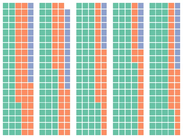
Since there is no pre-defined method for waffle bar chart, we will create a 1 x n figure, where n is the number of bar we want (1 row and n cols). In our case, it's one bar for each year (= 5).
We will iterate over each axe and add the waffle chart of the corresponding year. The waffle chart is made with the make_waffle() function
number_of_bars = len(df.columns) # one bar per year

# Init the whole figure and axes
fig, axs = plt.subplots(nrows=1,
                        ncols=number_of_bars,
                        figsize=(8,6),)

# Iterate over each bar and create it
for i,ax in enumerate(axs):

    col_name = df.columns[i]
    values = df[col_name] # values from the i-th column

    Waffle.make_waffle(
        ax=ax,  # pass axis to make_waffle
        rows=20,
        columns=5,
        values=values,
    )

plt.show()Stack vertically
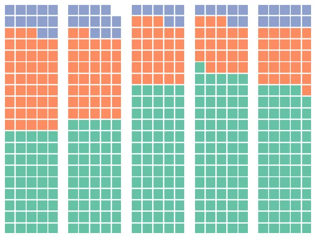
By default, the bars are stacked horizontally (from left to right). But in the context of a waffle bar chart, it might be more relevant to stack vertically.
For this, we have to add vertical=True in the make_waffle() function:
number_of_bars = len(df.columns) # one bar per year

# Init the whole figure and axes
fig, axs = plt.subplots(nrows=1,
                        ncols=number_of_bars,
                        figsize=(8,6),)

# Iterate over each bar and create it
for i,ax in enumerate(axs):

    col_name = df.columns[i]
    values = df[col_name] # values from the i-th column

    Waffle.make_waffle(
        ax=ax,  # pass axis to make_waffle
        rows=20,
        columns=5,
        values=values,
        vertical=True,
    )

plt.show()Custom colors and style
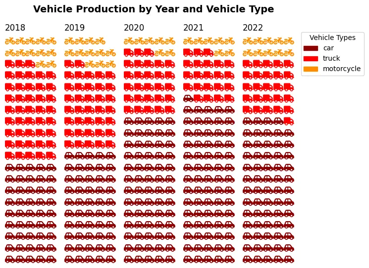
The previous graphs lack the comments and legends needed for easy interpretation.
To this end, we're going to add :
- a legend: it is created by iterating through a list of colors and generating graphical elements (
Patches) with corresponding labels - a title via the
subtitle()function - change the colors with the
colorsargument - change the shapes with the
iconsargument
number_of_bars = len(df.columns) # one bar per year
colors = ["darkred", "red", "darkorange"]

# Init the whole figure and axes
fig, axs = plt.subplots(nrows=1,
                        ncols=number_of_bars,
                        figsize=(8,6),)

# Iterate over each bar and create it
for i,ax in enumerate(axs):

    col_name = df.columns[i]
    values = df[col_name]/1000 # values from the i-th column

    Waffle.make_waffle(
        ax=ax,  # pass axis to make_waffle
        rows=20,
        columns=5,
        values=values,
        title={"label": col_name, "loc": "left"},
        colors=colors,
        vertical=True,
        icons=['car-side', 'truck', 'motorcycle'],
        font_size=12, # size of each point
        icon_legend=True,
        legend={'loc': 'upper left', 'bbox_to_anchor': (1, 1)},
    )

# Add a title
fig.suptitle('Vehicle Production by Year and Vehicle Type',
             fontsize=14, fontweight='bold')


# Add a legend
legend_labels = df.index
legend_elements = [mpatches.Patch(color=colors[i],
                                  label=legend_labels[i]) for i in range(len(colors))]
fig.legend(handles=legend_elements,
           loc="upper right",
           title="Vehicle Types",
           bbox_to_anchor=(1.04, 0.9))

plt.subplots_adjust(right=0.85)
plt.show()Going further
This post explains how to create a waffle bar chart.
For more examples of how to create or customize your waffle chart, see the waffle section. You may also be interested in how to create a waffle chart with grouping.