Libraries & Data
For creating this chart, we will need to load the following libraries:
- matplotlib for creating the chart and the arrows
- pandas for loading the data
- pypalettes: for the color palette
import matplotlib.pyplot as plt
import pandas as pd
from pypalettes import load_cmap

# set a higher resolution
plt.rcParams['figure.dpi'] = 250

# load the gapminder dataset
df = pd.read_csv('https://raw.githubusercontent.com/holtzy/The-Python-Graph-Gallery/master/static/data/gapminderData.csv')
df = df[df['year']==df['year'].max()]
df.head()| country | year | pop | continent | lifeExp | gdpPercap | |
|---|---|---|---|---|---|---|
| 11 | Afghanistan | 2007 | 31889923.0 | Asia | 43.828 | 974.580338 |
| 23 | Albania | 2007 | 3600523.0 | Europe | 76.423 | 5937.029526 |
| 35 | Algeria | 2007 | 33333216.0 | Africa | 72.301 | 6223.367465 |
| 47 | Angola | 2007 | 12420476.0 | Africa | 42.731 | 4797.231267 |
| 59 | Argentina | 2007 | 40301927.0 | Americas | 75.320 | 12779.379640 |
Simple bubble chart
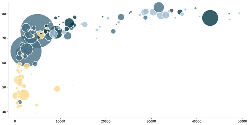
This code uses the ax.scatter() function from matplotlib.
The aim of this post is to show how arrows with inflexion points can be used to improve this kind of chart.
# initialize the figure
fig, ax = plt.subplots(figsize=(14,7))
ax.set_xlim(-1500, 50000)
ax.spines[['top', 'right']].set_visible(False)

# create a bubble chart
ax.scatter(
    x = df['gdpPercap'],
    y = df['lifeExp'],
    s = df['pop']/100000,
    c = pd.Categorical(df['continent']).codes,
    cmap = load_cmap('Acadia'),
    alpha = 0.8,
    edgecolors="white",
    linewidth=2
)

# display the plot
plt.show()Simple arrow with an inflexion point
In order to make our code easier to read, we will create a function called arrow_inflection() that will receive the following parameters:
- an
ax: - a
startandendpoint for the arrow (tuple with x and y values) - the
angleAandangleBfor the arrow - the
radiusof the inflexion point - the
colorof the arrow (default is black) - the
transformfor custom coordinates (default isNone)
def arrow_inflexion(
   ax,
   start, end,
   angleA, angleB,
   radius=0,
   color="black",
   transform=None
):

   # get the coordinates
   x1, y1 = end
   x2, y2 = start

   # avoid division by zero
   epsilon = 1e-6
   if x2 == x1:
      x2 += epsilon
   if y2 == y1:
      y2 += epsilon

   # select right coordinates
   if transform is None:
      transform = ax.transData

   # add the arrow
   connectionstyle = f"angle,angleA={angleA},angleB={angleB},rad={radius}"
   ax.annotate(
      "",
      xy=(x1, y1), xycoords=transform,
      xytext=(x2, y2), textcoords=transform,
      arrowprops=dict(
         color=color, arrowstyle="->",
         shrinkA=5, shrinkB=5,
         patchA=None, patchB=None,
         connectionstyle=connectionstyle,
      ),
)The function can be a bit complex at first since it uses lots of different matplotlib tools. Here are the main ones that we explain how to use in the gallery:
- the
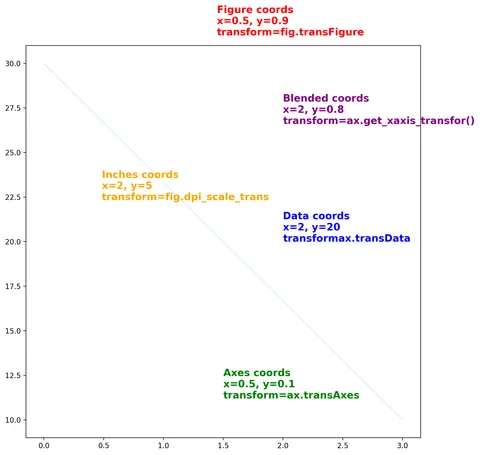
transformargument for choosing the coordinate system - how to create a simple arrows
- how to create a curved arrows
Otherwise you can just use the above function like in the examples below and it will work just fine:
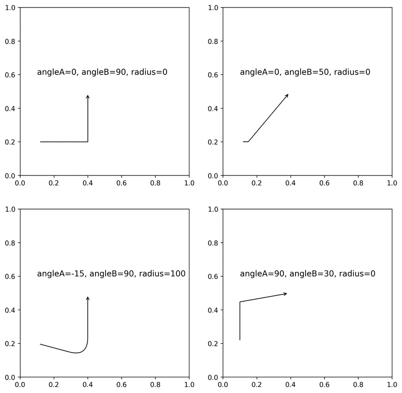
# initialize the figure with 4 subplots
fig, axs = plt.subplots(nrows=2, ncols=2, figsize=(10,10))

# top left arrow
arrow_inflexion(ax=axs[0,0], start=(0.1, 0.2), end=(0.4, 0.5), angleA=0, angleB=90, radius=0)
axs[0,0].text(x=0.1, y=0.6, s="angleA=0, angleB=90, radius=0", fontsize=12, ha='left')

# top right arrow
arrow_inflexion(ax=axs[0,1], start=(0.1, 0.2), end=(0.4, 0.5), angleA=0, angleB=50, radius=0)
axs[0,1].text(x=0.1, y=0.6, s="angleA=0, angleB=50, radius=0", fontsize=12, ha='left')

# bottom left arrow
arrow_inflexion(ax=axs[1,0], start=(0.1, 0.2), end=(0.4, 0.5), angleA=-15, angleB=90, radius=100)
axs[1,0].text(x=0.1, y=0.6, s="angleA=-15, angleB=90, radius=100", fontsize=12, ha='left')

# bottom right arrow
arrow_inflexion(ax=axs[1,1], start=(0.1, 0.2), end=(0.4, 0.5), angleA=90, angleB=10, radius=0)
axs[1,1].text(x=0.1, y=0.6, s="angleA=90, angleB=30, radius=0", fontsize=12, ha='left')

# display the plot
plt.show()Combined bubble chart with arrows
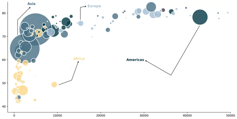
The following code is based on our previous bubble chart with the use of our arrow_inflection() function.
The only real complexity is to find the right values for the start and end points of the arrows. Since there is no magic method for this, you will have to go through a trial and error process to find the right values.
# initialize the figure
fig, ax = plt.subplots(figsize=(14,7))
ax.set_xlim(-1500, 50000)
ax.spines[['top', 'right']].set_visible(False)
cmap = load_cmap('Acadia')

# create a bubble chart
bubble = ax.scatter(
    x = df['gdpPercap'],
    y = df['lifeExp'],
    s = df['pop']/100000,
    c = pd.Categorical(df['continent']).codes,
    cmap = cmap,
    alpha = 0.8,
    edgecolors="white",
    linewidth=2
)

# add an arrow
arrow_inflexion(ax=ax, start=(10000, 49), end=(15000, 60), angleA=20, angleB=70)
arrow_inflexion(ax=ax, start=(43000, 75), end=(30000, 60), angleA=60, angleB=-30)
arrow_inflexion(ax=ax, start=(15300, 76.5), end=(17000, 83), angleA=90, angleB=10)
arrow_inflexion(ax=ax, start=(800, 70), end=(4000, 83), angleA=90, angleB=45)

# simple annotation at the end of each arrow
ax.text(x=15000, y=60, s="Africa", fontsize=12, ha='center', fontweight='bold', color=cmap(0))
ax.text(x=28000, y=59.5, s="Americas", fontsize=12, ha='center', fontweight='bold', color=cmap(1))
ax.text(x=18500, y=82.5, s="Europe", fontsize=12, ha='center', fontweight='bold', color=cmap(4))
ax.text(x=4000, y=83.5, s="Asia", fontsize=12, ha='center', fontweight='bold', color=cmap(3))

# display the plot
plt.show()Going further
You might be interested in:
- create annotations with different styles
- how to create rounded arrows
- customize fonts in matplotlib
- how to manage subplots