Density chart
Density plots allow you to visualize the distribution of a numeric variable for one or several groups. They are very well adapted for large datasets, as stated in data-to-viz.com.
Note that 2 approaches exist to build them in python: the first one consists of computing a kernel density estimate, and the second one involves building a high resolution histogram.
⏱ Quick start
If you are in a rush, the most straightforward way to build a density chart is to use Seaborn and its kdeplot() function. You just need to provide it with a numeric variable from your dataset. 🔥
# library & dataset
import seaborn as sns
df = sns.load_dataset('iris')

# Make default density plot
sns.kdeplot(df['sepal_width']) Density charts with
 Seaborn
Seaborn is a python library allowing to make better charts easily. It is well adapted to build density charts thanks to its kdeplot function.
The following charts will guide you through its usage, going from a very basic density plot to something much more customized.
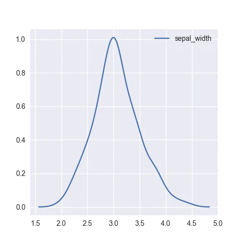
The most basic density plot one can make with python and seaborn
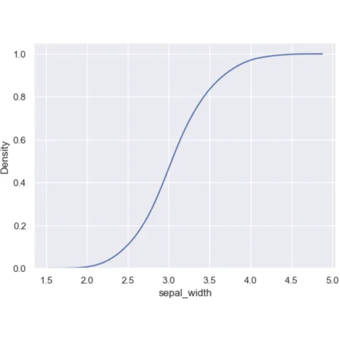
Cumulative version of the most basic density plot
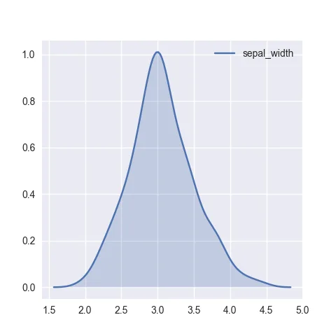
seaborn densty chart with filled area
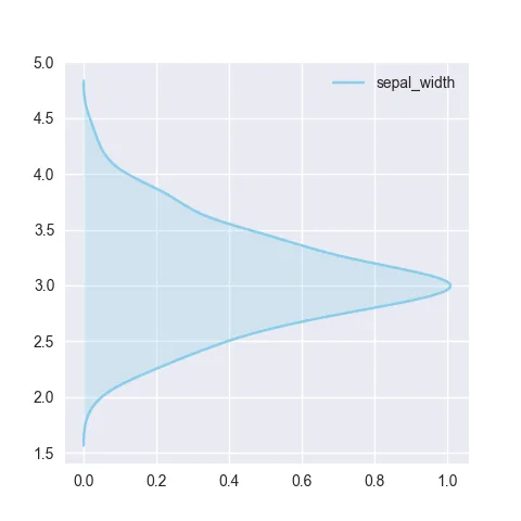
vertical seaborn density chart
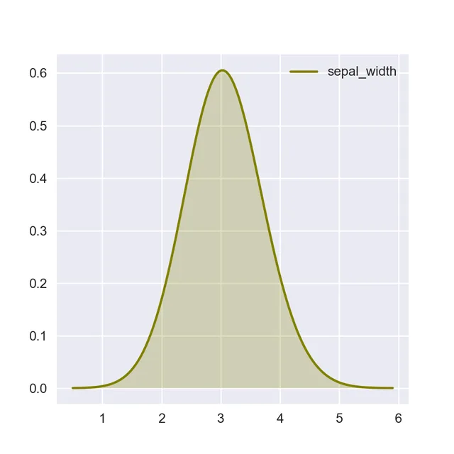
control density chart color
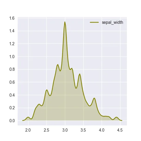
Changed the bandwidth used to compute the density
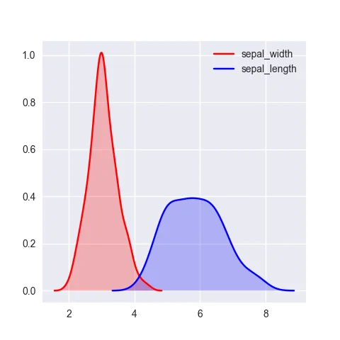
Density chart with several displayed groups
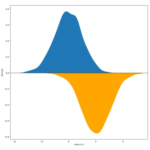
Mirror density chart to compare the distribution of 2 variables
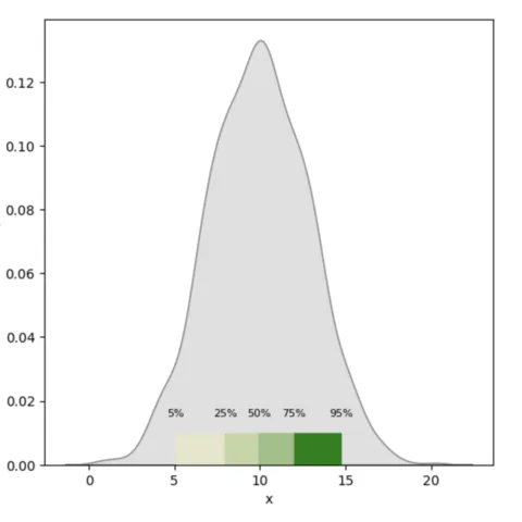
Density chart with quantiles displayed
Density charts, Seaborn and multiple groups
It is a common use case to compare the density of several groups in a dataset. Several options exist to do so.
You can plot all items on the same chart, using transparency and annotation to make the comparison possible.
Or you can use a technique called small multiples where the graph window is split in individual charts, avoiding group overlaps that are sometimes hard to read.
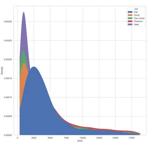
Density chart with multiple groups overlapped
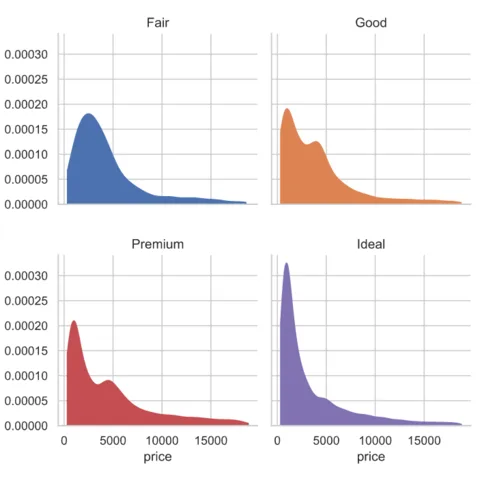
Density chart with multiple groups overlapped
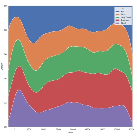
Density chart with multiple groups overlapped
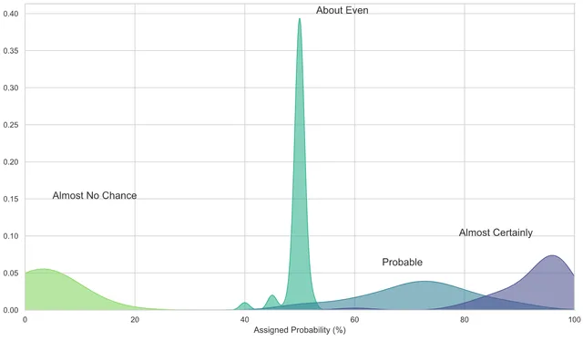
A density chart with multiple groups displayed, transparency and clean annotation.
🔎 kdeplot() function parameters → see full doc
→ Description
The kdeplot() function of seaborn generates Kernel Density Estimates to depict the probability density function of a continuous variable. It outputs a smoothed curve representing the distribution of the data.
→ Arguments
Description
Dataframe-like (pandas, numpy, polars...) with the columns we want to plot.
Possible values → dataframe
It just has to be a pandas.DataFrame (columns are variables), numpy.ndarray (rows/columns are variables), or any mapping/sequence (dictionaries/lists)
Supports both long-form (each variable in its own column) and wide-form (variables in separate columns; reshaped internally).
Code Example
# Library & Dataset
import seaborn as sns
df = sns.load_dataset('iris')

# Plot
sns.kdeplot(data=df, x='sepal_width') Density charts with
 Matplotlib
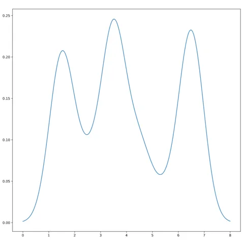
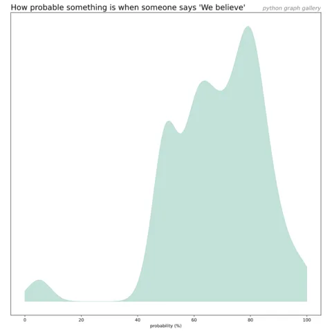
It is possible to build a density chart with matplotlib, but it is truely a struggle compared to making it with seaborn as shown above.
Here is an example to prove it is doable, but I strongly advise to go for seaborn.





💡 Out of dataviz inspiration?
I have spent years collecting the most beautiful data visualizations out there. Get the list of my top 300 dataviz projects, hand-picked, for free.
I respect your privacy. Unsubscribe anytime.