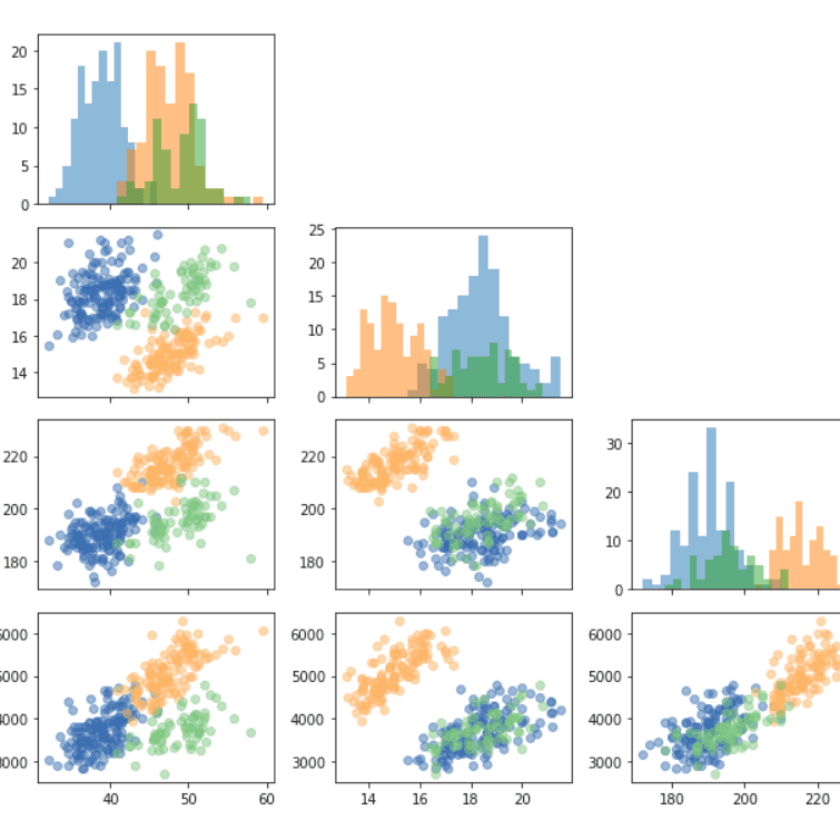
Correlogram

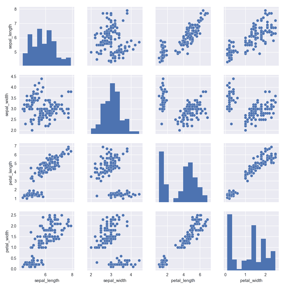
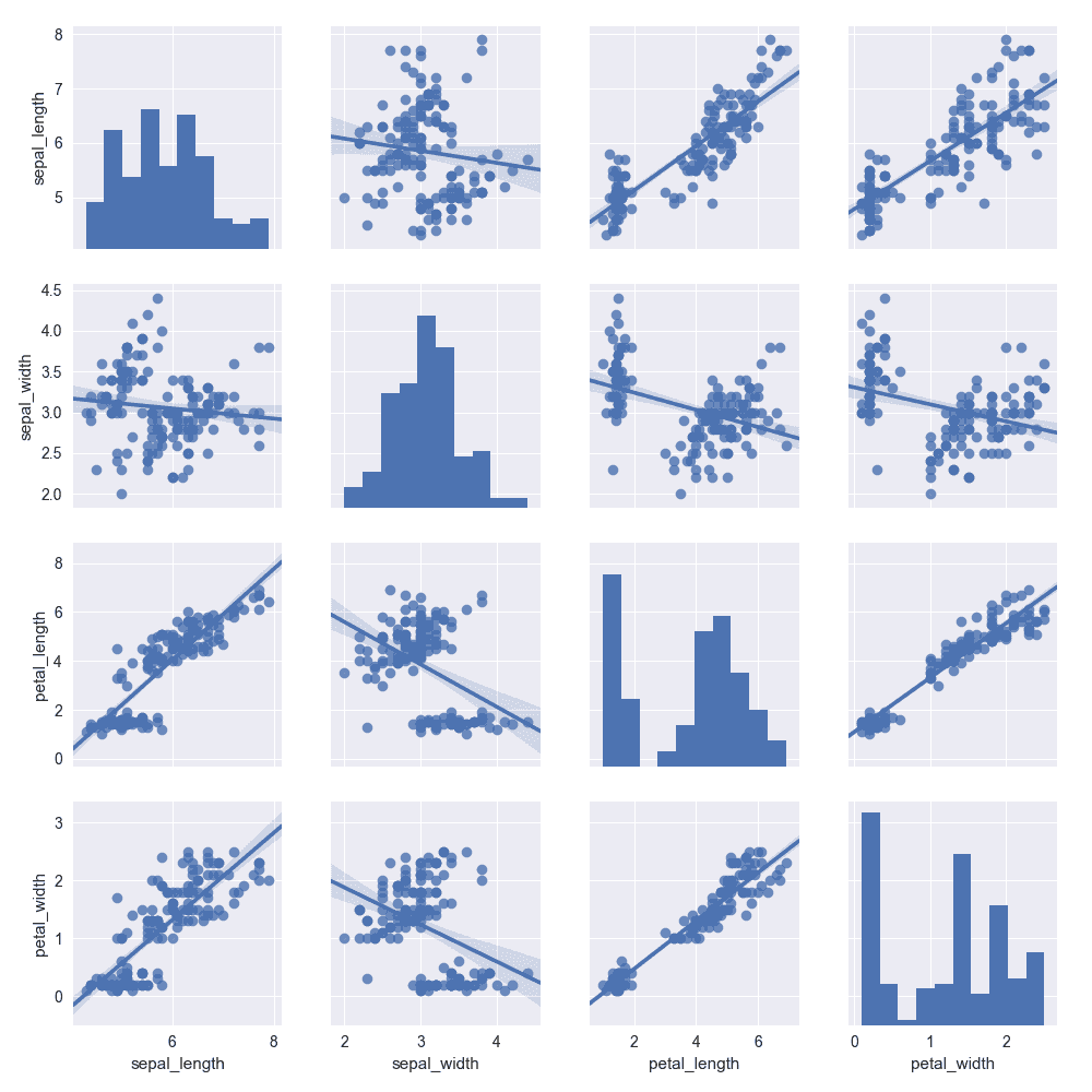
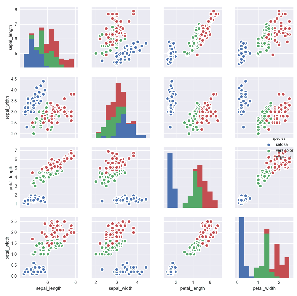
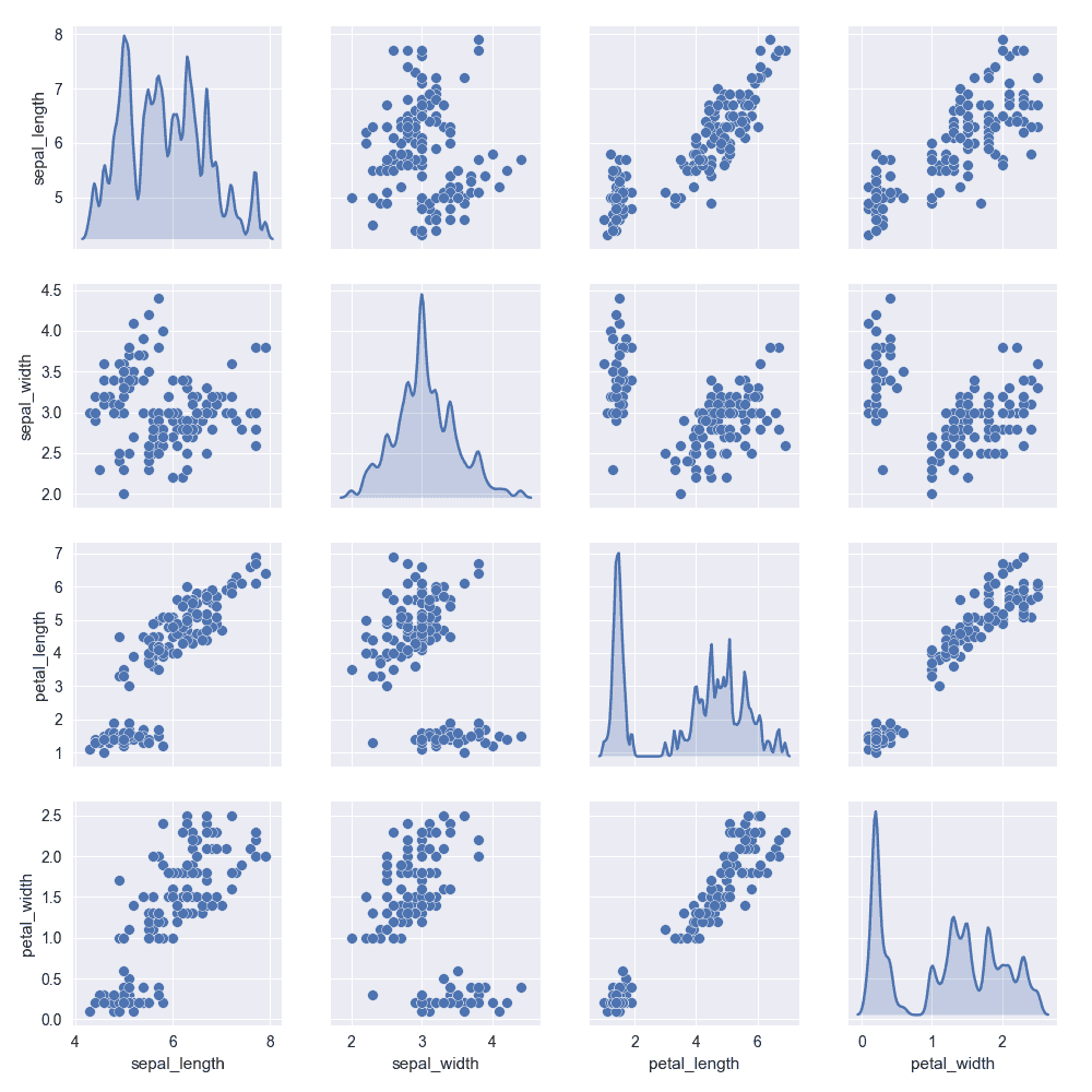
A correlogram or correlation matrix allows to analyse the relationship between each pair of numeric variables of a matrix. The correlation is visualised as a scatterplot. The diagonal represents the distribution of each variable with a histogram or a density plot.
⏱ Quick start
Once more, the Seaborn library is here to build a high quality correlogram with a few lines of code only.🔥
Note that all the stuff you learned in the scatterplotand histogram sections can be used here.
# library & dataset
import seaborn as sns
df = sns.load_dataset('iris')
import matplotlib.pyplot as plt

# Basic correlogram
sns.pairplot(df)
plt.show()
 Correlogram with
 Seaborn
Seaborn is definitely the best way to build a correlogram with python. It provides a pairplot() function that handles most of the work for you. The examples below give an overview of the customizations you can apply to it to suits your need.
 Correlogram with
 Matplotlib
As usual it is totally possible to build the chart with Matplotlib, but requires to write a bit more code. Basically, it is done using the subplots() function to create the grid, and next building a loop to add the charts one by one.
💡 Scatterplot and Histogram sections are related
Note that a correlogram is an aggregate of scatterplots and histograms. Most of the customizations described in those related sections can be applied here.
🚨 Grab the Data To Viz poster!
Do you know all the chart types? Do you know which one you should pick? I made a decision tree that answers those questions. You can download it for free!

