Chord diagram

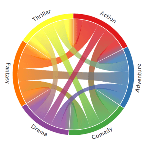
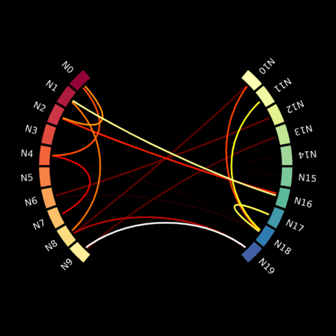
A chord diagram represents flows or connections between several entities (called nodes). Each entity is represented by a fragment on the outer part of the circular layout. Then, arcs are drawn between each entities. The size of the arc is proportional to the importance of the flow.
Chord diagram with the Chord library
Chord diagram is not a very usual type of chart. The most common library like Matplotlib andSeaborn will not be of any help to build one. Fortunately, the chord library wraps some functions coming from javascript and the d3.js library.
The examples below will guide you through a migration dataset already discussed in data-to-viz.com. It starts by describing the input dataset and the basic usage of the Chord() function.
Chord diagram with Bokeh
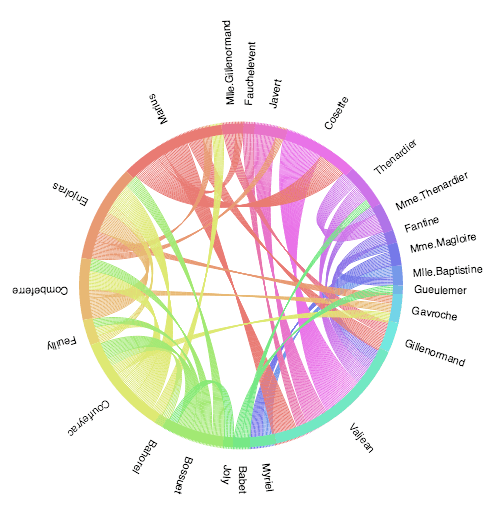
Bokeh is a pretty neat python library for data visualization. It provides a chord_from_df() function dedicated to chord diagram.
The example below comes straight from their documentation. It represents the relationship between each character of the book Les misérables.
Chord diagram with Plotly
plotly is a powerful python library for data visualization and also allows to build chord diagrams. The good part is that it builds interactive charts. However if comes with a lot of code complexity so be ready to spend several hours before getting your first figure. 😞
The example below shows the relationship between several people on facebook. Have a look to the plotly doc for explanation and code. Hover over a connection to get names and flow value.
Chord diagram with the Mne library
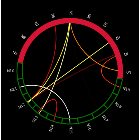
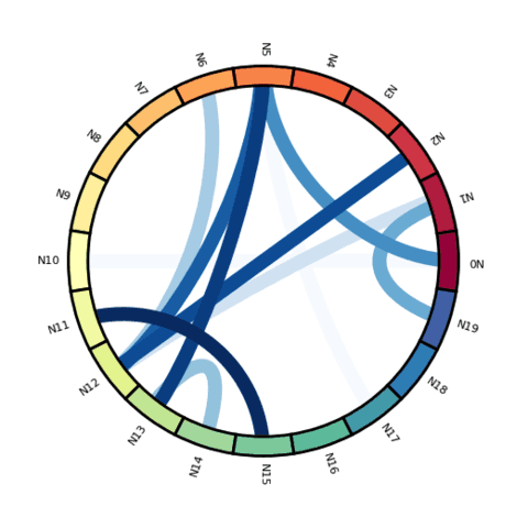
The mne library has been written for neuroscience purposes, but it comes with some handy functions when it comes to build chord diagrams. Visit the examples below to learn the basics and more!
🚨 Grab the Data To Viz poster!
Do you know all the chart types? Do you know which one you should pick? I made a decision tree that answers those questions. You can download it for free!

