The mne package
It is possible to build chord diagrams from a connectivity matrix thanks to the neuroscience library MNE. It comes with a visual function called plot_connectivity_circle() that is pretty handy to get good-looking chord diagrams in minutes!
Let's load the library and see what it can make!
from mne.viz import plot_connectivity_circle

# only for the exemple
import numpy as np
Most basic chord diagram with mne
Let's start with a basic examples. 20 nodes that are randomly connected. Two objects are created:
node_namesthat is a list of 20 node namesconthat is an object containing some random links between nodes.
Both object are passed to the plot_connectivity_circle() function that automatically builds the chord diagram.
N = 20  # Number of nodes
node_names = [f"N{i}" for i in range(N)]  # List of labels [N]

# Random connectivity
ran = np.random.rand(N, N)
# NaN so it doesn't display the weak links
con = np.where(ran > 0.9, ran, np.nan)fig, axes = plot_connectivity_circle(con, node_names)
Split the chord
It is possible to split the chord diagram in several parts. It can be handy to build chord diagrams where nodes are split in 2 groups, like origin and destination for instance.
start, end = 45, 135
first_half = (np.linspace(start, end, len(node_names)//2) +
              90).astype(int)[::+1] % 360
second_half = (np.linspace(start, end, len(node_names)//2) -
               90).astype(int)[::-1] % 360
node_angles = np.array(list(first_half) + list(second_half))fig, axes = plot_connectivity_circle(con, node_names,
node_angles=node_angles)
Style: node customization
Pretty much all parts of the chord diagram can be customized. Let's start by changing the node width (with node_width) and filtering the links that are shown (with vmin and vmax)
fig, axes = plot_connectivity_circle(con, node_names,
                                     node_width=2, vmin=0.97, vmax=0.98)
Now let's customize the nodes a bit more:
node_colorsfor the fill colornode_edgecolorfor the edgesnode_linewidthfor the width
node_edgecolor = N//2 * [(0, 0, 0, 0.)] + N//2 * ['green']
node_colors = N//2 * ['crimson'] + N//2 * [(0, 0, 0, 0.)]fig, axes = plot_connectivity_circle(con, node_names,
node_colors=node_colors, node_edgecolor=node_edgecolor, node_linewidth=2)
Style: labels and links
Now some customization for labels, links and background:
colormapfacecolortextcolorcolorbarlinewidth
fig, axes = plot_connectivity_circle(con, node_names,
                                     colormap='Blues', facecolor='white', textcolor='black', colorbar=False,
                                     linewidth=10)
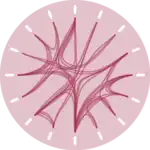
Brocoli
Let's get some fun and build a data art brocoli like chord diagram 😊 !
N = 200
node_names = N * ['']
ran = np.random.rand(N, N)
con = np.where(ran > 0.95, ran, np.nan)
first_half = (np.linspace(0, 180, len(node_names)//2)).astype(int)[::+1] % 360
second_half = (np.linspace(70, 110, len(node_names)//2) -
               180).astype(int)[::-1] % 360
node_angles = np.array(list(first_half) + list(second_half))
node_colors = node_edgecolor = N * ['green']fig, axes = plot_connectivity_circle(con, node_names,
node_angles=node_angles,
colormap='Greens', facecolor='w', textcolor='k', colorbar=False,
node_colors=node_colors, node_edgecolor=node_edgecolor,
node_width=0.1, node_linewidth=1, linewidth=1)