Libraries
First, you need to install plottable with the following command:
pip install plottable
We'll also need the following libraries:
- pandas for creating a dataframe with our data
- matplotlib for customizing the table and display it
import matplotlib.pyplot as plt
import pandas as pd

from plottable import Table, ColumnDefinition
from plottable.formatters import decimal_to_percent
from plottable.plots import bar, percentile_bars, percentile_stars, progress_donutDataset
Since most of the time, when we want to display a beautiful table, it comes from a pandas dataframe, we'll create a (simple) pandas df and use it as the starting point we want to make nice.
We set the same values in each column to show the various possible plots and how they render within the same value.
data = {'Score': [82, 68, 17, 39, 91],
        'Value': [82, 68, 17, 39, 91],
        'Metric': [82, 68, 17, 39, 91],
        'KPI': [82, 68, 17, 39, 91]}
df = pd.DataFrame(data)

# put everything in percentage
df = df/100Bar
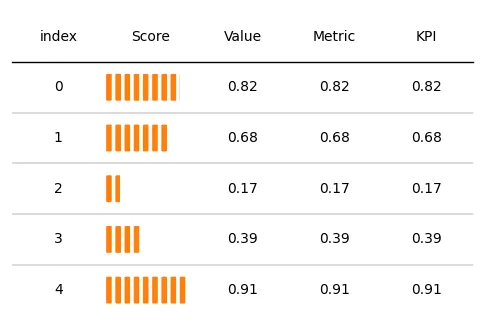
In the column definition argument, we specify plot_fn=percentile_bars for percentile bars.
We also have to add "is_pct": True in the plot_kw argument (kw stands for keyword). This means that our values are in percentage.
For more visibility, we center the text with textprops={"ha": "center"} when creating the Table().
# Init a figure
fig, ax = plt.subplots(figsize=(6, 4))

# Create the Table() object
tab = Table(df,
            textprops={"ha": "center"},
            column_definitions=[ColumnDefinition("Score",
                                                 plot_fn=percentile_bars,
                                                 plot_kw={"is_pct": True})]
           )

# Display the output
plt.show()Start review
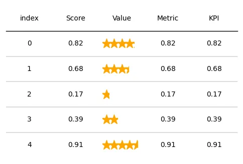
In the column definition argument, we specify plot_fn=percentile_stars for a start review.
We also have to add "is_pct": True in the plot_kw argument (kw stands for keyword). This means that our values are in percentage.
For more visibility, we center the text with textprops={"ha": "center"} when creating the Table().
# Init a figure
fig, ax = plt.subplots(figsize=(6, 4))

# Create the Table() object
tab = Table(df, cell_kw={"linewidth": 0,  "edgecolor": "k"},
            textprops={"ha": "center"},
            column_definitions=[ColumnDefinition("Value",
                                                 plot_fn=percentile_stars,
                                                 plot_kw={"is_pct": True})]
           )

# Display the output
plt.show()Donut progress
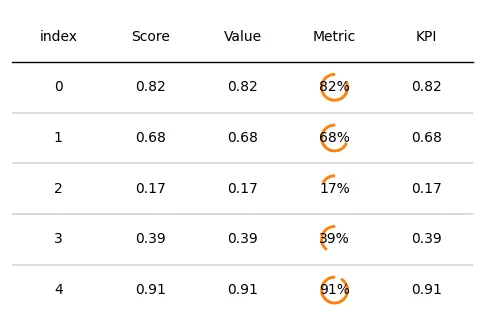
In the column definition argument, we specify plot_fn=progress_donut for a donut progress.
We also have to add "is_pct": True in the plot_kw argument (kw stands for keyword). This means that our values are in percentage.
For more visibility, we center the text with "ha": "center" and "formatter": "{:.0%}" (percentage formatting) in the plot_kw argument when creating the Table().
# Init a figure
fig, ax = plt.subplots(figsize=(6, 4))

# Create the Table() object
tab = Table(df,
            textprops={"ha": "center"},
            column_definitions=[ColumnDefinition("Metric",
                                                 plot_fn=progress_donut,
                                                 plot_kw={"is_pct": True,
                                                          "formatter": "{:.0%}"})])

# Display the output
plt.show()Progress bar
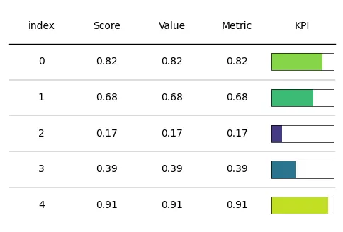
In the column definition argument, we specify plot_fn=progress_donut for a donut progress.
We also have to add "is_pct": True in the plot_kw argument (kw stands for keyword). This means that our values are in percentage.
For more visibility, we:
- center the text with
"ha": "center" - define a cmap with matplotlib: in our case it will be the
viridisone - add edges around bars with
"plot_bg_bar": True - reduce edge width with
"lw": 0.5(default is 1)
# Define a colormap from matplotlib
cmap = plt.get_cmap('viridis')

# Init a figure
fig, ax = plt.subplots(figsize=(6, 4))

# Create the Table() object
tab = Table(df,
            textprops={"ha": "center"},
            column_definitions=[ColumnDefinition("KPI",
                                                 plot_fn=bar,
                                                 plot_kw={"cmap": cmap,
                                                          "plot_bg_bar": True,
                                                          "lw": 0.5})]
           )

# Display the output
plt.show()All in once
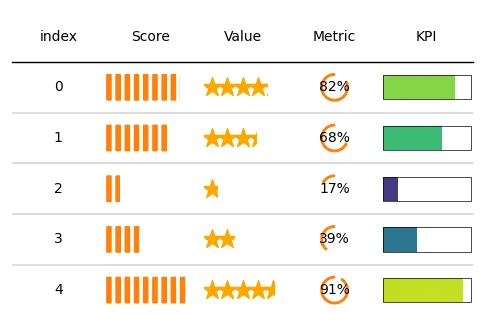
Let's add all the column definitions we've created before to see what each col looks like:
# Define a colormap from matplotlib
cmap = plt.get_cmap('viridis')

# Init a figure
fig, ax = plt.subplots(figsize=(6, 4))

col_defs = [ColumnDefinition("Metric", plot_fn=progress_donut, plot_kw={"is_pct": True,
                                                                        "formatter": "{:.0%}"}),
               ColumnDefinition("Value", plot_fn=percentile_stars, plot_kw={"is_pct": True}),
               ColumnDefinition("Score", plot_fn=percentile_bars, plot_kw={"is_pct": True}),
               ColumnDefinition("KPI", plot_fn=bar, plot_kw={"cmap":cmap,
                                                             "plot_bg_bar": True,
                                                             "lw": 0.5})
           ]

# Create the Table() object
tab = Table(df, cell_kw={"linewidth": 0,  "edgecolor": "k"},
            textprops={"ha": "center"},
            column_definitions=col_defs)

# Display the output
plt.show()Going further
This post explains the how add plots like progress bar, star review, donut progress, percent bar with the plottable library.
You might be interested in: